Bootstrap ITIS 313 Part 3 Resources 1 Official
Bootstrap ITIS 313 - Part 3 Resources: 1. Official Bootstrap Website (http: //getbootstrap. com/) 2. W 3 Schools (http: //www. w 3 schools. com/bootstrap/default. asp ) 3. Tutorial Point (http: //www. tutorialspoint. com/bootstrap/) 4. Tutorial Republic (http: //www. tutorialrepublic. com/twitter-bootstrap-tutorial/ ) 5. Connolly andand Hoar (2015)Hoar Fundamentals of Web Development – Sections & Development 5. 7 Randy Connolly Ricardo Fundamentals of 5. 6 Web Textbook to be published by Pearson Ed in early 2014 1 http: //www. funwebdev. com
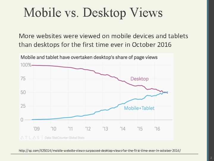
Mobile vs. Desktop Views More websites were viewed on mobile devices and tablets than desktops for the first time ever in October 2016 http: //qz. com/825014/mobile-website-views-surpassed-desktop-views-for-the-first-time-ever-in-october-2016/ 2
What is Bootstrap? • A CSS framework is a pre-created set of CSS classes and other software tools that make it easier to use and work with CSS. • Bootstrap is a powerful front-end framework for faster and easier web development. • Originally developed by Twitter, now an independent opensource framework. • Current version is Bootstrap 3, and 4. 0 is in alpha stage • It includes HTML, CSS and Java. Script based design templates for common user interface components like Typography, Forms Controls, Tables, Navigations, Dropdowns, Alerts, Tabs, Carousel and many other 3
Advantages of Bootstrap 1. Save lots of time: using the Bootstrap predefined design templates and classes and concentrate on other development work. 2. Responsive features: web pages to appear more appropriately on different devices and screen resolutions without any change in markup. 3. Consistent design: the designs and layouts of your web pages are consistent throughout your development. 4. Easy to use: Bootstrap is very easy to use. Anybody with the basic working knowledge of HTML and CSS can start development with Bootstrap. 5. Compatible with modern browsers 6. Open Source: And the best part is, it is completely free to download and use. 4
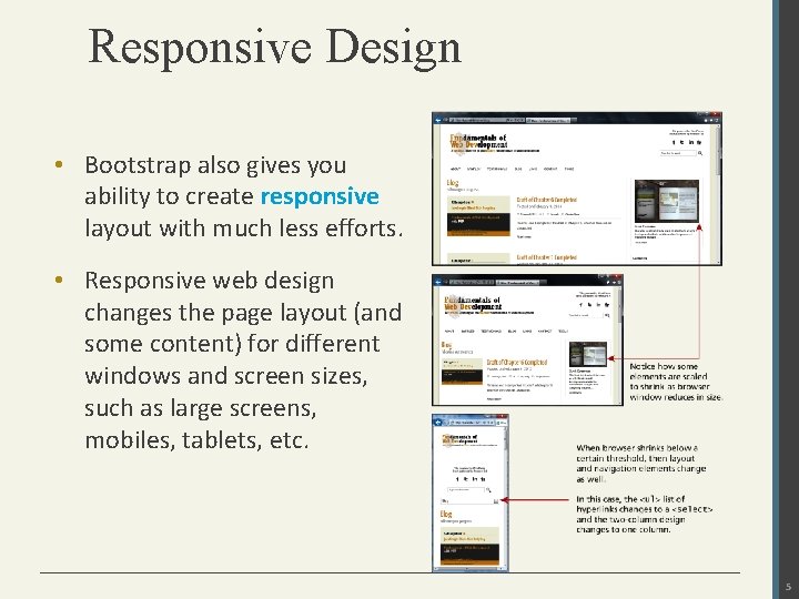
Responsive Design • Bootstrap also gives you ability to create responsive layout with much less efforts. • Responsive web design changes the page layout (and some content) for different windows and screen sizes, such as large screens, mobiles, tablets, etc. 5
What is The Viewport? • The viewport is the user's visible area of a web page. • The viewport varies with the device, and will be smaller on a mobile phone than on a computer screen. • Before tablets and mobile phones, web pages were designed only for computer screens, and it was common for web pages to have a static design and a fixed size. • Then, when we started surfing the internet using tablets and mobile phones, fixed size web pages were too large to fit the viewport. • To fix this, browsers on those devices scaled down the entire web page to fit the screen. • This was not perfect!! But a quick fix. 6
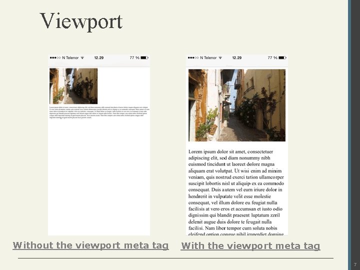
Viewport Without the viewport meta tag With the viewport meta tag 7
Setting The Viewport • HTML 5 introduced a method to let web designers take control over the viewport, through the <meta> tag. • You should include the following <meta> viewport element in all your web pages: <meta name="viewport" content="width=device-width, initialscale=1. 0"> • A <meta> viewport element gives the browser instructions on how to control the page's dimensions and scaling. • The width=device-width part sets the width of the page to follow the screen-width of the device. • The initial-scale=1. 0 part sets the initial zoom level when the page is first loaded by the browser. 8
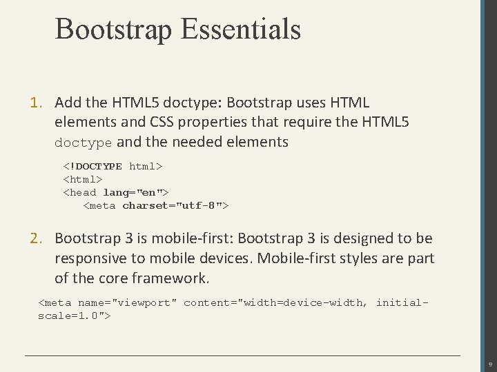
Bootstrap Essentials 1. Add the HTML 5 doctype: Bootstrap uses HTML elements and CSS properties that require the HTML 5 doctype and the needed elements <!DOCTYPE html> <head lang="en"> <meta charset="utf-8"> 2. Bootstrap 3 is mobile-first: Bootstrap 3 is designed to be responsive to mobile devices. Mobile-first styles are part of the core framework. <meta name="viewport" content="width=device-width, initialscale=1. 0"> 9
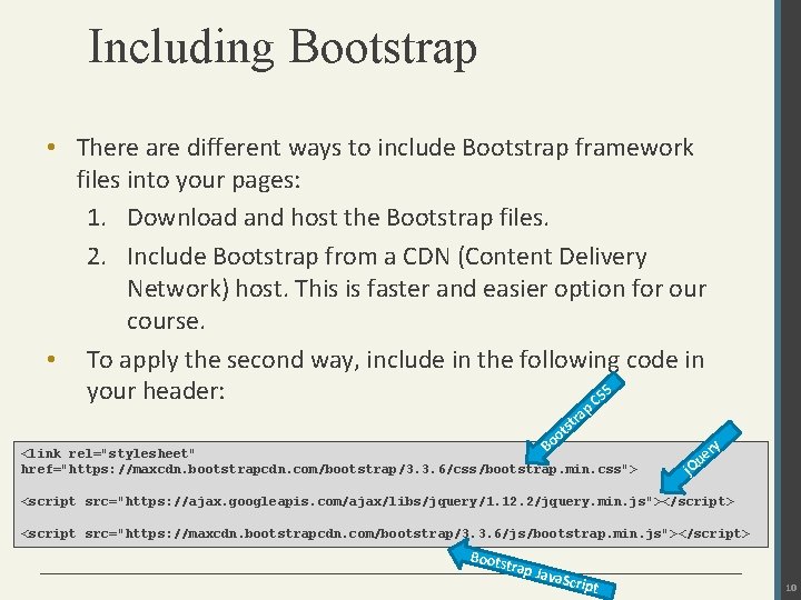
Including Bootstrap • There are different ways to include Bootstrap framework files into your pages: 1. Download and host the Bootstrap files. 2. Include Bootstrap from a CDN (Content Delivery Network) host. This is faster and easier option for our course. • To apply the second way, include in the following code in S your header: CS p ra st ot o B <link rel="stylesheet" href="https: //maxcdn. bootstrapcdn. com/bootstrap/3. 3. 6/css/bootstrap. min. css"> ry e Qu j <script src="https: //ajax. googleapis. com/ajax/libs/jquery/1. 12. 2/jquery. min. js"></script> <script src="https: //maxcdn. bootstrapcdn. com/bootstrap/3. 3. 6/js/bootstrap. min. js"></script> Boots trap J ava. Sc ript 10
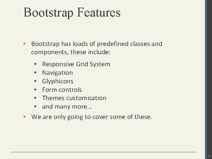
Bootstrap Features • Bootstrap has loads of predefined classes and components, these include: • Responsive Grid System • Navigation • Glyphicons • Form controls • Themes customisation • and many more… • We are only going to cover some of these. 11
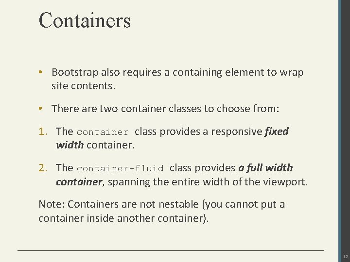
Containers • Bootstrap also requires a containing element to wrap site contents. • There are two container classes to choose from: 1. The container class provides a responsive fixed width container. 2. The container-fluid class provides a full width container, spanning the entire width of the viewport. Note: Containers are not nestable (you cannot put a container inside another container). 12
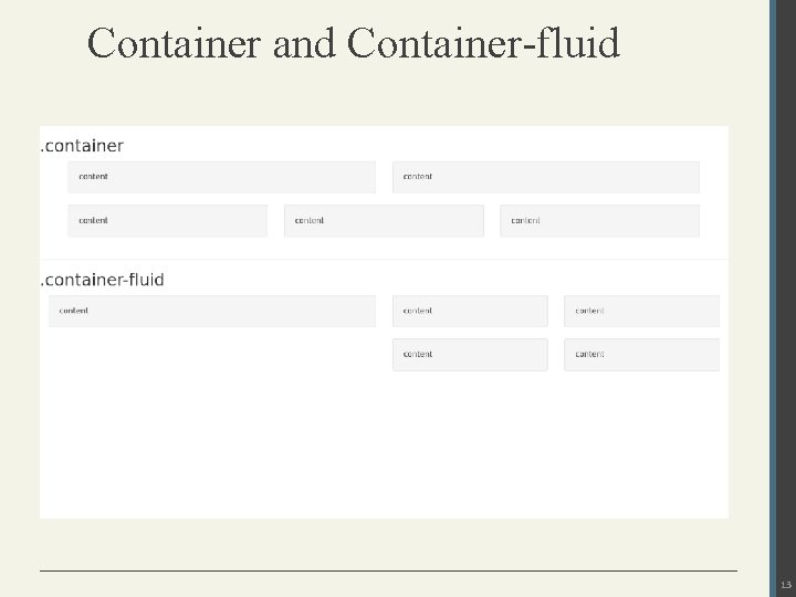
Container and Container-fluid 13
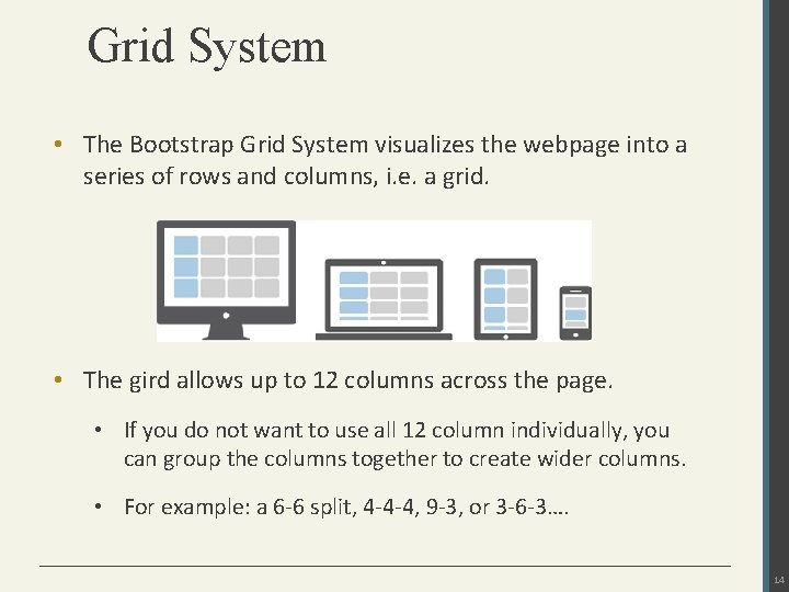
Grid System • The Bootstrap Grid System visualizes the webpage into a series of rows and columns, i. e. a grid. • The gird allows up to 12 columns across the page. • If you do not want to use all 12 column individually, you can group the columns together to create wider columns. • For example: a 6 -6 split, 4 -4 -4, 9 -3, or 3 -6 -3…. 14
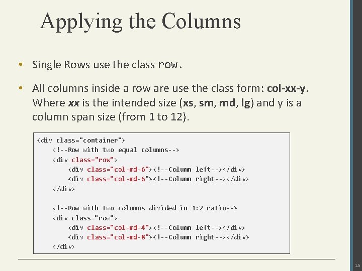
Applying the Columns • Single Rows use the class row. • All columns inside a row are use the class form: col-xx-y. Where xx is the intended size (xs, sm, md, lg) and y is a column span size (from 1 to 12). <div class="container"> <!--Row with two equal columns--> <div class="row"> <div class="col-md-6"><!--Column left--></div> <div class="col-md-6"><!--Column right--></div> <!--Row with two columns divided in 1: 2 ratio--> <div class="row"> <div class="col-md-4"><!--Column left--></div> <div class="col-md-8"><!--Column right--></div> 15
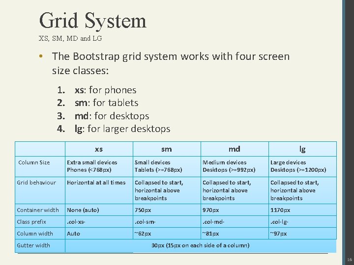
Grid System XS, SM, MD and LG • The Bootstrap grid system works with four screen size classes: 1. 2. 3. 4. xs: for phones sm: for tablets md: for desktops lg: for larger desktops xs sm md lg Column Size Extra small devices Phones (<768 px) Small devices Tablets (>=768 px) Medium devices Desktops (>=992 px) Large devices Desktops (>=1200 px) Grid behaviour Horizontal at all times Collapsed to start, horizontal above breakpoints Container width None (auto) 750 px 970 px 1170 px Class prefix . col-xs- . col-sm- . col-md- . col-lg- Column width Auto ~62 px ~81 px ~97 px Gutter width 30 px (15 px on each side of a column) 16
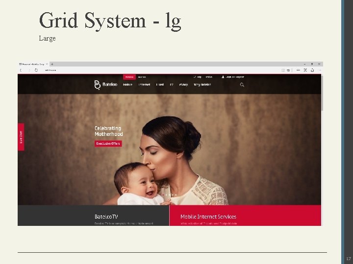
Grid System - lg Large 17
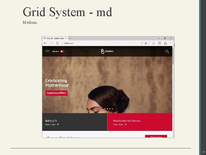
Grid System - md Medium 18
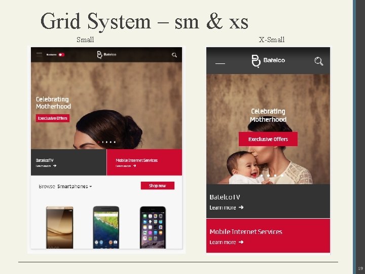
Grid System – sm & xs Small X-Small 19
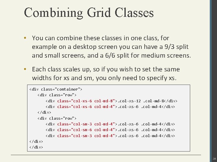
Combining Grid Classes • You can combine these classes in one class, for example on a desktop screen you can have a 9/3 split and small screens, and a 6/6 split for medium screens. • Each class scales up, so if you wish to set the same widths for xs and sm, you only need to specify xs. <div class="container"> <div class="row"> <div class="col-xs-6 </div> <div class="row"> <div class="col-sm-3 <div class="col-sm-6 <div class="col-sm-3 </div> col-md-8">. col-xs-12. col-md-8</div> col-md-4">. col-xs-6. col-md-4</div> 20
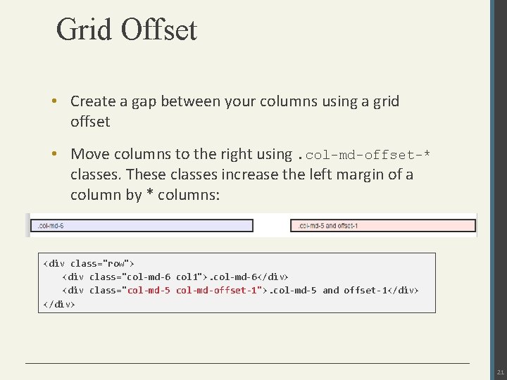
Grid Offset • Create a gap between your columns using a grid offset • Move columns to the right using. col-md-offset-* classes. These classes increase the left margin of a column by * columns: <div class="row"> <div class="col-md-6 col 1">. col-md-6</div> <div class="col-md-5 col-md-offset-1">. col-md-5 and offset-1</div> 21
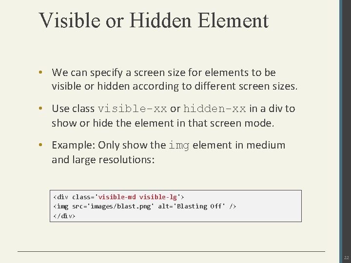
Visible or Hidden Element • We can specify a screen size for elements to be visible or hidden according to different screen sizes. • Use class visible-xx or hidden-xx in a div to show or hide the element in that screen mode. • Example: Only show the img element in medium and large resolutions: <div class='visible-md visible-lg'> <img src='images/blast. png' alt='Blasting Off' /> </div> 22
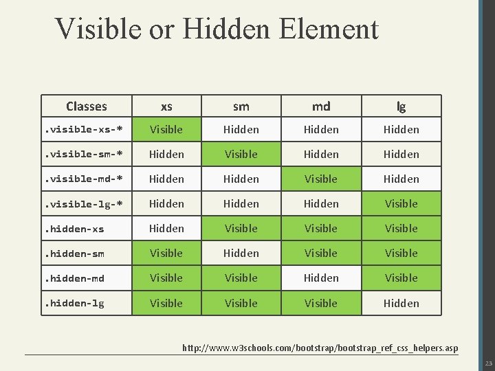
Visible or Hidden Element Classes xs sm md lg . visible-xs-* Visible Hidden . visible-sm-* Hidden Visible Hidden . visible-md-* Hidden Visible Hidden . visible-lg-* Hidden Visible . hidden-xs Hidden Visible . hidden-sm Visible Hidden Visible . hidden-md Visible Hidden Visible . hidden-lg Visible Hidden http: //www. w 3 schools. com/bootstrap_ref_css_helpers. asp 23
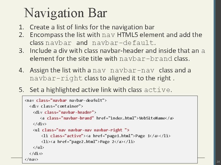
Navigation Bar 1. Create a list of links for the navigation bar 2. Encompass the list with nav HTML 5 element and add the class navbar and navbar-default. 3. Include a div with class navbar-header and inside that an a element for the site title with navbar-brand class. 4. Assign the list with a navbar-nav class and a navbar-right class to aligned it to the right. 5. Set a highlighted active link with class active. <nav class="navbar-deafult"> <div class="container"> <div class="navbar-header"> <a class="navbar-brand" href="index. html">Web. Site. Name</a> </div> <ul class="nav navbar-right "> <li class="active"><a href="page 1. html">Page 1</a></li> <li><a href="page 2. html">Page 2</a></li> </ul> </div> </nav> 24
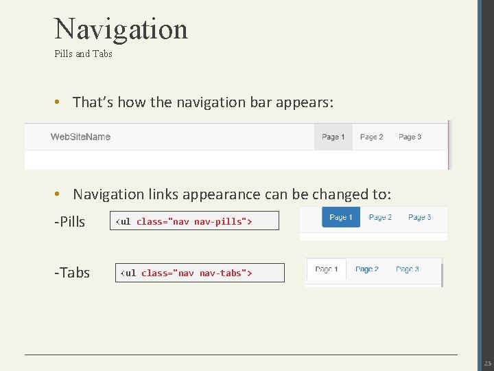
Navigation Pills and Tabs • That’s how the navigation bar appears: • Navigation links appearance can be changed to: -Pills <ul class="nav nav-pills"> -Tabs <ul class="nav nav-tabs"> 25
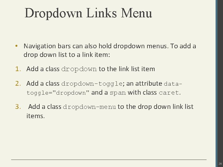
Dropdown Links Menu • Navigation bars can also hold dropdown menus. To add a drop down list to a link item: 1. Add a class dropdown to the link list item 2. Add a class dropdown-toggle; an attribute datatoggle="dropdown" and a span with class caret. 3. Add a class dropdown-menu to the drop down link list items. 26
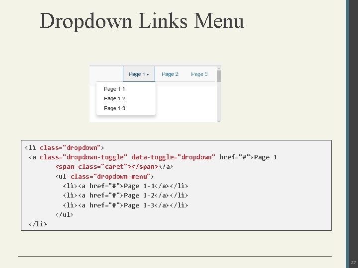
Dropdown Links Menu <li class="dropdown"> <a class="dropdown-toggle" data-toggle="dropdown" href="#">Page 1 <span class="caret"></span></a> <ul class="dropdown-menu"> <li><a href="#">Page 1 -1</a></li> <li><a href="#">Page 1 -2</a></li> <li><a href="#">Page 1 -3</a></li> </ul> </li> 27
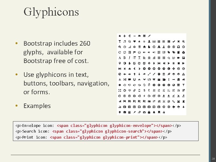
Glyphicons • Bootstrap includes 260 glyphs, available for Bootstrap free of cost. • Use glyphicons in text, buttons, toolbars, navigation, or forms. • Examples <p>Envelope icon: <span class="glyphicon-envelope"></span></p> <p>Search icon: <span class="glyphicon-search"></span></p> <p>Print icon: <span class="glyphicon-print"></span></p> 28
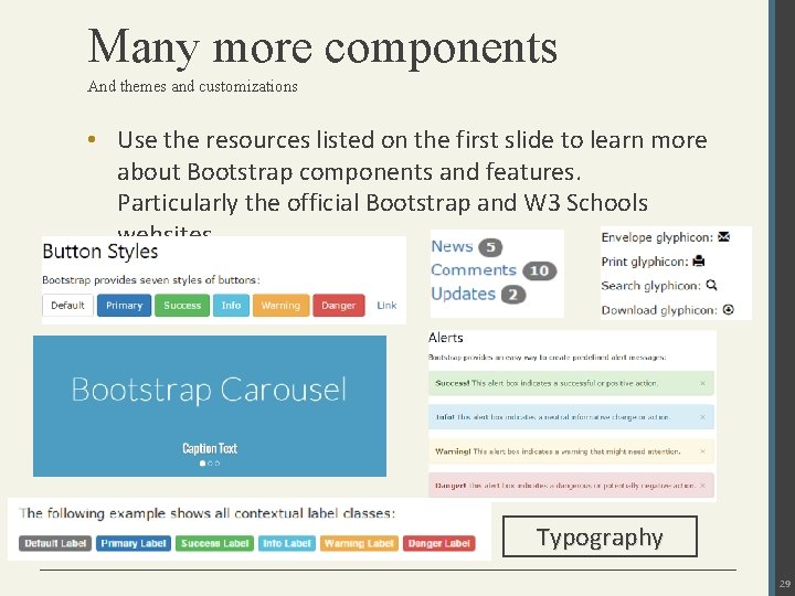
Many more components And themes and customizations • Use the resources listed on the first slide to learn more about Bootstrap components and features. Particularly the official Bootstrap and W 3 Schools websites. Typography 29
- Slides: 29