Best Layout Design Practices TECHNIQUES FOR ACHIEVING GOOD

Best Layout & Design Practices TECHNIQUES FOR ACHIEVING GOOD COMPOSITION 08/25/2016 Design for Advertising Miriam Ahmed

What Makes Good Design? Good design is extremely subjective. It's an art. And what looks like a million dollars to you might look like garbage to someone else. In art, the main message is always variable and open to the personal interpretation of each individual viewer. Art is not restricted to any one aim or target audience. Most times, the aim of art is to express or evoke the artist's or viewer's emotions or experiences. Design is by definition functional. Form follows function. In design, the main message is always unmistakable and each individual viewer should decode the same message. Your design exists to serve a specific purpose. Make communicating that purpose your sole aim when laying out your artwork.

What Makes Good Design? The following are a number of techniques you can use to get the ball rolling. Most designers have a preferred go-to approach. Try them all and see which ones stick. • 2 D Concepts: Use Design Elements and Principles • Subject Matters • Focal Points/ Emphasis • Expressive Typography • Grid Locked Design • Hierarchy • Know Your Place, Time and Style • First Things First • Create Patterns • Think Big • Play to Your Strengths • Think Different • Don’t Overdo It • Use Color Intelligently • Don’t Plagiarize

2 D Concepts • Elements • Line • Shape flat, 2 d forms • Value/Tone lights & darks • Texture implied/actual • Positive/ Negative Space • Color • (Text) http: //www. incredibleart. org/files/elements. htm http: //flyeschool. com/content/elementsartdesign-and-principles-designorganization • Principles • Balance (A)symmetrical • Repetition/ Rhythm (pattern) • Focus/Emphasis/Dominance Rule of Thirds Visual Center/ Museum Height Golden Ratio/ Divine Proportion • Unity/Harmony • Scale • Proportion • Contrast • Movement • Depth overlapping/ scale/ perspective/foreshortening

Subject Matters • Use Elements as tools to create Principles eg: • Use positive/negative space to create balance • Use lights/darks to imply movement • If your subject has to do with music, try to create rhythm. If your content calls for harmony, create balance. But remember that not everything must be aesthetically pleasing; if your content is edgy, create deliberate disharmony.
 using: • Rule of")
Focal Points/ Emphasis • Layout compositions (create focal points/ hierarchy) using: • Rule of Thirds • Visual Center/ Museum Height • Golden Ratio/ Divine Proportion

Focal Points/ Emphasis • Rule of Thirds

Focal Points/ Emphasis • Visual Center/ Museum Height

Focal Points/ Emphasis • Golden Ration / Divine Proportion

Maintain Visual Hierarchy Determine the hierarchy of the information. Your client may not always give you the information in a structured way. They may not place the important info at the top of the list. Not everyone is a marketing professional and most people don't think about which info is the most important. It is your job as a designer to go through the info and determine the hierarchy. Reorganize the text into a hierarchy, most important info first. Then design maintaining that hierarchy visually. Lead the viewer’s eye through the piece. The most important info should be visually dominant. This does not mean it needs to be placed at the top of the marketing piece. It could simply be the largest info, or the most colorful, or the most intricately designed, or the boldest. Design with the aim of communicating visual hierarchy

Maintain Visual Hierarchy

First Things First Start your composition by designing the most important information. Many designers are tempted to begin designing by placing a supporting image or illustration on the art board and then trying to layout the text around it. The problem with this is that quite frequently, the image or illustration is secondary to the textual message. It merely supports the real textual message.

First Things First

First Things First

First Things First

First Things First

First Things First In many cases, images are secondary information. They are there to support the text. Without the text, they do not communicate the specifics of the message (picture is worth a thousand words). Text however, can stand alone without needing an image for clarification. When designing, start with what NEEDS to be on the page or artboard. Base your design on the most important parts. If you begin your composition by designing the text, usually, supporting images or illustrations simply fall into place within the composition

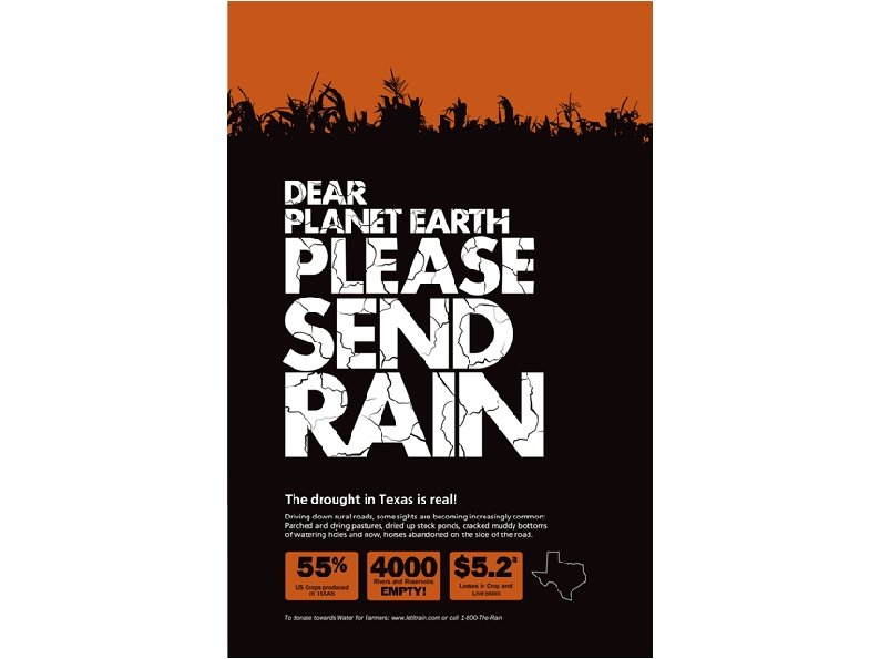
First Things First If the most important part of the ad is an image/illustration/graphic showing the Big Idea or driving concept, then lay that out first. Many images speaks very specifically for themselves. Well-branded images (those that are already popular and familiar) can be the focus of the composition. It can also be visually intriguing to present an image that is confusing. It invites the viewer to WANT to know more.

First Things First

Think Big A composition technique that utilizes bold contrast in scale: make something big, small and medium sized • Select the most important word, number, letter, or form in the content and make it larger than the page- as large as you can make it without losing legibility. • Use the negative spaces created for the rest of your layout. • Make the semi-important info medium sized Make the details or body copy small (Might not always work for all projects, eg. logo design or small packaging design)

Think Big

Think Big

Think Big

Think Different Good design is unique and unexpected. Why do you want to be unique? Because Good design is memorable Great design is unforgettable Weak design is "normal" and forgettable or goes unnoticed Why? Because that's the whole point of branding- to get people to remember your brand so they'll keep coming back to it. Designing a memorable brand will build brand loyalty and market share which translates into revenue. In order to be memorable, you need to stand out from the crowd. Offer great products, exceptional customer service, policies like free return shipping or price matching, or pull public marketing stunts.

Think Different But how do you make your DESIGN stand out from the crowd? Your design has to be unique. You have to design something noticeable, memorable, or even better, unforgettable. • Use layouts that are striking, bold, unconventional • Use color schemes that will attract your target audience, but are divergent from the expected colors for the subject • Use concepts and metaphors to evoke emotional reactions • Use expressive typography

Think Different • Don't design using cliché or elementary ideas These are usually the first few ideas that come to you when you're thinking or sketching. If it is one of your early ideas, chances are, it will also be other people's early ideas, and that means it's too elementary and most likely cliché. • The Big Idea: thematic design. Give viewers a puzzle to solve Base your design on the Big Idea which should be conceptual, metaphorical/ thematic. Take your concept further and make the design something that viewers have to understand, figure out, or in lay words "get". You want your viewers to get that "ahhh" moment when viewing your design, when they "get it".

Think Different

Think Different Think about what layouts are considered "normal" for your project and deliberately do the unexpected. Eg. The conventional letterhead layout: logo on top left or center of the page, and the contact info below a horizontal rule, either below the logo or at the bottom of the page, and, of course, a watermark in the middle of the page. This is what you should NOT do.

Think Different Take risks, be bold, be unconventional, be atypical and stand out from the crowd. This makes good design.

Use Color Intelligently Be aware of the psychological associations and implications of hues. Design on a color system based on the color wheel • Primary • Secondary • Tertiary • Complementary • Analogous • Monochromatic • Warm/ cool • Pastels

Use Color Intelligently Stick to the brand – design with the corporate colors Match your design concept and content with an appropriate, deliberately selected color scheme. Know the “typical” color schemes for your product, and try to distinguish your design by using colors that are appropriate, but not typical – eg. Use tints and shades, or use atypical colors in small sections for emphasis.


Typical Rock Concert Posters Which colors grab your attention more than any others, and why?

Typical Spa Posters Which colors grab your attention more than any others, and why?
 for print • RGB")
Use Color Intelligently Color modes • CMYK (aka 4 -color) for print • RGB for screen • Grayscale for black and white images • Pantone Matching System (PMS) for printed spot colors PMS colors • Use these when your brand standards mandate them. For eg. HU colors are 186 (red) and 2965 (blue) • Use when printing 3 colors or fewer (it is more expensive to print several PMS colors)

Expressive Typography Know your type history and background of font styles like Roman, sans serif. Know the difference between classic, long-established, professionally founded typefaces such as Frutiger, Futura, Helvetica, Bodoni, Didot, Caslon, etc and the trendy, amateur designed fonts downloaded from free font websites.

Expressive Typography Understand the architecture of letterforms and look for typefaces that are well-designed-- ie. designed by someone who understands the impact of x-height, stroke weight, kerning, leading, serifs, etc. Carefully select typefaces based on their historic viability, design, personality, conveyed meanings, but also based on readability - x height.

Expressive Typography

Expressive Typography

Expressive Typography

Expressive Typography Design your type. Don't just type it. Design it. Play with arrangement, make the letter forms visually express the verbal idea by using scale, position, rotation, repetition, tracking, leading.

Expressive Typography Usually people remember to design headlines. But even body copy should be DESIGNED. Remember that body copy is treated as a BLOCK of text that can be rotated, angled, shaped to contribute aesthetics and meaning to your project.

Expressive Typography Do not scale type without holding shift key – maintain the proportions the type designer intended Manipulate leading, tracking Use columns in Illustrator and In. Design Try styles like drop caps in In. Design for body copy

Grid Locked Design Good design is always based on a grid. Before you begin a project, even one as simple as a logo design, you must decide: • how many columns your artwork will be • What size your gutters will be (0. 25” is standard) • What size your margins will be Larger projects can afford larger margins. Larger margins create more white space and give your design more breathing room. . . this is luxurious! Always stick to the grid. But be unconventional when following it. For example, if you have a 4 column grid, leave the left column empty and place your body copy in a 2 -column text box that stretches across the remaining 3 columns. Line up your compositional elements perfectly to the grid. Even bastard measures align perfectly with the grid!

Grid Locked Design

Grid Locked Design

Grid Locked Design

Know Your Place, Time and Style Know your design history. Know cultural trends. Know local styles. Refer to eras, time periods, places, or design styles for inspiration when the subject or content is appropriate. Eg: 80 s, retro, western, elegant, disco, 50 s, German, Dutch, blues, rockconcert, edgy, surfer, Hawaiian, Black Arts, etc. Research designs from the time-period or place and base your design off one or more of your findings.

Know Design Styles & Movements Understand design terms like Minimalist design, Dutch de Stijl, Swiss, etc. Understand that Art Movements like (Renaissance, Bauhaus, Cubism, Surrealism, Pop Art, Afri. COBRA etc) impacted design trends. Research these and understand their significance so that you are not using design styles arbitrarily based on assumed implications. Making educated design style decisions that are solidly grounded in knowledge will set you apart as a professional designer, and the higher level of understanding will shine through in your design work!

Dutch Style

Swiss Style

50 s Retro/Vintage Style

Cubist-inspired Style

Minimalist Style

Western Style

Bauhaus Style

Black Arts Movement Style

Black Arts Movement Style

Juxtaposing Styles Juxtapose different or contrasting styles to make interesting compositions This usually only works when MANY styles are juxtaposed within a single composition, and the layout of the composition is very orderly and balanced - to counter the chaos and abnormality created by the juxtaposition.

Juxtaposing Styles

Create Patterns Use an element from your artwork to create a motif that you repeat to make your design interesting. Consider geometric and organic patterns. Consider type-based patterns. Patterns can be made more unique and interesting by making each repeated motif a different size, shade, tint or hue from your color scheme.

Create Patterns

Create Patterns

Play to Your Strengths People tend to apply their strongest skills to their design work. Illustrators tend to design with a lot of organic, illustrated lines. They frequently prefer to illustrate text instead of typing it, or they will draw a person instead of using a photo. Typographers tend to create designs with emphasis on the type design. Know your strengths and use them.

Play to Your Strengths

Play to Your Strengths

Don’t Overdo It Choose 1 method and stick to it. Don't try to add too many design ideas to your project. This leads to chaotic, confusing, misdirectional and unaesthetic design.

Don’t Plagiarize Respect others’ intellectual and artistic property rights. Feel free to look things up, and to be inspired by others’ creativity, but NEVER, EVER COPY!

Assignment 3: Composition 1. Using only the 2 D elements and principles of line and repetition design a logo for • a Department of Art Halloween costume party named “Masquerpiece” or “Living Art” OR • a new U Street live Jazz club named “Live on U” • (10 minutes) 2. Using symmetry and rotation, design a logo for • the Howard University Sesquicentennial (150 years of Bison pride) OR • a logo for a bakery named “Drizzle” • (10 minutes)

Assignment 3: Composition 3. Choose one of the composition approaches suggested in this presentation and design a poster using rule of thirds, a diagonal grid and type only. (20 minutes) • Live on U opening night on Friday September 30 OR • Sesquicentennial art exhibition opening on Sun Jan 1 4. Choose a different composition approach and design a poster using visual center, expressive type, and a photo or illustration. (20 minutes) • advertising Drizzle’s grand opening on Halloween (photo or illustration of a cupcake) OR • advertising the Halloween party (illustration of artistic pumpkin, artistic ghost, etc).
 2.")
Homework 1. Assignment 4: B&W and Scalable Graphic Marks (due Wed Sep 12) 2. Read The Graphic Design Idea Book Chapter 2
- Slides: 72