Bell Ringer Lesson 1 2 Displaying Categorical Data
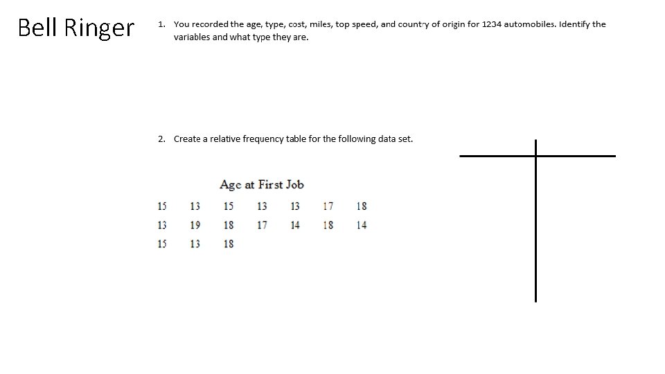
Bell Ringer

Lesson 1. 2 Displaying Categorical Data
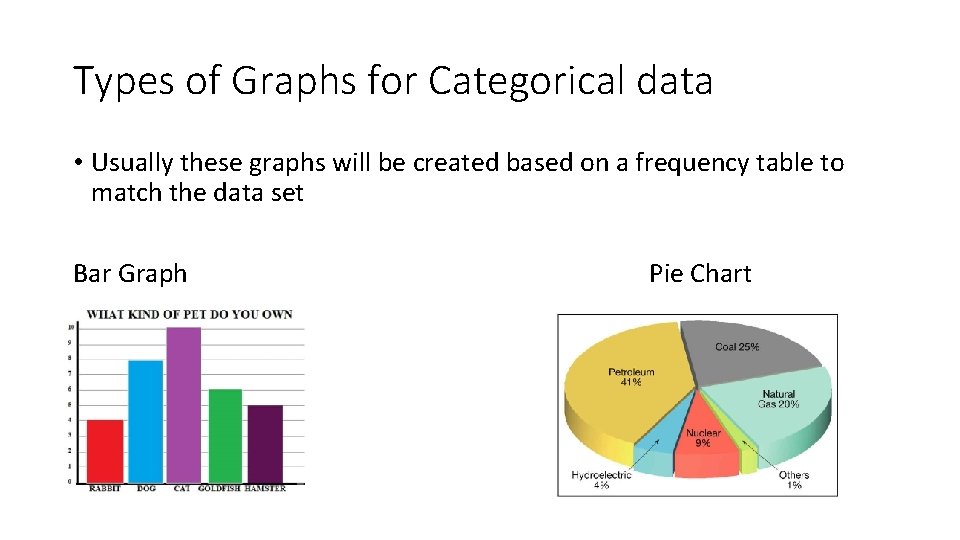
Types of Graphs for Categorical data • Usually these graphs will be created based on a frequency table to match the data set Bar Graph Pie Chart
Bar Graphs • A Bar Graph is a diagram in which the numerical values of variables are represented by the height or length of lines or rectangles of equal width. • Are used to compare facts, especially with categorical data or groups • Compare different groups • Track changes over time • If using a bar graph to measure the change over time, bar graphs are best if the changes are larger.
How to make a Bar Graph • Create a Frequency table if one is not given • Draw and label each of your axes • “Scale” the axes. • Always start the vertical axis at zero and make tick marks at equal intervals up the rest of the axis • Draw the bars
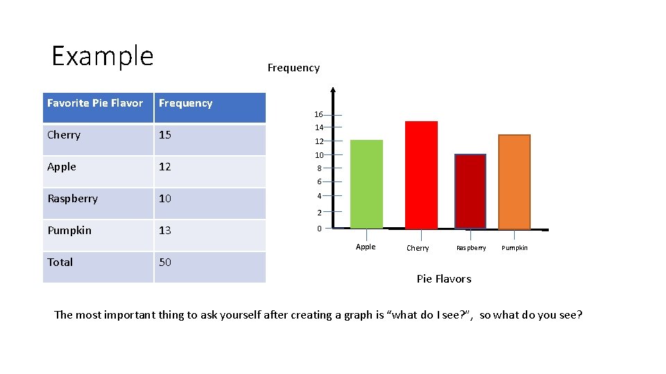
Example Frequency Favorite Pie Flavor Frequency Cherry 15 Apple 12 16 14 12 10 8 6 Raspberry 10 4 2 Pumpkin 13 0 Apple Total Cherry Raspberry Pumpkin 50 Pie Flavors The most important thing to ask yourself after creating a graph is “what do I see? ”, so what do you see?
Pie Chart • A Pie Chart is a type of graph in which a circle is divided into sectors that each represent a proportion of the whole. • Show percentage or part of wholes • Does not show change over time.
How to make a Pie Chart • Steps to create an accurate pie chart: Collect and organize data Create a bar graph or some form of grouping to show parts of the whole Use a compass to create a circle Calculate the percentage of each category of data collected Calculate the amount of degrees of each “slice” of the pie chart that represents each category • Draw a radius line, then use a protractor to measure the degrees (may round) • Label with name and percentage for each category • • • Therefore we will usually use technology to Pie Charts
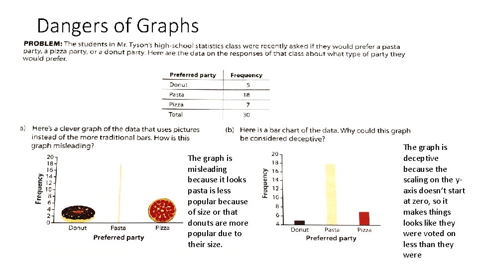
Dangers of Graphs The graph is misleading because it looks pasta is less popular because of size or that donuts are more popular due to their size. The graph is deceptive because the scaling on the yaxis doesn’t start at zero, so it makes things looks like they were voted on less than they were
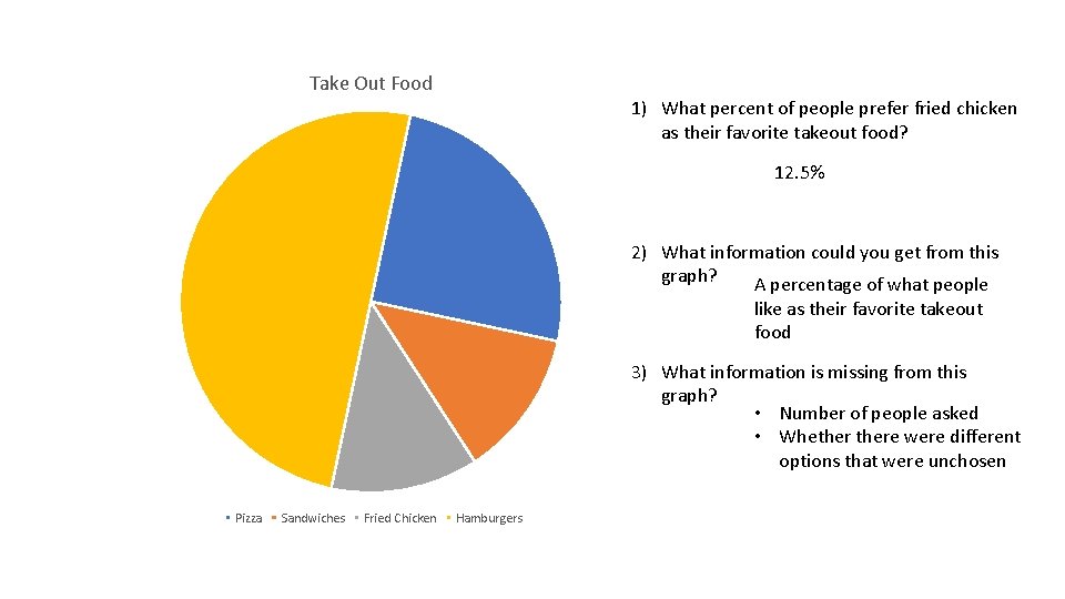
Take Out Food 1) What percent of people prefer fried chicken as their favorite takeout food? 12. 5% 2) What information could you get from this graph? A percentage of what people like as their favorite takeout food 3) What information is missing from this graph? • Number of people asked • Whethere were different options that were unchosen Pizza Sandwiches Fried Chicken Hamburgers
- Slides: 10