Basic Statistics for Business and Economics Chapter 2
Basic Statistics for Business and Economics Chapter 2 Describing Data Fifth Edition Frequency distributions and Graphic Presentation Douglas William Samuel Irwin/Mc. Graw-Hill
Topics Covered • Organizing data in Frequency distributions • Frequency distributions types; histogram, frequency polygon, and cumulative frequency polygon. • Graphical techniques ; Line Charts, Bar Charts, and Pie Charts.
Constructing Frequency Distribution • The objective is to organize data in various ways to point out : - Where the data values tend to concentrate? - Distinguish the largest and smallest values. Frequency distribution: grouping data into mutually exclusive classes showing the number of observations in each.
Constructing Frequency Distribution There are five steps to organize data into frequency distribution; 1 - Decide on the number of the classes 2 - Determine the class interval or width 3 - Set the individual class limits 4 - Tally the data into the classes 5 - Count the number of each item in each class.

Constructing Frequency Distribution Example; In the Text book, page 25, Ms Kathryn Ball of Auto. USA wants to develop some tables, charts, and graphs from the following raw materials, to show the typical selling price on various dealer lots. Table 2 -1 price vehicles sold last month at whitner Autoplex
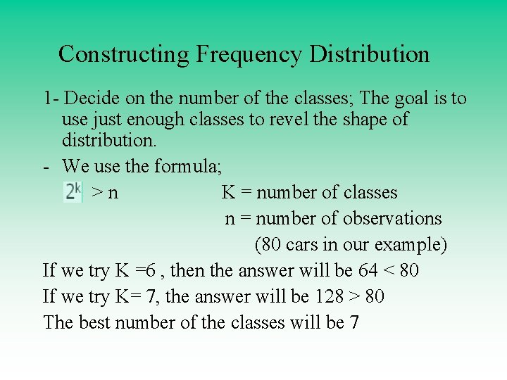
Constructing Frequency Distribution 1 - Decide on the number of the classes; The goal is to use just enough classes to revel the shape of distribution. - We use the formula; >n K = number of classes n = number of observations (80 cars in our example) If we try K =6 , then the answer will be 64 < 80 If we try K= 7, the answer will be 128 > 80 The best number of the classes will be 7
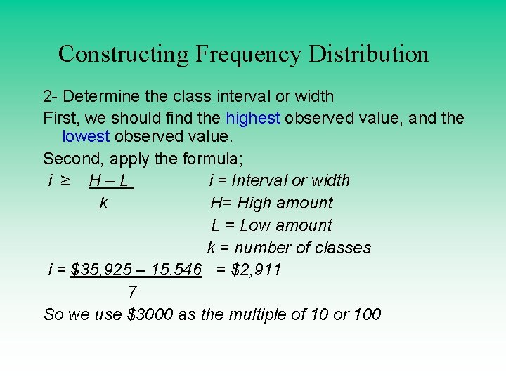
Constructing Frequency Distribution 2 - Determine the class interval or width First, we should find the highest observed value, and the lowest observed value. Second, apply the formula; i ≥ H–L i = Interval or width k H= High amount L = Low amount k = number of classes i = $35, 925 – 15, 546 = $2, 911 7 So we use $3000 as the multiple of 10 or 100
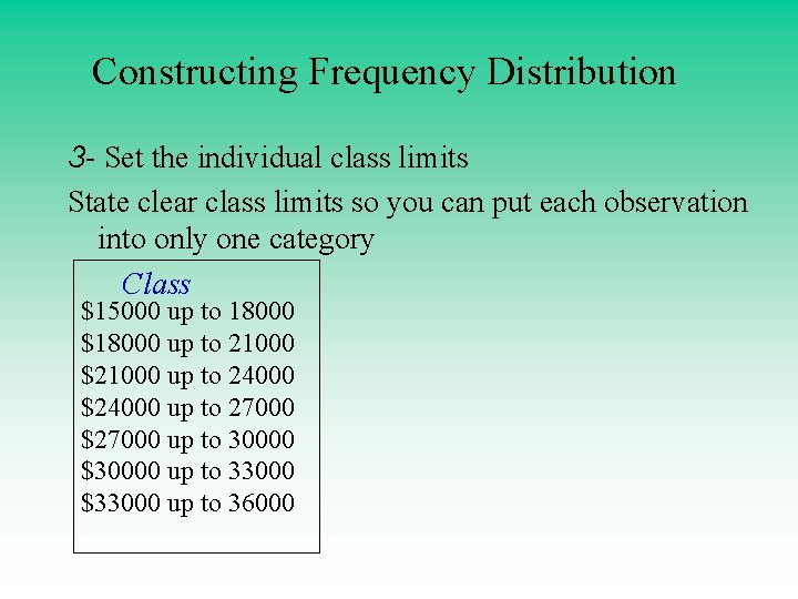
Constructing Frequency Distribution 3 - Set the individual class limits State clear class limits so you can put each observation into only one category Class $15000 up to 18000 $18000 up to 21000 $21000 up to 24000 $24000 up to 27000 $27000 up to 30000 $30000 up to 33000 $33000 up to 36000
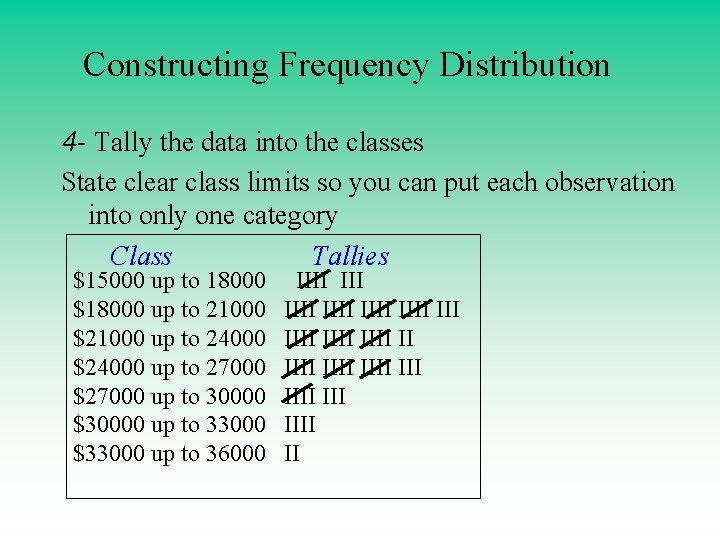
Constructing Frequency Distribution 4 - Tally the data into the classes State clear class limits so you can put each observation into only one category Class Tallies $15000 up to 18000 $18000 up to 21000 $21000 up to 24000 $24000 up to 27000 $27000 up to 30000 $30000 up to 33000 $33000 up to 36000 IIII IIII IIII III IIII II
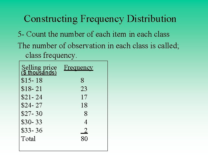
Constructing Frequency Distribution 5 - Count the number of each item in each class The number of observation in each class is called; class frequency. Selling price ($ thousands) $15 - 18 $18 - 21 $21 - 24 $24 - 27 $27 - 30 $30 - 33 $33 - 36 Total Frequency 8 23 17 18 8 4 2 80
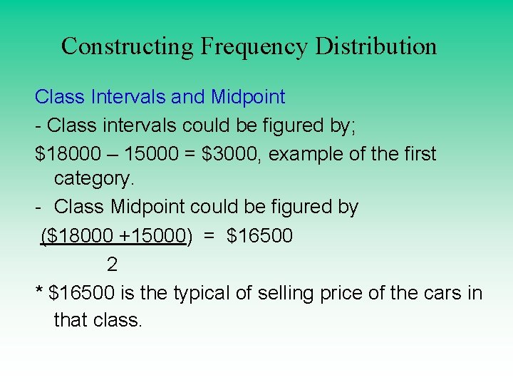
Constructing Frequency Distribution Class Intervals and Midpoint - Class intervals could be figured by; $18000 – 15000 = $3000, example of the first category. - Class Midpoint could be figured by ($18000 +15000) = $16500 2 * $16500 is the typical of selling price of the cars in that class.
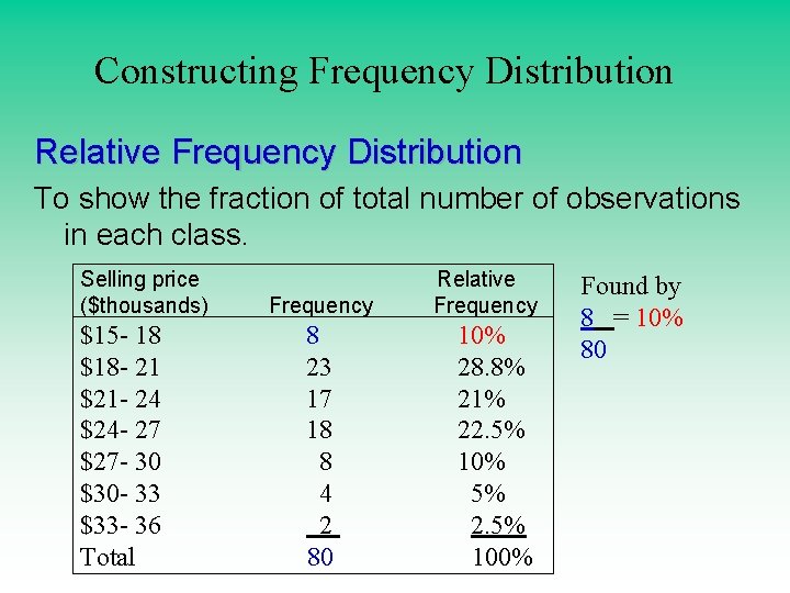
Constructing Frequency Distribution Relative Frequency Distribution To show the fraction of total number of observations in each class. Selling price ($thousands) $15 - 18 $18 - 21 $21 - 24 $24 - 27 $27 - 30 $30 - 33 $33 - 36 Total Frequency 8 23 17 18 8 4 2 80 Relative Frequency 10% 28. 8% 21% 22. 5% 10% 5% 2. 5% 100% Found by 8 = 10% 80
Constructing Frequency Distribution Class Exercises Page 31
Graphic Presentation of Frequency distribution There are three types of charts; 1 - Histogram chart 2 - Frequency polygon chart 3 - Cumulative frequency polygon 4 - Other charts; line graphs, Bar chart, Pie chart.
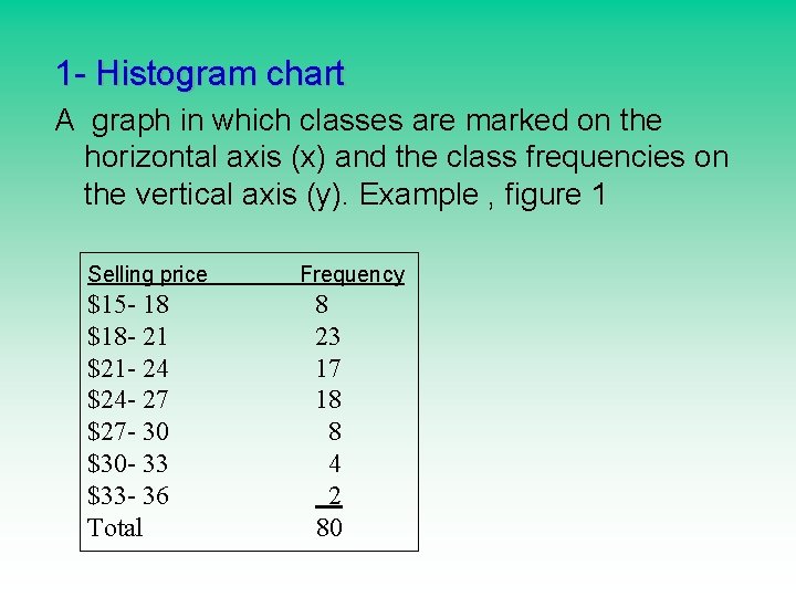
1 - Histogram chart A graph in which classes are marked on the horizontal axis (x) and the class frequencies on the vertical axis (y). Example , figure 1 Selling price $15 - 18 $18 - 21 $21 - 24 $24 - 27 $27 - 30 $30 - 33 $33 - 36 Total Frequency 8 23 17 18 8 4 2 80
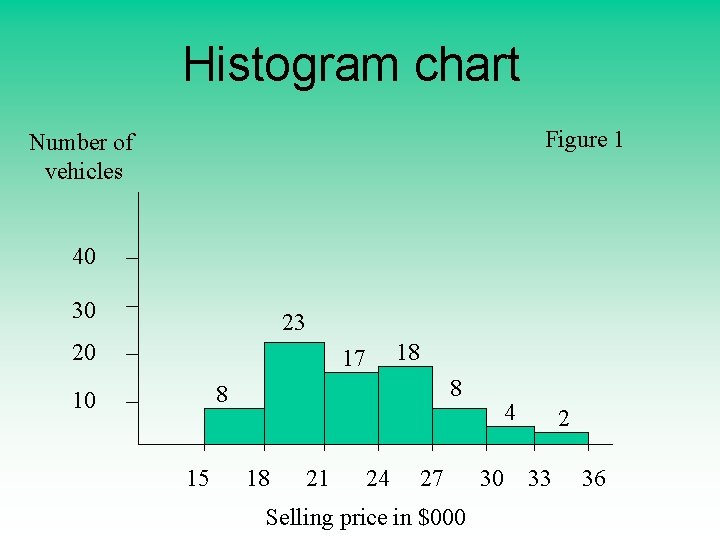
Histogram chart Figure 1 Number of vehicles 40 30 23 20 18 17 8 8 10 15 18 21 24 27 Selling price in $000 4 30 33 2 36
2 - Frequency polygon chart Another way to allow us to get quick picture of the main characteristics of the data ( highs, lows, points of concentration, etc) • Class midpoint in X axis and the class frequency in y axis. Figure 2, Figure 3
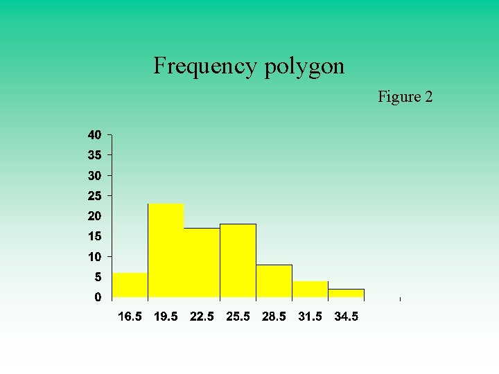
Frequency polygon Figure 2
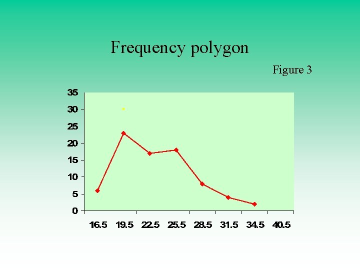
Frequency polygon Figure 3
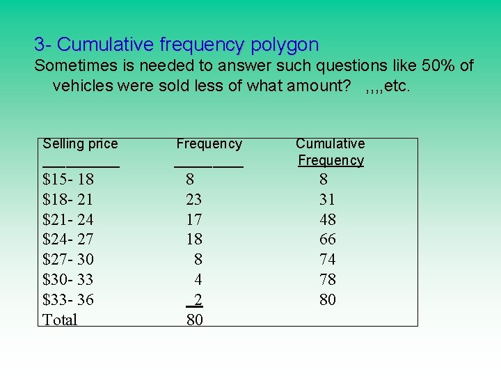
3 - Cumulative frequency polygon Sometimes is needed to answer such questions like 50% of vehicles were sold less of what amount? , , etc. Selling price _____ $15 - 18 $18 - 21 $21 - 24 $24 - 27 $27 - 30 $30 - 33 $33 - 36 Total Frequency _____ 8 23 17 18 8 4 2 80 Cumulative Frequency 8 31 48 66 74 78 80
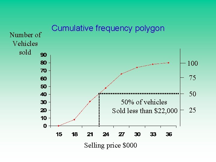
Number of Vehicles sold Cumulative frequency polygon 100 75 50 50% of vehicles Sold less than $22, 000 Selling price $000 25
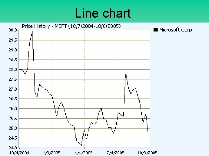
4 - Other charts; line graphs, Bar chart, Pie chart. - Line charts ; show the change or trend in variable. used for stocks - Bar charts; compare ordinal scale - Pie charts; useful with nominal level data
Line chart
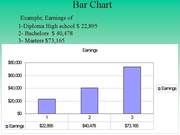
Bar Chart Example; Earnings of 1 -Diploma High school $ 22, 895 2 - Bachelors $ 40, 478 3 - Masters $73, 165
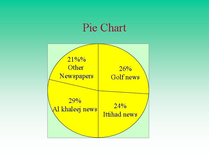
Pie Chart 21%% Other Newspapers 29% Al khaleej news 26% Golf news 24% Ittihad news
Graphic Presentation of Frequency distribution Class Exercises Page 46
- Slides: 26