Bad Powerpoint Example A one linerfill the space
Bad Powerpoint Example

A one liner…fill the space! This is my powerpoint

…but not too much This my is
Consider Font Size Normal font for writing a paper… Can’t be read by your audience Size 28 font suggested
Amount of text You want to avoid big blocks of text because your audience doesn’t need you if they can just read the paragraph up on the screen. You shouldn’t be writing paragraphs or have word for word on your slide what you are going to say. The slide should offer brief points that you as the presenter expand upon. Too much text on the slide overwhelms an audience and renders the speaker obsolete. Use bullet points not long complex sentences. You probably haven’t even read all of this and have tuned it out by now.

Backgrounds and font need to match!
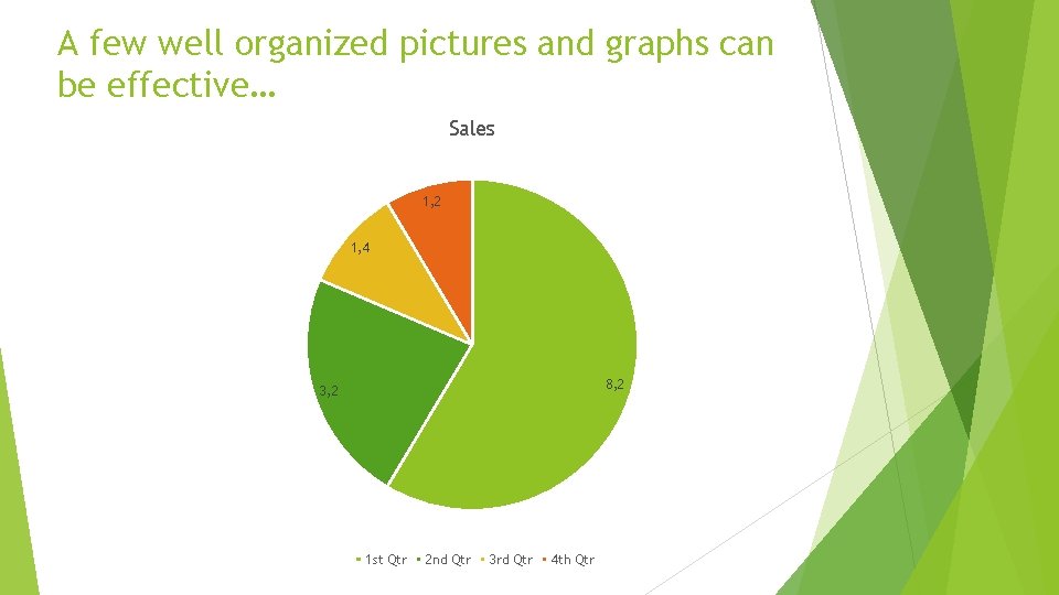
A few well organized pictures and graphs can be effective… Sales 1, 2 1, 4 8, 2 3, 2 1 st Qtr 2 nd Qtr 3 rd Qtr 4 th Qtr
…or can distract. Tip: If you can’t explain it or it doesn’t contribute to the point you’re making don’t include it.
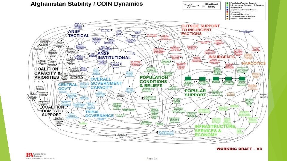
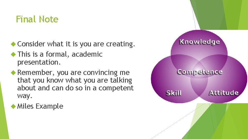
Final Note Consider what it is you are creating. This is a formal, academic presentation. Remember, you are convincing me that you know what you are talking about and can do so in a competent way. Miles Example
- Slides: 12