Bab 2 PENGENDALIAN DATA KANDUNGAN 2 1 Pengumpulan

Bab 2 PENGENDALIAN DATA

KANDUNGAN 2. 1 Pengumpulan data 2. 1. 1 Data tak terkumpul 2. 1. 2 Data terkumpul 2. 1. 3 Taburan kekerapan 2. 2 Perwakilan data secara visual 2. 2. 1 Carta palang 2. 2. 2 Carta pai

2. 2. 3 Plot garisan 2. 2. 4 Histogram 2. 2. 5 Poligon kekerapan 2. 2. 6 Lengkung kekerapan 2. 2. 7 Ogif 2. 2. 8 Plot tangkai (Stem and leaf plot) 2. 2. 9 Plot kotak (Box plot) 2. 3 Aplikasi TMK 2. 3. 1 Contoh seperti EXCEL, TOOL PAX 2. 4 Analisis dan interpretasi data kuantitatif

2. 1 Pengumpulan data • • DATA Data dapatlah dianggapkan sebagai maklumat berangka yang diperlukan untuk membuat sesuatu keputusan yang baik dalam situasi tertentu. Data terbahagi kepada 2 iaitu : · Data Mentah : 1. Data yang dikumpul daripada kajian atau penyelidikan dan maklumat yang tidak mudah difahami, serta tidak boleh didapati dengan cepat. 2. Data yang direkodkan mengikut susunan ianya dikutip tanpa diproses atau dikelaskan dipanggil data mentah. · Data Terkumpul 1. Data yang dikumpulkan dalam satu jadual yang dikenali sebagai Jadual Kekerapan

Apabila skor ujian diperoleh daripada sekumpulan pelajar, ia biasanya akan berada dalam susunan rawak seperti yang ditunjukkan: • 90, 56, 70, 90, 70, 40, 56, 90, 86, 46, 57, 78, 90 Kesemua ini adalah skor-skor mentah. Oleh itu, seorang guru perlu mengorganisasi dan mempamerkan skor dalam bentuk yang teratur supaya ia lebih bermakna. Guru perlu membuat pengiraan mudah untuk mentafsirkan data secara tepat. Terdapat dua cara, iaitu taburan secara menaik dan menurun.

• Taburan Secara Menaik dan Menurun Susunan Menaik: • • Data-data disusun daripada yang terendah kepada tertinggi seperti: • 40, 46, 56, 57, 70, 70, 78, 86, 90, 90 • Susunan Menurun: • • Data-data disusun daripada yang terendah kepada yang tertinggi. Contohnya: • 90, 90, 86, 78, 70, 70, 57, 56, 46, 40

• Taburan Kekerapan • • Skor 56%: 2 pelajar • • Skor 70%: 3 pelajar • • Skor 90%: 4 pelajar • • Kekerapan merujuk kepada berapakali sesuatu skor wujud dalam sesuatu taburan. • • Maka kekerapan untuk skor 90% ialah 4 (kekerapan tertinggi) manakala kekerapan untuk 56% ialah 2(kekerapan terendah).

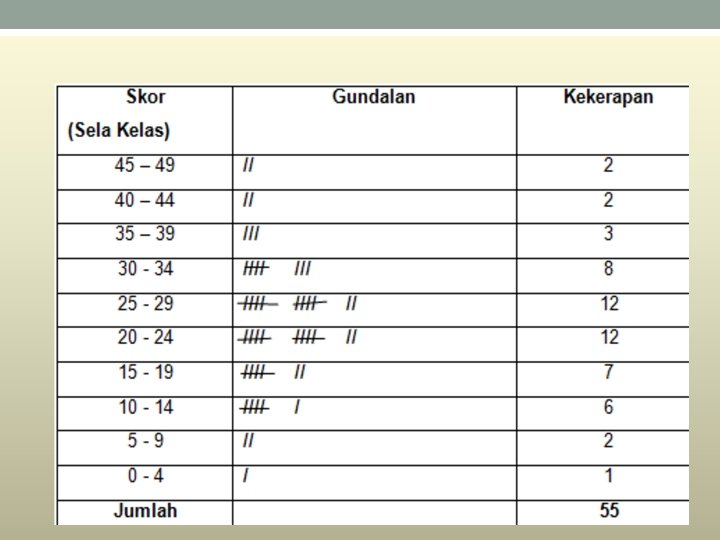
• • Jika mempunyai bilangan skor yang banyak , adalah berguna untuk dibina taburan kekerapan secara berkumpulan serta graf taburan. • Skor skor dikumpulkan dalam sela kelas, dan bilangan skor yang ada dalam setiap sela digundalkan. • Tanda-tanda gundal ini dikira untuk memperoleh kekerapan, iaitu bilangan skor dalam setiap sela kelas. • Sebagai contoh, perhatikan bagaimana skor-skor berikut disusun dalam taburan kekerapan dengan julat kelas sebanyak 5.

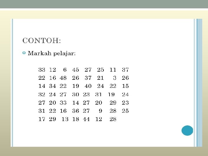
• 33 12 64 52 72 5 11 37 • 22 16 48 26 37 21 3 26 • 14 34 22 19 40 24 22 15 • 32 24 27 30 23 31 19 24 • 27 20 33 14 27 20 29 23 • 31 22 16 36 27 92 82 5 • 17 29 13 18 44 12 28

Data tak terkumpul Contoh : 54 67 85 34 92 38 67 55 45 83 Data tak terkumpul yang banyak boleh dikumpulkan dalam bentuk jadual yang mengandungi selang. Hasilnya ialah data terkumpul.
 Kekerapan 140 x < 145 x")
Data terkumpul • Contoh: Tinggi, x (cm) Kekerapan 140 x < 145 x < 150 x < 155 x < 160 x < 165 x < 170 4 5 8 12 25 10

Data yang dipersembahkan dalam bentuk ini dipanggil data terkumpul berbanding data mentah yang disebut juga data tak terkumpul. Pengumpulan data: dalam kategori yang menunjukkan bilangan pemerhatian dalam setiap kategori yang saling eksklusif. Suatu kumpulan data yang diringkaskan bagi memaparkan kekerapan sesuatu item dalam setiap kelas Paparan secara berjadual Memaparkan maklumat yang lebih bermakna berbanding data mentah. Menyediakan lebih maklumat dan mudah difahami

• TABURAN/JADUAL KEKERAPAN Malumat ini bolehlah disusun dalam satu jadual yang dipanggil taburan kekerapan atau jadual kekerapan. Sesuatu taburan kekerapan akan memaparkan bagaimana kekerapan atau frenkuensi tertabur bagi setiap kategori

Frequency distribution table • A frequency distribution table contains a list of data values and its frequency. • Raw data and data not organized in classes are called ungroup data. Data Frequency Data 2 8 5 6 3 2 1 4 3 4 5 6 7 7

Frequency distribution table Data organized in classes are called group data Data Frequency 2 - 4 8 5 - 7 4 8 - 10 6 11 - 13 7 14 - 16 2 17 - 19 5 q. The class interval is the interval that includes all the values in a data set bounded by the lower and upper limit of the class.

q The lower and biggest values of the upper limits of a class are the smallest and biggest values of the class interval respectively. q The class boundary is the mid-point of the upper limit of one class and the lower limit of the next class.

Membina Jadual Kekerapan • q Bilangan kelas yang sesuai • Biasanya : 5 -12 • Bergantung kepada bilangan cerapan yang terdapat dalam sesuatu set data Gunakan Peraturan Sturges (k) boleh digunakan menganggar bilangan kelas, k k = 1 + 3. 3 log n dengan n sebagai bilangan cerapan.

q Sempadan kelas : separuh daripada jumlah had atas suatu kelas dan had bawah kelas selepasnya. • Contoh: Misalnya, untuk kelas 21 – 30 dan 31 – 40, sempadan kelas ialah = 30. 5. q Lebar kelas (L) L = Hampirkan nilainya kepada integer terdekat. • q Julat = Nilai cerapan terbesar – nilai cerapan terkecil

Contoh Bina sebuah jadual kekerapan: 9. 9 15. 4 8. 4 5. 4 5. 9 8. 8 15. 6 12. 7 23. 3 14. 3 20. 8 24. 1 17. 0 11. 8 9. 2 12. 6 19. 5 5. 4 7. 8 19. 2 22. 1 20. 5 28. 6 16. 9 16. 8

• Bilangan cerapan, n = 30. • Bilangan kelas, k = 1 + (3. 3) log n = 1 + (3. 3) log 30 = 6 • Julat = Nilai cerapan terbesar – nilai cerapan terkecil = 28. 6 – 5. 4 = 23. 2 • Lebar Kelas = 4

Selang kelas Sempadan kelas Kekerapan 5. 4 – 9. 3 5. 35 – 9. 35 8 9. 4 – 13. 3 9. 35 – 13. 35 6 13. 4 – 17. 3 13. 35 – 17. 35 7 17. 4 – 21. 3 17. 35 – 21. 35 4 21. 4 – 25. 3 21. 35 – 25. 35 4 25. 4 – 29. 3 25. 35 – 29. 35 1 Jumlah 30

q Kekerapan Relatif Kekerapan relatif =

Selang kelas Kekerapan 5. 4 – 9. 3 4 Kekerapan relatif 0. 16 9. 4 – 13. 3 4 0. 16 13. 4 – 17. 3 8 0. 32 17. 4 – 21. 3 5 0. 20 21. 4 – 25. 3 3 0. 12 25. 4 – 29. 3 1 0. 04 Jumlah 25 1. 00

Latihan 1: Katakan kita ingin membina jadual kekerapan daripada data markah 32 orang pelajar seperti di bawah dengan penetapan 5 selang kelas. • 80, 79, 78, 68, 80, 65, 75, 79, 76, 75, 80, 50, 68, 80, 50, 81, 63, 88, 75, 84, 85, 70, 67, 70, 80, 69, 80

• Langkah 1 : Cari julat. • Julat = nilai tertinggi – nilai terendah = 88 – 50 = 38 • Langkah 2 : Bahagikan julat dengan bilangan selang kelas yang dikehendaki. • 38 ÷ 5 = 7. 8 ≈ 8 (dibundar kepada nombor bulat yang lebih tinggi) • Langkah 3 : Bina had kelas dengan lebar 8. (Nota : 8 ni dapat dari Langkah 2). • Ini bermakna terdapat 8 data dalam satu selang kelas. Mulakan selang kelas yang pertama dengan nilai terkecil dalam data. Maka selang kelas yang pertama ialah 50 -57.

• Langkah 4 : Buatkan gundalan • Gundalan dibuat untuk mendapatkan kekerapan bagi setiap selang kelas • Langkah 5: Jadual Kekerapan

Latihan 2 • Bina satu jadual kekerapan: 94, 78, 87, 90, 45, 90, 36, 45, 67, 88, 83, 76, 81, 77, 94, 67, 55, 84, 64, 93, 24, 44, 58, 85, 67, 88, 91, 80, 76, 93, 74, 34, 47, 66, 78, 54, 68, 79, 89, 93, 47, 91, 75, 64, 54, 60, 44, 57, 81, 76.

LATIHAN Class Interval Frequency 2 -4 5 5 -7 6 8 -10 10 11 -13 8 14 -16 4 17 -19 3 lower limit 2 Upper Lower limit boundary 4 1. 5 Upper boundary Class Size 4. 5 3

q We can obtain the relative frequency distribution from the frequency distribution table. Class Interval 2 - 4 5 - 7 8 - 10 11 - 13 14 - 16 17 - 19 Total Relative Frequency 5 /36 = 0. 1389

2. 2 Perwakilan Data secara Visual Carta Palang

Kekerapan • Carta palang yang termudah: 80 70 60 50 40 30 20 10 0 A B C Kelas D

• Carta palang berganda: • Untuk buat perbandingan tertentu.

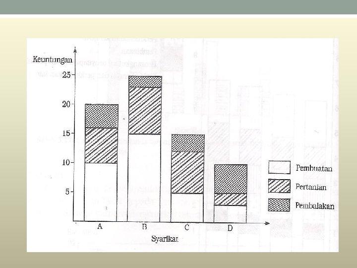
• Carta palang berkomponen • Melalui carta palang berkomponen, kita dapat membuat perbandingan beberapa perkara dalam satu palang yang sama. • Di sini setiap palang dibahagikan kepada beberapa bahagian tertentu bergantung kepada bilangan perkara yang ingin dibandingkan.
) mengikut Syarikat A sektor Syarikat B Syarikat C Syarikat D Pembuatan")
Keuntungan (RM juta)) mengikut Syarikat A sektor Syarikat B Syarikat C Syarikat D Pembuatan 10 15 5 3 Pertanian 6 8 7 2 Pembalakan 4 2 3 5
")
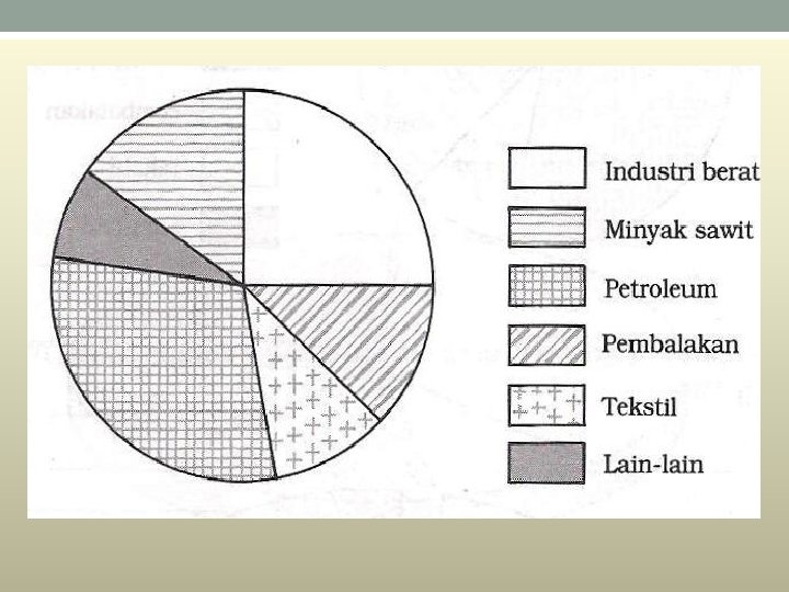
Carta Pai • Contoh data yang sesuai digambarkan dengan menggunakan carta pai: • (i) Perbelanjaan bulanan sesebuah keluarga dibahagikan kepada belanja sewa, makanan, pakaian, hiburan, dan lain-lain. • (ii) Jumlah keuntungan sesebuah syarikat dibahagikan kepada keuntungan-keuntungan daripada beberapa anak syarikat miliknya. (iii) Jumlah pendapatan sesebuah negara mengikut pecahan sektor-sektor ekonomi yang berikut: Industri berat, tekstil, pembalakan, petroleum, minyak sawit, dan lain-lain lagi. • Untuk membina sebuah carta pai, sudut bagi setiap sektor perlu ditentukan. Pembahagian sudut-sudut setiap sektor berdasarkan jumah 360 o, iaitu sudut bagi sebuah bulatan adalah

Contoh: • Bina carta pai: Sektor ekonomi Industri berat Tekstil Pembalakan Petroleum Minyak sawit Lain-lain Pendapatan (RM’ 000 juta) 10 4 5 12 6 3
 Sudut Industri berat 10 x 360 o =")
Sektor ekonomi Pendapatan (RM’ 000 juta) Sudut Industri berat 10 x 360 o = 90 o Tekstil 4 x 360 o = 36 o Balak 5 x 360 o = 45 o Petroleum 12 Minyak sawit 6 Lain-lain 3 x 360 o = 108 o x 360 o = 54 o x 360 o = 27 o
 Peratus Industri berat 10 Tekstil 4 x 100%")
Sektor ekonomi Pendapatan (RM’ 000 juta) Peratus Industri berat 10 Tekstil 4 x 100% = 25. 0 x 100% = 10. 0 Pembalakan 5 x 100% = 12. 5 Petroleum 12 x 100% = 30. 0 Minyak sawit Lain-lain 6 3 x 100% = 15. 0 x 100% = 7. 5 40 100%

Plot garisan • Plot garis diwakili oleh garis lurus yang menyambungkan titik-titik yang mewakili data-data yang dicerap.

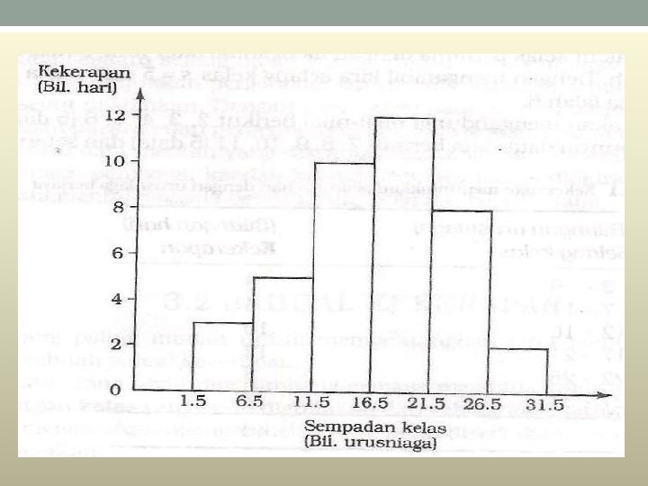
Histogram • A histogram is a graphical method for displaying the shape of a distribution. It is particularly useful when there a large number of observations. • The first step is to create a frequency table. A table containing the number of occurrences in each class of data; Frequency tables often used to create histograms and frequency polygons. • .

• In a histogram, the class frequencies are represented by bars. The height of each bar corresponds to its class frequency. A histogram of these data is shown in Figure 1.
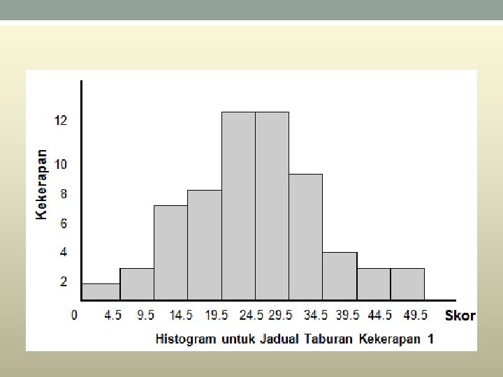

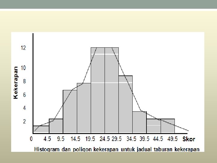
CONTOH: Selang kelas Kekerapan 2 -6 7 -11 12 -16 17 -21 22 -26 27 -31 3 5 10 12 8 2

Selang kelas 2 -6 7 -11 12 -16 17 -21 22 -26 27 -31 Kekerapan 3 5 10 12 8 2 Sempadan kelas 1. 5 -6. 5 -11. 5 -16. 5 -21. 5 -26. 5 -31. 5
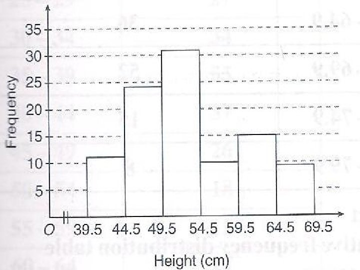
 40 -44 45 -49 50 -54 55 -59 60 -64 Kekerapan 11")
Tinggi (cm) 40 -44 45 -49 50 -54 55 -59 60 -64 Kekerapan 11 24 31 10 15 65 -69 9
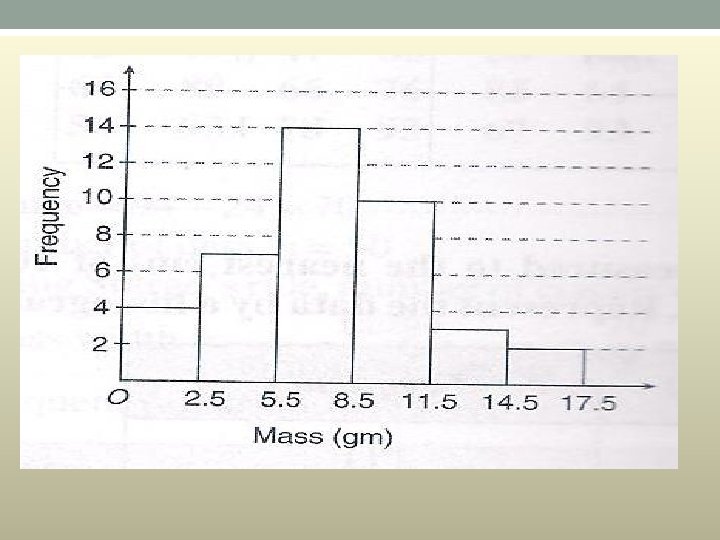
 0 -2 3 -5 6 -8 9 -11 12 -14 15 -17")
Jisim (g) 0 -2 3 -5 6 -8 9 -11 12 -14 15 -17 Kekerapan 4 7 14 10 3 2

Frequency Polygons • Frequency polygons are a graphical device for understanding the shapes of distributions. They serve the same purpose as histograms, but are especially helpful for comparing sets of data. • Frequency polygons are also a good choice for displaying cumulative frequency distributions.
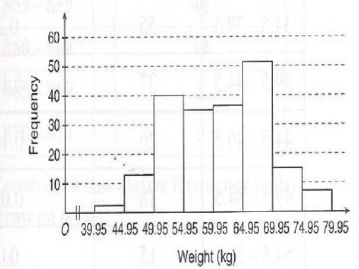
 Kekerapan K. Relatif 39. 95 -44. 95 2 0. 01 44. 95")
Jisim (kg) Kekerapan K. Relatif 39. 95 -44. 95 2 0. 01 44. 95 -49. 95 12 0. 06 49. 95 -54. 95 40 0. 2 54. 95 -59. 95 35 0. 175 59. 95 -64. 95 36 0. 18 64. 95 -69. 95 52 0. 26 69. 95 -74. 95 15 0. 075 74. 95 -79. 95 8 0. 04
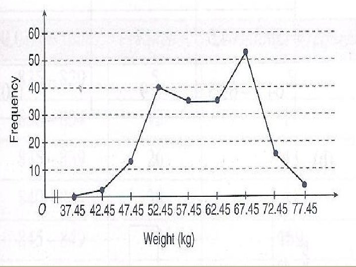

• The Frequency poligon
 Untuk kes-kes tertentu, data perlu dibentangkan dengan jadual kekerapan longgokan")
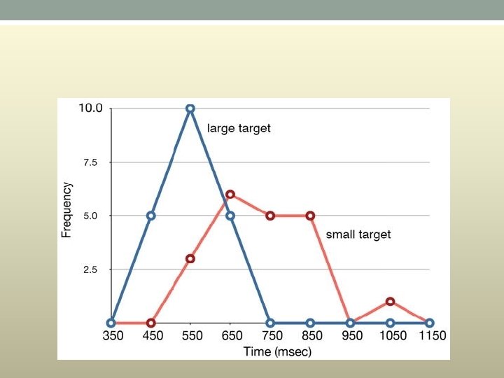
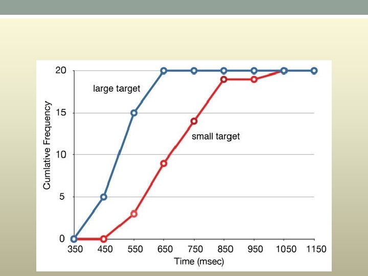
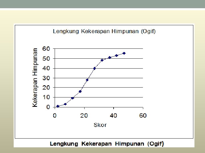
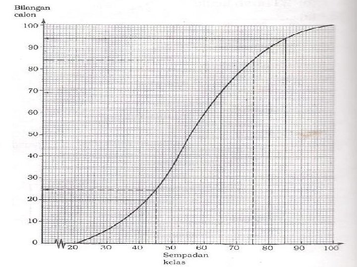
Ogif (Lengkung kekerapan longgokan) Untuk kes-kes tertentu, data perlu dibentangkan dengan jadual kekerapan longgokan supaya kita dapat mengetahui jumlah terkumpul pada suatu selang tertentu. Daripada jadual kekerapan longgokan, ogif atau lengkung kekerapan longgokan dapat dilukis. Melalui ogif, banyak nilai statistik seperti kuartil pertama, median, kuartil ketiga, desil, persentil dan sebagainya dapat dianggar.

The total of a frequency and all frequencies so far in a frequency distribution.
 • Graf Lengkung taburan kekerapan himpunan juga dikenali")
• Lengkong Kekerapan Himpunan (Ogif) • Graf Lengkung taburan kekerapan himpunan juga dikenali sebaga ogif. . • • Taburan kekerapan himpunan digunakan untuk melukis graf yang dinamakan ogif untuk mentafsir data yang diperoleh. • • Untuk melukis ogif, nilai data beradadipaksi x, manakala kekerapan himpunan berada paksi-y. • • Ogif yang dilukis dibawah berdasarkan Jadual diatas

• Terdapat dua jenis kekerapan longgokan, iaitu kekerapan longgokan ‘kurang daripada’ dan kekerapan longgokan ‘lebih daripada’. • Kekerapan longgokan ‘kurang daripada’ bagi suatu kelas merupakan jumlah kekerapan bagi kelas itu dan kekerapan bagi kelas-kelas sebelumnya. (Bentuk menaik) • Kekerapan longgokan ‘lebih daripada’ bagi suatu kelas merupakan jumlah kekerapan bagi kelas selepasnya. (Bentuk menurun)

• Cumulative frequency polygon
 • • Kekerapan himpunan ialah jumlah kekerapan data dan")
• Kekerapan Himpunan (Ogif) • • Kekerapan himpunan ialah jumlah kekerapan data dan kekerapan data sebelumnya.

• Ogif ialah suatu graf licin dengan kekerapan longgokan pada paksi mencancang dan sempadan atas kelas pada paksi mengufuk. • Terdapat dua jenis ogif, iaitu a. Ogif “kurang daripada” b. Ogif “lebih daripada” • Apabila melukis lengkung kekerapan longgokan, kekerapan longgokan diplotkan bertentangan sempadan atas kelas bersepadan. Asalan graf ialah sempadan bawah kelas pertama yang mempunyai kekerapan sifar.

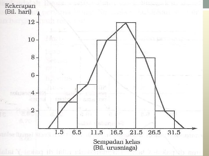
Selang kelas Sempadan Kelas 45 -47 44. 5 -47. 5 Kekerapan 4 48 -50 10 51 -53 7 54 -56 8 57 -59 3 60 -62 6 63 -65 2

• Jika ogif‘kurang daripada’ , perlu cari ‘frekuensi longgok an kurang daripada’ dengan merujuk sempadan kelas. Kurang daripada Frekuensi longgokan 44. 5 0 47. 5 4+ 0 = 4 50. 5 4 + 10 = 14 53. 5 14+ 7 = 22 56. 5 21 + 8 = 29 59. 5 29 + 3 = 32 62. 5 32 + 6 = 38 65. 5 38 + 2 = 40

Jika ogif‘ lebih daripada’ , perlu cari ‘frekuensi longgokan lebih daripada’ dengan merujuk sempadan kelas Lebih daripada Frequency longgokkan 44. 5 40 -0 = 40 47. 5 40 -4 = 36 50. 5 36 -10 = 26 53. 5 26 -7 = 19 56. 5 19 – 8 =11 59. 5 11 -3=8 62. 5 8 -6=2 65. 5 2 -2 = 0
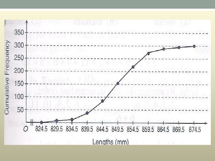
 829 834")
825 830 835 840 845 850 855 860 865 870 Panjang (mm) 829 834 839 844 849 854 859 864 869 874 Bilangan 5 12 26 38 78 68 46 19 5 3
 Kekerapan K. longgokan 825 -829 5 5 830 -834 12 17 835")
Panjang (mm) Kekerapan K. longgokan 825 -829 5 5 830 -834 12 17 835 -839 26 43 840 -845 38 81 845 -849 78 159 850 -854 68 227 855 -859 46 273 860 -864 19 292 865 -869 5 297 870 -874 3 300

Soalan Seramai 100 orang operator pengeluaran bagi Syarikat Syarimah Sdn. Bhd. menduduki ujian penilaian kecekapan bekerja. Berdasarkan keputusan ujian yang diberi, Lukis satu ogif bagi data di atas. Gunakan ogif anda untuk menjawab soalan yang berikut. (a) Cari bilangan operator yang mendapat markah kurang daripada 65. (b) Cari bilangan operator yang mendapat markah antara 45 dan 75.
 20% daripada operator yang mendapat markah terendah akan diberi latihan khas. Cari")
(c) 20% daripada operator yang mendapat markah terendah akan diberi latihan khas. Cari markah tertinggi bagi operator yang akan diberi latihan khas. (d) Operator yang mendapat markah 85 ke atas akan diberi bonus khas. Cari bilangan operator yang mendapat bonus khas. (e) 10% daripada operator yang mendapat markah terbaik akan dinaikkan pangkat kepada penyelia pengeluaran. Cari markah terendah yang perlu diperoleh supaya dapat dinaikkan pangkat?

Markah Bilangan 20 x < 30 30 x < 40 40 x < 50 50 x < 60 60 x < 70 70 x < 80 80 x < 90 90 x < 100 Jumlah 6 11 18 25 17 13 7 3 100
 69 orang (b) 50 orang • (c) 42 markah (d) 6 orang •")
(a) 69 orang (b) 50 orang • (c) 42 markah (d) 6 orang • (e) 80 markah •
 Plot tangkai atau gambar rajah dahan daun ialah")
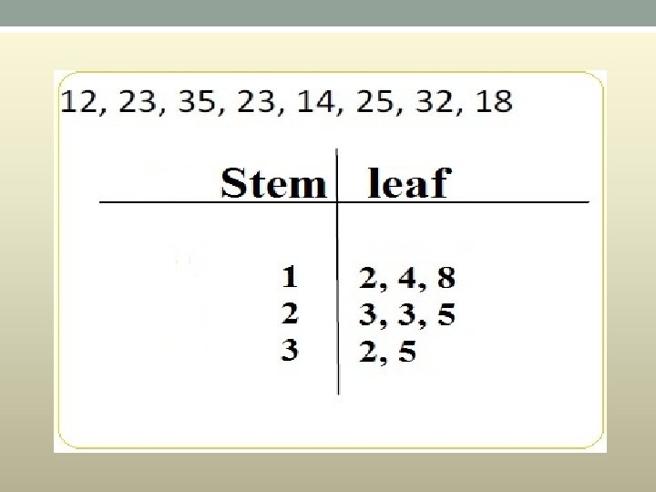
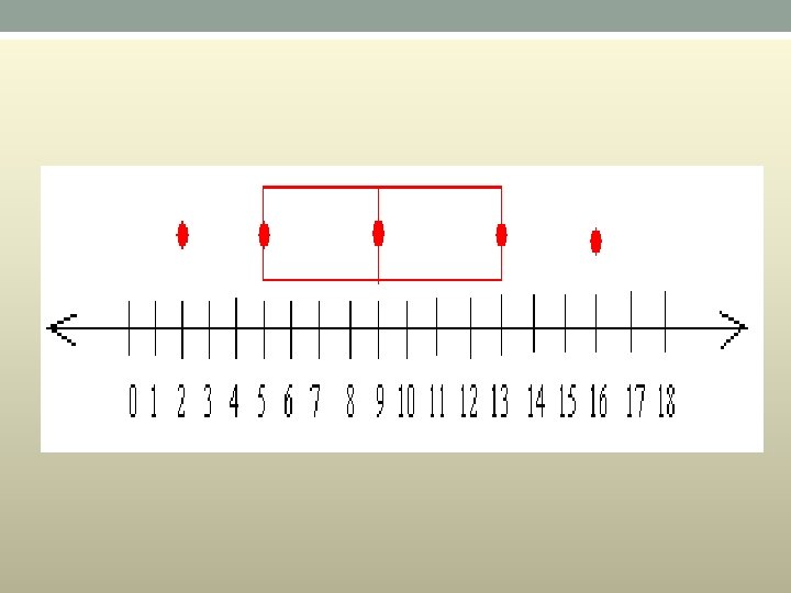
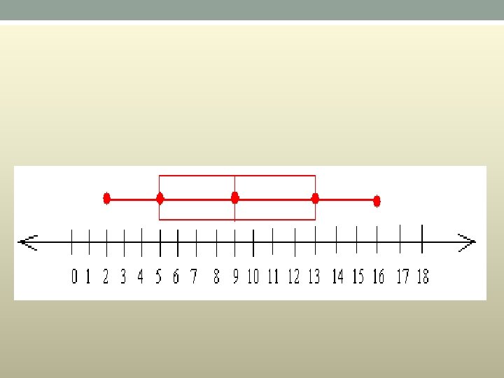
Plot tangkai (Stem and leaf plot) Plot tangkai atau gambar rajah dahan daun ialah satu teknik analisis data yang mengekalkan semua maklumat data asal. Dalam satu plot tangkai, tangkai (atau dahan) ialah nombor tanpa digit terkanannya dan digit terkanan nombor dinamakan daun. Satu garis mencancang dilukis untuk memisahkan tangkai dengan daun.

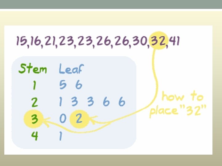
Stem and Leaf Plot • A Stem and Leaf Plot is a special table where each data value is split into a "stem" (the first digit or digits) and a "leaf" (usually the last digit). Like in this example: • "32" is split into "3" (stem) and "2" (leaf). • Stem "1" Leaf "5" means 15. The "stem" values are listed down, and the "leaf" values go right (or left) from the stem values. • The "stem" is used to group the scores and each "leaf" shows the individual scores within each group.

• What Are They Used For? • They are usually used when there are large amounts of numbers to analyze. Series of scores on sports teams, series of temperatures or rainfall over a period of time, series of classroom test scores are examples of when Stem and Leaf Plots could be used.

Example • 77 80 82 68 65 59 61 57 50 62 61 70 69 64 67 70 62 65 65 73 76 87 80 82 83 79 79 71 80 77

Contoh: 102, 104, 105, 109, 110, 113, 116, 120, 121, 134, 137. Plot tangkai bagi data ialah 10 2 4 5 5 9 11 0 3 6 12 0 1 1 13 4 7 Tangkai Daun Kekunci: 10|2 = 102

• A box plot is a graphical rendition of statistical data based on the minimum, first quartile, median, third quartile, and maximum. The term "box plot" comes from the fact that the graph looks like a rectangle with lines extending from the top and bottom. • A standard box plot is composed of the median, upper hinge, lower hinge, upper adjacent value, lower adjacent value, outside values, and far out values • The illustration shows a generic example of a box plot with the maximum, third quartile, median, first quartile, and minimum values labeled.

• BOX PLOT • A graphical summary of a numerical data sample through five statistics: median, lower quartile, upper quartile, and some indication of more extreme upper and lower values

Box and whiskers plot • Basically a box and whiskers plot looks like this: •

• the reason we call the two lines extending from the edge of the box whiskers is simply because they look like whiskers or mustache, especially mustache of a cat

• Lower extreme: the lowest or smallest value in a set of data • Lower quartile or first quartile: the median of all data below the median • Median or second quartile: the middle value of the set of data. If there are two values in the middle, the median is the average of the two values • Upper quartile or third quartile: the median of all data above the median • Upper extreme: The biggest value in the set

Why Use a Box and Whisker Plot? • Box and whisker plots are very effective and easy to read. They summarize data from multiple sources and display the results in a single graph. Box and whisker plots allow for comparison of data from different categories for easier, more effective decision-making.

When to Use a Box and Whisker Plot • Use box and whisker plots when you have multiple data sets from independent sources that are related to each other in some way. Examples include test scores between schools or classrooms, data from before and after a process change, similar features on one part such as cam shaft lobes, or data from duplicate machines manufacturing the same products.

Box and Whisker Plot Procedure • A box and whisker plot is developed from five statistics. • Minimum value – the smallest value in the data set • Second quartile – the value below which the lower 25% of the data are contained • Median value – the middle number in a range of numbers • Third quartile – the value above which the upper 25% of the data are contained • Maximum value – the largest value in the data set

Example • Construct a box and whiskers plot for the data set: {5, 2, 16, 9, 13, 7, 10} • First, you have to put the data set in order from greatest to least or from least to greatest • From least to greatest we get : 2 5 7 9 10 13 16 • Since the smallest value in the set is 2, the lower extreme is 2 • Since the greatest value in the set is 16, the upper extreme is 16 • Now, look carefully at the set: 2 5 7 9 10 13 16 You can see that 9 is located right in the middle of the set of data Therefore, 9 is the median

• Construct a box and whiskers plot for the data set: {5, 2, 16, 9, 13, 7, 10} First, you have to put the data set in order from greatest to least or from least to greatest From least to greatest we get : 2 5 7 9 10 13 16 Since the smallest value in the set is 2, the lower extreme is 2 Since the greatest value in the set is 16, the upper extreme is 16 Now, look carefully at the set: 2 5 7 9 10 13 16 You can see that 9 is located right in the middle of the set of data Therefore, 9 is the median
 • Cerapan terbesar:")
• Cerapan terkecil: (Q 1 – 1. 5 x JAK) • Cerapan terbesar: (Q 3 + 1. 5 x JAK) • Plot kotak adalah berguna untuk: (i) memastikan lokasi satu set data berdasarkan median. (ii) memastikan serakan bagi data berdasarkan panjang kotak, julat antara kuartil dan panjang misai-misai (iaitu julat data tanpa nilai-nilai ekstrem). • .
 mengenal pasti kepencongan bagi taburan data. Jika bahagian kanan kotak daripada")
• iii) mengenal pasti kepencongan bagi taburan data. Jika bahagian kanan kotak daripada median lebih panjang, dan/atau misai kanan lebih panjang, maka data itu terpencong kanan. Demikian juga, jika kotak sebelah kiri dan/atau misai kiri lebih panjang, maka data itu terpencong kiri. Jika kotak dan misai-misai simetri, data itu tertabur secara bersimetri. Contoh: i) Simetri ii) Terpencong ke kiri (Kepencongan negatif) iii) Terpencong ke kanan (Kepencongan positif)

How to Create a Histogram in Excel • A histogram is a column chart that displays frequency data. In order to use the Histogram tool in Excel, you'll need to organize your data into two columns on the spreadsheet: one column for "input data, " and the other for "bin numbers. " • Input data is the data that you want to analyze. Bin numbers represent the intervals that you want the Histogram tool to use for measuring and analyzing the input data.

• STEP 1 • Installing the Analysis Tool. Pak Add-In for Excel 2010 and 2013 • Make sure that the add-in is installed. Before you can use the Histogram tool in Microsoft Excel, you'll need to make sure that the Analysis Tool. Pak Add-in is ready to use 1. Navigate to the "Excel Add-ins" dialog box. You can do this from the main Home screen once you've opened the program. Click Options on the File menu. 2. Then, click Add-Ins in the navigation pane. 3. In the Manage list, choose Excel Add-ins. Then, click Go.

• 2 • Select the Analysis Tool. Pak Add-in. Once you're in the Add-Ins dialog box, select the Analysis Tool. Pak check box under Add-Ins available, if it is not already selected, Then, click OK. Note that the Analysis Tool. Pak Add-in will not appear in the Add-Ins dialog box if it is not already installed on your computer. If you do not see Analysis Tool. Pak in the Add-Ins dialog box, run Microsoft Excel Setup. Add the Tool. Pak to the list of installed items

Installing the Analysis Tool. Pak Add-In for Excel 2007 • 1 • Navigate to the "Excel Add-ins" dialog box. This is where you can check whether the Analysis Tool. Pak is already installed on your computer. From the Home screen, click the Microsoft Office button. Then, select Excel Options. • Click Add-Ins from the navigation pane. • Pick Excel Add-ins from the Manage list. Then, click Go.

• Select the Tool. Pak. • In the Add-Ins dialog box, make sure that the Analysis Tool. Pak check box under Add-Ins available has been selected. Then, click OK. This should activate the Analysis Tool. Pak—and thus the Histogram function—on your computer

• 1 • Enter your data. Organize your data into two adjacent columns on the spreadsheet. Fill the left-hand column with your "input data, " and the right-hand with your "bin numbers. "[3] Input data is the set of numbers that you want to analyze with the Histogram tool. [4] • Bin numbers represent the intervals that you want the Histogram tool to use for measuring and analyzing the input data. For instance, if you want to separate grades into categories of A, B, C, D, and F, you could make bins for 60, 70, 80, 90, and 100. [5]

• Open the Data Analysis box. • The process is consistent for all versions of Excel released since 2007. If you are using an earlier version of the software, then you will need to follow a slightly different process. In Excel 2013, Excel 2010 and Excel 2007: navigate to the Data tab. Then, click Data Analysis in the Analysis group. • For Excel 2003 and earlier versions: select Data Analysis from the Tools menu. If there is not a Data Analysis option under the Tools menu, then you may need to install the add-in

3. Select "Histogram. " Once you're in the Data Analysis dialog box, find Histogram listed amid the other analysis tools. Then, click OK. This will open the Histogram dialog box. 4. Select the input range and the bin range. The input range is the range of cells that contain data. If your input data is a set of ten numbers, and you have copied it into the A column (from A 1 to A 10), then enter your data range as A 1: A 10. The bin range is the range of cells that contain your bin numbers. If you have four "bins" at the top of Column B, then enter your bin range as B 1: B 4. 5. Check the chart output box. Under Output Options, click New Workbook. Then, select the Chart Output check box

• 6 • Click OK to finish the job. Excel will generate a new workbook with a histogram table and an embedded chart. The chart should be a column chart that arranges the data from your histogram table. [6]

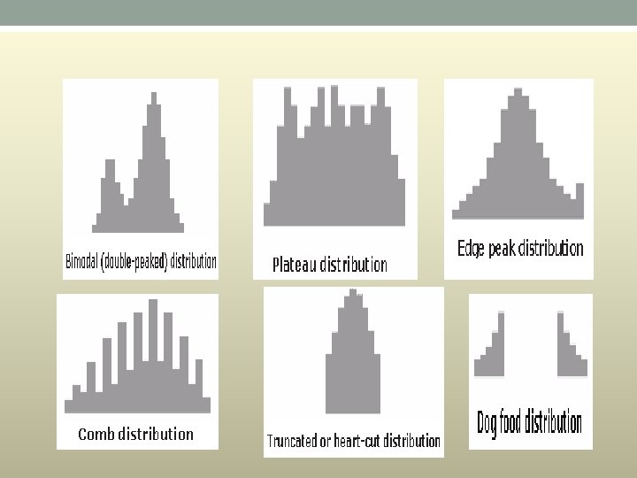
Typical Histogram Shapes and What They Mean • Normal. A common pattern is the bell–shaped curve known as the “normal distribution. ” In a normal distribution, points are as likely to occur on one side of the average as on the other. Be aware, however, that other distributions look similar to the normal distribution. Statistical calculations must be used to prove a normal distribution.

• Skewed. The skewed distribution is asymmetrical because a natural limit prevents outcomes on one side. The distribution’s peak is off center toward the limit and a tail stretches away from it. For example, a distribution of analyses of a very pure product would be skewed, because the product cannot be more than 100 percent pure. Other examples of natural limits are holes that cannot be smaller than the diameter of the drill bit or call-handling times that cannot be less than zero. These distributions are called right – or left–skewed according to the direction of the tail.

Cuba gunakan EXCEL dan Tool Pack untuk melukis pelbagai jenis graf. Cuba selesaikan latihan yang diberi.
- Slides: 124