Asking Users and Experts Li Zhang Jacey Yuewei


- Slides: 28

Asking Users and Experts Li Zhang (Jacey) Yuewei Zhou (Joanna)

Asking Experts Why Experts? Users are not easily accessible Too expensive Takes too long Then Ask experts to provide feedback.

Experts Inspection How ? Experts inspect the human-computer interface and predict problems users would have when interacting with it. Advantages • • Relatively inexpensive Easy to learn Effective Can be used at any stage of a design project

Inspection Techniques Ø Heuristic evaluations Ø Walkthroughs

Heuristic Evaluation Ø Informal usability inspection technique Ø Experts review guided by a set of heuristics ( usability principles )

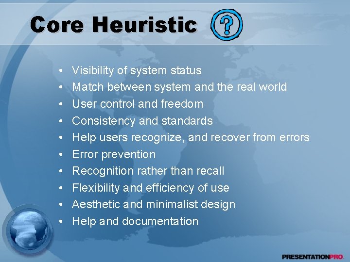
Core Heuristic • • • Visibility of system status Match between system and the real world User control and freedom Consistency and standards Help users recognize, and recover from errors Error prevention Recognition rather than recall Flexibility and efficiency of use Aesthetic and minimalist design Help and documentation

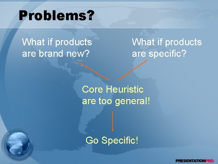
Problems? What if products are brand new? What if products are specific? Core Heuristic are too general! Go Specific!

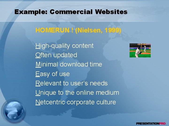
Example: Commercial Websites HOMERUN ! (Nielsen, 1999) High-quality content Often updated Minimal download time Easy of use Relevant to user’s needs Unique to the online medium Netcentric corporate culture

Conclusion Which heuristics are the best, and How many are needed are debatable and depend on product.

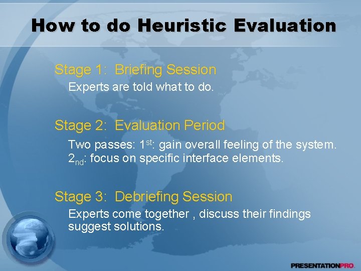
How to do Heuristic Evaluation Stage 1: Briefing Session Experts are told what to do. Stage 2: Evaluation Period Two passes: 1 st: gain overall feeling of the system. 2 nd: focus on specific interface elements. Stage 3: Debriefing Session Experts come together , discuss their findings suggest solutions.

Dilemma • About 33% reported problems are real usability problems. • Sometimes heuristic evaluation misses severe problems. Heuristic evaluation misses about 21% of user’s problems. • 43% are not problems at all.

Solutions • Use complementary user testing techniques along with heuristic evaluation. • Get really good or experienced evaluators • Have several evaluators to avoid one person’s bias or poor performance.

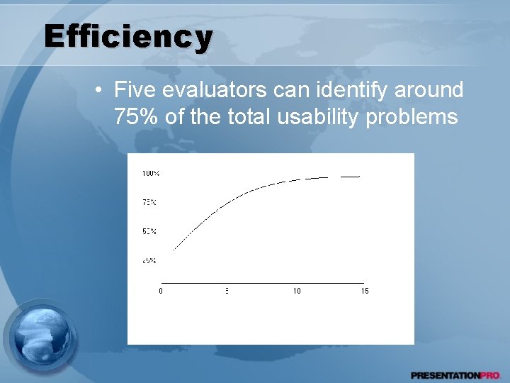
Efficiency • Five evaluators can identify around 75% of the total usability problems

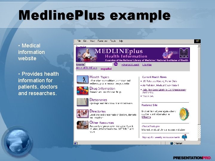
Medline. Plus example • Medical information website • Provides health information for patients, doctors and researches.

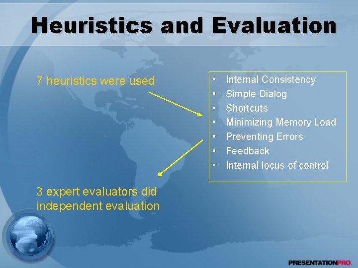
Heuristics and Evaluation 7 heuristics were used 3 expert evaluators did independent evaluation • • Internal Consistency Simple Dialog Shortcuts Minimizing Memory Load Preventing Errors Feedback Internal locus of control

Improvement Suggestions Ø Layout: Uncomplicated Vertical Design; well suited for printing; conservative using of graphics Ø Internal Consistency: Formatting of pages and logo is consistent across the website. Ø Arrangement of health topics: Problems should be arranged alphabetically as well as in categories. Ø Depth of navigation menu: increase the fan-out in navigation menu in the left margin.

General Web Design Ø Navigation Ø Access Ø Information Design Navigate large website, lost in cyberspace Slow internet connections, limited processing power User’s understanding and impressions

Guidelines for Web Design Ø Navigation Ø Access Ø Information Design • Avoid orphan pages • Avoid excessive white space resulting in long page • Provide navigation support • Avoid narrow, deep or hierarchical menus • Avoid non-standard link colors • Provide consistent look and feel for navigation • Avoid complex URLs • Avoid long download times • content comprehension and aesthetics

Heuristics For more…. Ø For online communities • Sociability • Usability Ø For other devices • handheld, computerized toy • More…

Walkthroughs Ø Cognitive Walkthroughs Ø Pluralistic Walkthroughs

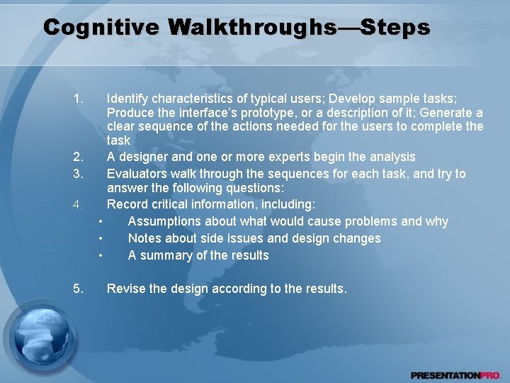
Cognitive Walkthroughs • Simulating user’s problem-solving process at each step in the humancomputer dialog • Checking to see if the user’s goals and memory for actions can be assumed to lead to the next correct action • They focus on evaluating designs for ease of learning

Cognitive Walkthroughs—Steps 1. 2. 3. 4. 5. Identify characteristics of typical users; Develop sample tasks; Produce the interface’s prototype, or a description of it; Generate a clear sequence of the actions needed for the users to complete the task A designer and one or more experts begin the analysis Evaluators walk through the sequences for each task, and try to answer the following questions: Record critical information, including: • Assumptions about what would cause problems and why • Notes about side issues and design changes • A summary of the results Revise the design according to the results.

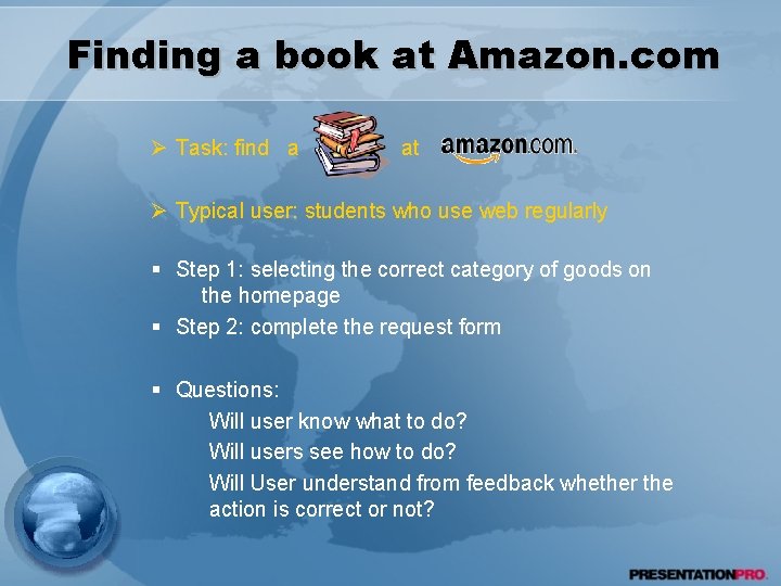
Finding a book at Amazon. com Ø Task: find a at Ø Typical user: students who use web regularly § Step 1: selecting the correct category of goods on the homepage § Step 2: complete the request form § Questions: Will user know what to do? Will users see how to do? Will User understand from feedback whether the action is correct or not?

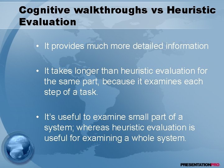
Cognitive walkthroughs vs Heuristic Evaluation • It provides much more detailed information • It takes longer than heuristic evaluation for the same part, because it examines each step of a task. • It’s useful to examine small part of a system; whereas heuristic evaluation is useful for examining a whole system.

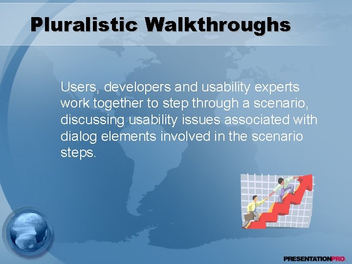
Pluralistic Walkthroughs Users, developers and usability experts work together to step through a scenario, discussing usability issues associated with dialog elements involved in the scenario steps.

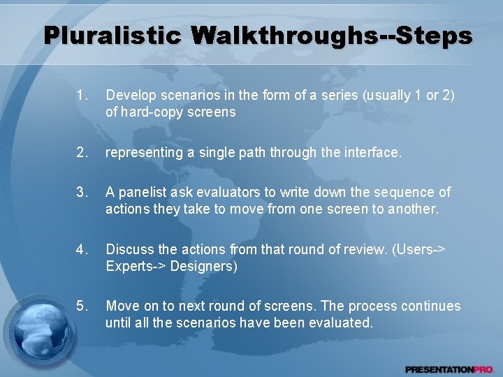
Pluralistic Walkthroughs--Steps 1. Develop scenarios in the form of a series (usually 1 or 2) of hard-copy screens 2. representing a single path through the interface. 3. A panelist ask evaluators to write down the sequence of actions they take to move from one screen to another. 4. Discuss the actions from that round of review. (Users-> Experts-> Designers) 5. Move on to next round of screens. The process continues until all the scenarios have been evaluated.

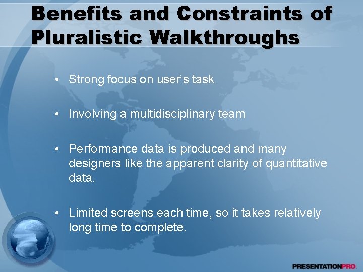
Benefits and Constraints of Pluralistic Walkthroughs • Strong focus on user’s task • Involving a multidisciplinary team • Performance data is produced and many designers like the apparent clarity of quantitative data. • Limited screens each time, so it takes relatively long time to complete.

Thanks!