Art Criticism By Priscilla Petersen Storm on the

Art Criticism By: Priscilla Petersen
 1857 Power. Point by:")
Storm on the Great Bridge Created by: Utagawa Hiroshige (Ando) 1857 Power. Point by: Priscilla Petersen
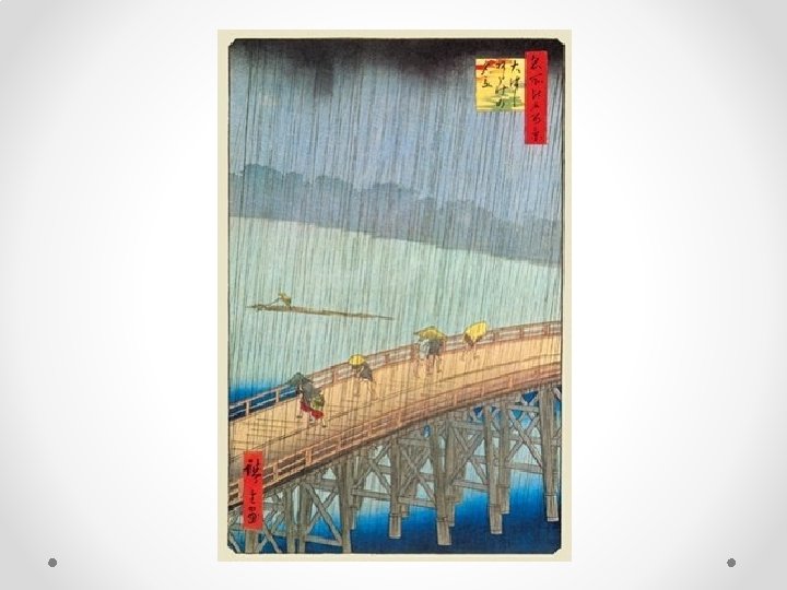

Media the Storm on the Great Bridge was made by Woodblock printing. Which is a technique for printing text, images, or patterns used widely throughout East Asia.

Description “Storm on the Great Bridge” has a verity of shades of blacks, Dark and Light browns, and various types blues. Lines were shown amazingly even through out the painting. The lines are all over the art peice, in the rain on the bridge. Value are shown more in the bridge, water and the sky with the lights and darks. Shape is in the poles of the bridge and the villagers hats. Form is located in the bridge you can see the 3 D effect on the bridge. Texture doesn’t really stand out a lot in this peice. The space is located in the background where the mountains are in the distance.

Analysis “Storm on the Great Bridge, "was well balanced with all the lines, shapes, and value come into place nicely. The shape of the bridge was a Emphasis on this piece because that’s the first thing the looker sees. The unity is the lines and shape forming a great picture of what a storm like that really looks like. Contrast is shown differently mainly between line and value because they over power each other. The movement of this piece is the rain falling down the page.

Interpretation The art is shown the emotion of the storms in Japan and what the villagers are feeling at the moment. The villagers attempt to get out of the sudden rain with hats or mats they find and then they run.

Evaluation • The best part of this art piece has to be the bridge because without the bridge, no “storm over the bridge” would happen. They could improve on how they did the mountain and sky because is doesn’t necessarily show a horizon line.
- Slides: 8