Applied Fieldwork Enquiry 3 Data processing and presentation
- Slides: 20

Applied Fieldwork Enquiry 3. Data processing and presentation

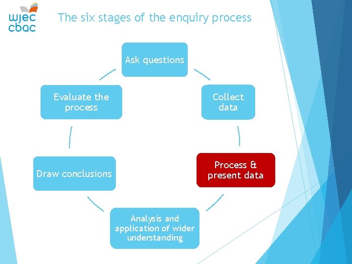
The six stages of the enquiry process Ask questions Evaluate the process Collect data Process & present data Draw conclusions Analysis and application of wider understanding

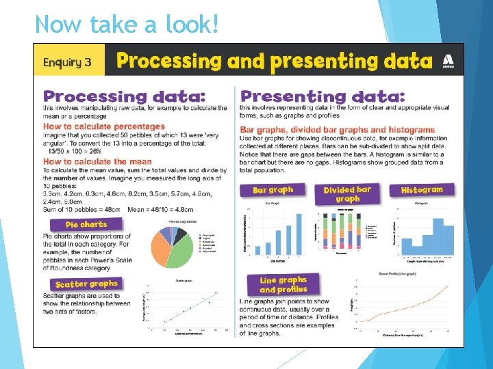
How can data be processed? Raw data often needs to be processed to make it easier to see trends and patterns. Mean – this is an average value for a data set and enables comparisons between data sets, e. g. average pebble size at different sites. Sum the values for a data set and divide by the number of values. Percentage – this calculation expresses a value as a percentage, i. e. out of 100. If 15 out of 50 pebbles are very angular, this equates to 30%. This calculation also enables comparisons to be made between data sets.

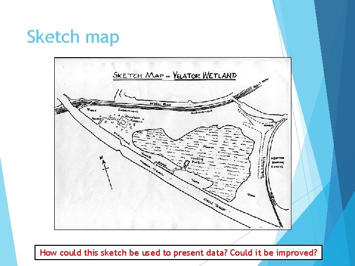
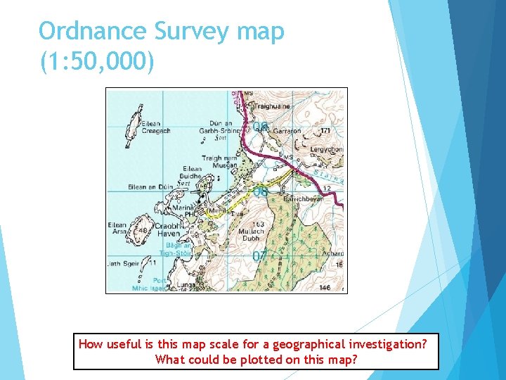
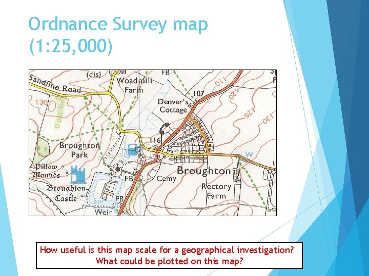
How can data be presented? Data can be presented in the form of maps, graphs and diagrams. The presentation of data helps to visualise and identify trends, patterns and relationships. Maps – these can include sketch maps, geological maps, OS maps and GIS or satellite images. Maps can be annotated or used as base maps for located symbols (bars, circles, pies). Make sure you always include a scale and a north arrow. Graphs – these can include line graphs, bar graphs, histograms, pie charts and scatter graphs. Make sure you always label the axes and use the same scale if drawing comparative graphs. Diagrams – diagrams can be used to illustrate processes and landforms, systems and cycles, for example, how the process of longshore drift affects coastal landforms.

Sketch map How could this sketch be used to present data? Could it be improved?

Ordnance Survey map (1: 50, 000) How useful is this map scale for a geographical investigation? What could be plotted on this map?

Ordnance Survey map (1: 25, 000) How useful is this map scale for a geographical investigation? What could be plotted on this map?

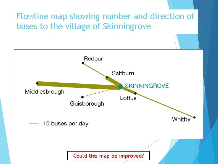
Flowline map showing number and direction of buses to the village of Skinningrove Could this map be improved?

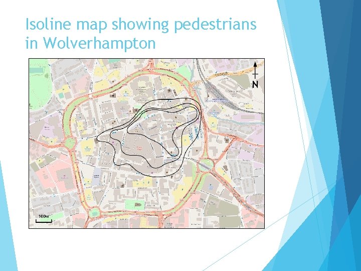
Isoline map showing pedestrians in Wolverhampton

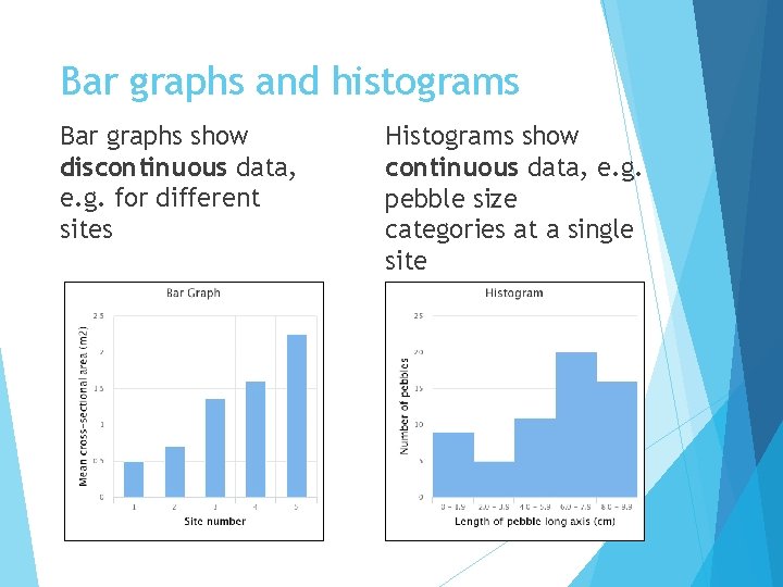
Bar graphs and histograms Bar graphs show discontinuous data, e. g. for different sites Leave a gap between the bars Histograms show continuous data, e. g. pebble size categories at a single site

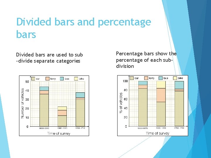
Divided bars and percentage bars Divided bars are used to sub -divide separate categories Percentage bars show the percentage of each subdivision

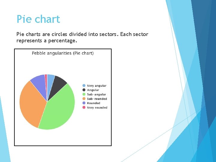
Pie charts are circles divided into sectors. Each sector represents a percentage.

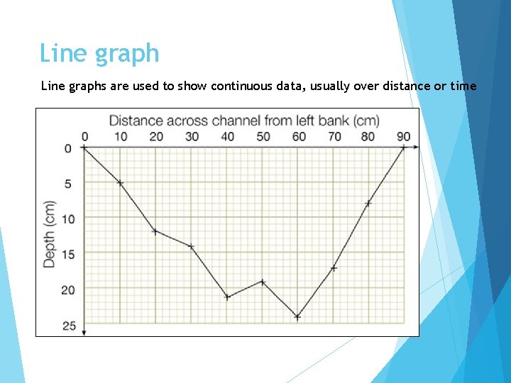
Line graphs are used to show continuous data, usually over distance or time

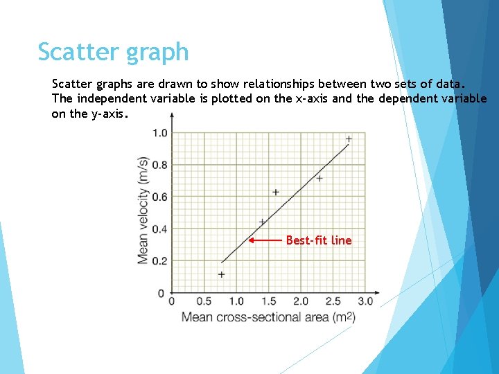
Scatter graphs are drawn to show relationships between two sets of data. The independent variable is plotted on the x-axis and the dependent variable on the y-axis. Best-fit line

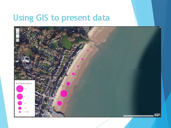
Using GIS to present data

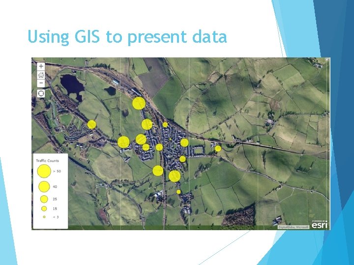
Using GIS to present data

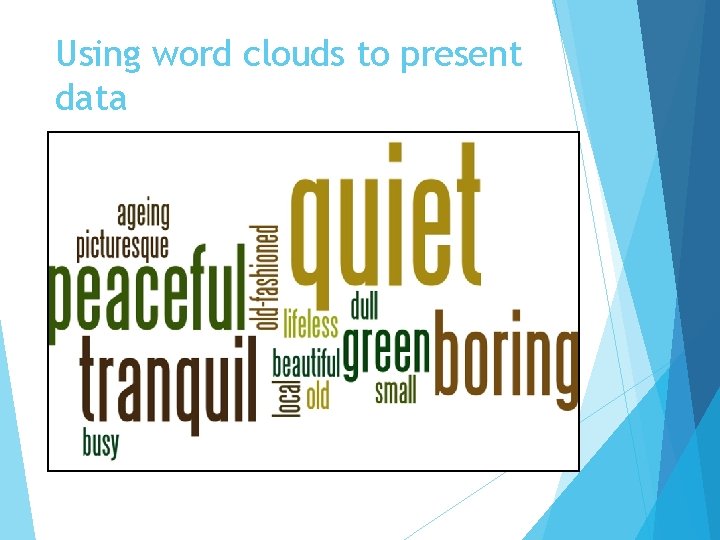
Using word clouds to present data

Now take a look!

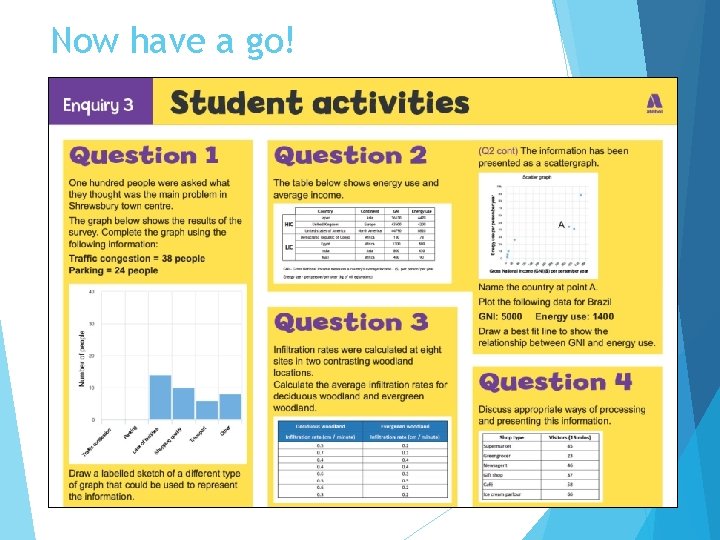
Now have a go!

Nominated criteria Table A: Methodologies Table B: Conceptual framework 2018: Geographical flows 2018: Cycles and flows 2019: Qualitative surveys 2019: Place 2020: Use of transects 2020: Sphere of Influence