Applied Data Analytics Curriculum Development of Masters Degree


- Slides: 34

Applied Data Analytics Curriculum Development of Master’s Degree Program in Industrial Engineering for Thailand Sustainable Smart Industry

Session 5: Data Dashboard Curriculum Development of Master’s Degree Program in Industrial Engineering for Thailand Sustainable Smart Industry

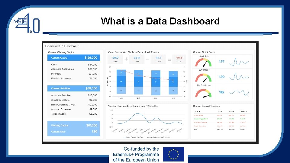
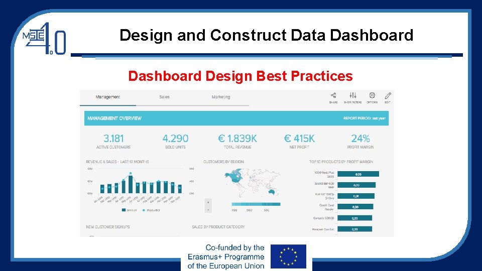
What is a Data Dashboard • A data dashboard assists in 3 key business elements: strategy, planning, and analytics • Data dashboards are visualizations that provide centralized & interactive means of monitoring, measuring, analyzing, and extracting insightful information from various relevant datasets in several key areas of enterprises • Data dashboards displays aggregated information in both intuitive and visual ways. • Data dashboards provide users an overview of company’s various internal departments, goals, initiatives, processes, or projects. These are measured through Key Performance Indicators (KPIs), which provide insights that help to foster growth and improvement. • Data dashboards provide immediate navigable access to actionable analytics. Without data dashboards, it will be inefficient and time-consuming for businesses to deal with unstructured data sets.

What is a Data Dashboard

Applications of Data Dashboard The primary functions of data dashboards: answering critical business questions. • A data dashboard can help to answer a lot of business-related questions depending on goals, aims, and strategies. • By taking raw data from a number of sources, consolidating it and presenting it in a customized dashboard, data dashboard can help identify most valuable data and find actionable answers to most critical business questions. • Through linking with specific KPIs that align with business goals, we can drill down into specific pockets of information, creating benchmarks and measuring our success on a continual basis. This data-driven process will lead to “more successful” results

Applications of Data Dashboard In the context of Business Intelligence (BI), data dashboards are used for: • Deep-level insight: Drilling down deeper into key aspects of the business’s daily, weekly and monthly operation to create initiatives for increased efficiency. • Information sharing: Facilitate the online data visualization of most valuable data so that we can share key insights with other stakeholders both internally and outside the organization. • Performance measurement: By working with interactive KPIs, we can set specific business tasks, measuring our performance while working towards clearly defined milestones for enhanced business success. • Forecasting: As dashboards are equipped with predictive analytics, it’s possible to spot trends and patterns that will help develop initiatives and make preparations for future business success.

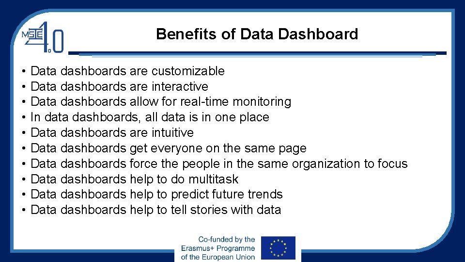
Benefits of Data Dashboard • • • Data dashboards are customizable Data dashboards are interactive Data dashboards allow for real-time monitoring In data dashboards, all data is in one place Data dashboards are intuitive Data dashboards get everyone on the same page Data dashboards force the people in the same organization to focus Data dashboards help to do multitask Data dashboards help to predict future trends Data dashboards help to tell stories with data

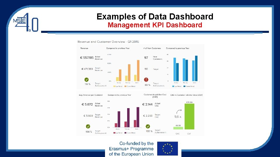
Examples of Data Dashboard Management KPI Dashboard

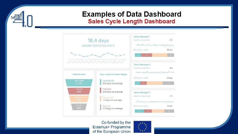
Examples of Data Dashboard Sales Cycle Length Dashboard

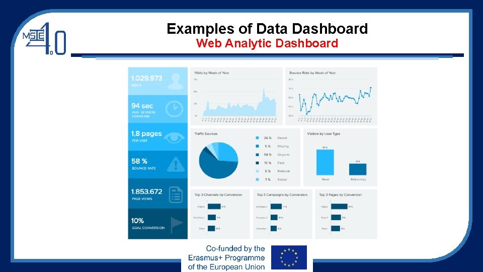
Examples of Data Dashboard Web Analytic Dashboard

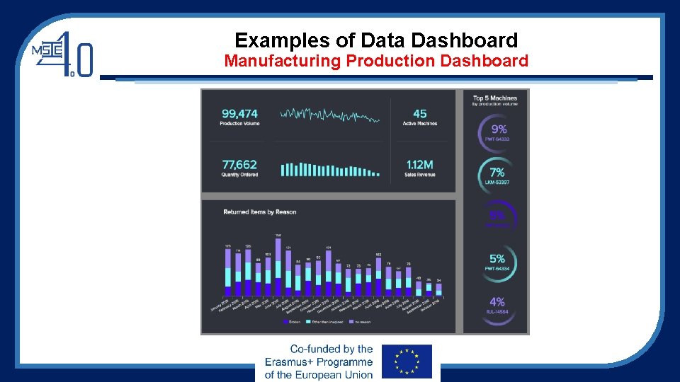
Examples of Data Dashboard Manufacturing Production Dashboard

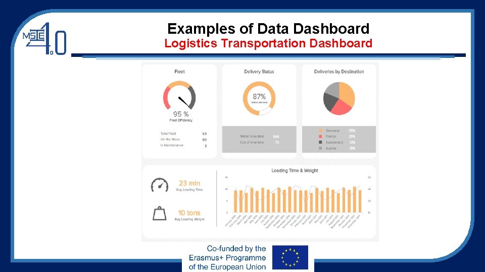
Examples of Data Dashboard Logistics Transportation Dashboard

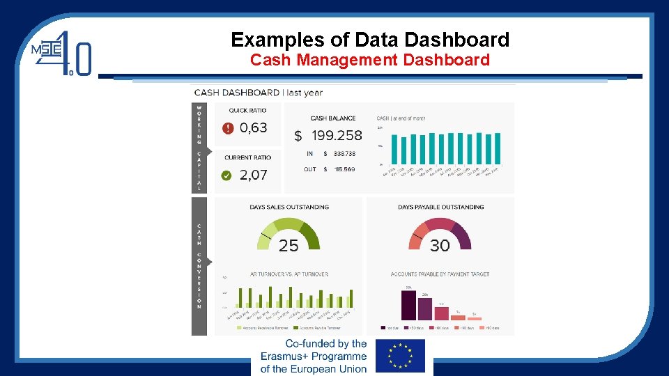
Examples of Data Dashboard Cash Management Dashboard

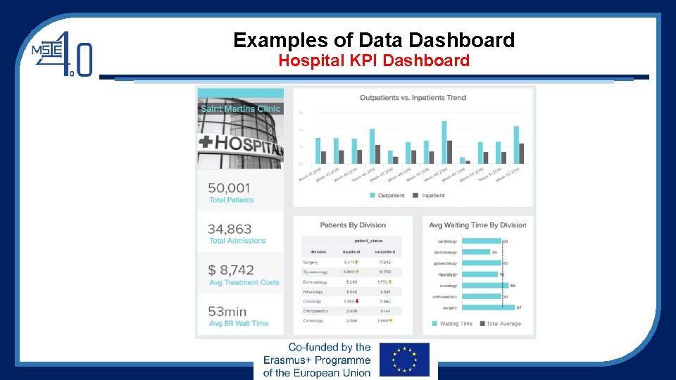
Examples of Data Dashboard Hospital KPI Dashboard

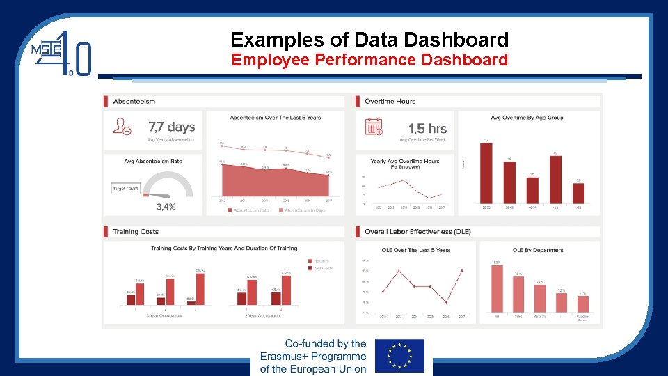
Examples of Data Dashboard Employee Performance Dashboard

Design and Construct Data Dashboard Design Principles A good dashboard design is the one that: • Makes the complex simple: we have lots of information, lots of data that changes all the time and different analytical needs and questions. We want to take all this complexity and make it simple. • Tells a clear story: connect data to its context in the business and answer the viewer’s questions. This is where the visual layout of a dashboard plays a crucial role. • Expresses the meaning of the data: the chosen data visualizations need to correctly represent the data and the information you want to extract from it. • Reveals details as needed: we want each viewer to have access to the data they need — no less but also no more. Some users might need to be able to see a more granular view of the data, but others could suffice with an overview.

Design and Construct Data Dashboard Design Best Practices 1. Focus on your end goal • Each dashboard should be designed for a particular user group with the specific aim of assisting recipients in the business decision-making process. • Information is valuable only when it is directly actionable. • The receiving user must be able to employ the information in his own business strategies and goals. • Make sure that you are able to identify the key information, and separate it from the inessential one to enhance users’ productivity.

Design and Construct Data Dashboard Design Best Practices 1. Focus on your end goal Four primary types of dashboards for business-based activity: • Strategic: focus on monitoring long-term company strategies by analyzing and benchmarking a wide range of critical trend-based information. • Operational: monitor, measure and manage processes or operations with a shorter or more immediate time scale. • Analytical: contain large streams of comprehensive data that allow analysts to drill down and extract insights to help the company to progress at an executive level. • Tactical: these information-rich dashboards are best suited to mid-management and help in formulating growth strategies based on trends, strengths, and weaknesses across departments

Design and Construct Data Dashboard Design Best Practices 2. Don’t put all information on the same page • Never create one-size-fits-all dashboards and don’t put all information into the same page. • Your audiences as groups of individuals have different needs – sales manager doesn’t need to see the same data as a marketing specialist, HR department or professionals in logistics analytics. • It’s better to simply create one dashboard for each group of individuals depending on role.

Design and Construct Data Dashboard Design Best Practices 3. Choose relevant KPIs • For KPI dashboard design, selecting the right key performance indicators (KPIs) • KPIs should only display visual representations of relevant insights based on specific areas of the business.

Design and Construct Data Dashboard Design Best Practices 4. Provide contexts • Without providing context, we don’t know if the numbers are good or bad, or if they are typical or unusual? • Without comparison values, numbers on a dashboard are meaningless. And more importantly, it is impossible to decide whether any action is required. • Try to provide maximum information, even if some of them seem obvious. Name all the axes and add titles to all charts. Remember to provide comparison values. • Rule of thumb: use comparisons that are most common, for example, comparison against a set target, against a preceding period or against a projected value.

Design and Construct Data Dashboard Design Best Practices 5. Made it as easy as possible • Concerning dashboard design, accessibility is one of the most important principles. • You should present data in a clear and approachable way that facilitates the decisionmaking process. • If the charts look too complex, the users will spend more time on data analysis than they would without the dashboard. • Data analysis displayed on a dashboard should provide additional value. For example, a user shouldn’t need to do some more calculations on his own to get to the information he was looking for, because everything he needs will be clearly displayed on the charts. • Always try to put yourself in the user’s position.

Design and Construct Data Dashboard Design Best Practices 6. Choose the layout carefully • Placement of charts on a dashboard should be visually organized. • Poor layout forces users to think more before they grasp the idea • The general rule is that the key information should be displayed first – on the top of the screen, upper left-hand corner. The scientific wisdom behind this placement: most cultures read their written language from left to right and top to bottom. • Start with the big picture. The major trend should be visible at a glance. After this, you can proceed with more detailed charts. • Remember to group the charts by theme with the comparable metrics placed next to each other.

Design and Construct Data Dashboard Design Best Practices 7. Prioritize simplicity • Nowadays, we can play with a lot of options in the chart creation: frames, backgrounds, effects, gridlines, etc. However, don’t try to use them all at once. • Those options should be used only when there is a reason for applying them. • Be careful with your labels or legend and pay attention to the font, size, and color. It shouldn’t hide your chart, but also be big enough to be readable.

Design and Construct Data Dashboard Design Best Practices 8. Choose just a few colors and stick with them • This is one of the most important of all dashboard design best practices. • Stay consistent and not use too many different colors. We can choose two to three colors, and then play with gradients. • A common mistake is using highly saturated colors too frequently. Intense colors can draw users’ attention to a certain piece of data, but if a dashboard contains only highly saturated colors, users may feel overwhelmed and lost

Design and Construct Data Dashboard Design Best Practices 9. Don’t overuse real-time data • In some cases, information displayed in too much detail only serves to lead to distraction. • Unless you’re tracking some live results, most dashboards don’t need to be updated continually. • Most project management dashboards must only be updated periodically – on a weekly, daily or hourly basis. After all, it is the right data that counts the most.

Design and Construct Data Dashboard Design Best Practices 10. Use the right type of chart You can destroy all of your efforts with a missing or incorrect chart type. It’s important to understand what type of information you want to convey and choose a data visualization that is suited to the task.

Design and Construct Data Dashboard Design Best Practices 10. Use the right type of chart For examples: • Line charts are great to display patterns of change across a continuum. • Bar charts help you to quickly compare items in the same category • Pie charts aren’t the perfect choice because it is difficult to accurately compare the sizes of the pie slices. • Scatterplots lack precision and clarity as the relationships between two quantitative measures don’t change very frequently. • Bubble charts are not fit for dashboards. They require too much mental effort from their users even when it comes to reading simple information in a context. Due to their lack of precision and clarity, they are not very common and users are not familiar with them. It is noted that dashboard-centric charts and visualizations fall into four primary categories: relationship, distribution, composition, and comparison.

Design and Construct Data Dashboard Design Best Practices 11. Be consistent with labelling and data formatting • Design a dashboard should focus on clarity and consistency. • Your labeling and formatting should be consistent across KPIs, tools, and metrics. • If formatting or labeling for related metrics or KPIs is wildly different, it will cause confusion, slow down data analysis activities, and increase chances of making mistakes.

Design and Construct Data Dashboard Design Best Practices 12. Use interactive elements • Comprehensive dashboard should allow users to dig deep into certain trends, metrics, or insights with ease. • Factoring drill-downs, click-to-filter, and time interval widgets introduced into the design are vital to build a good dashboard.

Design and Construct Data Dashboard Design Best Practices

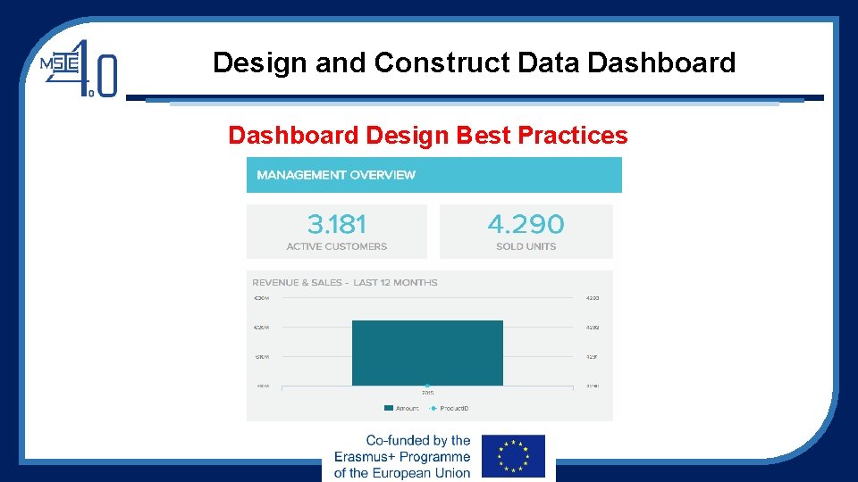
Design and Construct Data Dashboard Design Best Practices

Design and Construct Data Dashboard Design Best Practices 13. Double up margins • Pay attention to “white space” – the area of blankness between elements featured on a dashboard design. • Dashboard designers should pay attention to this because when metrics, stats, and insights are unbalanced, they are difficult to digest. • It is of good practice to double the margins surrounding the main elements of the dashboard to ensure each is framed with a balanced area of white space, making the information easier to absorb.

Design and Construct Data Dashboard Design Best Practices 14. Keep evolving the dashboard • Keep evolving the designs in response to the changes will ensure ongoing analytical success. • When designing dashboards, asking for feedback is essential. By requesting regular input from your team and asking the right questions, you’ll be able to improve the layout, functionality, look, feel, and balance of KPIs to ensure optimum value at all times.