AP STATISTICSUNIT 2 EXPLORING DATA More about exploring

AP STATISTICS—UNIT 2 EXPLORING DATA More about exploring quantitative data (Click for the next slide)
EXPLORING DATA STARTS WITH… …pictures, pictures! • All graphs display the v Bar Graphs v Pie Charts v Two-way (Contingency) Tables v Histograms v Dot Plots distribution of a variable of interest. In other words, they show the values the variable can take, and how often the variable takes each value. • These four graphs display quantitative (numerical) data. v Stem (and Leaf) Plots v Cumulative Relative Frequency Graphs (Ogives) Let’s take a closer look… (Click for the next slide)
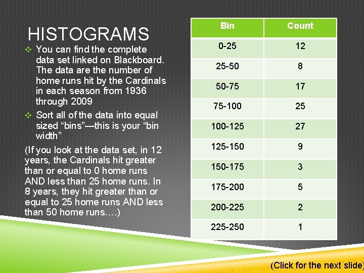
HISTOGRAMS v You can find the complete data set linked on Blackboard. The data are the number of home runs hit by the Cardinals in each season from 1936 through 2009 v Sort all of the data into equal sized “bins”—this is your “bin width” (If you look at the data set, in 12 years, the Cardinals hit greater than or equal to 0 home runs AND less than 25 home runs. In 8 years, they hit greater than or equal to 25 home runs AND less than 50 home runs…. ) Bin Count 0 -25 12 25 -50 8 50 -75 17 75 -100 25 100 -125 27 125 -150 9 150 -175 3 175 -200 5 200 -225 2 225 -250 1 (Click for the next slide)
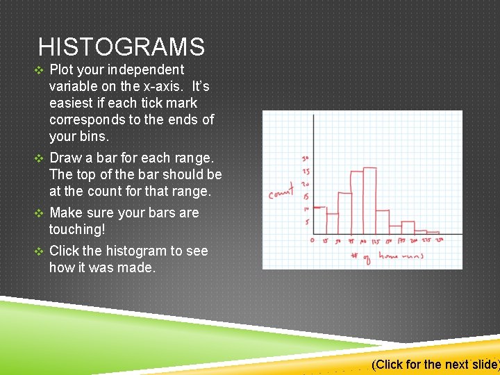
HISTOGRAMS v Plot your independent variable on the x-axis. It’s easiest if each tick mark corresponds to the ends of your bins. v Draw a bar for each range. The top of the bar should be at the count for that range. v Make sure your bars are touching! v Click the histogram to see how it was made. (Click for the next slide)
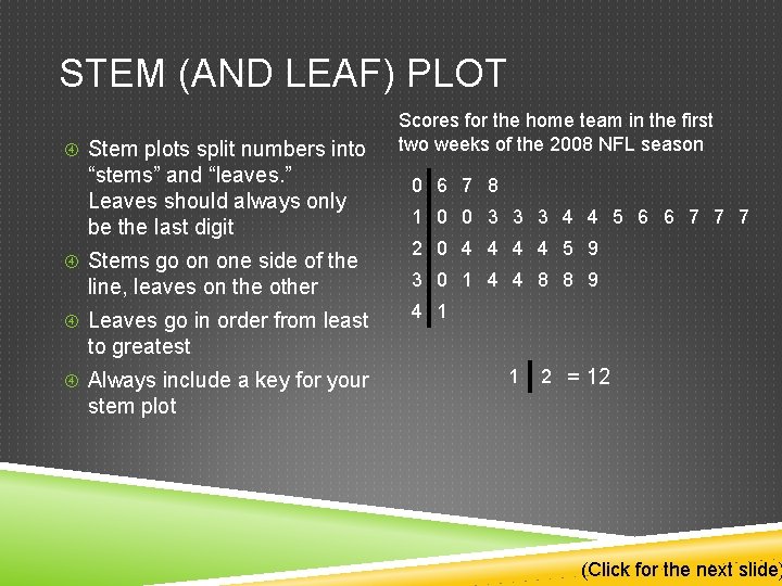
STEM (AND LEAF) PLOT Stem plots split numbers into “stems” and “leaves. ” Leaves should always only be the last digit Stems go on one side of the line, leaves on the other Leaves go in order from least Scores for the home team in the first two weeks of the 2008 NFL season 0 6 7 8 1 0 0 3 3 3 4 4 5 6 6 7 7 7 2 0 4 4 5 9 3 0 1 4 4 8 8 9 4 1 to greatest Always include a key for your 1 2 = 12 stem plot (Click for the next slide)
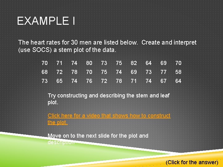
EXAMPLE I The heart rates for 30 men are listed below. Create and interpret (use SOCS) a stem plot of the data. 70 71 74 80 73 75 82 64 69 70 68 72 78 70 75 74 69 73 77 58 73 65 74 76 72 78 71 74 67 64 Try constructing and describing the stem and leaf plot. Click here for a video that shows how to construct the plot. Move on to the next slide for the plot and description (Click for the answer)
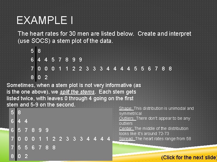
EXAMPLE I The heart rates for 30 men are listed below. Create and interpret (use SOCS) a stem plot of the data. 5 8 6 4 4 5 7 8 9 9 7 0 0 0 1 1 2 2 3 3 3 4 4 5 5 6 7 8 8 8 0 2 Sometimes, when a stem plot is not very informative (as is the one above), we split the stems. Each stem gets listed twice, with leaves 0 through 4 going on the first stem and 5 -9 on the second. Shape: This distribution is unimodal and 5 8 symmetrical 6 4 4 6 5 7 8 9 9 7 0 0 0 1 1 2 2 3 3 3 4 4 7 5 5 6 7 8 8 8 0 2 Outliers: There don’t appear to be any outliers Center: The middle of the distribution looks like it’s around 72 -73 Spread: The heart rates range from 58 to 82 (Click for the next slide)
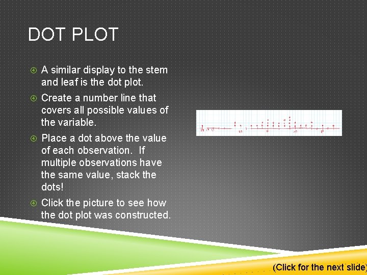
DOT PLOT A similar display to the stem and leaf is the dot plot. Create a number line that covers all possible values of the variable. Place a dot above the value of each observation. If multiple observations have the same value, stack the dots! Click the picture to see how the dot plot was constructed. (Click for the next slide)
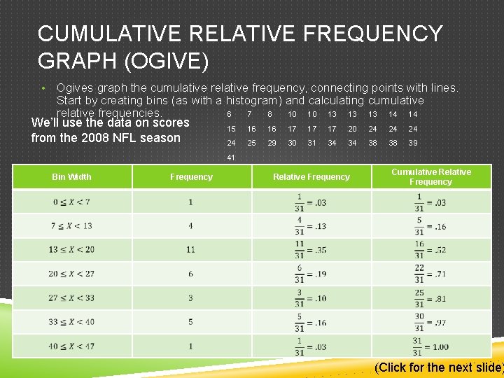
CUMULATIVE RELATIVE FREQUENCY GRAPH (OGIVE) • Ogives graph the cumulative relative frequency, connecting points with lines. Start by creating bins (as with a histogram) and calculating cumulative relative frequencies. 6 7 8 10 10 13 13 13 14 14 We’ll use the data on scores from the 2008 NFL season 15 16 16 17 17 17 20 24 24 25 29 30 31 34 34 38 38 39 41 Bin Width Frequency Relative Frequency Cumulative Relative Frequency (Click for the next slide)
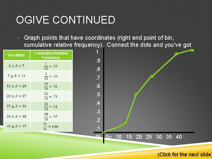
OGIVE CONTINUED • Graph points that have coordinates (right end point of bin, cumulative relative frequency). Connect the dots and you’ve got 1 an ogive! Cumulative Relative Bin Width Frequency . 9. 8. 7. 6. 5. 4. 3. 2. 1 0^ 5> 10 15 20 25 30 35 40 (Click for the next slide)
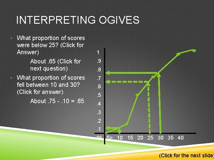
INTERPRETING OGIVES • What proportion of scores were below 25? (Click for Answer) About. 65 (Click for next question) 1. 9. 8 • What proportion of scores . 7 fell between 10 and 30? (Click for answer) . 6 About. 75 -. 10 =. 65 . 5. 4. 3. 2. 1 0^ 5> 10 15 20 25 30 35 40 (Click for the next slide)

THERE IS AN ASSIGNMENT ON MYMATHLAB. HOLLA AT ME WITH WAYS TO MAKE THESE BETTER PEACE That’s all Folks!
- Slides: 12