AOIT Web Design Unit 1 Lesson 2 Creating

AOIT Web Design Unit 1, Lesson 2 Creating Power. Point Presentations Copyright © 2012– 2015 National Academy Foundation. All rights reserved.

Simple, clear slides are keys to success Guideline Why? Keep the slides simple. The audience will get lost in crowded and confusing slides. Use clearning objectives. Learning is more effective when it’s focused. Make the The audience will stay more engaged if the information friendly. information feels good to them. Avoid lectures. The audience will check out if they’re bored. When are Power. Point presentations appropriate instructional materials?

Make slides easy to read • • Use clear font styles and sizes large enough to read. Limit text on slides. Use light-colored backgrounds. Use dark-colored text. Good design Bad design

Explain your learning objectives • Make clear what you want your audience to learn. • Present information in multiple ways. • Summarize information at the end of the presentation. Use charts and graphs to present information in multiple ways or to summarize.

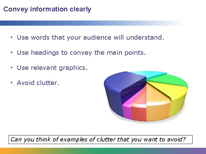
Convey information clearly • Use words that your audience will understand. • Use headings to convey the main points. • Use relevant graphics. • Avoid clutter. Can you think of examples of clutter that you want to avoid?

Present your slides in your own words • Avoid reading slides word for word. • Practice ahead of time to be confident. • Add information and examples as you speak. • Allow time for note taking. • Answer questions from the audience.

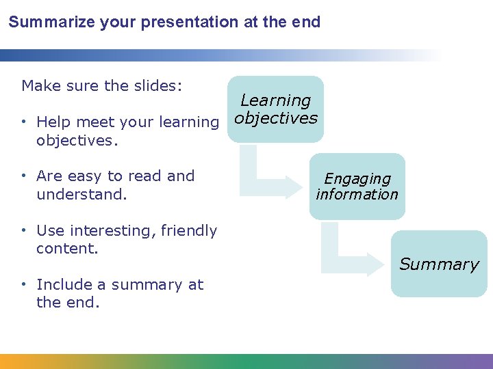
Summarize your presentation at the end Make sure the slides: Learning • Help meet your learning objectives. • Are easy to read and understand. • Use interesting, friendly content. • Include a summary at the end. Engaging information Summary
- Slides: 7