Android User Interface Yuliana Setiowati Rizky Yuniar Hakkun
- Slides: 29

Android User Interface Yuliana Setiowati Rizky Yuniar Hakkun Politeknik Elektronika Negeri Surabaya 1

Outline • • • Label Button Image View and Image Button Edit. Text Check. Box Radio. Button

The View Class • The View class represents the basic building block for user interface components. • View is the base class for widgets, which are used to create interactive UI components (buttons, text fields, etc. ). • The View. Group subclass is the base class for layouts, which are invisible containers that hold other Views (or other View. Groups) and define their layout properties.

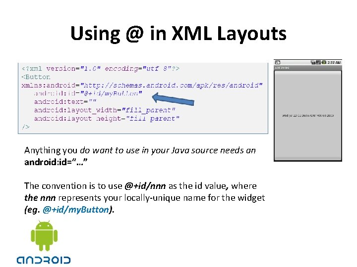
Using @ in XML Layouts Anything you do want to use in your Java source needs an android: id=“…” The convention is to use @+id/nnn as the id value, where the nnn represents your locally-unique name for the widget (eg. @+id/my. Button).

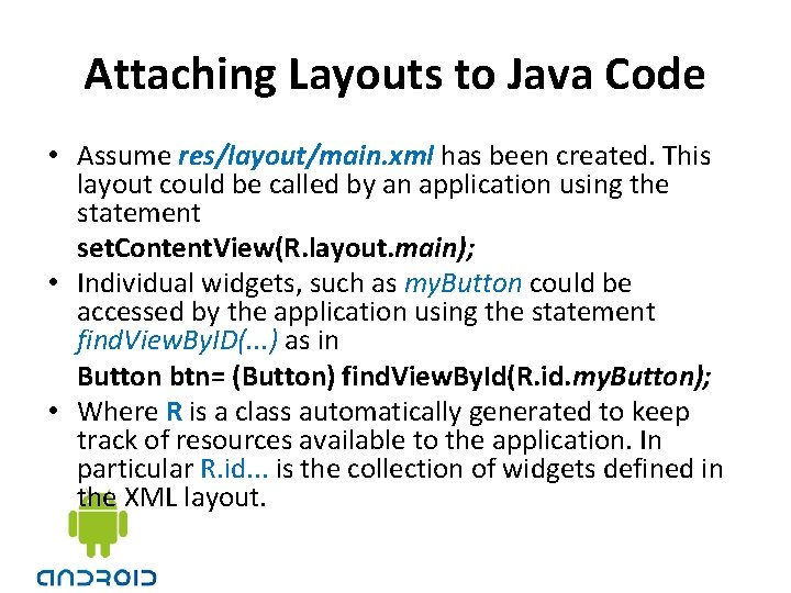
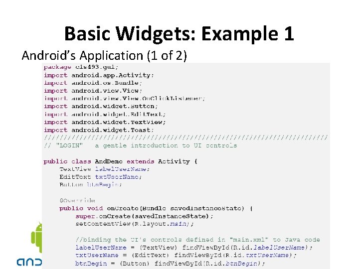
Attaching Layouts to Java Code • Assume res/layout/main. xml has been created. This layout could be called by an application using the statement set. Content. View(R. layout. main); • Individual widgets, such as my. Button could be accessed by the application using the statement find. View. By. ID(. . . ) as in Button btn= (Button) find. View. By. Id(R. id. my. Button); • Where R is a class automatically generated to keep track of resources available to the application. In particular R. id. . . is the collection of widgets defined in the XML layout.

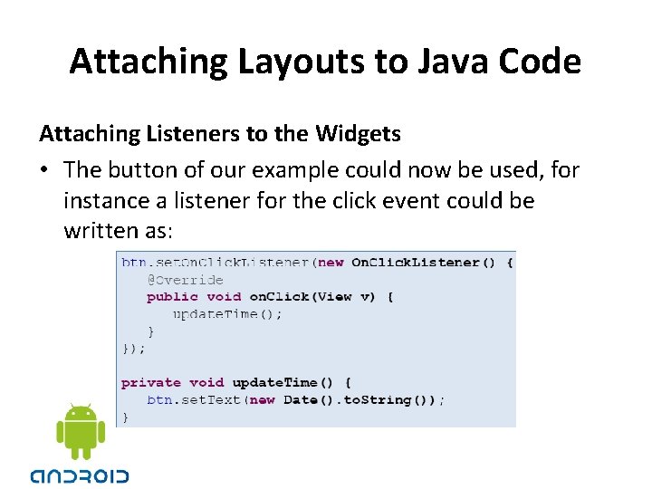
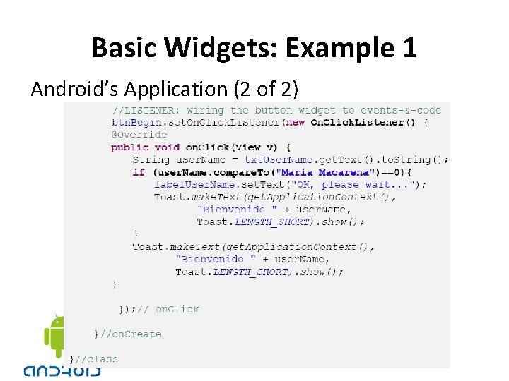
Attaching Layouts to Java Code Attaching Listeners to the Widgets • The button of our example could now be used, for instance a listener for the click event could be written as:

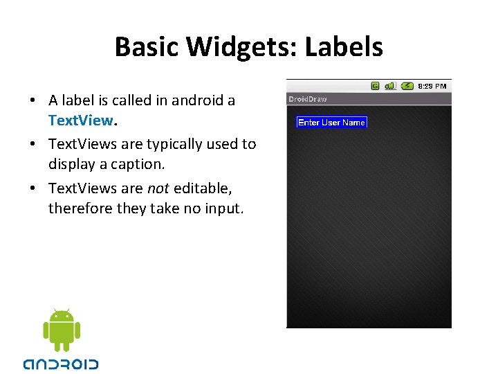
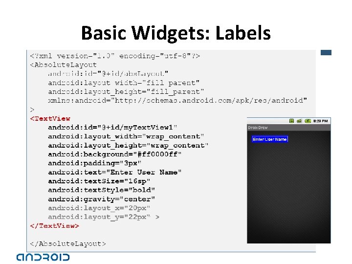
Basic Widgets: Labels • A label is called in android a Text. View. • Text. Views are typically used to display a caption. • Text. Views are not editable, therefore they take no input.

Basic Widgets: Labels

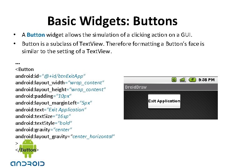
Basic Widgets: Buttons • A Button widget allows the simulation of a clicking action on a GUI. • Button is a subclass of Text. View. Therefore formatting a Button’s face is similar to the setting of a Text. View. . <Button android: id="@+id/btn. Exit. App" android: layout_width="wrap_content" android: layout_height="wrap_content" android: padding="10 px" android: layout_margin. Left="5 px" android: text="Exit Application" android: text. Size="16 sp" android: text. Style="bold" android: gravity="center" android: layout_gravity="center_horizontal" > </Button>

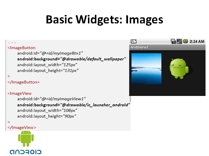
Basic Widgets: Images • Image. View and Image. Button are two Android widgets that allow embedding of images in your applications. • Each widget takes an android: src or android: background attribute (in an XML layout) to specify what picture to use. • Pictures are usually reference a drawable resource. • You can also set the image content based on a URI from a content provider via set. Image. URI(). • Image. Button, is a subclass of Image. View. It adds the standard Button behavior for responding to clickevents.

Basic Widgets: Images

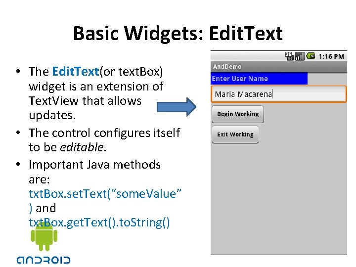
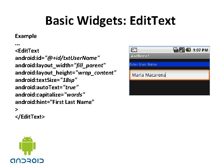
Basic Widgets: Edit. Text • The Edit. Text(or text. Box) widget is an extension of Text. View that allows updates. • The control configures itself to be editable. • Important Java methods are: txt. Box. set. Text(“some. Value” ) and txt. Box. get. Text(). to. String()

Basic Widgets: Edit. Text Example. . . <Edit. Text android: id="@+id/txt. User. Name" android: layout_width="fill_parent" android: layout_height="wrap_content" android: text. Size="18 sp" android: auto. Text="true" android: capitalize="words" android: hint="First Last Name" > </Edit. Text>

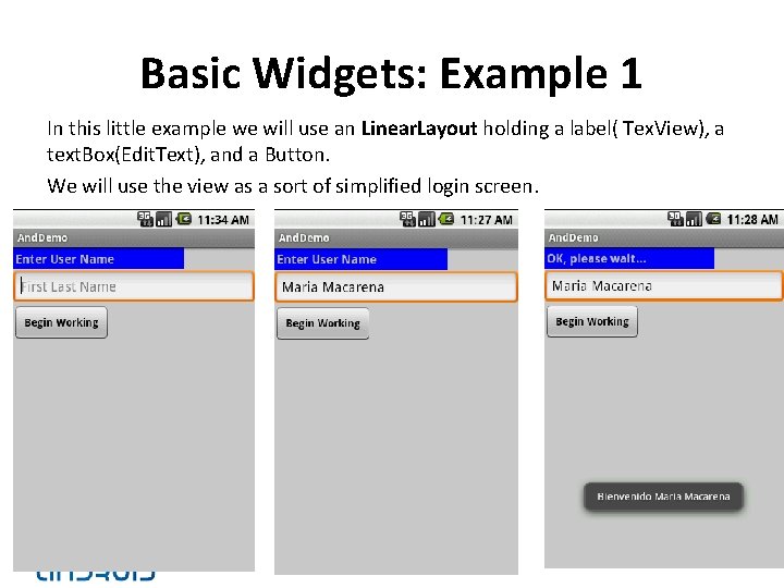
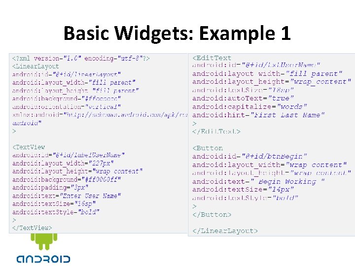
Basic Widgets: Example 1 In this little example we will use an Linear. Layout holding a label( Tex. View), a text. Box(Edit. Text), and a Button. We will use the view as a sort of simplified login screen.

Basic Widgets: Example 1

Basic Widgets: Example 1 Android’s Application (1 of 2)

Basic Widgets: Example 1 Android’s Application (2 of 2)

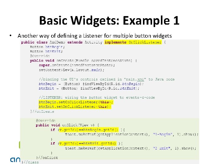
Basic Widgets: Example 1 • Another way of defining a Listener for multiple button widgets

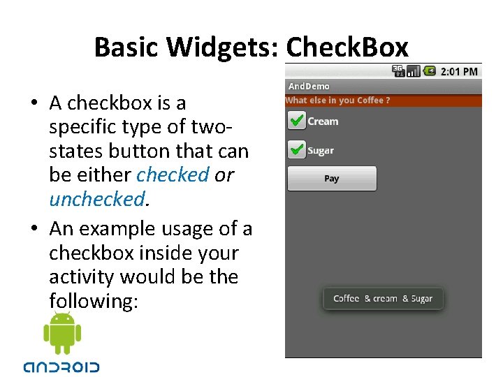
Basic Widgets: Check. Box • A checkbox is a specific type of twostates button that can be either checked or unchecked. • An example usage of a checkbox inside your activity would be the following:

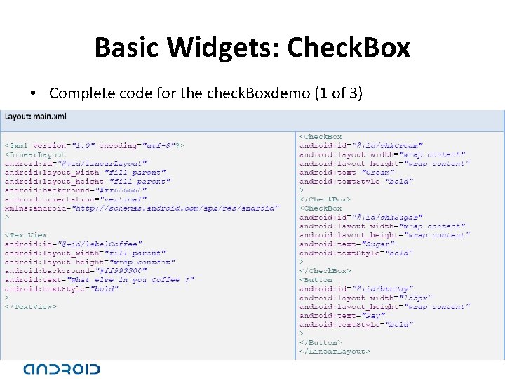
Basic Widgets: Check. Box • Complete code for the check. Boxdemo (1 of 3)

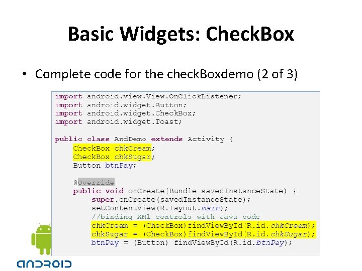
Basic Widgets: Check. Box • Complete code for the check. Boxdemo (2 of 3)

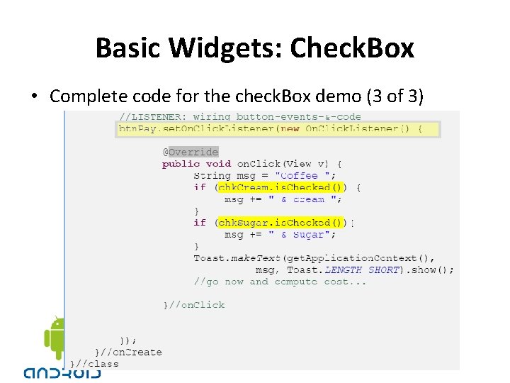
Basic Widgets: Check. Box • Complete code for the check. Box demo (3 of 3)

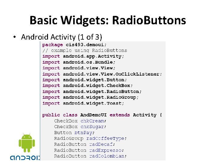
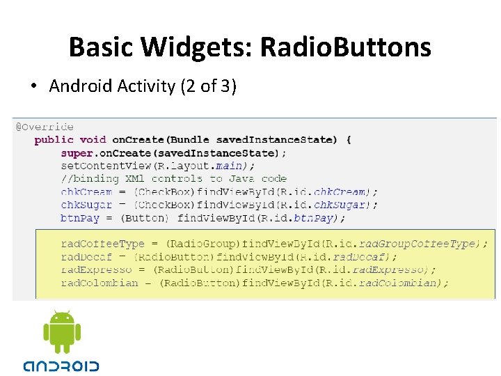
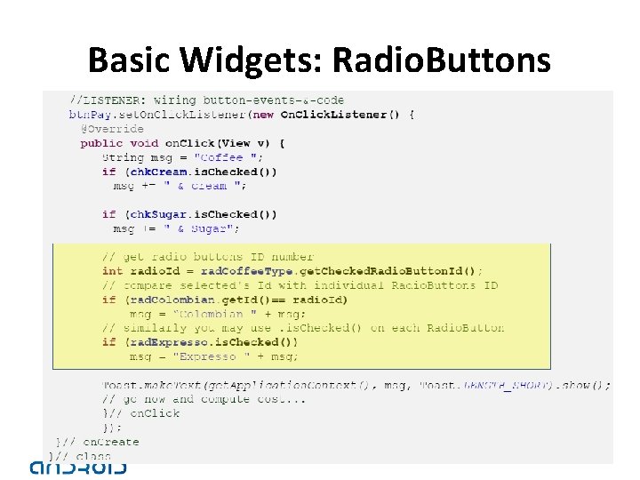
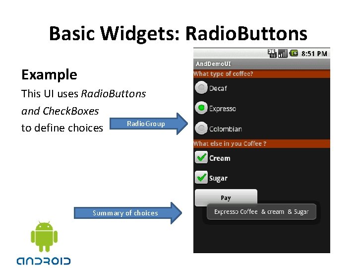
Basic Widgets: Radio. Buttons • A radio button is a two-states button that can be either checked or unchecked. • When the radio button is unchecked, the user can press or click it to check it. • Radio buttons are normally used together in a Radio. Group. • When several radio buttons live inside a radio group, checking one radio button unchecks all the others. • Similarly, you can call is. Checked() on a Radio. Buttonto see if it is selected, toggle() to select it, and so on, like you can with a Check. Box.

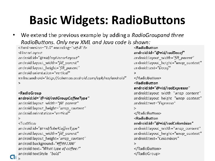
Basic Widgets: Radio. Buttons • We extend the previous example by adding a Radio. Groupand three Radio. Buttons. Only new XML and Java code is shown:

Basic Widgets: Radio. Buttons • Android Activity (1 of 3)

Basic Widgets: Radio. Buttons • Android Activity (2 of 3)

Basic Widgets: Radio. Buttons

Basic Widgets: Radio. Buttons Example This UI uses Radio. Buttons and Check. Boxes Radio. Group to define choices Summary of choices

Unit measurement in Android • px = Pixels – corresponds to actual pixels on the screen. • pt = Points – 1/72 of an inch based on the physical size of the screen. • dp Density-independent Pixels – an abstract unit that is based on the physical density of the screen. These units are relative to a 160 dpi screen, so one dp is one pixel on a 160 dpi screen. The ratio of dpto-pixel will change with the screen density, but not necessarily in direct proportion. Note: The compiler accepts both “dip” and “dp”, though “dp” is more consistent with “sp”. • sp Scale-independent Pixels – this is like the dp unit, but it is also scaled by the user’s font size preference. It is recommend you use this unit when specifying font sizes, so they will be adjusted for both the screen density and user’s preference.