ANATOMY OF A PICTOGRAPH Pictographs use pictures to

- Slides: 1

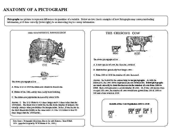
ANATOMY OF A PICTOGRAPH Pictographs use pictures to represent differences in quantities of a variable. Below are two classic examples of how Pictographs may convey misleading information, or if done correctly (lower right), be an interesting way to convey information. The above pictograph tell us … A. A new species of cow, the Crescive, evolved. B. Mankind has genetically bred larger cows. C. From 1860 to 1936 the number of cows increased. The above pictograph tell us … A. From 1515 to 1936 the rhinoceros shrank in overall size. B. Rhinos of the 16 th century were really weird looking. Answer: See below for the correct way to use pictographs. As with the rhinoceros, the cows above improperly present information. Below pictographs are used correctly to show the increase in the number of cows from 1860 to 1936. Each cow represents a certain number of cows. So, if one cow picture were to equal 100 cows, the number of cows would have grown from 100 in 1860 to 300 and a butts worth in 1936. C. The rhinoceros population decreased by about 350% Answer: C. The 1515 Rhino is 4. 5 times longer and 4. 5 times taller than the 1936 rhino. The intent was to show the decline in the number of animals, but visually conveys other possibilities for interpretation. In fact, if one factors in the third dimension (width) at the same ratio 1: 4. 5 the 1515 rhino is over 90 times larger than the 1936 model. Data Source: Pictographs taken from How to Lie with Statistics. Darrell Huff. 1954. (paperback reprint by W. W. Norton & Co. , 1993. ) Growth of the Cow Population 1860 vs. 1936