Analyzing Historical RedLining in Los Angeles Group members

Analyzing Historical Red-Lining in Los Angeles Group members: Carlos Baez, Megan Farschon, Niall Huffman, Keith Humphreys and Emma Joshi

Background/Motivation/Purpose • In the 1930’s and 40’s the Home Owners Loan Commission (HOLC) which was created to give housing loans to Americans who were facing foreclosure due to the economic hardships after the Great Depression, set about zoning and grading areas in American cities. • These were ranked on a “security grade” A to D scale, “A” being the most desirable for loans (often shaded in blue) and “D” being the least desirable (often shaded in red), hence the term “red-lining, ”. • Informing our class mates (and others) as to the potential long standing ramifications of red-lining including “spatially prejudicial” effects. • Our purposes include analyzing trends in current “quality of life” indicators as compared to 1939 “security-graded” areas. • To see what correlation, if any, exists between the locations of African Americans in 1939 compared to today. • To use many of the capabilities of GIS to help shed light on a complicated social problem.

Data Sources and Helpful People • • • • Department of History at USC San Diego Super Computer Center (SDCS) Federal Bureau of Investigations www. bestplaces. net The Environmental Protection Agency (EPA) Los Angeles Unified School District (LAUSD) Dave Manuwa & Janis Buckingham (LAUSD) Richard Marciano at the SDSC George Lipsitz at UCSB (Black Studies) Richard Church at UCSB (Geography) T-RACES project of Red-lining in the U. S. (USC) Professor Goodchild Josh Bader

What we set out to do • Retroactive predictive model • Use several measures of current quality-of-life (QOL) to build an index of overall QOL • Measure correlation w/ 1939 polygons • Build database from 1939 publicly available documents


Methods • • Database construction from HOLC’s indexed description of A, B, C and D group areas. Kriging of LAUSD Academic Performance Index (API) data. Vector overlay with visual analysis of all current data layers over 1939 LA Map #1. Buffer of Toxic Release Inventory (TRI) facilities, point-in-polygon to determine how many sites are in close proximity to each polygon. (TRI = Toxic Release Inventory) Digitizing of all Red, Yellow Blue and Green areas on 1939 LA Maps. Analytical Hierarchy Process (AHP) to determine importance weights for variables. An attempt at predictive modeling of 1939 Red-lined areas based on current factors. Statistical regressions of current variables compared to 1939 “security grade”.

Problems • • • Limited access to historic red-lined maps. Availability of current data to cover all the areas of our 1939 maps including: Cost prohibitive LA County Assessors Data ($260 and $12, 541), LAPD’s unwillingness to give us their ESRI designed Crime Analysis Mapping System (CAMS) data, LAUSD’s incomplete coverage. MAUP—Modifiable Areal Unit Problem (Census tracts, ZIP codes, school enrollment boundaries, police precincts, etc. ) Registration issues with 1939 maps (alignment issues between scanned 1939 maps). Using methods to create good weights for use in our predictive model. Statistical issues with kernel density estimation of TRI facilities and predicting where redlined areas would be. The beauty of a forward prediction model is that time will tell if the prediction has merit. The problem with a backwards predicting model is that the outcome is already known and one can “cheat” by tailoring the data to fit that known outcome. Accurate predictive modeling confused by the massive quantity of variables that can explain changes, or lack there of, in Los Angeles over the past 68 years. Some of which include: Changes in urban planning (road and freeway construction), gentrification, immense population increase, huge migration and immigration of various ethnic groups, having a movie star as Governor, etc. Issues with AHP and getting everyone to sign off on their weight matrices, with the decision to not do a backward predictive model, went our use of the AHP. Reconciling coordinate systems/projections of data layers. Difficulty getting kriging and kernel density estimation to work properly for us. Computers in the Star Lab!!!

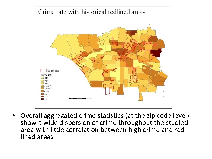
• Overall aggregated crime statistics (at the zip code level) show a wide dispersion of crime throughout the studied area with little correlation between high crime and redlined areas.

• Kriged API data shows a loose correlation between red-lined areas and API scores.

• Real estate values have a stronger correlation with security grade—more agreement in South Los Angeles, Eastside, etc.

• Income tends to have the strongest correlation with the security grade—lowest-income areas frequently matched redlined districts.

Regression graphs from 1939 database and current data

• According to the HOLC indices in 1939 the highest concentration of blacks are in the western part of South Central LA. Much of the area is zoned red and yellow with some blue outliers.

• 1939 HOLC individual security graded areas mentioned “undesirable populations on the periphery”, possibly accounting for the presence of moderate-to-high African American concentrations in the “blue outliers”.

• As seen in the previous slide, the black population which was most likely the ethnic group referenced in the HOLC’s description “undesirable populations on the periphery”, trended northwest in 1939 and is still present in the area at the time of the 2000 Census. This area that in South Central Los Angeles had few redlined zones in 1939 but currently has a relatively high rate of crime, low income levels, low API scores and low median home values. Our predictive model would not have worked here.

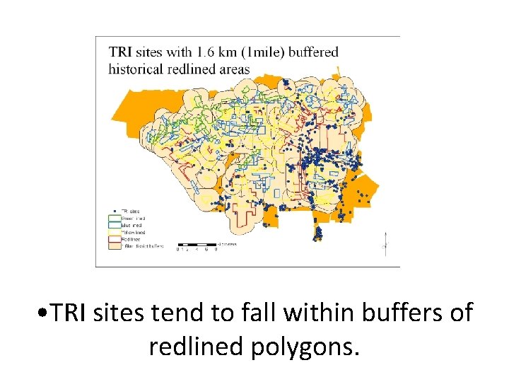
• The Highest concentrations of TRI sites tend to be nearest to redlined areas, with some blue outliers. Santa Monica has a few TRI sites now, but in the thirties was thought of as a “grungy port town” and was fairly significantly redlined. This too would not have countered our predictive model as Santa Monica does not fit the criteria of our retroactive prediction model.

• TRI sites tend to fall within buffers of redlined polygons.

Conclusions • Without certainty the practice of redlining was spatially and racially prejudicial when it was took place. • Due to such a wide variety of causative factors contributing to quality-of-life and socioeconomic dynamics in Los Angeles, it is hard to say with any certainty whethere are long standing effects caused by the practice of redlining in the 1930’s and 40’s. • Certain current factors are more related than others with the most related being current real estate values and income level and the least being API scores and crime. • In such a dynamic and diverse area like Los Angeles it is near to impossible to create an accurate predictive model of where redlined areas would have been. Especially given the almost 70 year time gap. • When running a backwards predictive model, it is fairly easy to manipulate data in a GIS to tailor to your hypothesis. • Given complete and accurate datasets, GIS can be a great tool in aiding understanding of complex social issues.

Things to do given more time and money (other things to consider) • We could build a database of all the Los Angeles redlined maps and indices (some 1000 documents spanning almost 10 years) and run a timeline analysis of redlining. This is what Richard Marciano and colleagues are in the process of doing at the SDSC. • Use Census data from the 40’s, 50’s 60’s, etc. to analyze changes and trends the various socioeconomic variables. • Purchase LA County Assessors Office datasets that allow us to analyze individual plot values for a more detailed approach. • Utilize programs such as Google Earth and Windows Live Local to investigate architecture and landscape architecture in the various “security graded” areas. • Make networks (or find them) of historical construction projects including street and freeway construction; relate these to 1930 s security grades.

Future Applications • Our work will add to the ongoing TRACES project sponsored by the SDSC. • We will make our data available for others to use through the website http: //salt. sdsc. edu/T -RACES/cities. html

THANK YOU!
- Slides: 21