Analyzing Categorical Data Categorical data is data divided
- Slides: 7

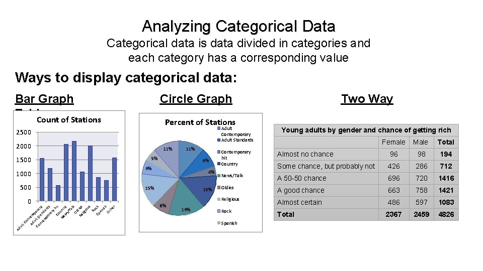
Analyzing Categorical Data Categorical data is data divided in categories and each category has a corresponding value Ways to display categorical data: Bar Graph Table Count of Stations Circle Graph Percent of Stations Adult Contemporary Adult Standards 2500 2000 1500 1000 500 Ad ul t Co n Ad tem ul po Co t S ra nt tan ry em d po ard ra s ry Co hit u Ne nt w ry s/ Ta l Ol k d Re ies lig io us Ro Sp ck an ish Ot he r 0 11% 5% 9% 6% 4% 15% 8% 16% Two Way Young adults by gender and chance of getting rich Female Male Total Contemporary hit Country Almost no chance 96 98 194 Some chance, but probably not 426 286 712 News/Talk A 50 -50 chance 696 720 1416 Oldies A good chance 663 758 1421 Religious Almost certain 486 597 1083 Total 2367 2459 4826 Rock Spanish

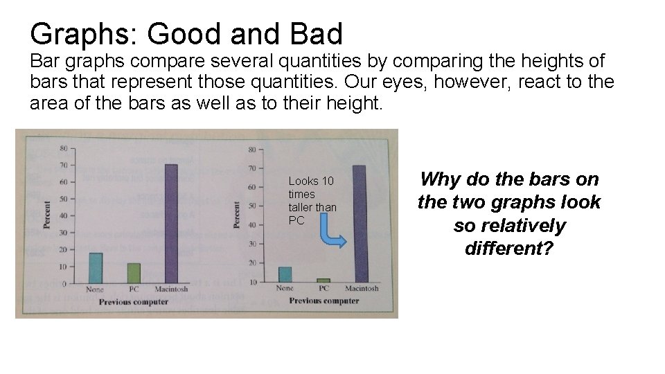
Graphs: Good and Bar graphs compare several quantities by comparing the heights of bars that represent those quantities. Our eyes, however, react to the area of the bars as well as to their height. Looks 10 times taller than PC Why do the bars on the two graphs look so relatively different?

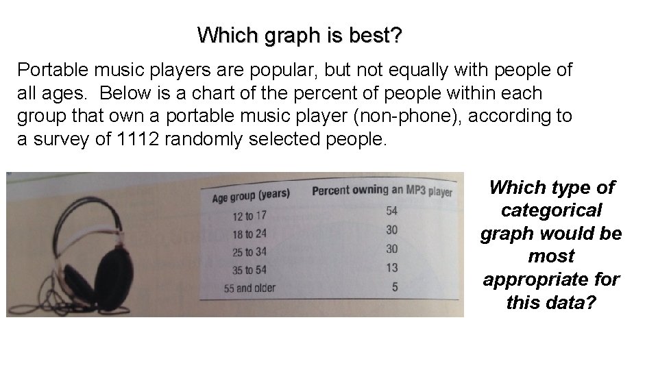
Which graph is best? Portable music players are popular, but not equally with people of all ages. Below is a chart of the percent of people within each group that own a portable music player (non-phone), according to a survey of 1112 randomly selected people. Which type of categorical graph would be most appropriate for this data?

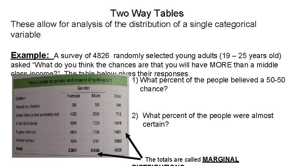
Two Way Tables These allow for analysis of the distribution of a single categorical variable Example: A survey of 4826 randomly selected young adults (19 – 25 years old) asked “What do you think the chances are that you will have MORE than a middle class income? ” The table below gives their responses. 1) What percent of the people believed a 50 -50 chance? 2) What percent of the people were almost certain? The totals are called MARGINAL

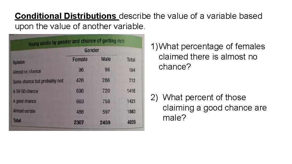
Conditional Distributions describe the value of a variable based upon the value of another variable. 1) What percentage of females claimed there is almost no chance? 2) What percent of those claiming a good chance are male?

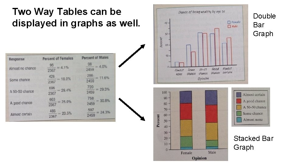
Two Way Tables can be displayed in graphs as well. Double Bar Graph Stacked Bar Graph

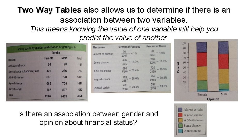
Two Way Tables also allows us to determine if there is an association between two variables. This means knowing the value of one variable will help you predict the value of another. Is there an association between gender and opinion about financial status?