Analysis of Quantitative data Anne SegondsPichon v 2020


- Slides: 146

Analysis of Quantitative data Anne Segonds-Pichon v 2020 -09

Outline of this section • Assumptions for parametric data • Comparing two means: Student’s t-test • Comparing more than 2 means • One factor: One-way ANOVA • Two factors: Two-way ANOVA • Relationship between 2 continuous variables: Correlation

Introduction • Key concepts to always keep in mind – Null hypothesis and error types – Statistics inference – Signal-to-noise ratio

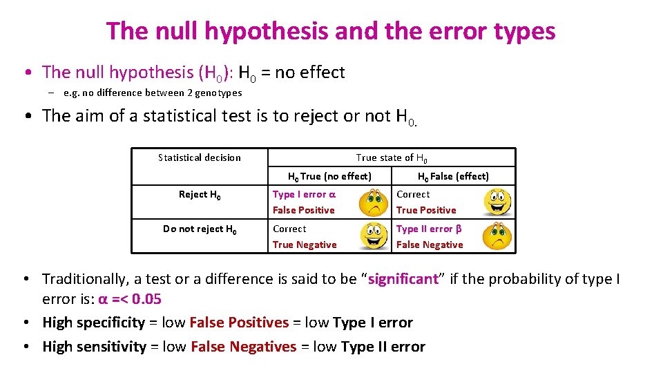
The null hypothesis and the error types • The null hypothesis (H 0): H 0 = no effect – e. g. no difference between 2 genotypes • The aim of a statistical test is to reject or not H 0. Statistical decision True state of H 0 True (no effect) H 0 False (effect) Reject H 0 Type I error α False Positive Correct True Positive Do not reject H 0 Correct True Negative Type II error β False Negative • Traditionally, a test or a difference is said to be “significant” if the probability of type I error is: α =< 0. 05 • High specificity = low False Positives = low Type I error • High sensitivity = low False Negatives = low Type II error

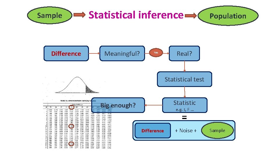
Sample Difference Statistical inference Meaningful? Yes Population Real? Statistical test Statistic Big enough? e. g. t, F … = Difference + Noise + Sample

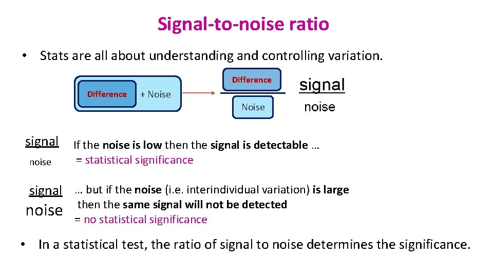
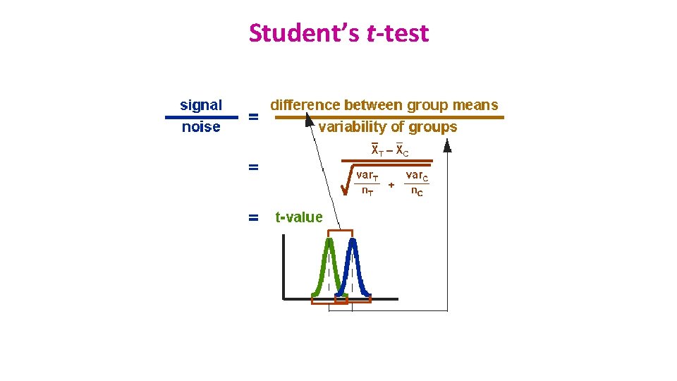
Signal-to-noise ratio • Stats are all about understanding and controlling variation. Difference + Noise signal noise If the noise is low then the signal is detectable … = statistical significance signal … but if the noise (i. e. interindividual variation) is large noise then the same signal will not be detected = no statistical significance • In a statistical test, the ratio of signal to noise determines the significance.

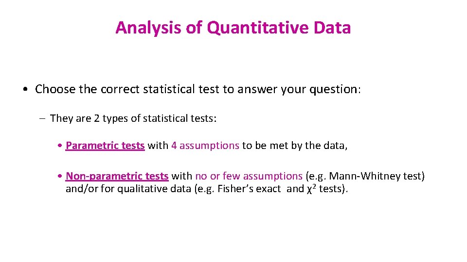
Analysis of Quantitative Data • Choose the correct statistical test to answer your question: – They are 2 types of statistical tests: • Parametric tests with 4 assumptions to be met by the data, • Non-parametric tests with no or few assumptions (e. g. Mann-Whitney test) and/or for qualitative data (e. g. Fisher’s exact and χ2 tests).

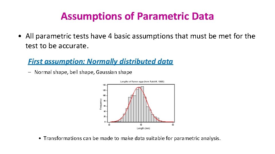
Assumptions of Parametric Data • All parametric tests have 4 basic assumptions that must be met for the test to be accurate. First assumption: Normally distributed data – Normal shape, bell shape, Gaussian shape • Transformations can be made to make data suitable for parametric analysis.

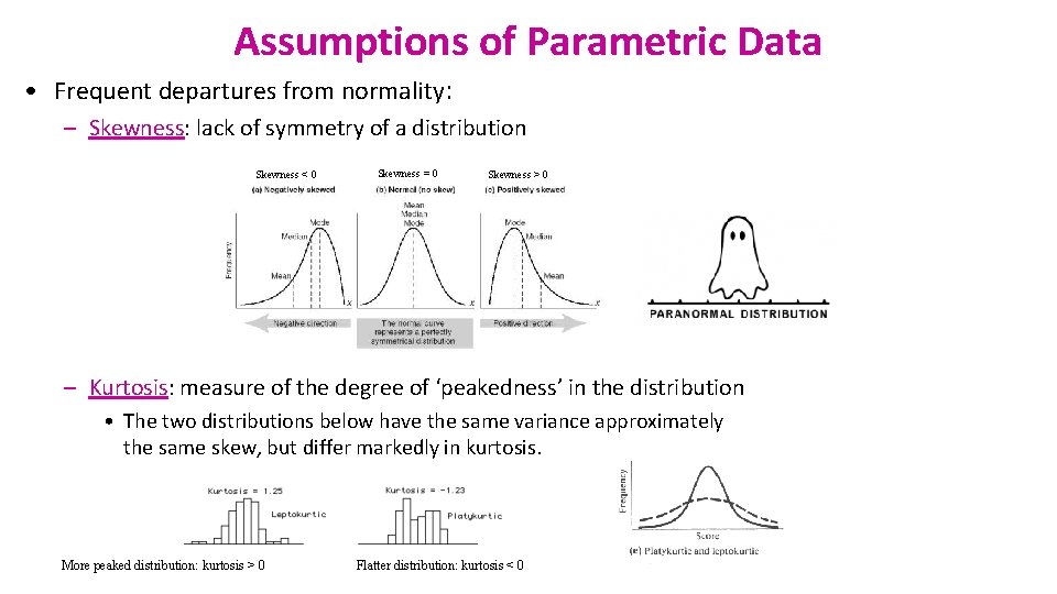
Assumptions of Parametric Data • Frequent departures from normality: – Skewness: lack of symmetry of a distribution Skewness < 0 Skewness = 0 Skewness > 0 – Kurtosis: measure of the degree of ‘peakedness’ in the distribution • The two distributions below have the same variance approximately the same skew, but differ markedly in kurtosis. More peaked distribution: kurtosis > 0 Flatter distribution: kurtosis < 0

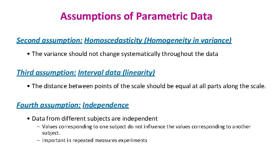
Assumptions of Parametric Data Second assumption: Homoscedasticity (Homogeneity in variance) • The variance should not change systematically throughout the data Third assumption: Interval data (linearity) • The distance between points of the scale should be equal at all parts along the scale. Fourth assumption: Independence • Data from different subjects are independent – Values corresponding to one subject do not influence the values corresponding to another subject. – Important in repeated measures experiments

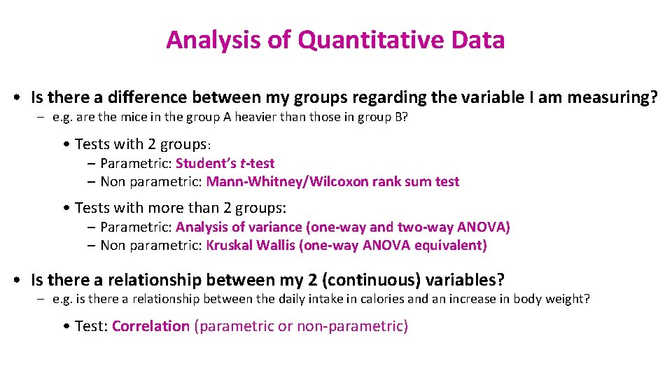
Analysis of Quantitative Data • Is there a difference between my groups regarding the variable I am measuring? – e. g. are the mice in the group A heavier than those in group B? • Tests with 2 groups: – Parametric: Student’s t-test – Non parametric: Mann-Whitney/Wilcoxon rank sum test • Tests with more than 2 groups: – Parametric: Analysis of variance (one-way and two-way ANOVA) – Non parametric: Kruskal Wallis (one-way ANOVA equivalent) • Is there a relationship between my 2 (continuous) variables? – e. g. is there a relationship between the daily intake in calories and an increase in body weight? • Test: Correlation (parametric or non-parametric)

Comparison between 2 groups

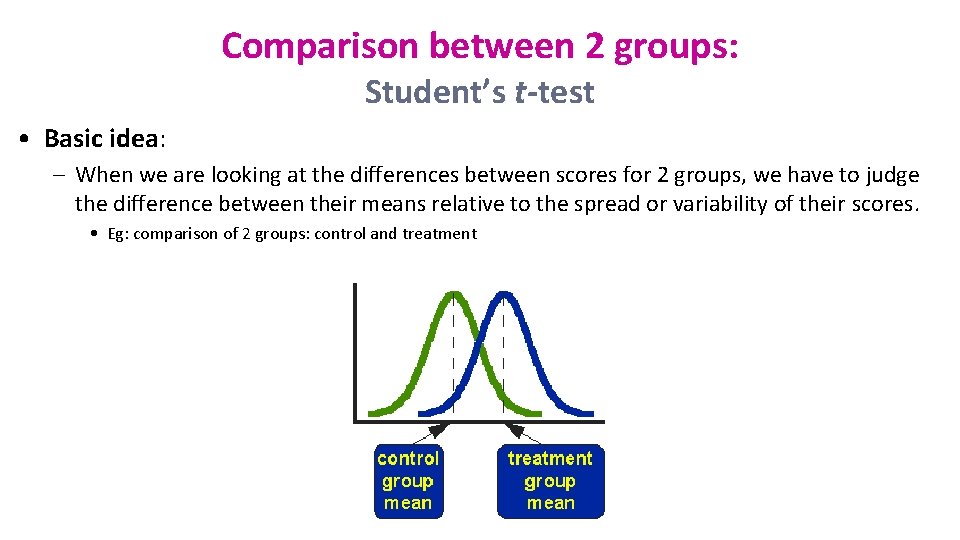
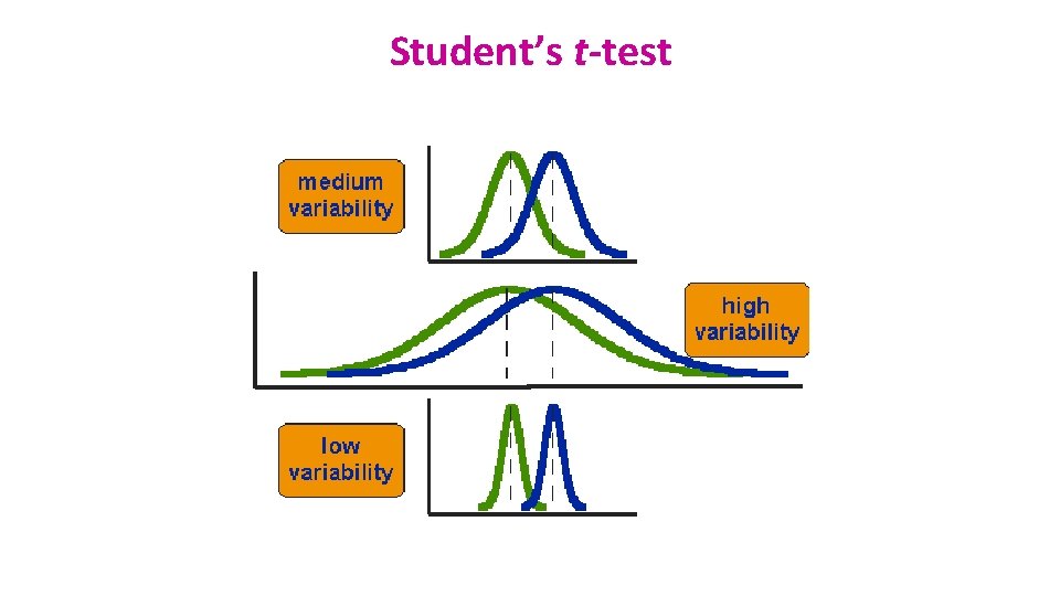
Comparison between 2 groups: Student’s t-test • Basic idea: – When we are looking at the differences between scores for 2 groups, we have to judge the difference between their means relative to the spread or variability of their scores. • Eg: comparison of 2 groups: control and treatment

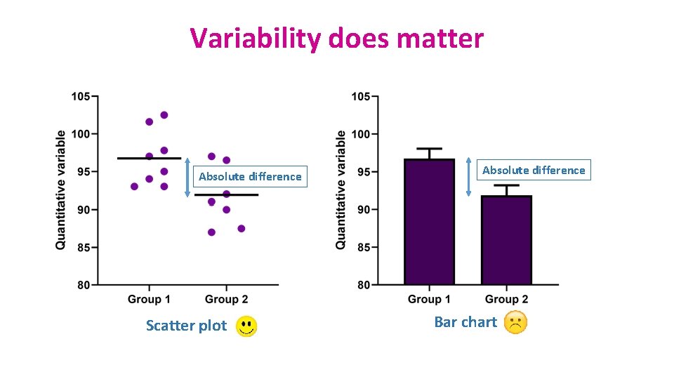
Variability does matter Absolute difference Scatter plot Absolute difference Bar chart

Student’s t-test

Student’s t-test

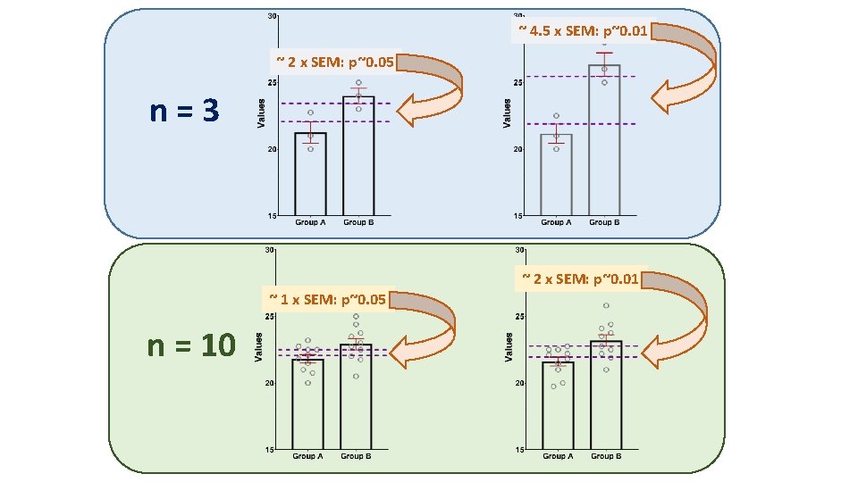
~ 4. 5 x SEM: p~0. 01 ~ 2 x SEM: p~0. 05 n=3 ~ 2 x SEM: p~0. 01 ~ 1 x SEM: p~0. 05 n = 10

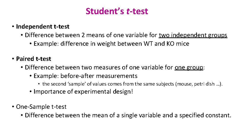
Student’s t-test • Independent t-test • Difference between 2 means of one variable for two independent groups • Example: difference in weight between WT and KO mice • Paired t-test • Difference between two measures of one variable for one group: • Example: before-after measurements • the second ‘sample’ of values comes from the same subjects (mouse, petri dish …). • Importance of experimental design! • One-Sample t-test • Difference between the mean of a single variable and a specified constant.

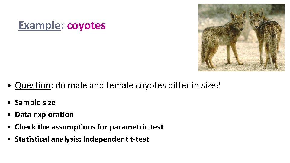
Example: coyotes • Question: do male and female coyotes differ in size? • • Sample size Data exploration Check the assumptions for parametric test Statistical analysis: Independent t-test

Exercise 3: Power analysis • Example case: No data from a pilot study but we have found some information in the literature. In a study run in similar conditions as in the one we intend to run, male coyotes were found to measure: 92 cm +/- 7 cm (SD). We expect a 5% difference between genders. • smallest biologically meaningful difference power. t. test(n = NULL, delta = NULL, sd = 1, sig. level = NULL, power = NULL, type = c("two. sample", "one. sample", "paired"), alternative = c("two. sided", "one. sided"))

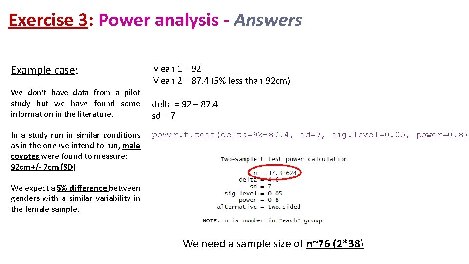
Exercise 3: Power analysis - Answers Example case: We don’t have data from a pilot study but we have found some information in the literature. In a study run in similar conditions as in the one we intend to run, male coyotes were found to measure: 92 cm+/- 7 cm (SD) Mean 1 = 92 Mean 2 = 87. 4 (5% less than 92 cm) delta = 92 – 87. 4 sd = 7 power. t. test(delta=92 -87. 4, sd=7, sig. level=0. 05, power=0. 8) We expect a 5% difference between genders with a similar variability in the female sample. We need a sample size of n~76 (2*38)


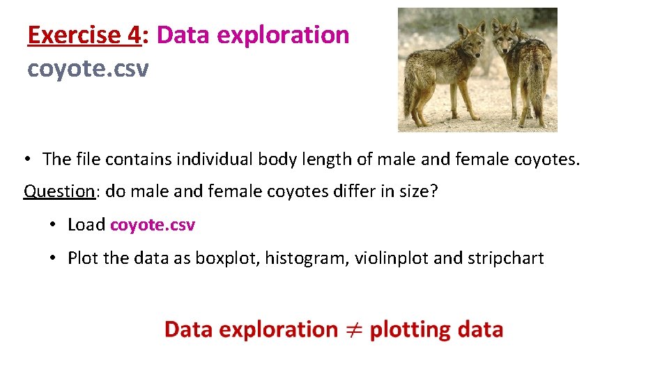
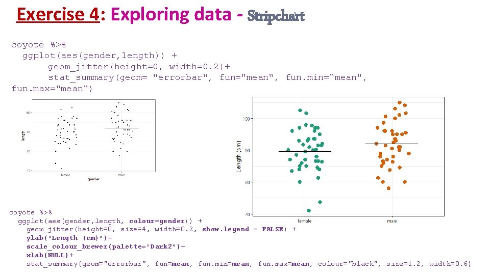
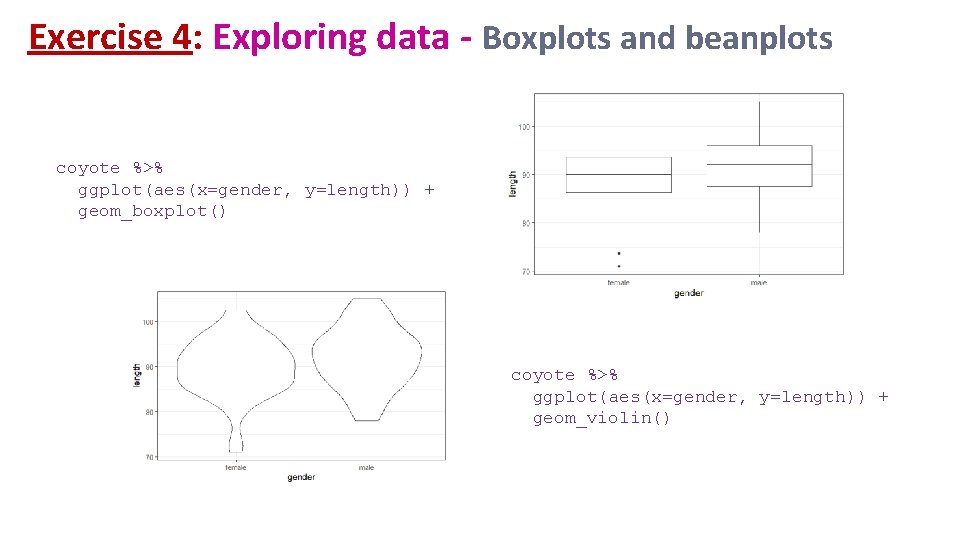
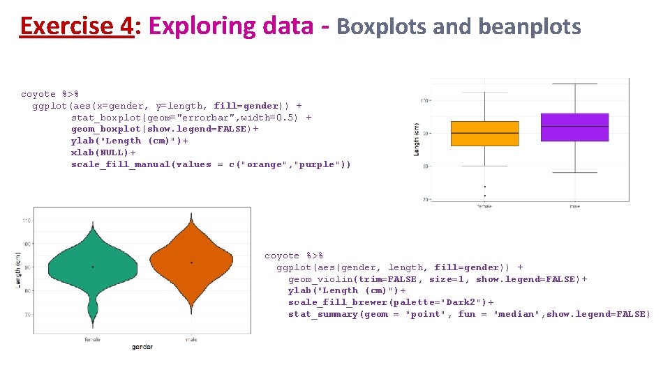
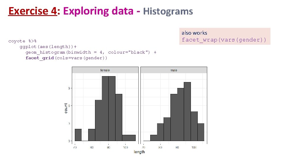
Exercise 4: Data exploration coyote. csv • The file contains individual body length of male and female coyotes. Question: do male and female coyotes differ in size? • Load coyote. csv • Plot the data as boxplot, histogram, violinplot and stripchart

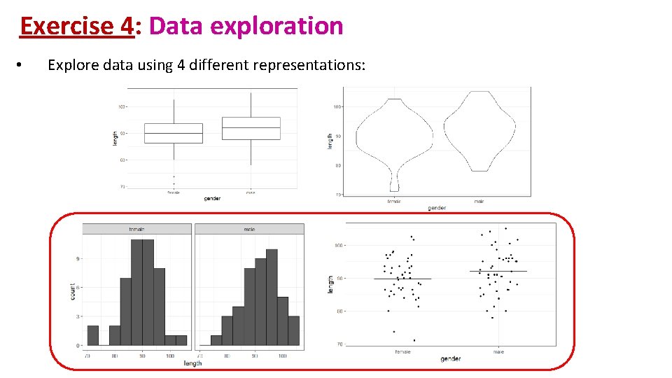
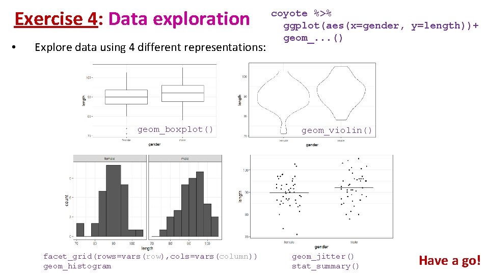
Exercise 4: Data exploration • Explore data using 4 different representations:

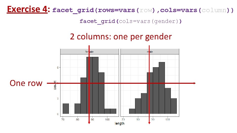
Exercise 4: facet_grid(rows=vars(row), cols=vars(column)) facet_grid(cols=vars(gender)) 2 columns: one per gender One row

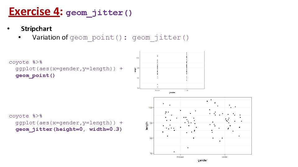
Exercise 4: geom_jitter() • Stripchart • Variation of geom_point(): geom_jitter() coyote %>% ggplot(aes(x=gender, y=length)) + geom_point() coyote %>% ggplot(aes(x=gender, y=length)) + geom_jitter(height=0, width=0. 3)

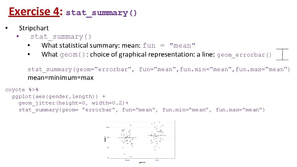
Exercise 4: stat_summary() • Stripchart • stat_summary() • What statistical summary: mean: fun = "mean" • What geom(): choice of graphical representation: a line: geom_errorbar() stat_summary(geom="errorbar", fun="mean", fun. min="mean", fun. max="mean") mean=minimum=max coyote %>% ggplot(aes(gender, length)) + geom_jitter(height=0, width=0. 2)+ stat_summary(geom= "errorbar", fun="mean", fun. min="mean", fun. max="mean")

Exercise 4: Data exploration • Explore data using 4 different representations: geom_boxplot() facet_grid(rows=vars(row), cols=vars(column)) geom_histogram coyote %>% ggplot(aes(x=gender, y=length))+ geom_. . . () geom_violin() geom_jitter() stat_summary() Have a go!

Exercise 4: Exploring data - Stripchart coyote %>% ggplot(aes(gender, length)) + geom_jitter(height=0, width=0. 2)+ stat_summary(geom= "errorbar", fun="mean", fun. min="mean", fun. max="mean") coyote %>% ggplot(aes(gender, length, colour=gender)) + geom_jitter(height=0, size=4, width=0. 2, show. legend = FALSE) + ylab("Length (cm)")+ scale_colour_brewer(palette="Dark 2")+ xlab(NULL)+ stat_summary(geom="errorbar", fun=mean, fun. min=mean, fun. max=mean, colour="black", size=1. 2, width=0. 6)

Exercise 4: Exploring data - Boxplots and beanplots coyote %>% ggplot(aes(x=gender, y=length)) + geom_boxplot() coyote %>% ggplot(aes(x=gender, y=length)) + geom_violin()

Exercise 4: Exploring data - Boxplots and beanplots coyote %>% ggplot(aes(x=gender, y=length, fill=gender)) + stat_boxplot(geom="errorbar", width=0. 5) + geom_boxplot(show. legend=FALSE)+ ylab("Length (cm)")+ xlab(NULL)+ scale_fill_manual(values = c("orange", "purple")) coyote %>% ggplot(aes(gender, length, fill=gender)) + geom_violin(trim=FALSE, size=1, show. legend=FALSE)+ ylab("Length (cm)")+ scale_fill_brewer(palette="Dark 2")+ stat_summary(geom = "point", fun = "median", show. legend=FALSE)

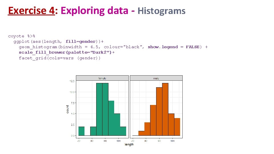
Exercise 4: Exploring data - Histograms coyote %>% ggplot(aes(length))+ geom_histogram(binwidth = 4, colour="black") + facet_grid(cols=vars(gender)) also works facet_wrap(vars(gender))

Exercise 4: Exploring data - Histograms coyote %>% ggplot(aes(length, fill=gender))+ geom_histogram(binwidth = 4. 5, colour="black", show. legend = FALSE) + scale_fill_brewer(palette="Dark 2")+ facet_grid(cols=vars (gender))

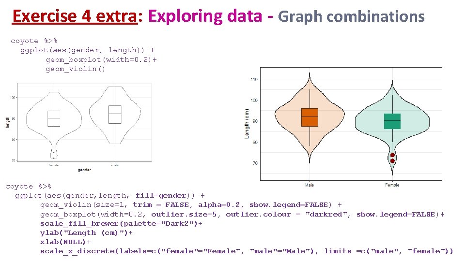
Exercise 4 extra: Exploring data - Graph combinations coyote %>% ggplot(aes(gender, length)) + geom_boxplot(width=0. 2)+ geom_violin() coyote %>% ggplot(aes(gender, length, fill=gender)) + geom_violin(size=1, trim = FALSE, alpha=0. 2, show. legend=FALSE) + geom_boxplot(width=0. 2, outlier. size=5, outlier. colour = "darkred", show. legend=FALSE)+ scale_fill_brewer(palette="Dark 2")+ ylab("Length (cm)")+ xlab(NULL)+ scale_x_discrete(labels=c("female"="Female", "male"="Male"), limits =c("male", "female"))

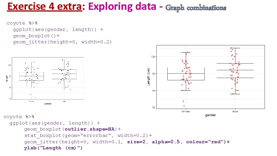
Exercise 4 extra: Exploring data - Graph combinations coyote %>% ggplot(aes(gender, length)) + geom_boxplot()+ geom_jitter(height=0, width=0. 2) coyote %>% ggplot(aes(gender, length)) + geom_boxplot(outlier. shape=NA)+ stat_boxplot(geom="errorbar", width=0. 2)+ geom_jitter(height=0, width=0. 1, size=2, alpha=0. 5, colour="red")+ ylab("Length (cm)")

Checking the assumptions

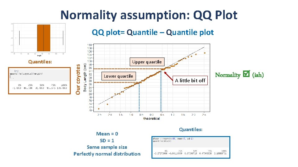
Normality assumption: QQ Plot Quantiles: Our coyotes QQ plot= Quantile – Quantile plot Upper quartile Lower quartile Mean = 0 SD = 1 Same sample size Perfectly normal distribution A little bit off Quantiles: Normality (ish)

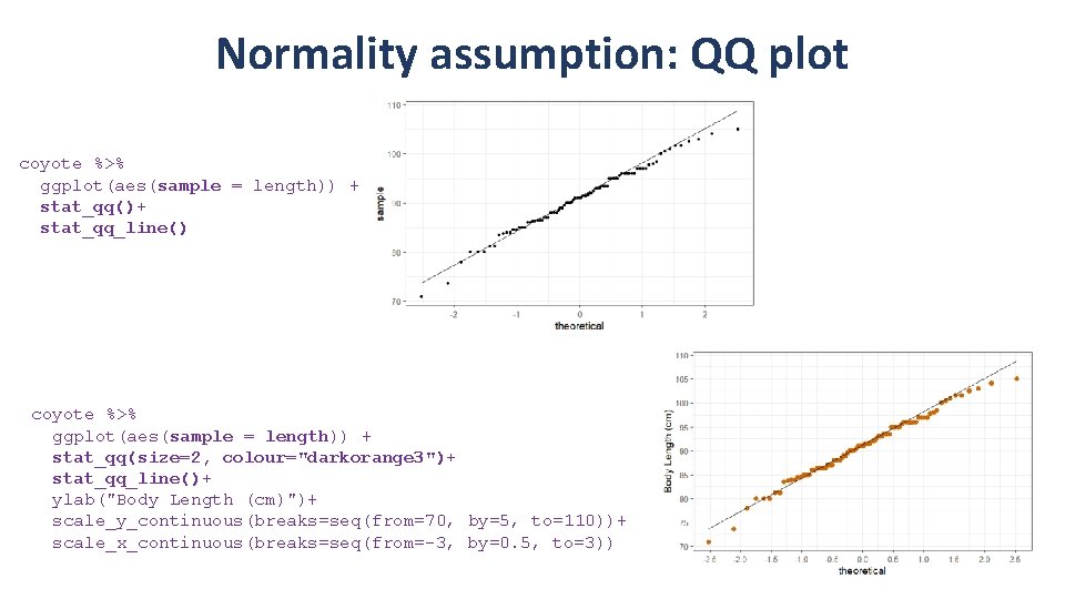
Normality assumption: QQ plot coyote %>% ggplot(aes(sample = length)) + stat_qq()+ stat_qq_line() coyote %>% ggplot(aes(sample = length)) + stat_qq(size=2, colour="darkorange 3")+ stat_qq_line()+ ylab("Body Length (cm)")+ scale_y_continuous(breaks=seq(from=70, by=5, to=110))+ scale_x_continuous(breaks=seq(from=-3, by=0. 5, to=3))

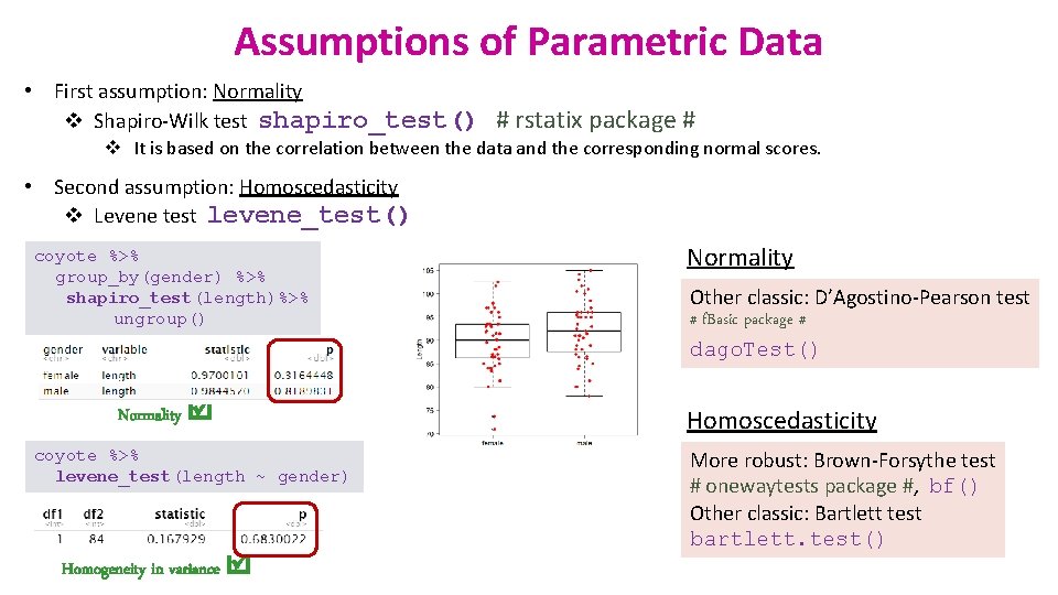
Assumptions of Parametric Data • First assumption: Normality v Shapiro-Wilk test shapiro_test() # rstatix package # v It is based on the correlation between the data and the corresponding normal scores. • Second assumption: Homoscedasticity v Levene test levene_test() coyote %>% group_by(gender) %>% shapiro_test(length)%>% ungroup() Normality coyote %>% levene_test(length ~ gender) Homogeneity in variance Normality Other classic: D’Agostino-Pearson test # f. Basic package # dago. Test() Homoscedasticity More robust: Brown-Forsythe test # onewaytests package #, bf() Other classic: Bartlett test bartlett. test()

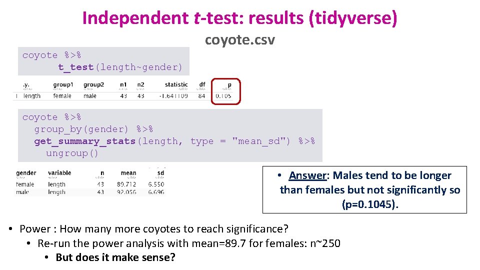
Independent t-test: results (tidyverse) coyote. csv coyote %>% t_test(length~gender) coyote %>% group_by(gender) %>% get_summary_stats(length, type = "mean_sd") %>% ungroup() • Answer: Males tend to be longer than females but not significantly so (p=0. 1045). • Power : How many more coyotes to reach significance? • Re-run the power analysis with mean=89. 7 for females: n~250 • But does it make sense?

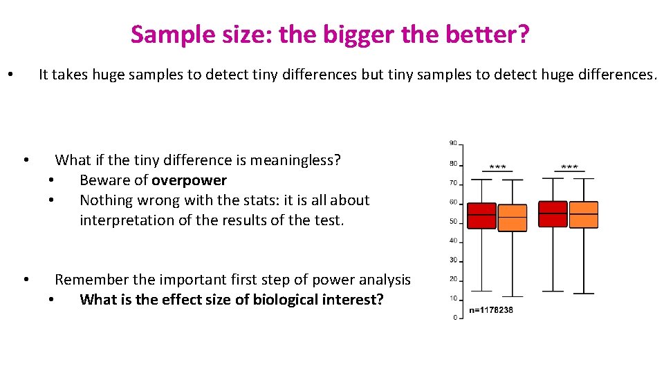
Sample size: the bigger the better? It takes huge samples to detect tiny differences but tiny samples to detect huge differences. • • What if the tiny difference is meaningless? • Beware of overpower • Nothing wrong with the stats: it is all about interpretation of the results of the test. • Remember the important first step of power analysis • What is the effect size of biological interest?

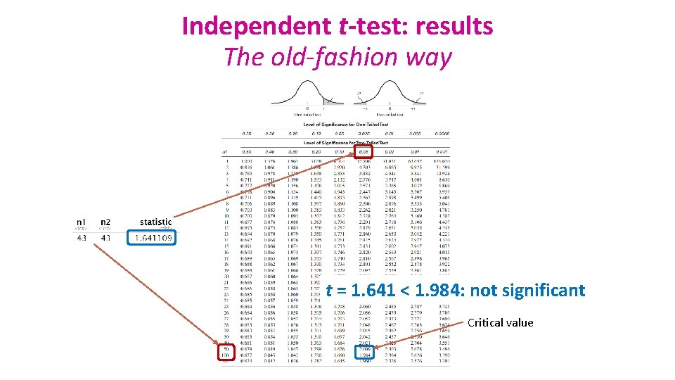
Independent t-test: results The old-fashion way t = 1. 641 < 1. 984: not significant Critical value

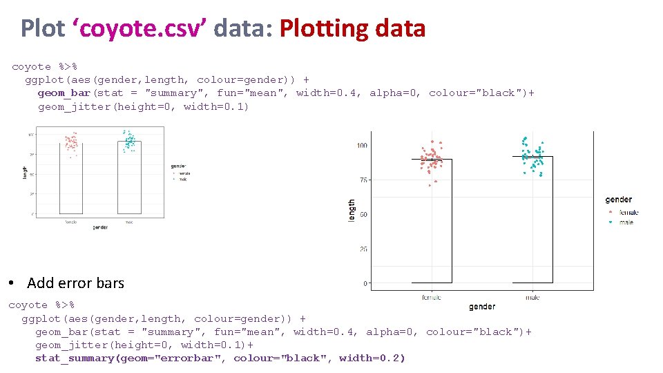
Plot ‘coyote. csv’ data: Plotting data coyote %>% ggplot(aes(gender, length, colour=gender)) + geom_bar(stat = "summary", fun="mean", width=0. 4, alpha=0, colour="black")+ geom_jitter(height=0, width=0. 1) • Add error bars coyote %>% ggplot(aes(gender, length, colour=gender)) + geom_bar(stat = "summary", fun="mean", width=0. 4, alpha=0, colour="black")+ geom_jitter(height=0, width=0. 1)+ stat_summary(geom="errorbar", colour="black", width=0. 2)

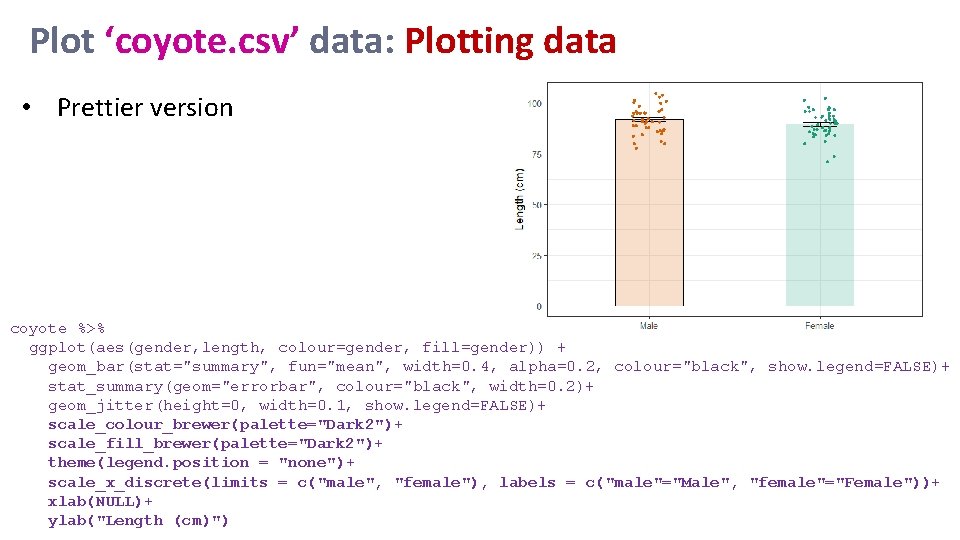
Plot ‘coyote. csv’ data: Plotting data • Prettier version coyote %>% ggplot(aes(gender, length, colour=gender, fill=gender)) + geom_bar(stat="summary", fun="mean", width=0. 4, alpha=0. 2, colour="black", show. legend=FALSE)+ stat_summary(geom="errorbar", colour="black", width=0. 2)+ geom_jitter(height=0, width=0. 1, show. legend=FALSE)+ scale_colour_brewer(palette="Dark 2")+ scale_fill_brewer(palette="Dark 2")+ theme(legend. position = "none")+ scale_x_discrete(limits = c("male", "female"), labels = c("male"="Male", "female"="Female"))+ xlab(NULL)+ ylab("Length (cm)")

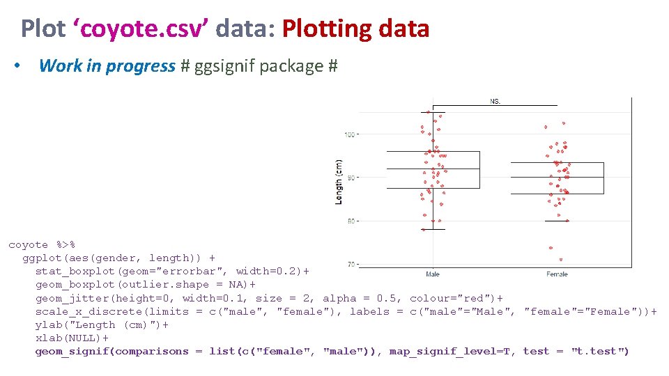
Plot ‘coyote. csv’ data: Plotting data • Work in progress # ggsignif package # coyote %>% ggplot(aes(gender, length)) + stat_boxplot(geom="errorbar", width=0. 2)+ geom_boxplot(outlier. shape = NA)+ geom_jitter(height=0, width=0. 1, size = 2, alpha = 0. 5, colour="red")+ scale_x_discrete(limits = c("male", "female"), labels = c("male"="Male", "female"="Female"))+ ylab("Length (cm)")+ xlab(NULL)+ geom_signif(comparisons = list(c("female", "male")), map_signif_level=T, test = "t. test")

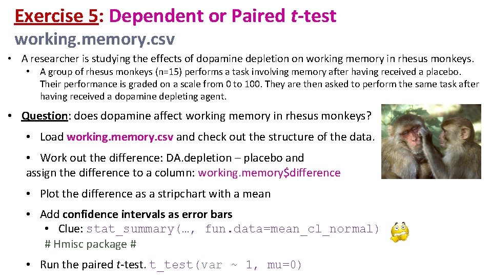
Exercise 5: Dependent or Paired t-test working. memory. csv • A researcher is studying the effects of dopamine depletion on working memory in rhesus monkeys. • A group of rhesus monkeys (n=15) performs a task involving memory after having received a placebo. Their performance is graded on a scale from 0 to 100. They are then asked to perform the same task after having received a dopamine depleting agent. • Question: does dopamine affect working memory in rhesus monkeys? • Load working. memory. csv and check out the structure of the data. • Work out the difference: DA. depletion – placebo and assign the difference to a column: working. memory$difference • Plot the difference as a stripchart with a mean • Add confidence intervals as error bars • Clue: stat_summary(…, fun. data=mean_cl_normal) # Hmisc package # • Run the paired t-test. t_test(var ~ 1, mu=0)

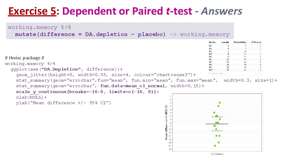
Exercise 5: Dependent or Paired t-test - Answers working. memory %>% mutate(difference = DA. depletion - placebo) -> working. memory # Hmisc package # working. memory %>% ggplot(aes("DA. Depletion", difference))+ geom_jitter(height=0, width=0. 05, size=4, colour="chartreuse 3")+ stat_summary(geom="errorbar", fun="mean", fun. min="mean", fun. max="mean", stat_summary(geom="errorbar", fun. data=mean_cl_normal, width=0. 15)+ scale_y_continuous(breaks=-16: 0, limits=c(-16, 0))+ xlab(NULL)+ ylab("Mean difference +/- 95% CI") width=0. 3, size=1)+

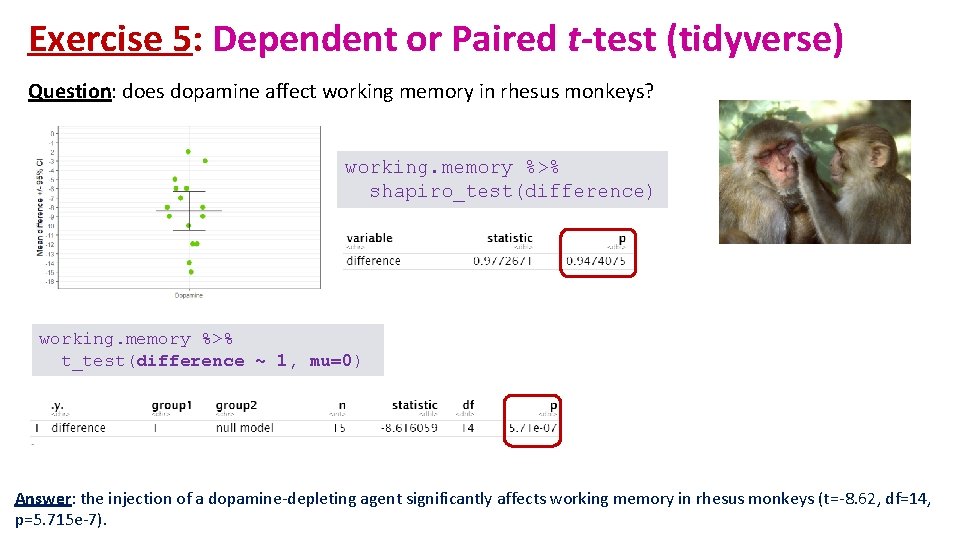
Exercise 5: Dependent or Paired t-test (tidyverse) Question: does dopamine affect working memory in rhesus monkeys? working. memory %>% shapiro_test(difference) working. memory %>% t_test(difference ~ 1, mu=0) Answer: the injection of a dopamine-depleting agent significantly affects working memory in rhesus monkeys (t=-8. 62, df=14, p=5. 715 e-7).

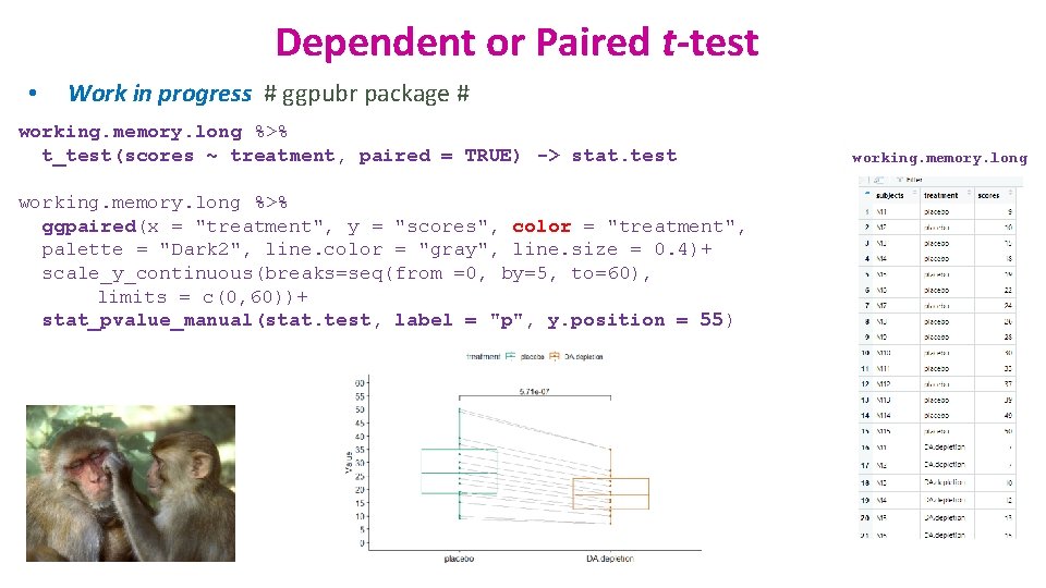
Dependent or Paired t-test • Work in progress # ggpubr package # working. memory. long %>% t_test(scores ~ treatment, paired = TRUE) -> stat. test working. memory. long %>% ggpaired(x = "treatment", y = "scores", color = "treatment", palette = "Dark 2", line. color = "gray", line. size = 0. 4)+ scale_y_continuous(breaks=seq(from =0, by=5, to=60), limits = c(0, 60))+ stat_pvalue_manual(stat. test, label = "p", y. position = 55) working. memory. long

Comparison between more than 2 groups One factor = One predictor One-Way ANOVA

Signal-to-noise ratio Difference Variability Signal Noise Signal = Noise = statistical significance = no statistical significance

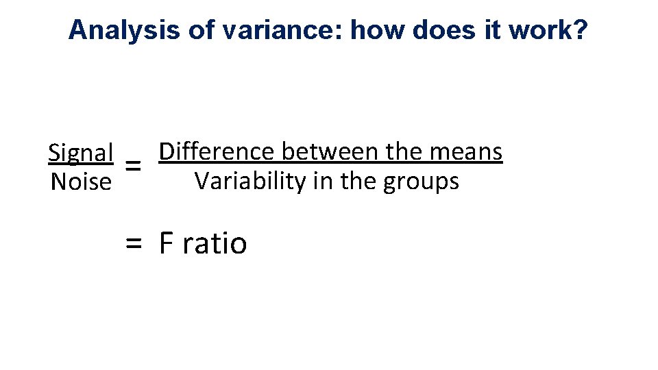
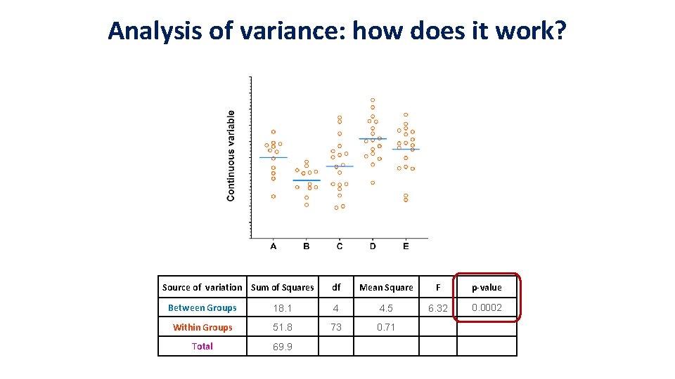
Analysis of variance: how does it work? Signal Noise = Difference between the means Variability in the groups = F ratio

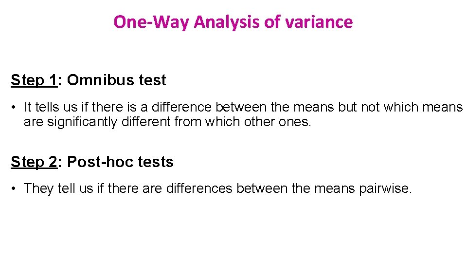
One-Way Analysis of variance Step 1: Omnibus test • It tells us if there is a difference between the means but not which means are significantly different from which other ones. Step 2: Post-hoc tests • They tell us if there are differences between the means pairwise.

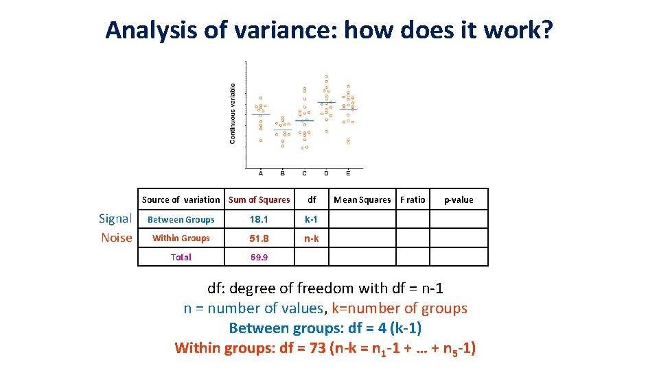
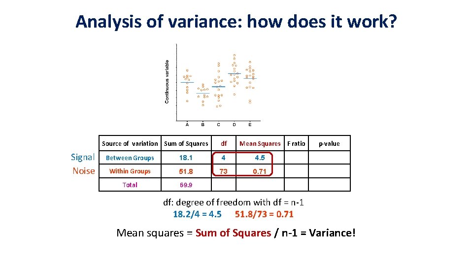
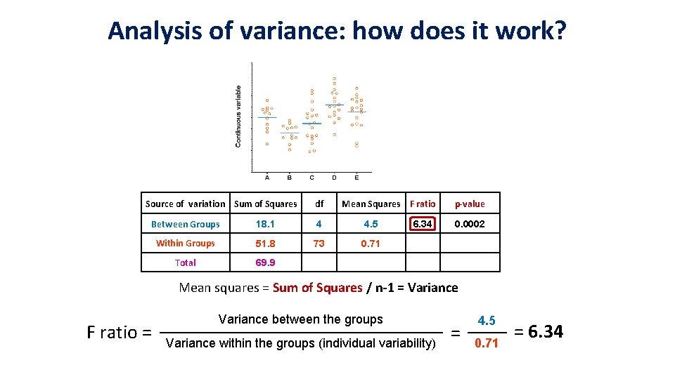
Analysis of variance: how does it work? Source of variation Sum of Squares df Mean Square F p-value 6. 32 0. 0002 Between Groups 18. 1 4 4. 5 Within Groups 51. 8 73 0. 71 Total 69. 9

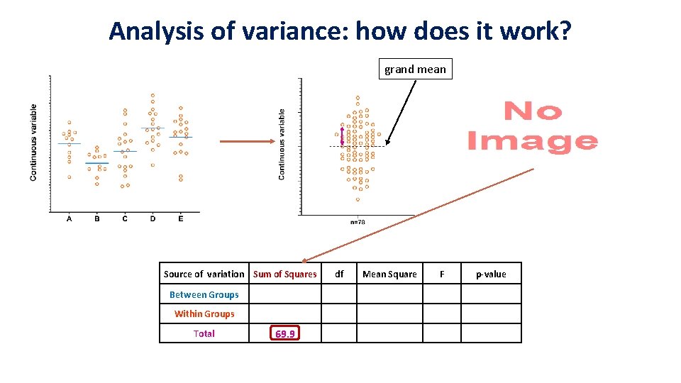
Analysis of variance: how does it work? grand mean Source of variation Sum of Squares Between Groups Within Groups Total 69. 9 df Mean Square F p-value

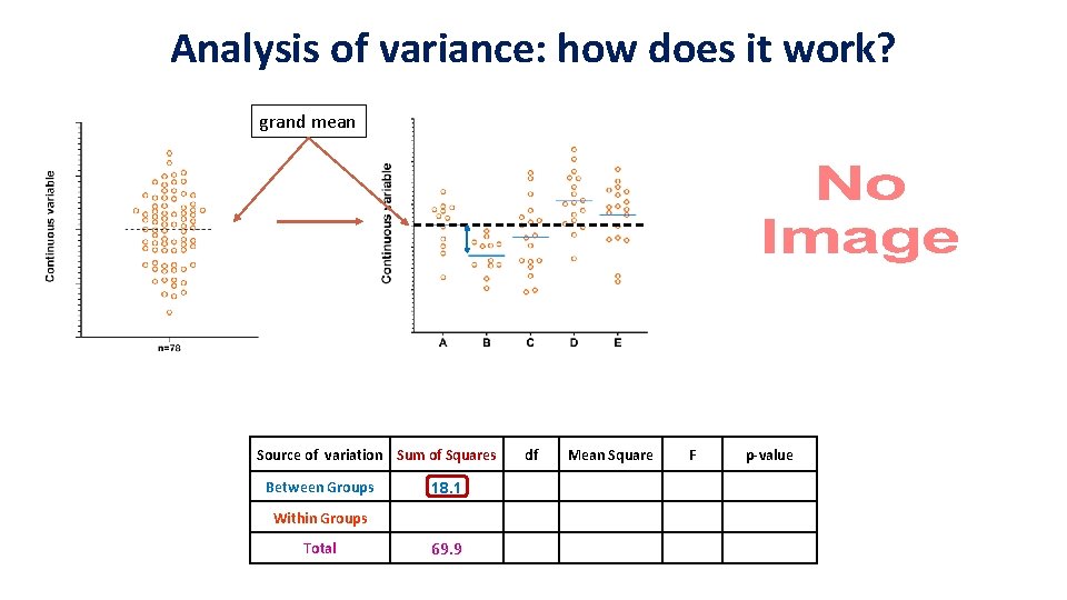
Analysis of variance: how does it work? grand mean Source of variation Sum of Squares Between Groups 18. 1 Within Groups Total 69. 9 df Mean Square F p-value

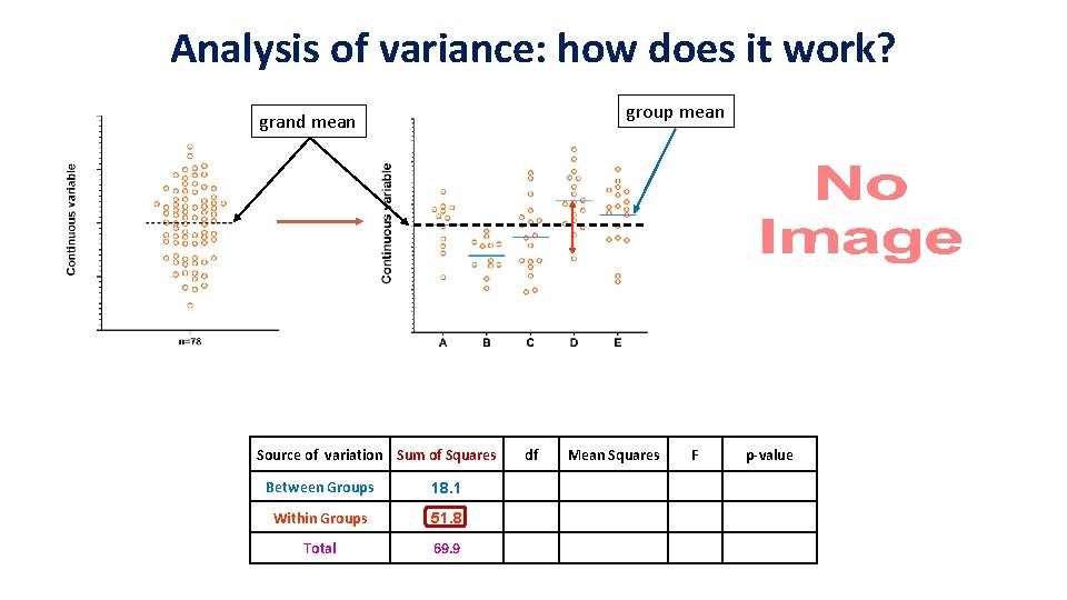
Analysis of variance: how does it work? group mean grand mean Source of variation Sum of Squares Between Groups 18. 1 Within Groups 51. 8 Total 69. 9 df Mean Squares F p-value

Analysis of variance: how does it work? Source of variation Sum of Squares Signal Noise df Between Groups 18. 1 k-1 Within Groups 51. 8 n-k Total 69. 9 Mean Squares F ratio p-value df: degree of freedom with df = n-1 n = number of values, k=number of groups Between groups: df = 4 (k-1) Within groups: df = 73 (n-k = n 1 -1 + … + n 5 -1)

Analysis of variance: how does it work? Source of variation Sum of Squares Signal Noise df Mean Squares F ratio Between Groups 18. 1 4 4. 5 Within Groups 51. 8 73 0. 71 Total 69. 9 p-value df: degree of freedom with df = n-1 18. 2/4 = 4. 5 51. 8/73 = 0. 71 Mean squares = Sum of Squares / n-1 = Variance!

Analysis of variance: how does it work? Source of variation Sum of Squares df Mean Squares F ratio Between Groups 18. 1 4 4. 5 Within Groups 51. 8 73 0. 71 Total 69. 9 6. 34 p-value 0. 0002 Mean squares = Sum of Squares / n-1 = Variance F ratio = Variance between the groups Variance within the groups (individual variability) = 4. 5 0. 71 = 6. 34

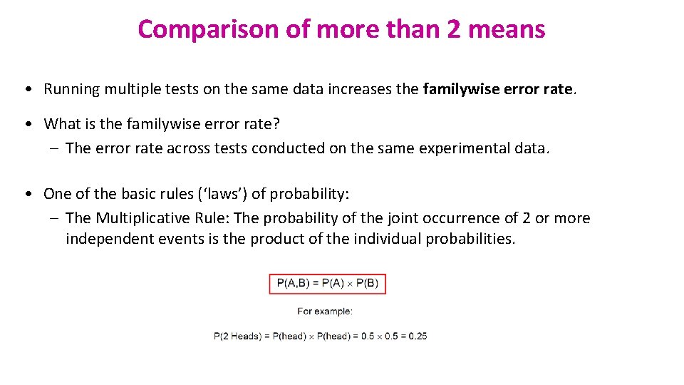
Comparison of more than 2 means • Running multiple tests on the same data increases the familywise error rate. • What is the familywise error rate? – The error rate across tests conducted on the same experimental data. • One of the basic rules (‘laws’) of probability: – The Multiplicative Rule: The probability of the joint occurrence of 2 or more independent events is the product of the individual probabilities.

Familywise error rate • Example: All pairwise comparisons between 3 groups A, B and C: – A-B, A-C and B-C • Probability of making the Type I Error: 5% – The probability of not making the Type I Error is 95% (=1 – 0. 05) • Multiplicative Rule: – Overall probability of no Type I errors is: 0. 95 * 0. 95 = 0. 857 • So the probability of making at least one Type I Error is 1 -0. 857 = 0. 143 or 14. 3% • The probability has increased from 5% to 14. 3% • Comparisons between 5 groups instead of 3, the familywise error rate is 40% (=1 -(0. 95)n)

Familywise error rate • Solution to the increase of familywise error rate: correction for multiple comparisons – Post-hoc tests • Many different ways to correct for multiple comparisons: – Different statisticians have designed corrections addressing different issues • e. g. unbalanced design, heterogeneity of variance, liberal vs conservative • However, they all have one thing in common: – the more tests, the higher the familywise error rate: the more stringent the correction • Tukey, Bonferroni, Sidak, Benjamini-Hochberg … – Two ways to address the multiple testing problem • Familywise Error Rate (FWER) vs. False Discovery Rate (FDR)

Multiple testing problem • FWER: Bonferroni: αadjust = 0. 05/n comparisons e. g. 3 comparisons: 0. 05/3=0. 016 – Problem: very conservative leading to loss of power (lots of false negative) – 10 comparisons: threshold for significance: 0. 05/10: 0. 005 – Pairwise comparisons across 20. 000 genes • FDR: Benjamini-Hochberg: the procedure controls the expected proportion of “discoveries” (significant tests) that are false (false positive). – Less stringent control of Type I Error than FWER procedures which control the probability of at least one Type I Error – More power at the cost of increased numbers of Type I Errors. • Difference between FWER and FDR: – a p-value of 0. 05 implies that 5% of all tests will result in false positives. – a FDR adjusted p-value (or q-value) of 0. 05 implies that 5% of significant tests will result in false positives.

One-Way Analysis of variance Step 1: Omnibus test • It tells us if there is (or not) a difference between the means but not which means are significantly different from which other ones. Step 2: Post-hoc tests • They tell us if there are (or not) differences between the means pairwise. • A correction for multiple comparisons will be applied on the p-values. • These post hoc tests should only be used when the ANOVA finds a significant effect.

Example: protein. expression. csv • Question: is there a difference in protein expression between the 5 cell lines? • 1 Plot the data • 2 Check the assumptions for parametric test

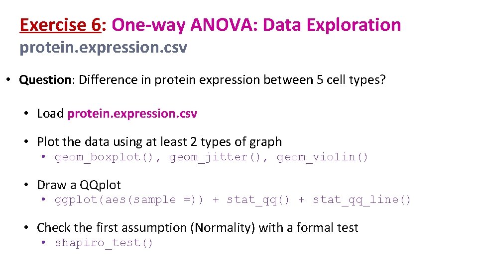
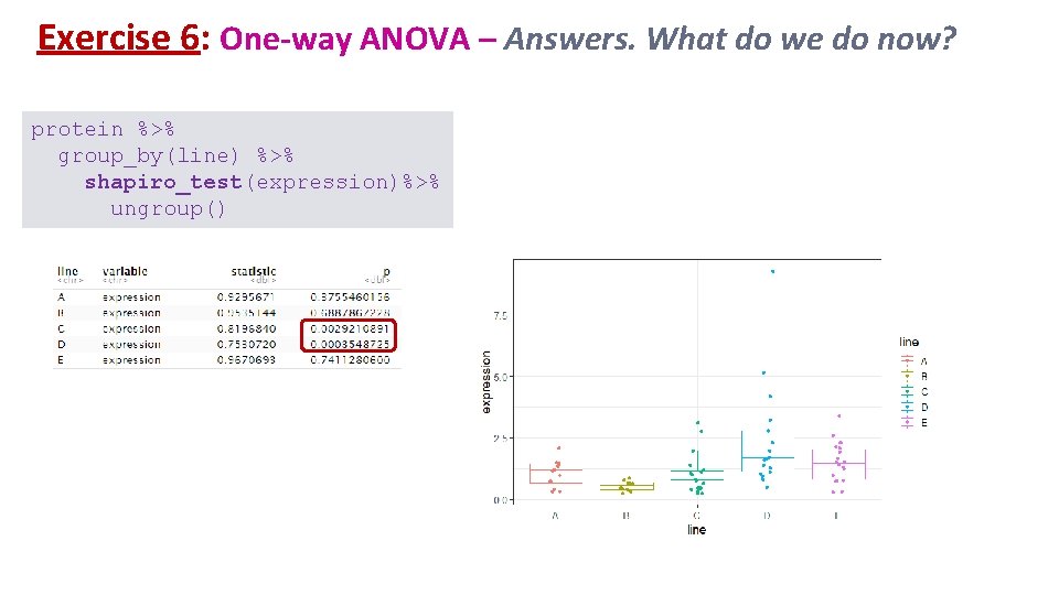
Exercise 6: One-way ANOVA: Data Exploration protein. expression. csv • Question: Difference in protein expression between 5 cell types? • Load protein. expression. csv • Plot the data using at least 2 types of graph • geom_boxplot(), geom_jitter(), geom_violin() • Draw a QQplot • ggplot(aes(sample =)) + stat_qq() + stat_qq_line() • Check the first assumption (Normality) with a formal test • shapiro_test()

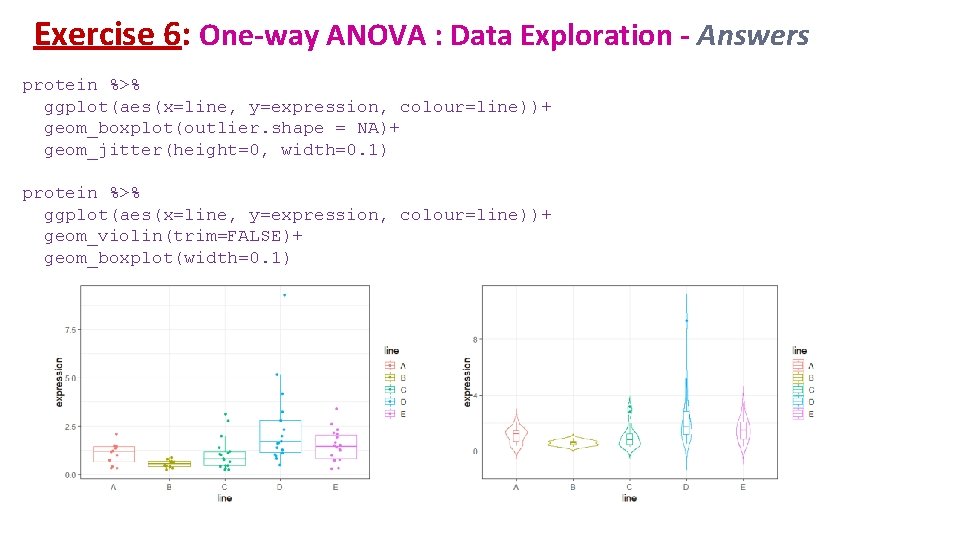
Exercise 6: One-way ANOVA : Data Exploration - Answers protein %>% ggplot(aes(x=line, y=expression, colour=line))+ geom_boxplot(outlier. shape = NA)+ geom_jitter(height=0, width=0. 1) protein %>% ggplot(aes(x=line, y=expression, colour=line))+ geom_violin(trim=FALSE)+ geom_boxplot(width=0. 1)

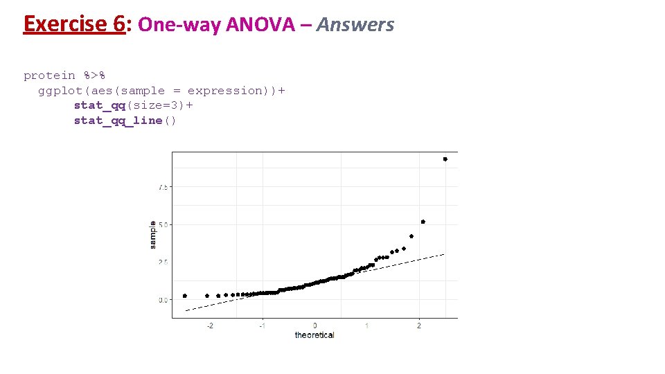
Exercise 6: One-way ANOVA – Answers protein %>% ggplot(aes(sample = expression))+ stat_qq(size=3)+ stat_qq_line()

Exercise 6: One-way ANOVA – Answers. What do we do now? protein %>% group_by(line) %>% shapiro_test(expression)%>% ungroup()

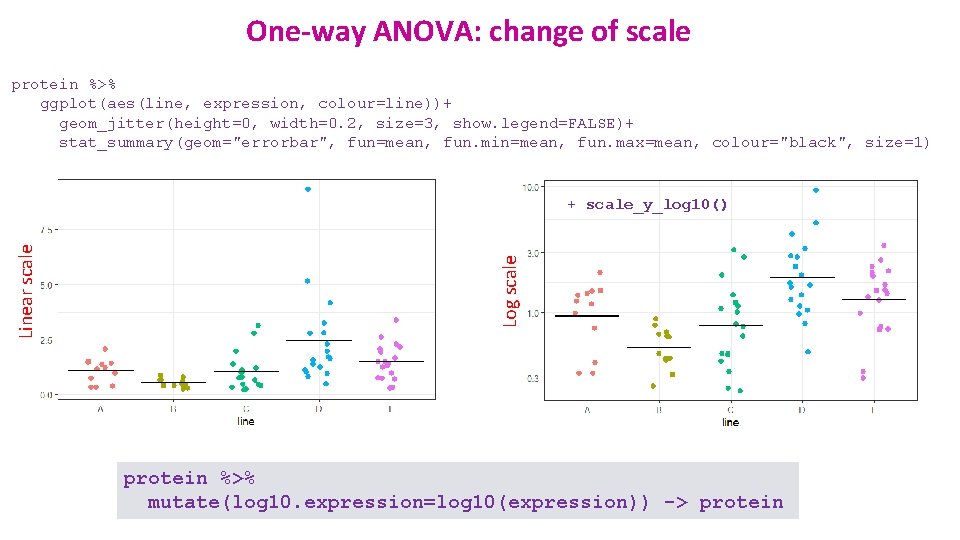
One-way ANOVA: change of scale protein %>% ggplot(aes(line, expression, colour=line))+ geom_jitter(height=0, width=0. 2, size=3, show. legend=FALSE)+ stat_summary(geom="errorbar", fun=mean, fun. min=mean, fun. max=mean, colour="black", size=1) Log scale Linear scale + scale_y_log 10() protein %>% mutate(log 10. expression=log 10(expression)) -> protein

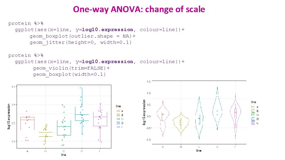
One-way ANOVA: change of scale protein %>% ggplot(aes(x=line, y=log 10. expression, colour=line))+ geom_boxplot(outlier. shape = NA)+ geom_jitter(height=0, width=0. 1) protein %>% ggplot(aes(x=line, y=log 10. expression, colour=line))+ geom_violin(trim=FALSE)+ geom_boxplot(width=0. 1)

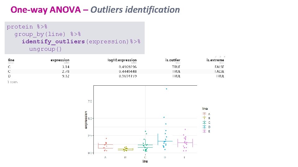
One-way ANOVA – Outliers identification protein %>% group_by(line) %>% identify_outliers(expression)%>% ungroup()

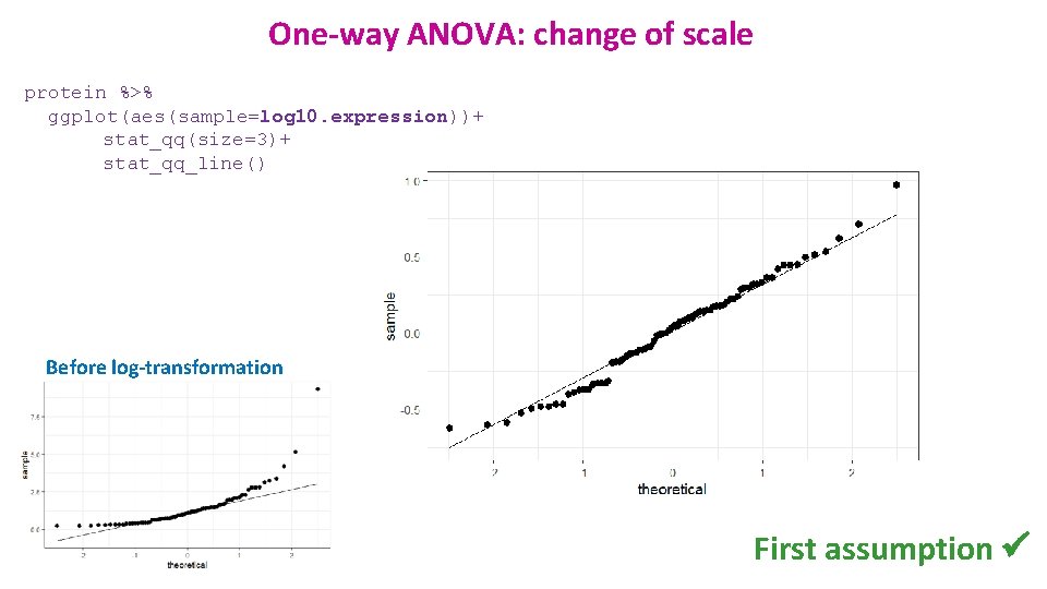
One-way ANOVA: change of scale protein %>% ggplot(aes(sample=log 10. expression))+ stat_qq(size=3)+ stat_qq_line() Before log-transformation First assumption ü

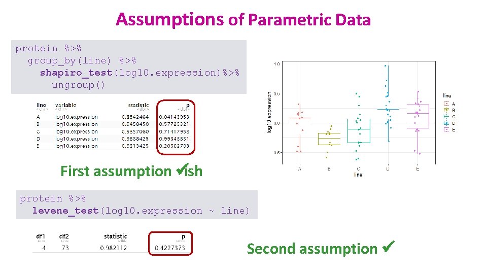
Assumptions of Parametric Data protein %>% group_by(line) %>% shapiro_test(log 10. expression)%>% ungroup() First assumption üish protein %>% levene_test(log 10. expression ~ line) Second assumption ü

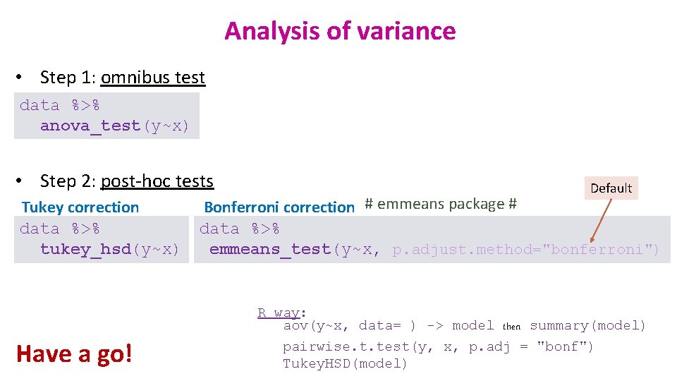
Analysis of variance • Step 1: omnibus test data %>% anova_test(y~x) • Step 2: post-hoc tests Tukey correction data %>% tukey_hsd(y~x) Have a go! Default Bonferroni correction # emmeans package # data %>% emmeans_test(y~x, p. adjust. method="bonferroni") R way: aov(y~x, data= ) -> model then summary(model) pairwise. t. test(y, x, p. adj = "bonf") Tukey. HSD(model)

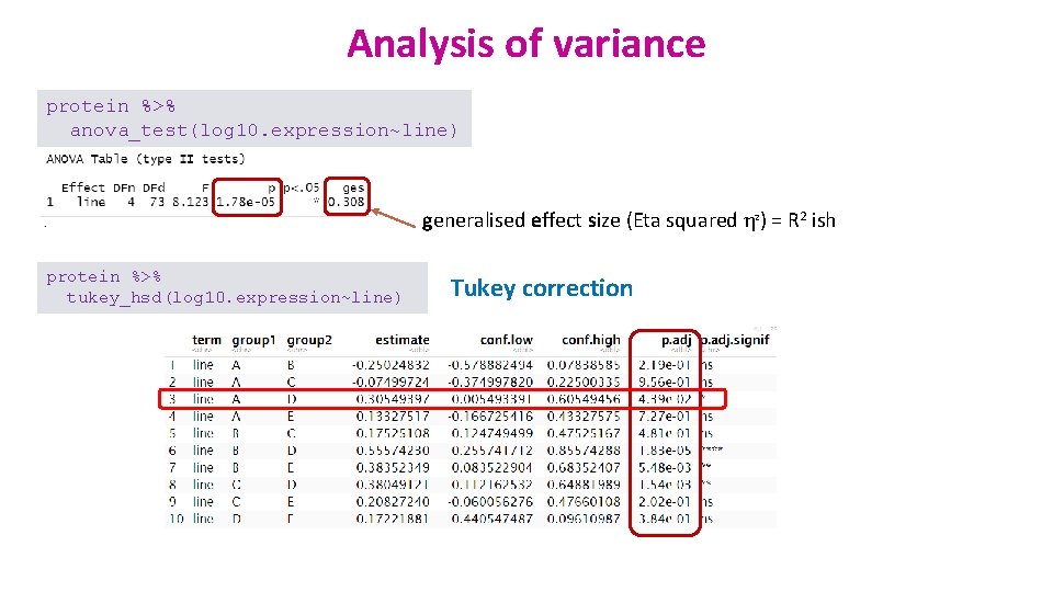
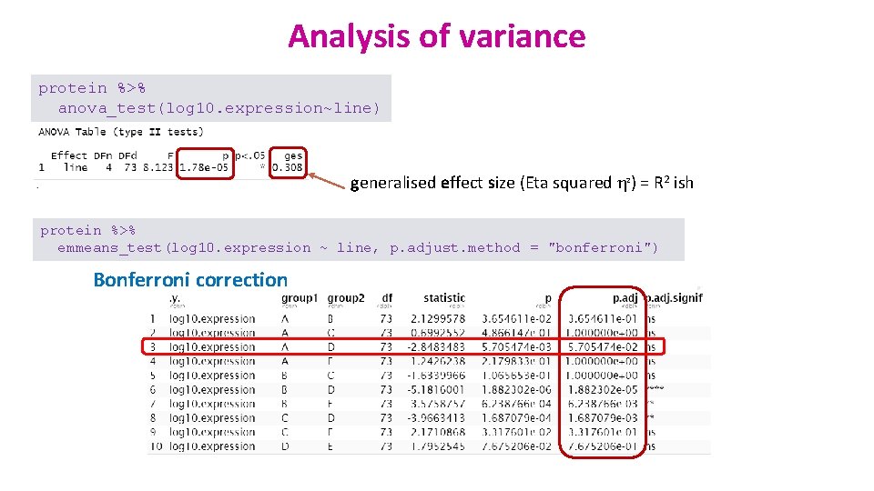
Analysis of variance protein %>% anova_test(log 10. expression~line) generalised effect size (Eta squared η 2) = R 2 ish protein %>% tukey_hsd(log 10. expression~line) Tukey correction

Analysis of variance protein %>% anova_test(log 10. expression~line) generalised effect size (Eta squared η 2) = R 2 ish protein %>% emmeans_test(log 10. expression ~ line, p. adjust. method = "bonferroni") Bonferroni correction

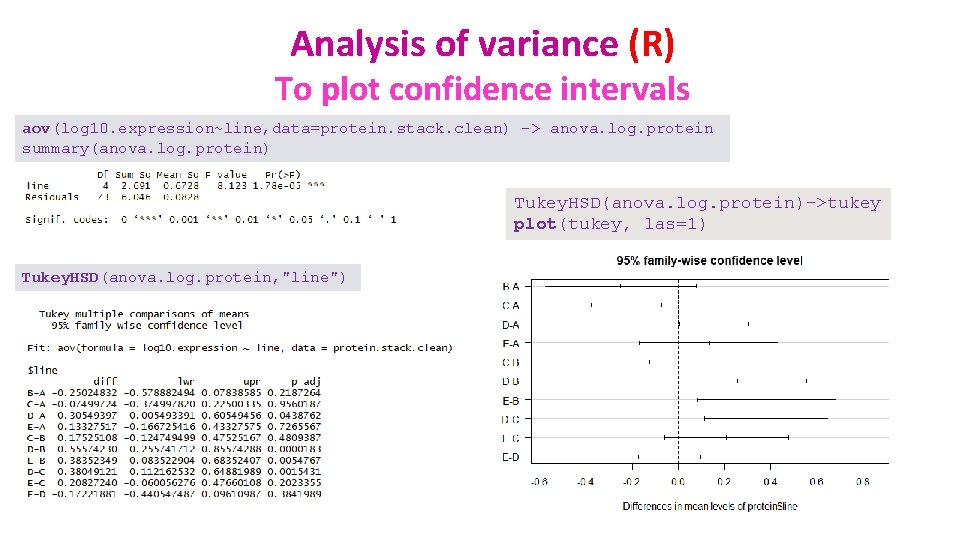
Analysis of variance (R) To plot confidence intervals aov(log 10. expression~line, data=protein. stack. clean) -> anova. log. protein summary(anova. log. protein) Tukey. HSD(anova. log. protein)->tukey plot(tukey, las=1) Tukey. HSD(anova. log. protein, "line")

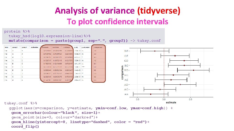
Analysis of variance (tidyverse) To plot confidence intervals protein %>% tukey_hsd(log 10. expression~line)%>% mutate(comparison = paste(group 1, sep=". ", group 2)) -> tukey. conf %>% ggplot(aes(x=comparison, y=estimate, ymin=conf. low, ymax=conf. high)) + geom_errorbar(colour="black", size=1)+ geom_point(size=3, colour="darkred")+ geom_hline(yintercept=0, linetype="dashed", color = "red")+ coord_flip()

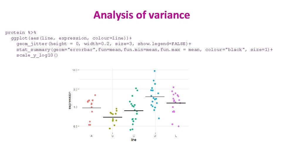
Analysis of variance protein %>% ggplot(aes(line, expression, colour=line))+ geom_jitter(height = 0, width=0. 2, size=3, show. legend=FALSE)+ stat_summary(geom="errorbar", fun=mean, fun. min=mean, fun. max = mean, colour="black", size=1)+ scale_y_log 10()

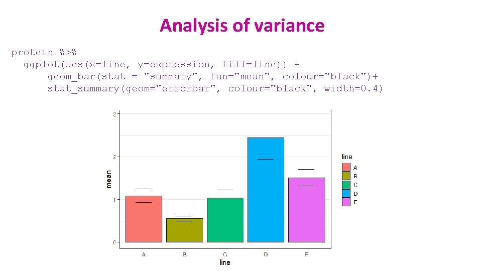
Analysis of variance protein %>% ggplot(aes(x=line, y=expression, fill=line)) + geom_bar(stat = "summary", fun="mean", colour="black")+ stat_summary(geom="errorbar", colour="black", width=0. 4)

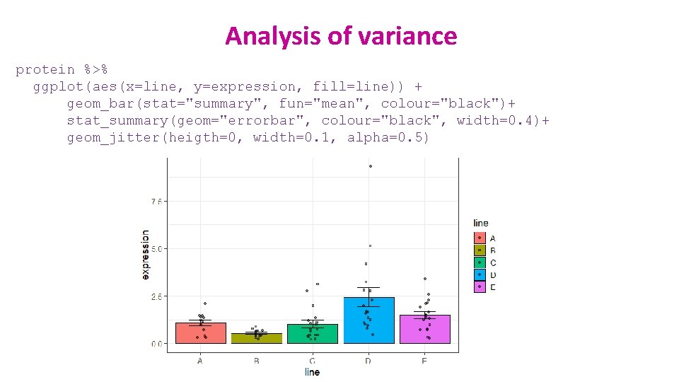
Analysis of variance protein %>% ggplot(aes(x=line, y=expression, fill=line)) + geom_bar(stat="summary", fun="mean", colour="black")+ stat_summary(geom="errorbar", colour="black", width=0. 4)+ geom_jitter(heigth=0, width=0. 1, alpha=0. 5)

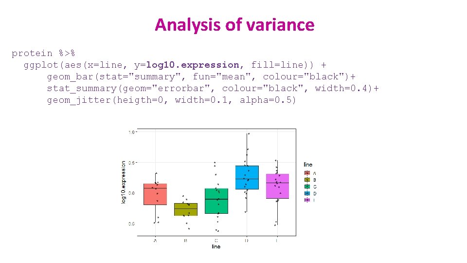
Analysis of variance protein %>% ggplot(aes(x=line, y=log 10. expression, fill=line)) + geom_bar(stat="summary", fun="mean", colour="black")+ stat_summary(geom="errorbar", colour="black", width=0. 4)+ geom_jitter(heigth=0, width=0. 1, alpha=0. 5)

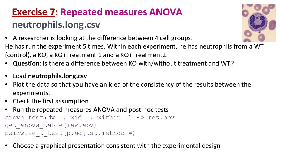
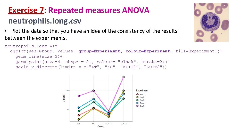
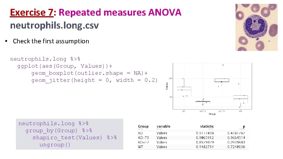
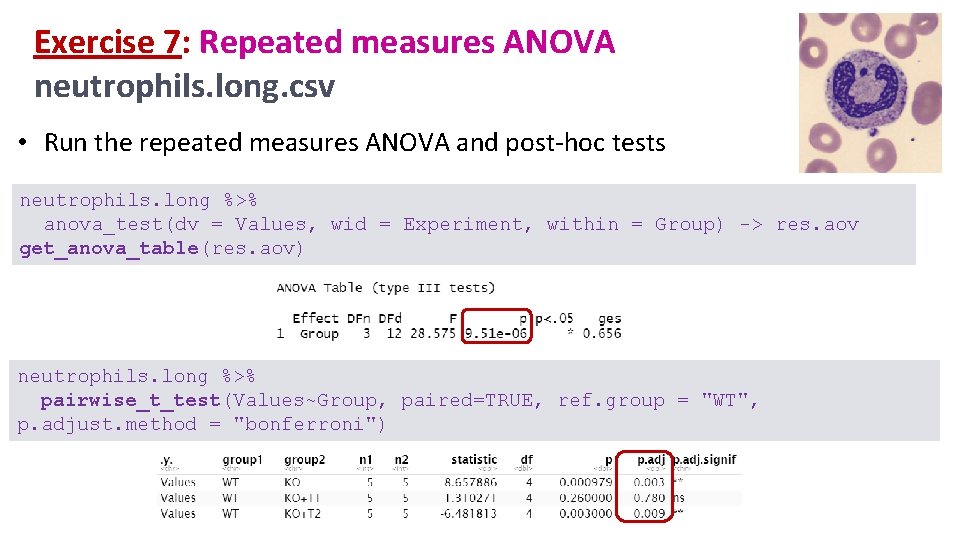
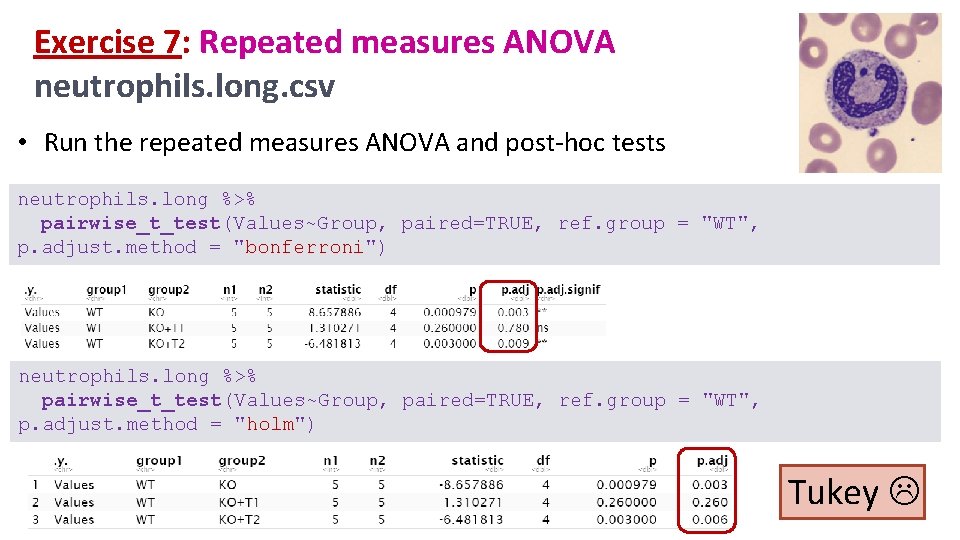
Exercise 7: Repeated measures ANOVA neutrophils. long. csv • A researcher is looking at the difference between 4 cell groups. He has run the experiment 5 times. Within each experiment, he has neutrophils from a WT (control), a KO+Treatment 1 and a KO+Treatment 2. • Question: Is there a difference between KO with/without treatment and WT? • Load neutrophils. long. csv • Plot the data so that you have an idea of the consistency of the results between the experiments. • Check the first assumption • Run the repeated measures ANOVA and post-hoc tests anova_test(dv =, wid =, within =) -> res. aov get_anova_table(res. aov) pairwise_t_test(p. adjust. method =) • Choose a graphical presentation consistent with the experimental design

Exercise 7: Repeated measures ANOVA neutrophils. long. csv • Plot the data so that you have an idea of the consistency of the results between the experiments. neutrophils. long %>% ggplot(aes(Group, Values, group=Experiment, colour=Experiment, fill=Experiment))+ geom_line(size=2)+ geom_point(size=4, shape = 21, colour= "black", stroke=2)+ scale_x_discrete(limits = c("WT", "KO+T 1", "KO+T 2"))

Exercise 7: Repeated measures ANOVA neutrophils. long. csv • Check the first assumption neutrophils. long %>% ggplot(aes(Group, Values))+ geom_boxplot(outlier. shape = NA)+ geom_jitter(height = 0, width = 0. 2) neutrophils. long %>% group_by(Group) %>% shapiro_test(Values) %>% ungroup()

Exercise 7: Repeated measures ANOVA neutrophils. long. csv • Run the repeated measures ANOVA and post-hoc tests neutrophils. long %>% anova_test(dv = Values, wid = Experiment, within = Group) -> res. aov get_anova_table(res. aov) neutrophils. long %>% pairwise_t_test(Values~Group, paired=TRUE, ref. group = "WT", p. adjust. method = "bonferroni")

Exercise 7: Repeated measures ANOVA neutrophils. long. csv • Run the repeated measures ANOVA and post-hoc tests neutrophils. long %>% pairwise_t_test(Values~Group, paired=TRUE, ref. group = "WT", p. adjust. method = "bonferroni") neutrophils. long %>% pairwise_t_test(Values~Group, paired=TRUE, ref. group = "WT", p. adjust. method = "holm") Tukey

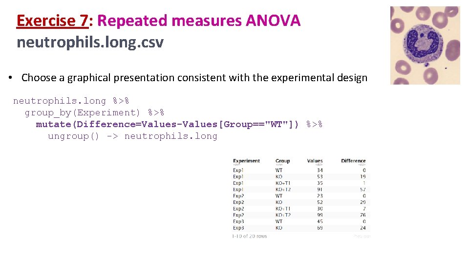
Exercise 7: Repeated measures ANOVA neutrophils. long. csv • Choose a graphical presentation consistent with the experimental design neutrophils. long %>% group_by(Experiment) %>% mutate(Difference=Values-Values[Group=="WT"]) %>% ungroup() -> neutrophils. long

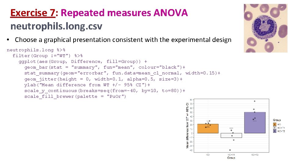
Exercise 7: Repeated measures ANOVA neutrophils. long. csv • Choose a graphical presentation consistent with the experimental design neutrophils. long %>% filter(Group !="WT") %>% ggplot(aes(Group, Difference, fill=Group)) + geom_bar(stat = "summary", fun="mean", colour="black")+ stat_summary(geom="errorbar", fun. data=mean_cl_normal, width=0. 15)+ geom_jitter(height = 0, width=0. 1, alpha=0. 5, size=3)+ ylab("Mean difference from WT +/- 95% CI")+ scale_y_continuous(breaks=seq(from=-40, by=10, to=80))+ scale_fill_brewer(palette = "Pu. Or")

Comparison between more than 2 groups Two factors = Two predictors Two-Way ANOVA

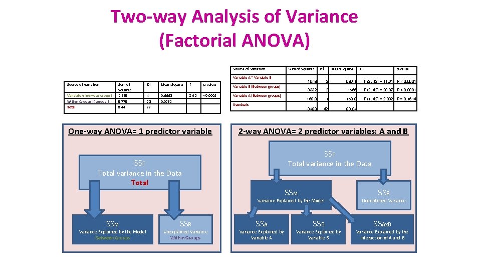
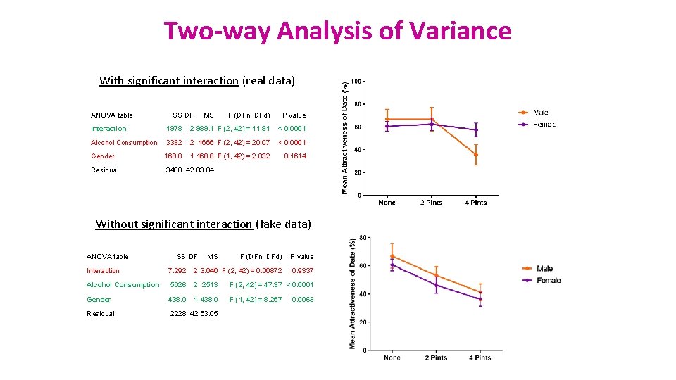
Two-way Analysis of Variance (Factorial ANOVA) Source of variation Sum of Squares Variable A * Variable B Source of variation Variable A (Between Groups) Within Groups (Residual) Total Sum of Squares 2. 665 5. 775 8. 44 Df Mean Square F p-value 4 73 77 0. 6663 0. 0791 8. 42 <0. 0001 Variable B (Between groups) Variable A (Between groups) Residuals One-way ANOVA= 1 predictor variable Df Mean Square 1978 2 989. 1 F (2, 42) = 11. 91 P < 0. 0001 3332 2 1666 F (2, 42) = 20. 07 P < 0. 0001 168. 8 F (1, 42) = 2. 032 P = 0. 1614 3488 42 83. 04 SST Total variance in the Data Total SSM Variance Explained by the Model Between Groups p-value 2 -way ANOVA= 2 predictor variables: A and B SST SSM F SSR Unexplained Variance Within Groups SSA Variance Explained by Variable A SSB Variance Explained by Variable B SSR Unexplained Variance SSAx. B Variance Explained by the Interaction of A and B

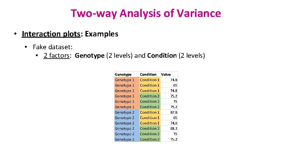
Two-way Analysis of Variance • Interaction plots: Examples • Fake dataset: • 2 factors: Genotype (2 levels) and Condition (2 levels)

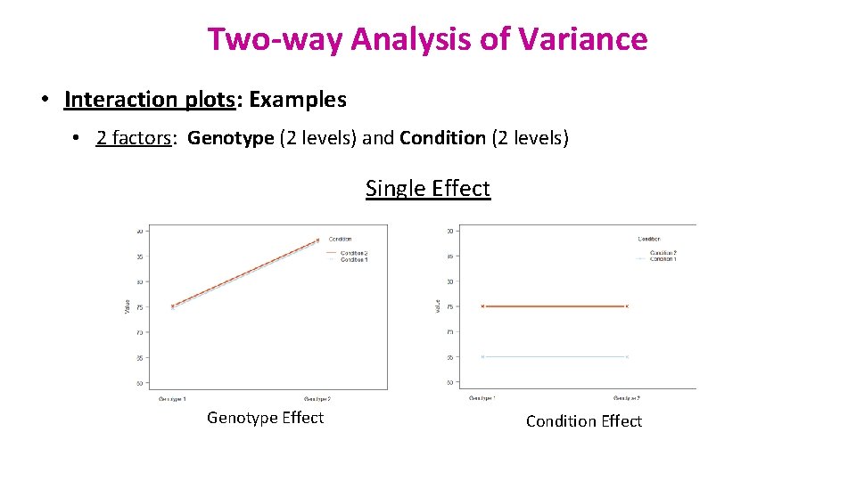
Two-way Analysis of Variance • Interaction plots: Examples • 2 factors: Genotype (2 levels) and Condition (2 levels) Single Effect Genotype Effect Condition Effect

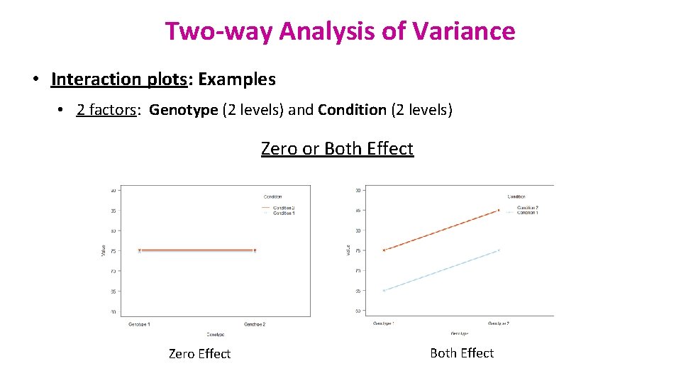
Two-way Analysis of Variance • Interaction plots: Examples • 2 factors: Genotype (2 levels) and Condition (2 levels) Zero or Both Effect Zero Effect Both Effect

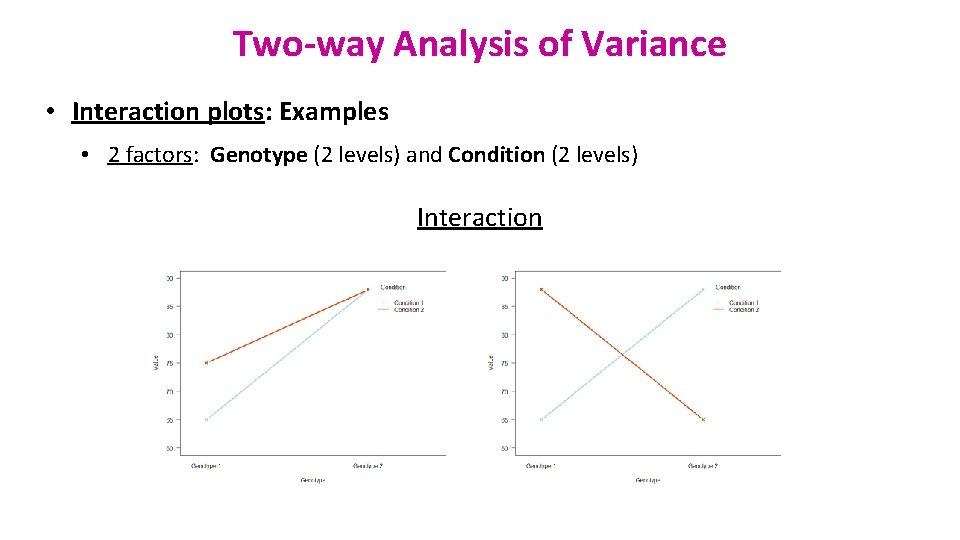
Two-way Analysis of Variance • Interaction plots: Examples • 2 factors: Genotype (2 levels) and Condition (2 levels) Interaction

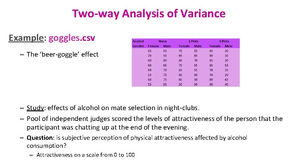
Two-way Analysis of Variance Example: goggles. csv – The ‘beer-goggle’ effect – Study: effects of alcohol on mate selection in night-clubs. – Pool of independent judges scored the levels of attractiveness of the person that the participant was chatting up at the end of the evening. – Question: is subjective perception of physical attractiveness affected by alcohol consumption? – Attractiveness on a scale from 0 to 100

Exercise 8: Two-way ANOVA goggles. csv • Load goggles. csv • Graphically explore the data • effect of alcohol only • effect of gender only • effect of both • Check the assumptions visually (plot+qqplot) and formally (test) levene_test(y ~ factor 1*factor 2)

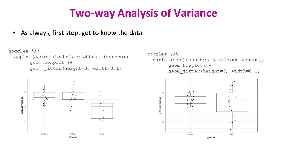
Two-way Analysis of Variance • As always, first step: get to know the data goggles %>% ggplot(aes(x=alcohol, y=attractiveness))+ geom_boxplot()+ geom_jitter(height=0, width=0. 1) goggles %>% ggplot(aes(x=gender, y=attractiveness))+ geom_boxplot()+ geom_jitter(height=0, width=0. 1)

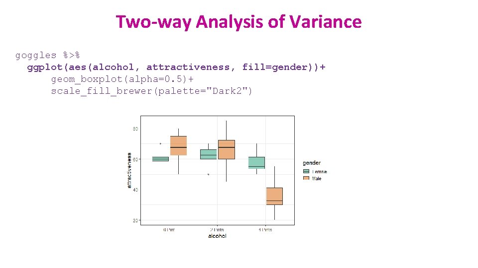
Two-way Analysis of Variance goggles %>% ggplot(aes(alcohol, attractiveness, fill=gender))+ geom_boxplot(alpha=0. 5)+ scale_fill_brewer(palette="Dark 2")

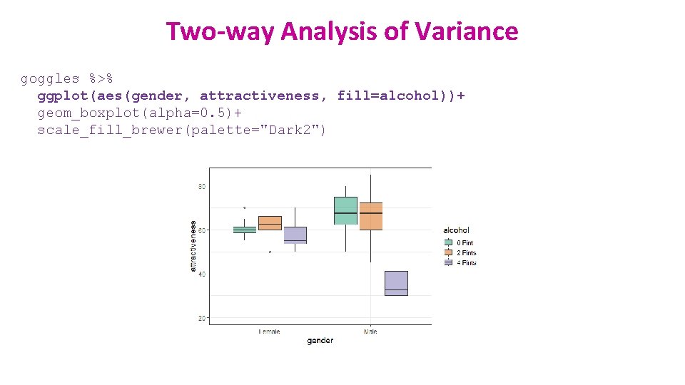
Two-way Analysis of Variance goggles %>% ggplot(aes(gender, attractiveness, fill=alcohol))+ geom_boxplot(alpha=0. 5)+ scale_fill_brewer(palette="Dark 2")

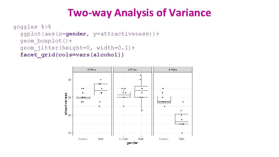
Two-way Analysis of Variance goggles %>% ggplot(aes(x=gender, y=attractiveness))+ geom_boxplot()+ geom_jitter(height=0, width=0. 1)+ facet_grid(cols=vars(alcohol))

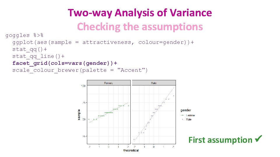
Two-way Analysis of Variance Checking the assumptions goggles %>% ggplot(aes(sample = attractiveness, colour=gender))+ stat_qq()+ stat_qq_line()+ facet_grid(cols=vars(gender))+ scale_colour_brewer(palette = "Accent") First assumption ü

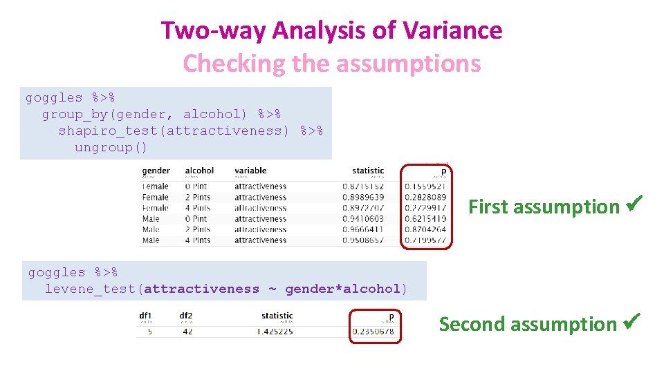
Two-way Analysis of Variance Checking the assumptions goggles %>% group_by(gender, alcohol) %>% shapiro_test(attractiveness) %>% ungroup() First assumption ü goggles %>% levene_test(attractiveness ~ gender*alcohol) Second assumption ü

Two-way Analysis of Variance With significant interaction (real data) ANOVA table SS DF MS F (DFn, DFd) P value Interaction 1978 2 989. 1 F (2, 42) = 11. 91 < 0. 0001 Alcohol Consumption 3332 2 1666 F (2, 42) = 20. 07 < 0. 0001 Gender 168. 8 1 168. 8 F (1, 42) = 2. 032 0. 1614 Residual 3488 42 83. 04 Without significant interaction (fake data) ANOVA table SS DF MS F (DFn, DFd) P value 0. 9337 Interaction 7. 292 2 3. 646 F (2, 42) = 0. 06872 Alcohol Consumption 5026 2 2513 F (2, 42) = 47. 37 < 0. 0001 Gender 438. 0 1 438. 0 F (1, 42) = 8. 257 Residual 2228 42 53. 05 0. 0063

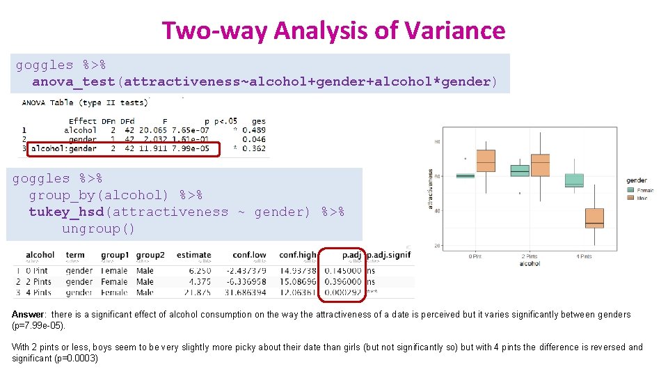
Two-way Analysis of Variance goggles %>% anova_test(attractiveness~alcohol+gender+alcohol*gender) goggles %>% group_by(alcohol) %>% tukey_hsd(attractiveness ~ gender) %>% ungroup() Answer: there is a significant effect of alcohol consumption on the way the attractiveness of a date is perceived but it varies significantly between genders (p=7. 99 e-05). With 2 pints or less, boys seem to be very slightly more picky about their date than girls (but not significantly so) but with 4 pints the difference is reversed and significant (p=0. 0003)

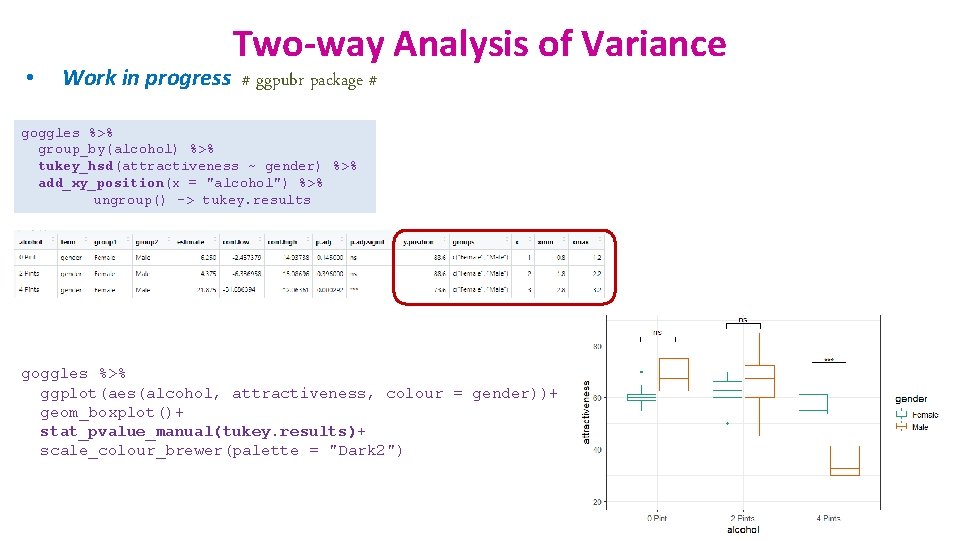
• Two-way Analysis of Variance Work in progress # ggpubr package # goggles %>% group_by(alcohol) %>% tukey_hsd(attractiveness ~ gender) %>% add_xy_position(x = "alcohol") %>% ungroup() -> tukey. results goggles %>% ggplot(aes(alcohol, attractiveness, colour = gender))+ geom_boxplot()+ stat_pvalue_manual(tukey. results)+ scale_colour_brewer(palette = "Dark 2")

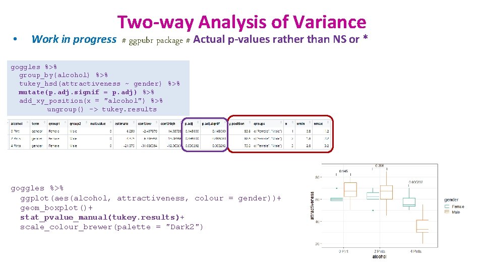
• Two-way Analysis of Variance Work in progress # ggpubr package # Actual p-values rather than NS or * goggles %>% group_by(alcohol) %>% tukey_hsd(attractiveness ~ gender) %>% mutate(p. adj. signif = p. adj) %>% add_xy_position(x = "alcohol") %>% ungroup() -> tukey. results goggles %>% ggplot(aes(alcohol, attractiveness, colour = gender))+ geom_boxplot()+ stat_pvalue_manual(tukey. results)+ scale_colour_brewer(palette = "Dark 2")

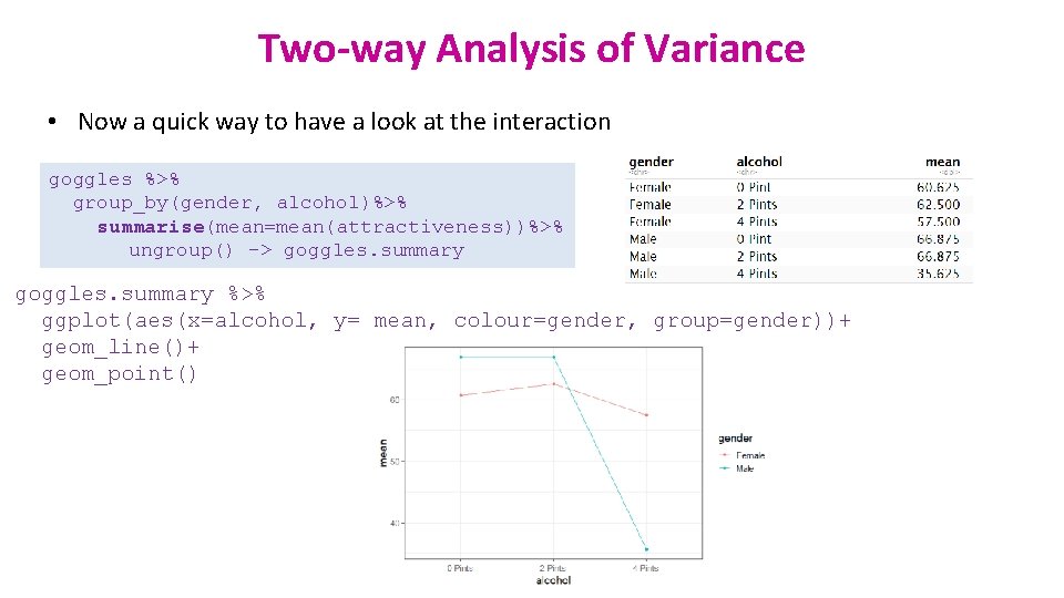
Two-way Analysis of Variance • Now a quick way to have a look at the interaction goggles %>% group_by(gender, alcohol)%>% summarise(mean=mean(attractiveness))%>% ungroup() -> goggles. summary %>% ggplot(aes(x=alcohol, y= mean, colour=gender, group=gender))+ geom_line()+ geom_point()

Association between 2 continuous variables One variable X and One variable Y One predictor Correlation

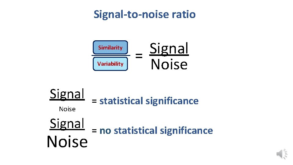
Signal-to-noise ratio Similarity Variability Signal Noise Signal = Noise = statistical significance = no statistical significance

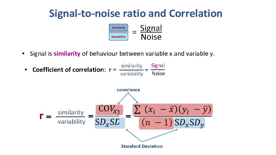
Signal-to-noise ratio and Correlation • Signal is similarity of behaviour between variable x and variable y. • Coefficient of correlation: r = Signal similarity = variability Noise covariance r similarity variability Standard Deviation

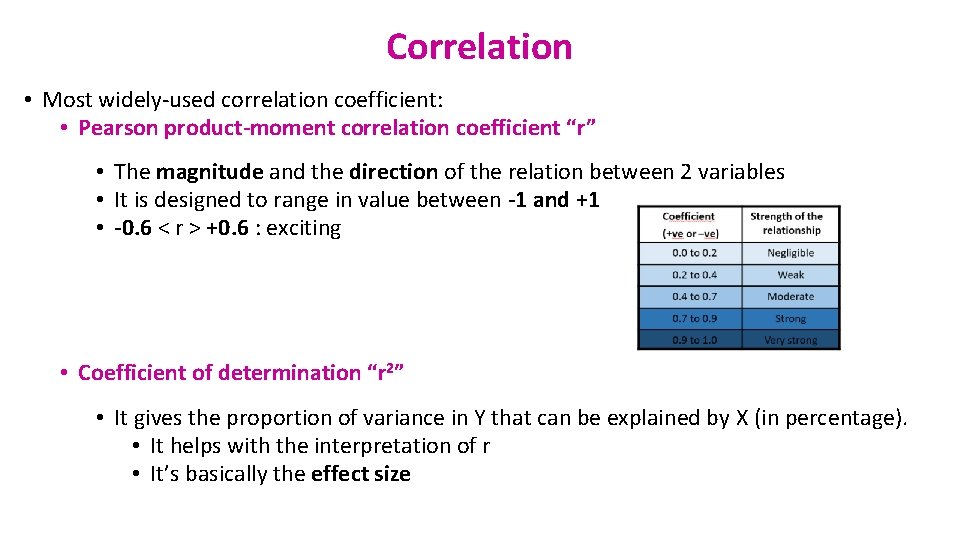
Correlation • Most widely-used correlation coefficient: • Pearson product-moment correlation coefficient “r” • The magnitude and the direction of the relation between 2 variables • It is designed to range in value between -1 and +1 • -0. 6 < r > +0. 6 : exciting • Coefficient of determination “r 2” • It gives the proportion of variance in Y that can be explained by X (in percentage). • It helps with the interpretation of r • It’s basically the effect size

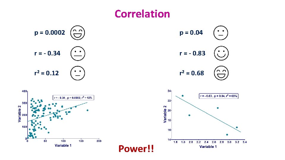
Correlation p = 0. 0002 p = 0. 04 r = - 0. 34 r = - 0. 83 r 2 = 0. 12 r 2 = 0. 68 Power!!

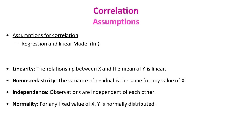
Correlation Assumptions • Assumptions for correlation – Regression and linear Model (lm) • Linearity: The relationship between X and the mean of Y is linear. • Homoscedasticity: The variance of residual is the same for any value of X. • Independence: Observations are independent of each other. • Normality: For any fixed value of X, Y is normally distributed.

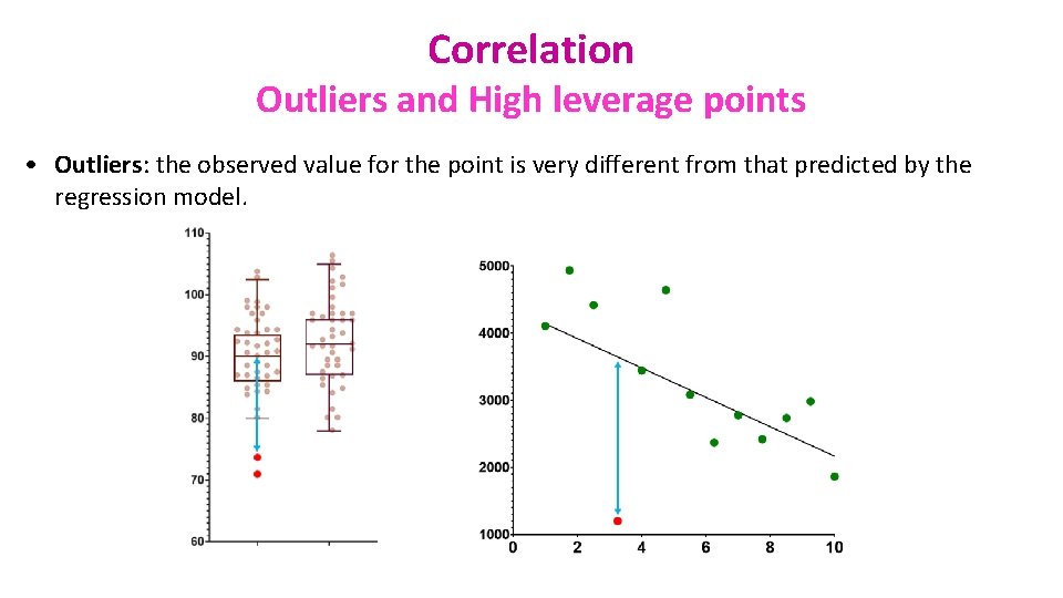
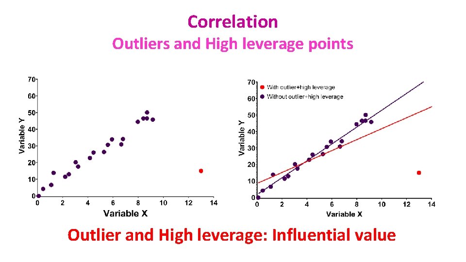
Correlation Outliers and High leverage points • Outliers: the observed value for the point is very different from that predicted by the regression model.

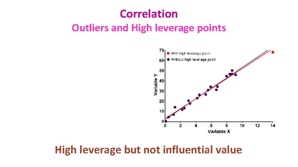
Correlation Outliers and High leverage points • Leverage points: A leverage point is defined as an observation that has a value of x that is far away from the mean of x. • Outliers and leverage points have the potential to be Influential observations: – Change the slope of the line. Thus, have a large influence on the fit of the model. • One method to find influential points is to compare the fit of the model with and without the dodgy observation.

Correlation Outliers and High leverage points All good

Correlation Outliers and High leverage points Outlier but not influential value

Correlation Outliers and High leverage points High leverage but not influential value

Correlation Outliers and High leverage points Outlier and High leverage: Influential value

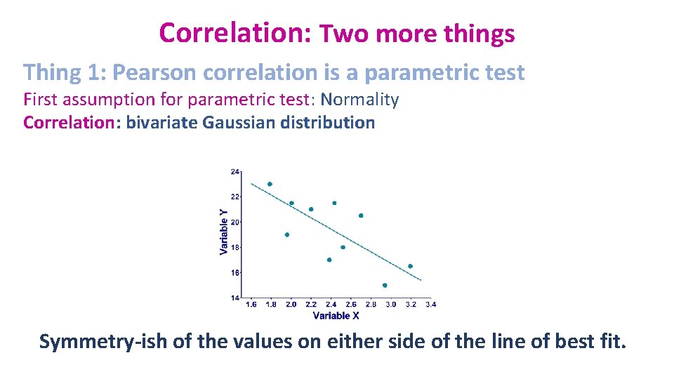
Correlation: Two more things Thing 1: Pearson correlation is a parametric test First assumption for parametric test: Normality Correlation: bivariate Gaussian distribution Symmetry-ish of the values on either side of the line of best fit.

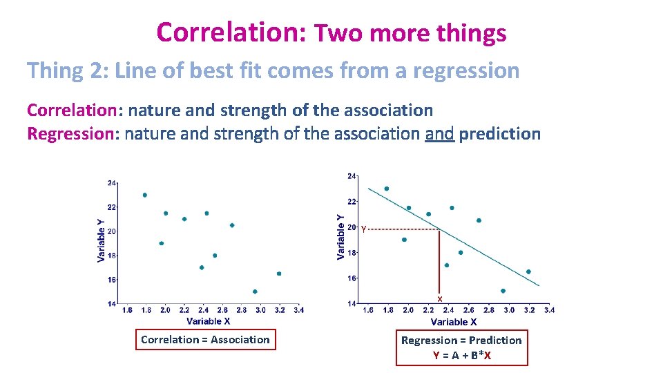
Correlation: Two more things Thing 2: Line of best fit comes from a regression Correlation: nature and strength of the association Regression: nature and strength of the association and prediction Y x Correlation = Association Regression = Prediction Y = A + B*X

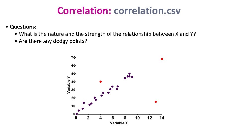
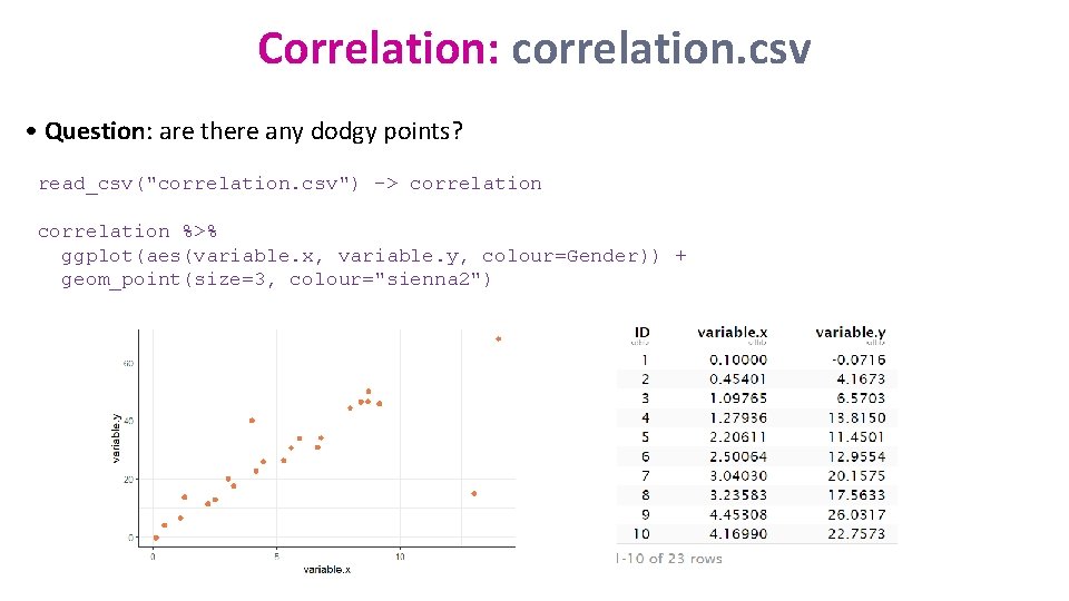
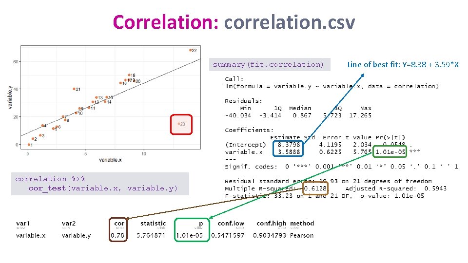
Correlation: correlation. csv • Questions: • What is the nature and the strength of the relationship between X and Y? • Are there any dodgy points?

Correlation: correlation. csv • Question: are there any dodgy points? read_csv("correlation. csv") -> correlation %>% ggplot(aes(variable. x, variable. y, colour=Gender)) + geom_point(size=3, colour="sienna 2")

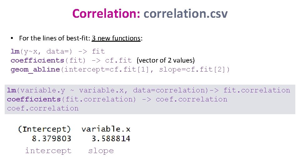
Correlation: correlation. csv • For the lines of best-fit: 3 new functions: lm(y~x, data=) -> fit coefficients(fit) -> cf. fit (vector of 2 values) geom_abline(intercept=cf. fit[1], slope=cf. fit[2]) lm(variable. y ~ variable. x, data=correlation)-> fit. correlation coefficients(fit. correlation) -> coef. correlation intercept slope

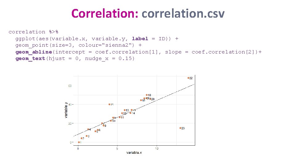
Correlation: correlation. csv correlation %>% ggplot(aes(variable. x, variable. y, label = ID)) + geom_point(size=3, colour="sienna 2") + geom_abline(intercept = coef. correlation[1], slope = coef. correlation[2])+ geom_text(hjust = 0, nudge_x = 0. 15)

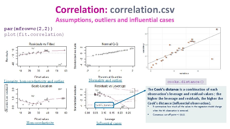
Correlation: correlation. csv Assumptions, outliers and influential cases par(mfrow=c(2, 2)) plot(fit. correlation) Linearity, homoscedasticity and outlier Normality and outlier cooks. distance() The Cook’s distance is a combination of each observation’s leverage and residual values ; the higher the leverage and residuals, the higher the Cook’s distance (influential observation). • • Homoscedasticity Influential cases It summarizes how much all the values in the regression model change when the ith observation is removed. Consensus: cut-off point =1 (0. 5).

Correlation: correlation. csv summary(fit. correlation) correlation %>% cor_test(variable. x, variable. y) Line of best fit: Y=8. 38 + 3. 59*X

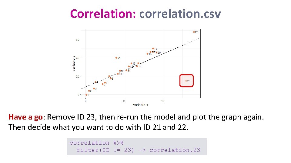
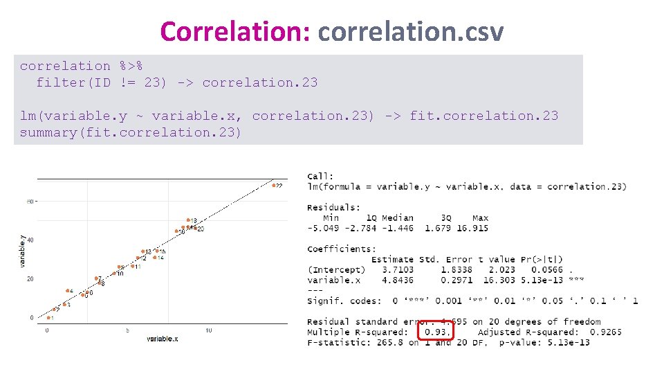
Correlation: correlation. csv Have a go: Remove ID 23, then re-run the model and plot the graph again. Then decide what you want to do with ID 21 and 22. correlation %>% filter(ID != 23) -> correlation. 23

Correlation: correlation. csv correlation %>% filter(ID != 23) -> correlation. 23 lm(variable. y ~ variable. x, correlation. 23) -> fit. correlation. 23 summary(fit. correlation. 23)

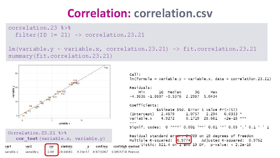
Correlation: correlation. csv correlation. 23 %>% filter(ID != 21) -> correlation. 23. 21 lm(variable. y ~ variable. x, correlation. 23. 21) -> fit. correlation. 23. 21 summary(fit. correlation. 23. 21) Correlation. 23. 21 %>% cor_test(variable. x, variable. y)

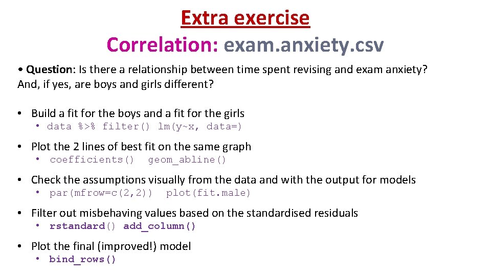
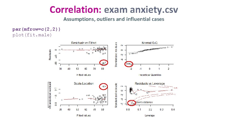
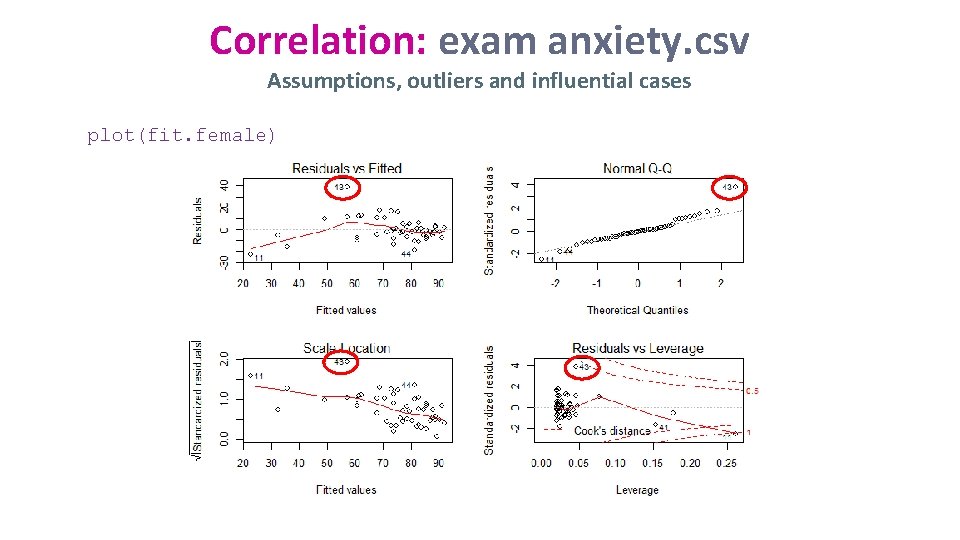
Extra exercise Correlation: exam. anxiety. csv • Question: Is there a relationship between time spent revising and exam anxiety? And, if yes, are boys and girls different? • Build a fit for the boys and a fit for the girls • data %>% filter() lm(y~x, data=) • Plot the 2 lines of best fit on the same graph • coefficients() geom_abline() • Check the assumptions visually from the data and with the output for models • par(mfrow=c(2, 2)) plot(fit. male) • Filter out misbehaving values based on the standardised residuals • rstandard() add_column() • Plot the final (improved!) model • bind_rows()

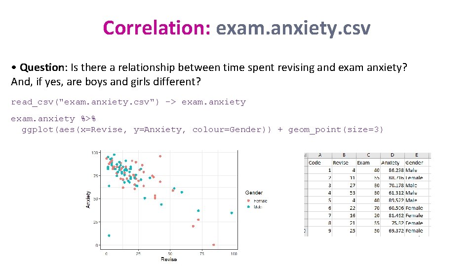
Correlation: exam. anxiety. csv • Question: Is there a relationship between time spent revising and exam anxiety? And, if yes, are boys and girls different? read_csv("exam. anxiety. csv") -> exam. anxiety %>% ggplot(aes(x=Revise, y=Anxiety, colour=Gender)) + geom_point(size=3)

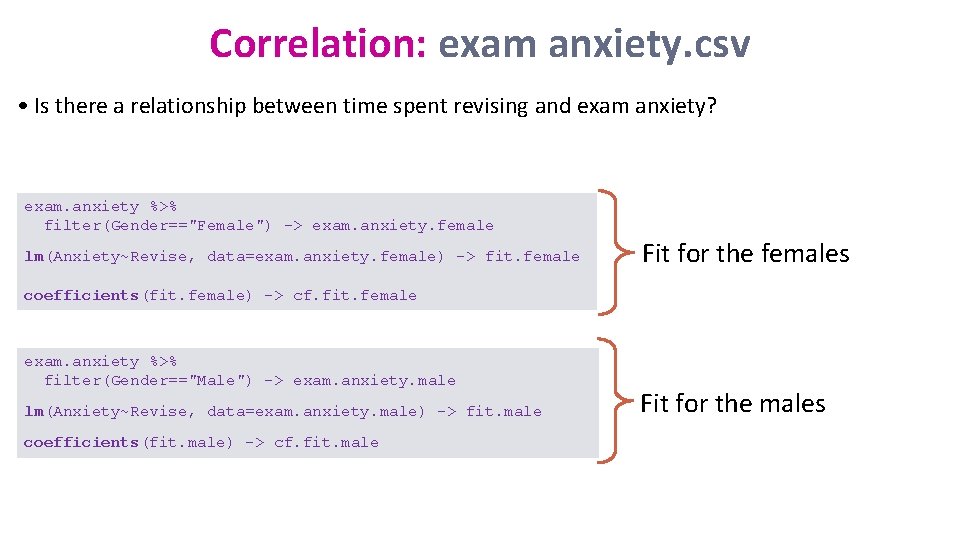
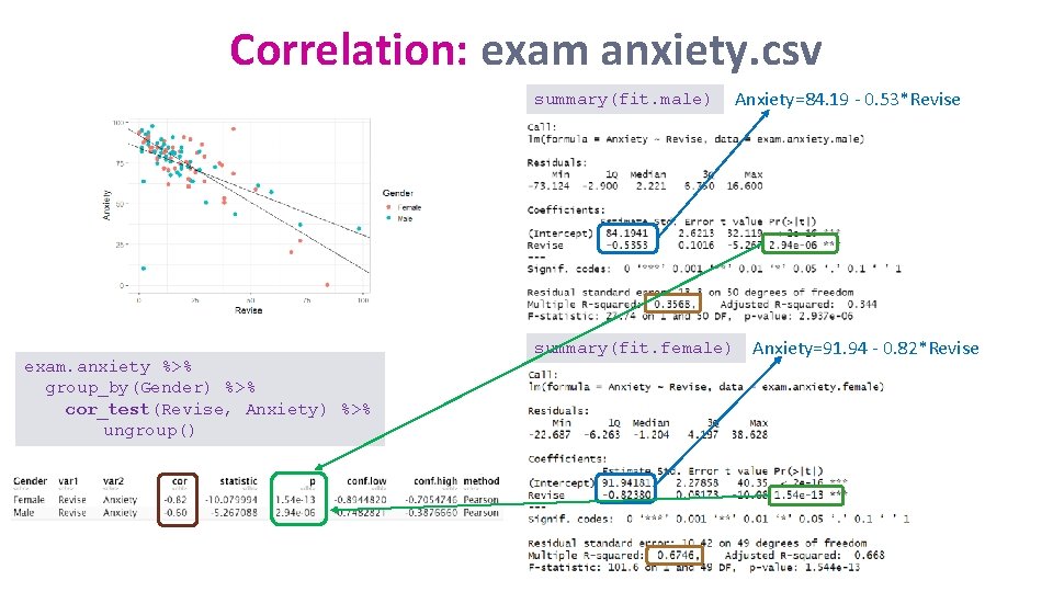
Correlation: exam anxiety. csv • Is there a relationship between time spent revising and exam anxiety? exam. anxiety %>% filter(Gender=="Female") -> exam. anxiety. female lm(Anxiety~Revise, data=exam. anxiety. female) -> fit. female Fit for the females coefficients(fit. female) -> cf. fit. female exam. anxiety %>% filter(Gender=="Male") -> exam. anxiety. male lm(Anxiety~Revise, data=exam. anxiety. male) -> fit. male coefficients(fit. male) -> cf. fit. male Fit for the males

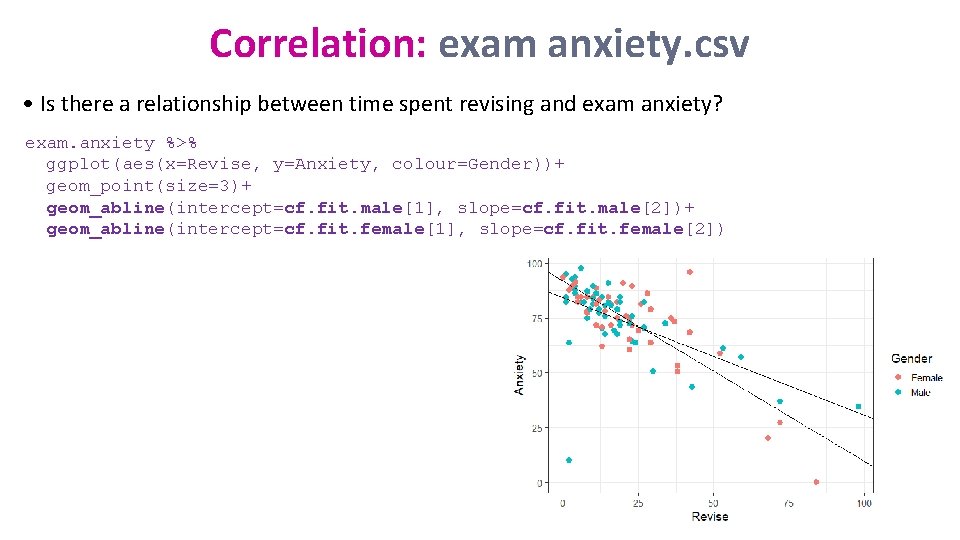
Correlation: exam anxiety. csv • Is there a relationship between time spent revising and exam anxiety? exam. anxiety %>% ggplot(aes(x=Revise, y=Anxiety, colour=Gender))+ geom_point(size=3)+ geom_abline(intercept=cf. fit. male[1], slope=cf. fit. male[2])+ geom_abline(intercept=cf. fit. female[1], slope=cf. fit. female[2])

Correlation: exam anxiety. csv Assumptions, outliers and influential cases par(mfrow=c(2, 2)) plot(fit. male)

Correlation: exam anxiety. csv Assumptions, outliers and influential cases plot(fit. female)

Correlation: exam anxiety. csv summary(fit. male) exam. anxiety %>% group_by(Gender) %>% cor_test(Revise, Anxiety) %>% ungroup() summary(fit. female) Anxiety=84. 19 - 0. 53*Revise Anxiety=91. 94 - 0. 82*Revise

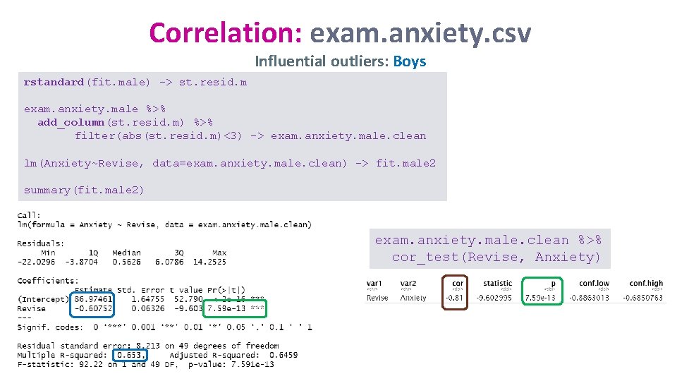
Correlation: exam. anxiety. csv Influential outliers: Boys rstandard(fit. male) -> st. resid. m exam. anxiety. male %>% add_column(st. resid. m) %>% filter(abs(st. resid. m)<3) -> exam. anxiety. male. clean lm(Anxiety~Revise, data=exam. anxiety. male. clean) -> fit. male 2 summary(fit. male 2) exam. anxiety. male. clean %>% cor_test(Revise, Anxiety)

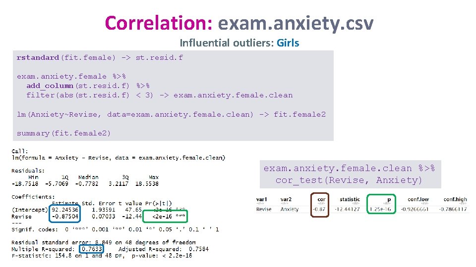
Correlation: exam. anxiety. csv Influential outliers: Girls rstandard(fit. female) -> st. resid. f exam. anxiety. female %>% add_column(st. resid. f) %>% filter(abs(st. resid. f) < 3) -> exam. anxiety. female. clean lm(Anxiety~Revise, data=exam. anxiety. female. clean) -> fit. female 2 summary(fit. female 2) exam. anxiety. female. clean %>% cor_test(Revise, Anxiety)

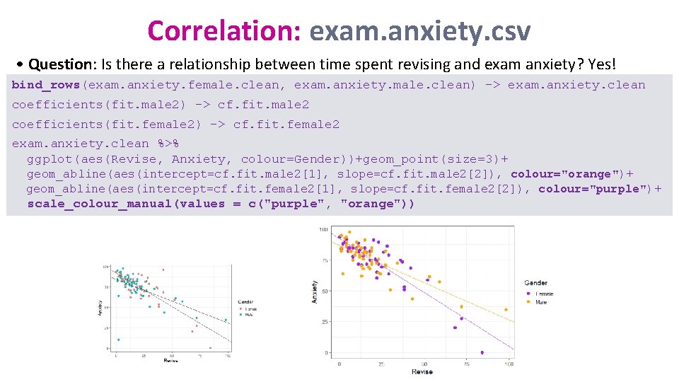
Correlation: exam. anxiety. csv • Question: Is there a relationship between time spent revising and exam anxiety? Yes! bind_rows(exam. anxiety. female. clean, exam. anxiety. male. clean) -> exam. anxiety. clean coefficients(fit. male 2) -> cf. fit. male 2 coefficients(fit. female 2) -> cf. fit. female 2 exam. anxiety. clean %>% ggplot(aes(Revise, Anxiety, colour=Gender))+geom_point(size=3)+ geom_abline(aes(intercept=cf. fit. male 2[1], slope=cf. fit. male 2[2]), colour="orange")+ geom_abline(aes(intercept=cf. fit. female 2[1], slope=cf. fit. female 2[2]), colour="purple")+ scale_colour_manual(values = c("purple", "orange"))

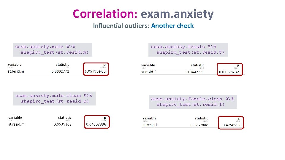
Correlation: exam. anxiety Influential outliers: Another check exam. anxiety. male %>% shapiro_test(st. resid. m) exam. anxiety. male. clean %>% shapiro_test(st. resid. m) exam. anxiety. female %>% shapiro_test(st. resid. f) exam. anxiety. female. clean %>% shapiro_test(st. resid. f)

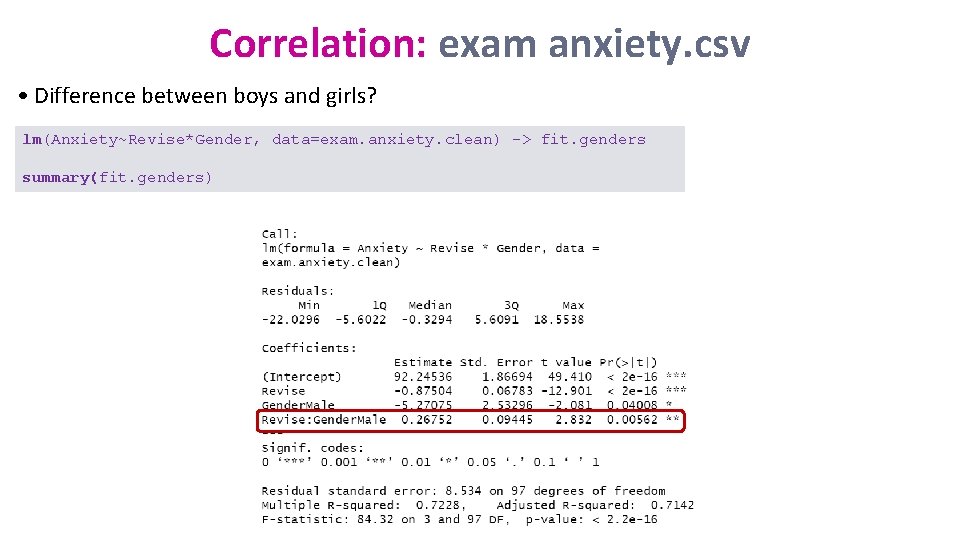
Correlation: exam anxiety. csv • Difference between boys and girls? lm(Anxiety~Revise*Gender, data=exam. anxiety. clean) -> fit. genders summary(fit. genders)
