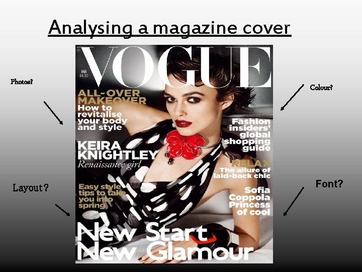
Analysing a magazine cover Photos Layout Colour Font
- Slides: 5

Analysing a magazine cover Photos? Layout? Colour? Font?

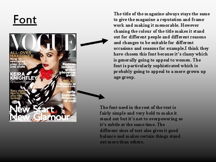
Font The title of the magazine always stays the same to give the magazine a reputation and frame work and making it memorable. However chaning the colour of the title makes it stand out for different people and different reasons and changes to be suitable for different occasions and seasons for example. I think they have chosen this font because it’s classy which is generally going to appeal to women. The font is particularly sophisticated which is probably going to appeal to a more grown up age group. The font used in the rest of the text is fairly simple and very bold to make it stand out but it’s not to overpowering so it’s subtle at the same time. The different sizes of text also gives it good balance and makes certain things stand out more than others.

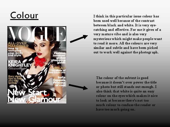
Colour I think in this particular issue colour has been used well because of the contrast between black and white. It is very eyecatching and effective. For me it gives of a very mature vibe and is also very mysterious which might make people want to read it more. All the colours are very similar and subtle and have been picked out to work well against the photograph. The colour of the subtext is good because it doesn't over power the title or photo but still stands out enough. I also think that white is quite an easy colour on the eyes which makes it nice to look at because there's not too much colour to confuse the reader or have too much going on.

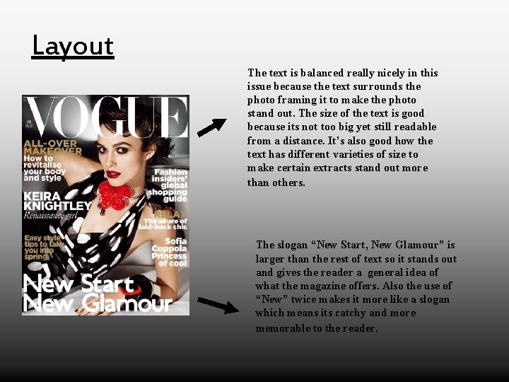
Layout The text is balanced really nicely in this issue because the text surrounds the photo framing it to make the photo stand out. The size of the text is good because its not too big yet still readable from a distance. It’s also good how the text has different varieties of size to make certain extracts stand out more than others. The slogan “New Start, New Glamour” is larger than the rest of text so it stands out and gives the reader a general idea of what the magazine offers. Also the use of “New” twice makes it more like a slogan which means its catchy and more memorable to the reader.

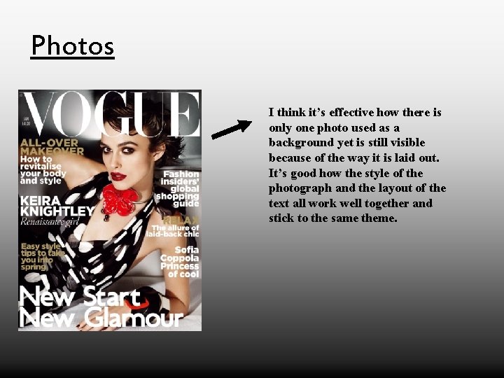
Photos I think it’s effective how there is only one photo used as a background yet is still visible because of the way it is laid out. It’s good how the style of the photograph and the layout of the text all work well together and stick to the same theme.