Agenda The User Interface The CSS Box Model
Agenda The User Interface The CSS Box Model The Flexbox Box Model Grid Layouts
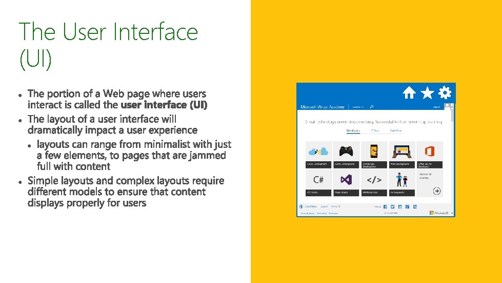
The User Interface (UI)
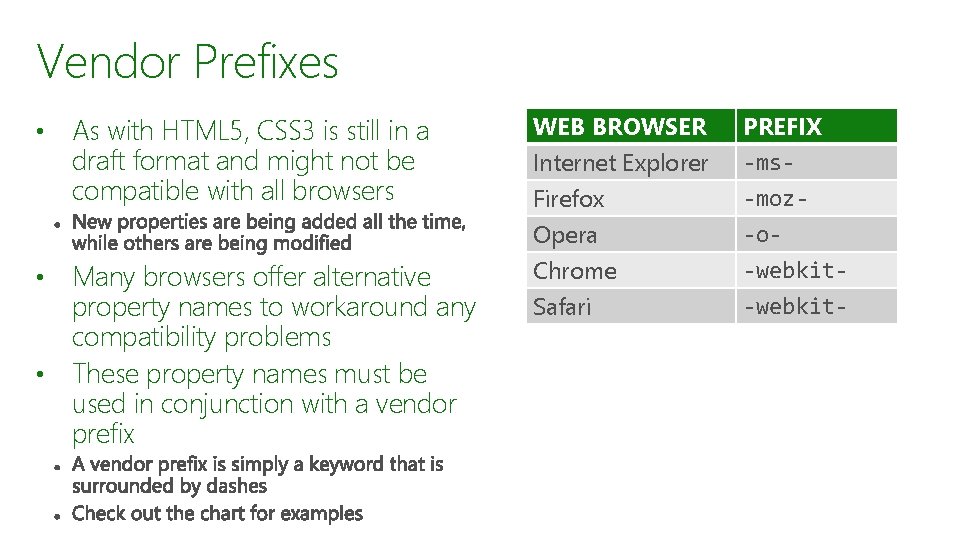
Vendor Prefixes • As with HTML 5, CSS 3 is still in a draft format and might not be compatible with all browsers Many browsers offer alternative property names to workaround any compatibility problems • These property names must be used in conjunction with a vendor prefix • WEB BROWSER Internet Explorer Firefox Opera PREFIX -ms-moz-o- Chrome -webkit- Safari
Vendor Prefixes in Action To apply the flexbox style to elements in a browser, like Chrome, you simply add the -webkit-flexbox property to your CSS • A best practice is to include the property with all four vendor prefixes • • If you have questions about whether your property will display properly, then check out caniuse. com
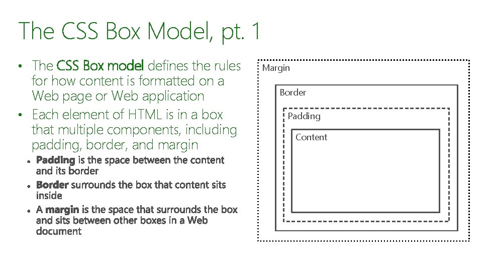
The CSS Box Model, pt. 1 • The CSS Box model defines the rules for how content is formatted on a Web page or Web application • Each element of HTML is in a box that multiple components, including padding, border, and margin Margin Border Padding Content
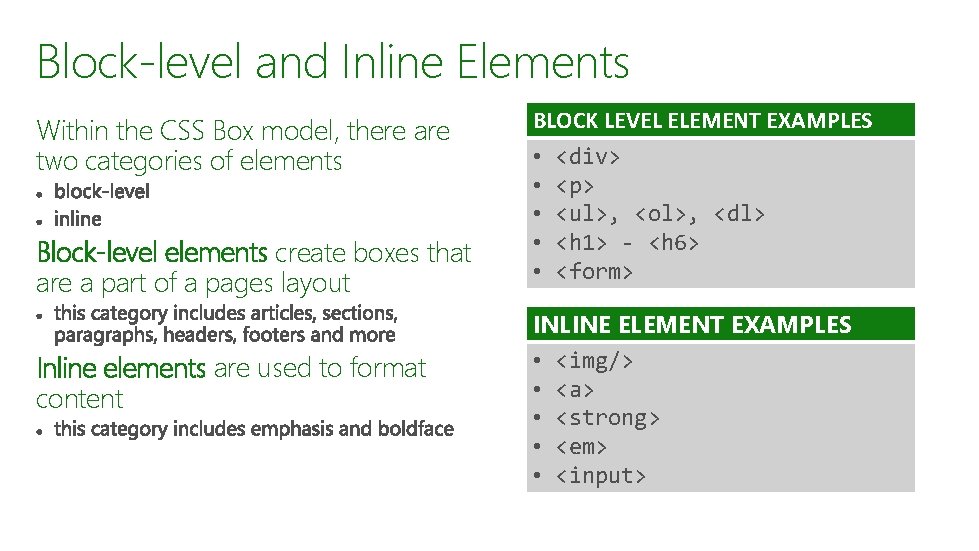
Block-level and Inline Elements Within the CSS Box model, there are two categories of elements Block-level elements create boxes that are a part of a pages layout Inline elements are used to format content BLOCK LEVEL ELEMENT EXAMPLES • • • <div> <p> <ul>, <ol>, <dl> <h 1> - <h 6> <form> INLINE ELEMENT EXAMPLES • <img/> • <a> • <strong> • <em> • <input>
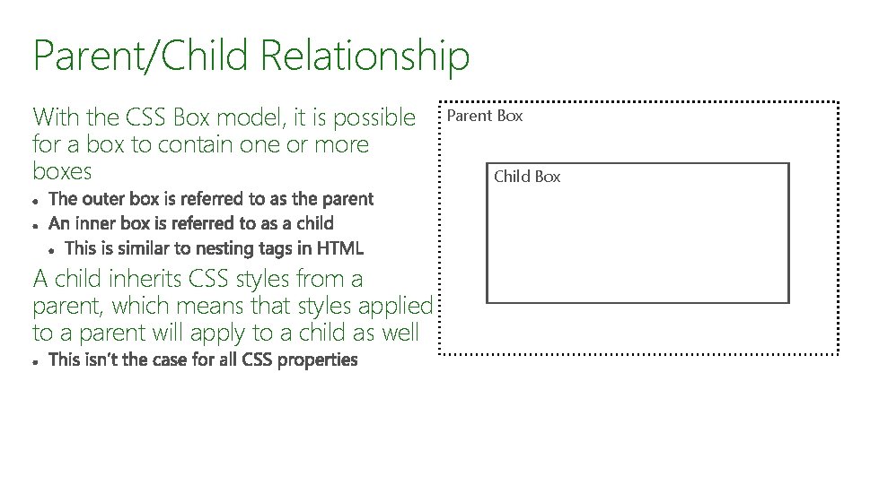
Parent/Child Relationship With the CSS Box model, it is possible for a box to contain one or more boxes A child inherits CSS styles from a parent, which means that styles applied to a parent will apply to a child as well Parent Box Child Box
Problems with the CSS Box Model • • The CSS Box model is not without problems Some browsers will apply properties differently

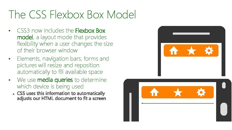
The CSS Flexbox Box Model • • • CSS 3 now includes the Flexbox Box model, a layout mode that provides flexibility when a user changes the size of their browser window Elements, navigation bars, forms and pictures will resize and reposition automatically to fill available space We use media queries to determine which device is being used
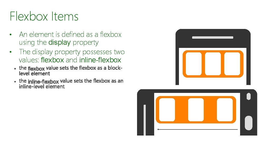
Flexbox Items An element is defined as a flexbox using the display property • The display property possesses two values: flexbox and inline-flexbox •
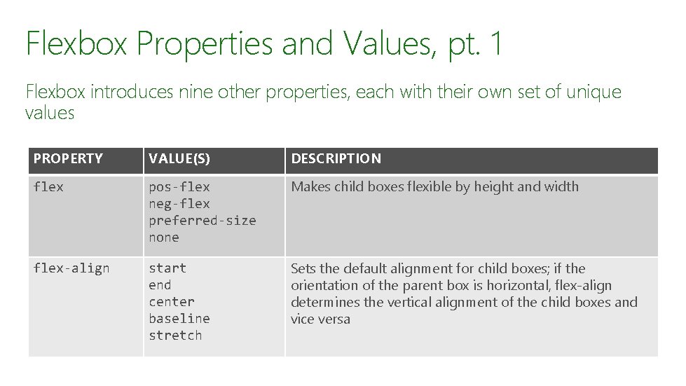
Flexbox Properties and Values, pt. 1 Flexbox introduces nine other properties, each with their own set of unique values PROPERTY VALUE(S) DESCRIPTION flex pos-flex neg-flex preferred-size none Makes child boxes flexible by height and width flex-align start end center baseline stretch Sets the default alignment for child boxes; if the orientation of the parent box is horizontal, flex-align determines the vertical alignment of the child boxes and vice versa
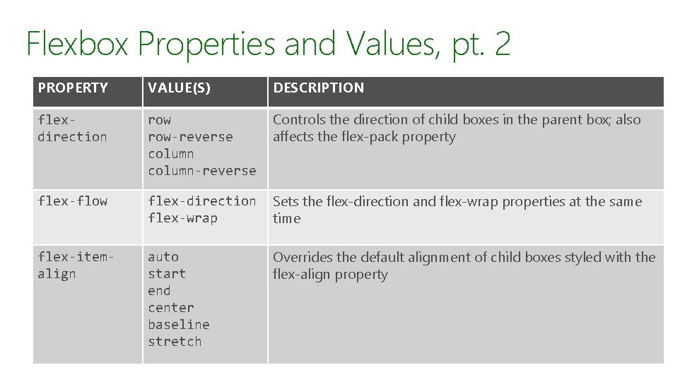
Flexbox Properties and Values, pt. 2 PROPERTY VALUE(S) DESCRIPTION flexdirection row-reverse column-reverse Controls the direction of child boxes in the parent box; also affects the flex-pack property flex-flow flex-direction flex-wrap Sets the flex-direction and flex-wrap properties at the same time flex-itemalign auto start end center baseline stretch Overrides the default alignment of child boxes styled with the flex-align property
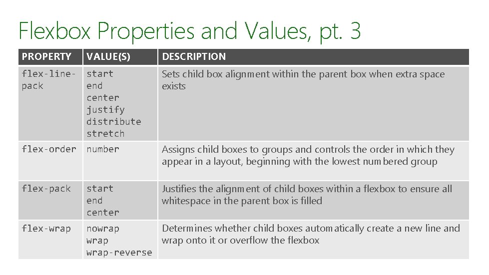
Flexbox Properties and Values, pt. 3 PROPERTY VALUE(S) DESCRIPTION flex-linepack start end center justify distribute stretch Sets child box alignment within the parent box when extra space exists flex-order number Assigns child boxes to groups and controls the order in which they appear in a layout, beginning with the lowest numbered group flex-pack start end center Justifies the alignment of child boxes within a flexbox to ensure all whitespace in the parent box is filled flex-wrap nowrap Determines whether child boxes automatically create a new line and wrap onto it or overflow the flexbox wrap-reverse
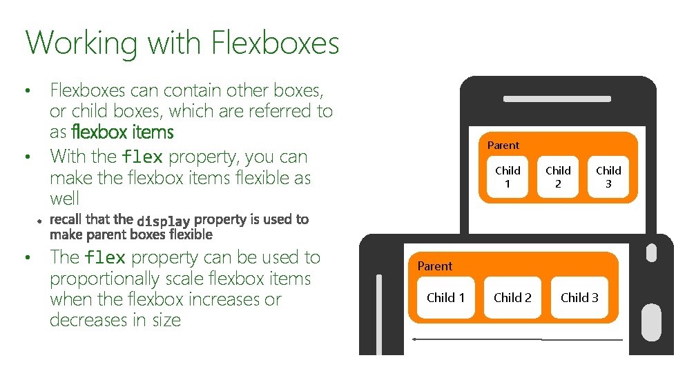
Working with Flexboxes can contain other boxes, or child boxes, which are referred to as flexbox items • With the flex property, you can make the flexbox items flexible as well • • The flex property can be used to proportionally scale flexbox items when the flexbox increases or decreases in size Parent Child 1 Child 2 Child 3
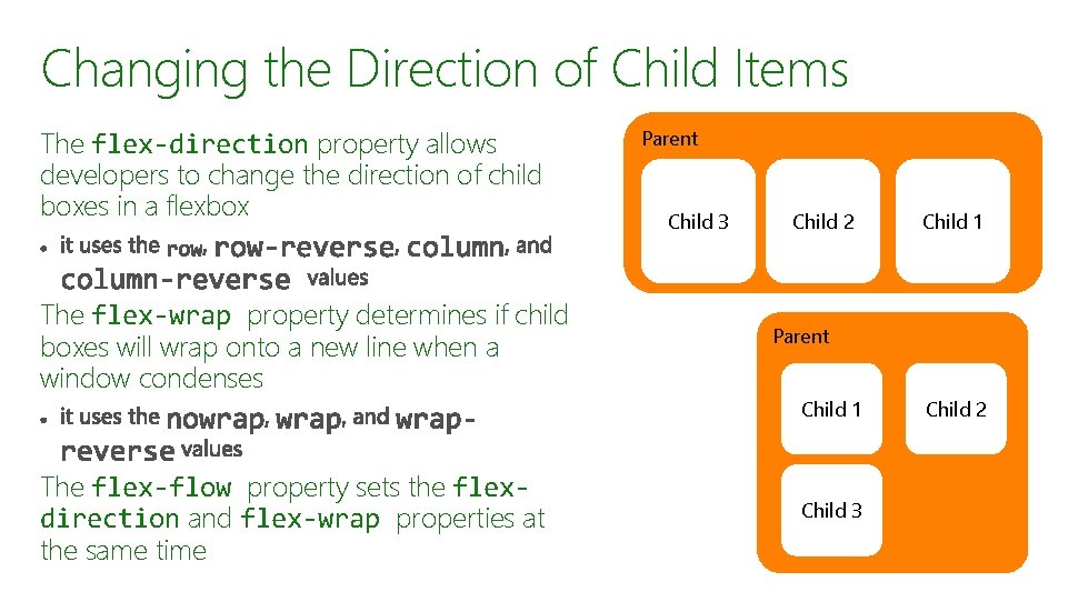
Changing the Direction of Child Items The flex-direction property allows developers to change the direction of child boxes in a flexbox The flex-wrap property determines if child boxes will wrap onto a new line when a window condenses The flex-flow property sets the flexdirection and flex-wrap properties at the same time Parent Child 3 Child 2 Child 1 Parent Child 1 Child 3 Child 2
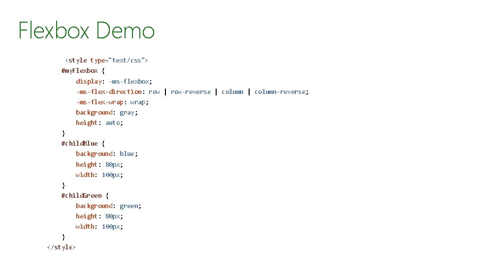
Flexbox Demo <style type="text/css"> #my. Flexbox { display: -ms-flexbox; -ms-flex-direction: row | row-reverse | column-reverse; -ms-flex-wrap: wrap; background: gray; height: auto; } #child. Blue { background: blue; height: 80 px; width: 100 px; } #child. Green { background: green; height: 80 px; width: 100 px; } </style>
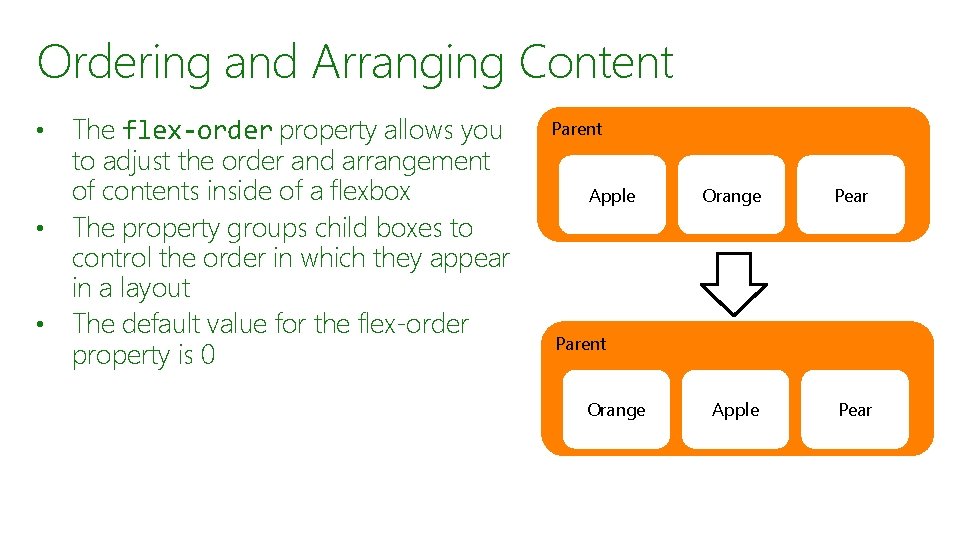
Ordering and Arranging Content The flex-order property allows you to adjust the order and arrangement of contents inside of a flexbox • The property groups child boxes to control the order in which they appear in a layout • The default value for the flex-order property is 0 • Parent Apple Orange Pear Apple Pear Parent Orange
More About Flexboxes https: //msdn. microsoft. com/en-us/library/hh 673531(v=vs. 85). aspx
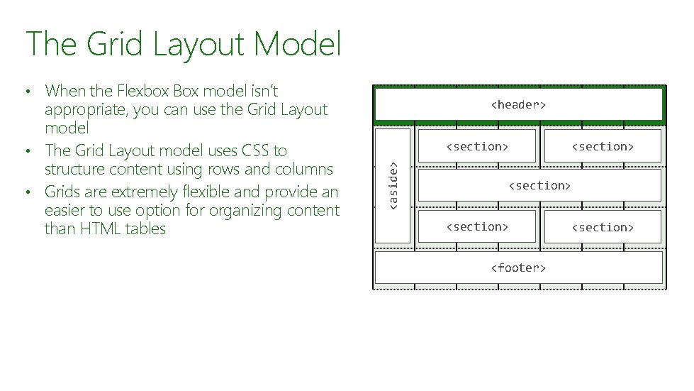
The Grid Layout Model • When the Flexbox Box model isn’t <header> <section> <aside> appropriate, you can use the Grid Layout model • The Grid Layout model uses CSS to structure content using rows and columns • Grids are extremely flexible and provide an easier to use option for organizing content than HTML tables <section> <footer> <section>
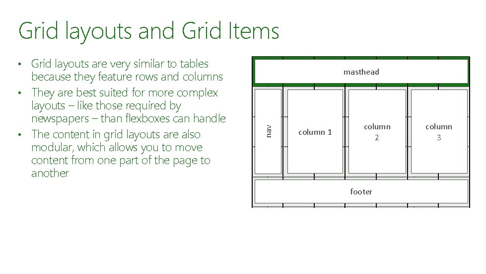
Grid layouts and Grid Items • Grid layouts are very similar to tables masthead nav because they feature rows and columns • They are best suited for more complex layouts – like those required by newspapers – than flexboxes can handle • The content in grid layouts are also modular, which allows you to move content from one part of the page to another column 1 column 2 footer column 3
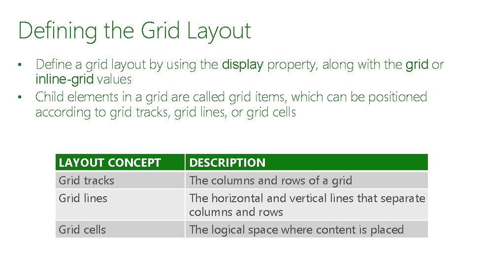
Defining the Grid Layout Define a grid layout by using the display property, along with the grid or inline-grid values • Child elements in a grid are called grid items, which can be positioned according to grid tracks, grid lines, or grid cells • LAYOUT CONCEPT Grid tracks Grid lines DESCRIPTION The columns and rows of a grid The horizontal and vertical lines that separate columns and rows Grid cells The logical space where content is placed
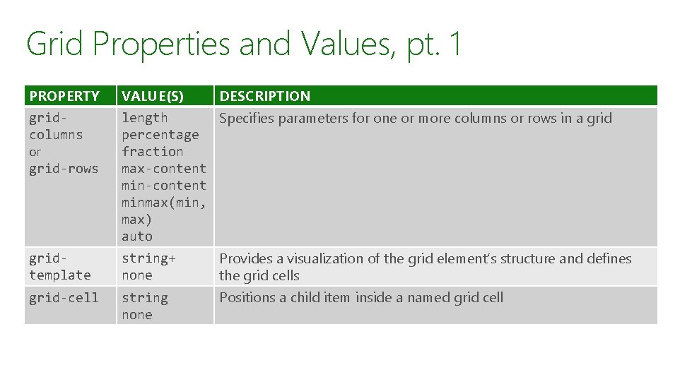
Grid Properties and Values, pt. 1 PROPERTY VALUE(S) DESCRIPTION gridcolumns or grid-rows length Specifies parameters for one or more columns or rows in a grid percentage fraction max-content minmax(min, max) auto gridtemplate string+ none Provides a visualization of the grid element’s structure and defines the grid cells grid-cell string none Positions a child item inside a named grid cell
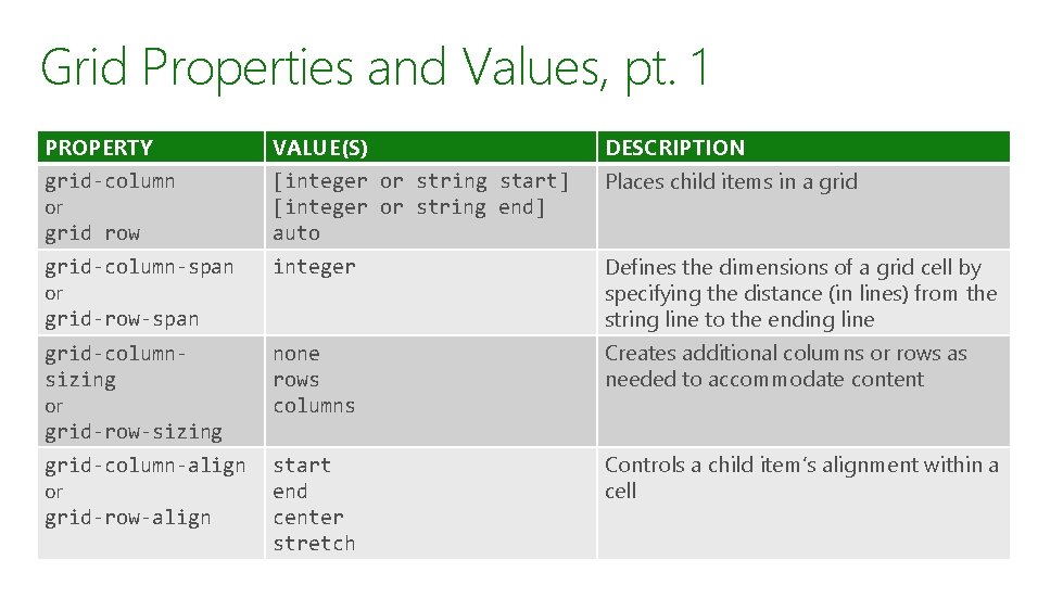
Grid Properties and Values, pt. 1 PROPERTY VALUE(S) DESCRIPTION grid-column or grid row [integer or string start] [integer or string end] auto Places child items in a grid-column-span or grid-row-span integer Defines the dimensions of a grid cell by specifying the distance (in lines) from the string line to the ending line grid-columnsizing or grid-row-sizing none rows columns Creates additional columns or rows as needed to accommodate content grid-column-align or grid-row-align start end center stretch Controls a child item’s alignment within a cell
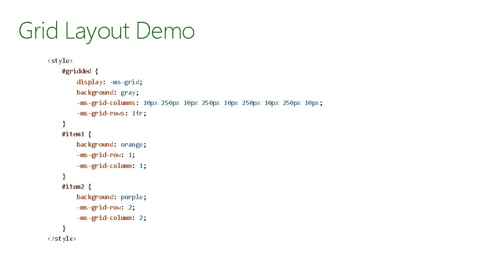
Grid Layout Demo <style> #gridded { display: -ms-grid; background: gray; -ms-grid-columns: 10 px 250 px 10 px; -ms-grid-rows: 1 fr; } #item 1 { background: orange; -ms-grid-row: 1; -ms-grid-column: 1; } #item 2 { background: purple; -ms-grid-row: 2; -ms-grid-column: 2; } </style>
More About Grid Layouts https: //msdn. microsoft. com/en-us/library/hh 673533(v=vs. 85). aspx

Summary The User Interface The CSS Box Model The Flexbox Box Model Grid Layouts

© 2015 Microsoft Corporation. All rights reserved.
- Slides: 32