Adobe Illustrator Characteristics of Logos Distinctive among other

Adobe Illustrator

Characteristics of Logos • • • Distinctive among other logos Memorable in the minds of viewers Appropriate for the brand Practical and Scalable for any purpose Original text and imagery

Graphic Designer: Carolyn Davidson, 1971. Inspired by Nike, goddess of victory. Company was originally called Blue Ribbon Sports.

Memorable Logo was introduced in 1962. Designed by Jim Schindler to resemble new arch shaped signs on the sides of the restaurants. He merged the two golden arches together to form the fam

1953: Fourth Mc. Donald's restaurant, in Downey, California. It is the oldest Mc. Donald's restaurant still in operation

Designed by Saul Bass in 1962 1946 original logo

Designed by Milton Glaser in 1977

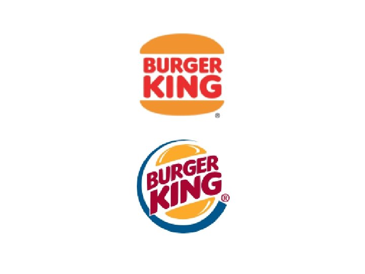
Appropriate Designed by Joe Finocchiaro

Practical

Clever Designed by Joe Finocchiaro

• Designed by Herb Lubalin and Tom Carnase in 1965 • Logo for a magazine that was never published

WE log

• Designed by Joe Finocchiaro in 2000

• Designed by Stanford professor Vaughan Pratt in 1982 • The letters u and n while arranged adjacent to each other look a lot like the letter S in a perpendicular direction.

• Designed by Herb Lubalin and Tom Carnase in 1980 • Communicates meaning figuratively through the logo • Also designed Brooks Brothers, Mac. World, Calvin Klein

• Designed by Phillipe Lenssen in 1999 • Design goals: clearly differentiate from other search engines • Be a search engine first and foremost • Playfully simple, colors evoke child play but stray from color formality • The texture and shading of each letter lift it from the page while giving it both weight and lightness. It is solid but there is also an ethereal quality to it. • Catull is font, old style serif (search looks in the past)

Logo by Typography • Typography is the preparation of text • Most logos contain originally designed text • The more original the logo it the more distinctive and memorable the work will be

Type and a mark

Designed by Chermayeff & Geismar

Just a mark

Designed by Chermayeff & Geismar

Three points used to represent the concept of Gottfied Daimler, which manufactures a range of transport movers that work effectively across air, water and land

Designed by Chermayeff & Geismar

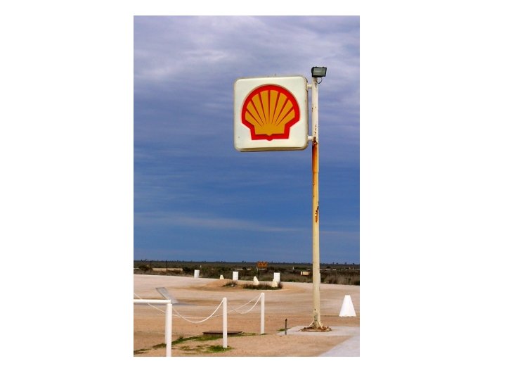
• Company founded in 1897 • Current logo designed by Raymond Loewy in 1967. • Design process was 4 years and included tests on highway poles and interviewing motorists

• Original logo was a mussel shell introduced in 1900 and replaced in 1904 by the first version of the scallop shell motif.

• Original designed by Richard Runyan in 1973

• Created in 1994 by Lindon Leader, at Landor Associates • Considered one of the best logos of all times • Hidden arrow suggesting forward movement and
 in 1976.")
• Designed by Ron Wayne (3 rd co-founder of Apple) in 1976.

• Designed by Rob Janoff 1977 • Bite mark to symbolize seduction, knowledge, play on byte

• Introduced in 1997 • Minimalism, controversial, new millenium

1942 -1954 1959 -1975 1954 -1959 1975 -1979 1956 -1961 1979 -1986

• Implies everything from A to Z and a smile

Color in Art and Design • With colors you can set a mood, attract attention, or make a statement. You can use color to energize, or to cool down. By selecting the right color scheme, you can create an ambiance of elegance, warmth or tranquility, or you can convey an image of playful youthfulness. Color can be your most powerful design element if you learn to use it effectively.

Color Harmonies URL Link • • Color Wheel Primary, Secondary, Tertiary Warm and Cool Analogous Complimentary Split Complimentary Triadic Monochromatic

KHS Logo Letters • Recreate the KHS letters in Adobe Illustrator. Vegas Gold: #bbb 400
- Slides: 45