Abstract Windowing Toolkit AWT Introduction Java AWT Abstract

Abstract Windowing Toolkit AWT
 is an API to develop GUI or")
Introduction • Java AWT (Abstract Windowing Toolkit) is an API to develop GUI or window-based application in java. • Java AWT components are platform-dependent i. e. components are displayed according to the view of operating system. • AWT is heavyweight i. e. its components uses the resources of system. • The java. awt package provides classes for AWT API such as Text. Field, Label, Text. Area, Radio. Button, Check. Box, Choice, List etc.

GUI

AWT Hierarchy

Object • The Object class is the top most class and parent of all the classes in java by default. • Every class in java is directly or indirectly derived from the object class.

Component • The Component is abstract class that encapsulates all the attributes of visual component. • All User interface (UI) elements that are displayed on screen are subclasses of Component is responsible for remembering the current foreground and background color and the currently selected text font.
 inserts a component on")
Methods of Component class Method Description public void add(Component c) inserts a component on this component. public void set. Size(int width, int height) sets the size (width and height) of the component. public void set. Layout(Layout. Manager m) defines the layout manager for the component. public void set. Visible(boolean status) changes the visibility of the component, by default false. void remove(Component c) Remove a component void set. Bounds(int x, int y, int width, int height) Set the location and size of single component and useful only with null layout.

Container • The Container is a component in AWT that can contain another components like buttons, textfields, labels etc. • The classes that extends Container class are known as container such as Frame, Dialog and Panel. • Container is responsible for laying out any components that it contains through the use of layout managers. • Methods: • void set. Font(Font f) • void set. Layout(Layout. Manager mgr)

Panel • Panel class is concrete class it doesn’t add new methods. • The Panel is the container that doesn't contain title bar and menu bars and Borders. • It can have other components like button, textfield etc.

An Applet is Panel is a Container java. lang. Object | +----java. awt. Component | +----java. awt. Container | +----java. awt. Panel | +----java. applet. Applet

An Applet • Applet is a public class which is predefined by java. applet. Applet • There is no main() method in Applet like Application program. The main() method is defined by browser or Appletviewer for Applet. • Life cycle methods: init, start, paint, stop, destroy • Applet is one type of container and subclass of Panel.

To create an applet • • • import java. applet. *; Import java. awt. *; Applet tag code in comment. Extends Applet class Life cycle method Class must be public

Applet Life Cycle

Window • The window is the container that have no borders and menu bars. • You must use frame, dialog or another window for creating a window.

Frame • It is subclass of Window. • The Frame is the container that contain title bar and can have menu bars, borders, and resizing corners. • It can have other components like button, textfield, etc. • Methods: • void set. Title(String title) • void set. Background(Color bgcolor)
 •")
Working with Frame Window • Extends Frame class • Constructor are: • Frame() • Frame(String title) • Setting and Getting window size: • void set. Size(int width, int height) • void set. Size(Dimension newsize) • Showing and Hiding Frame • void set. Visible(boolean visible. Flag)

Frame Class • We can create stand-alone AWT based applications. • A Frame provides main window for the GUI application. • There are two ways to create a Frame : 1. By instantiating Frame Class 2. By extending Frame class
![Program using Frames import java. awt. *; public static void main(String args[]){ class First.](http://slidetodoc.com/presentation_image/3b8ba2d58117e6e8e38320de1e4634b6/image-18.jpg "Program using Frames import java. awt. *; public static void main(String args[]){ class First.")
Program using Frames import java. awt. *; public static void main(String args[]){ class First. Frame{ First. Frame(){ First. Frame f=new First. Frame(); } Frame f=new Frame(); } Button b=new Button("click me"); b. set. Bounds(30, 50, 80, 30); f. add(b); f. set. Size(300, 300); f. set. Layout(null); f. set. Visible(true); }
{ Button b=new")
Program using Frames import java. awt. *; class First extends Frame{ First(){ Button b=new Button("click me"); b. set. Bounds(30, 100, 80, 30); add(b); set. Size(300, 300); set. Layout(null); set. Visible(true); } public static void main (String args[]){ First f=new First(); } }

Controls • • Labels Buttons Checkbox. Group Textfield Text. Field. Area Scoll. Bar

Label • The easiest control to use is a label. • A label is an object of type Label, and it contains a string, which it displays. • Labels are passive controls that do not support any interaction with the user.
 Label(String str, int how) The")
Labels • Label defines the following constructors: Label( ) Label(String str, int how) The first version creates a blank label. The second version creates a label that contains the string specified by str. This string is left-justified. • The third version creates a label that contains the string specified by str using the alignment specified by how. The value of how must be one of these three constants: Label. LEFT, Label. RIGHT, or Label. CENTER. • • •
 • String get. Text( ) •")
Label • Methods • void set. Text(String str) • String get. Text( ) • void set. Alignment(int how) • int get. Alignment( )

Controls // Demonstrate Labels import java. awt. *; import java. applet. *; /* <applet code="Label. Demo" width=300 height=200> </applet> */ public class Label. Demo extends Applet { public void init() { Label one = new Label("One"); Label two = new Label("Two"); Label three = new Label("Three"); // add labels to applet window add(one); add(two); add(three); } }

Buttons • The most widely used control is the push button. • A push button is a component that contains a label and that generates an event when it is pressed. • Push buttons are objects of type Button. • Button defines these two constructors: • Button( ) • Button(String str)
 void set. Label(String str) void set. Enabled(Boolean enable)")
Buttons • • String get. Label() void set. Label(String str) void set. Enabled(Boolean enable) Void add. Action. Listener(Action. Listener l) void remove. Action. Listener(Action. Listener l) String get. Action. Command() void set. Action. Command(String Cmd)
 // Demonstrate Buttons { import java. awt.")
Button yes, no, maybe; public void init() // Demonstrate Buttons { import java. awt. *; yes = new Button("Yes"); import java. applet. *; no = new Button("No"); /* maybe = new Button(“Understand"); <applet code="Button. Demo" add(yes); width=250 height=150> add(no); </applet> add(maybe); */ public class Button. Demo extends } public void paint(Graphics g) Applet { { g. draw. String(msg, 6, 100); String msg = ""; } }

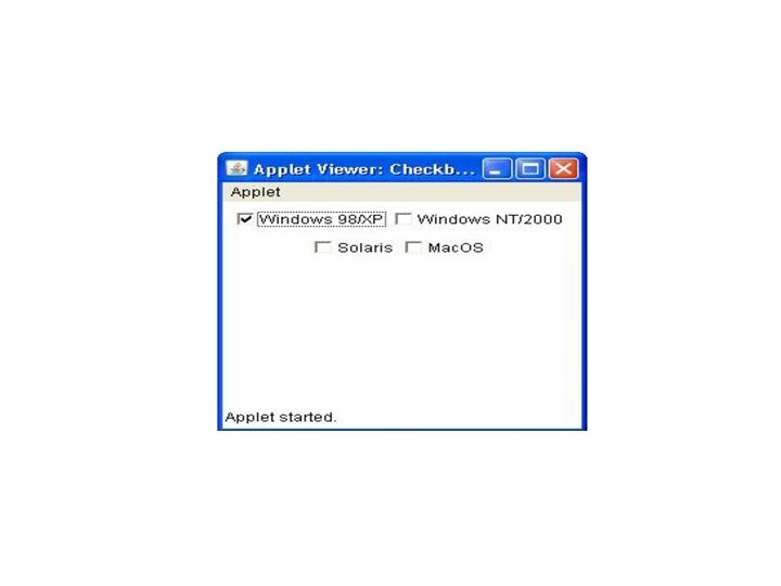
Check Boxes • A check box is a control that is used to turn an option on or off. • It consists of a small box that can either contain a check mark or not. • There is a label associated with each check box that describes what option the box represents. • We change the state of a check box by clicking on it. Check boxes can be used individually or as part of a group.
 Checkbox(String str, boolean on) Checkbox(String str, boolean")
Checkbox constructors: • • • Checkbox( ) Checkbox(String str, boolean on) Checkbox(String str, boolean on, Checkbox. Group cb. Group) Checkbox(String str, Checkbox. Group cb. Group, boolean on)
 void set. State(boolean on) String get.")
Methods • • • boolean get. State( ) void set. State(boolean on) String get. Label( ) void set. Label(String str) void add. Item. Listener(Item. Listener l) void remove. Item. Listener(Item. Listener l)
 // Demonstrate check boxes. { Win 98 = new Checkbox(\"Windows 98/XP\",")
public void init() // Demonstrate check boxes. { Win 98 = new Checkbox("Windows 98/XP", import java. awt. *; null, true); import java. applet. *; win. NT = new Checkbox("Windows /* NT/2000"); <applet code="Checkbox. Demo" solaris = new Checkbox("Solaris"); width=250 height=200> mac = new Checkbox("Mac. OS"); </applet> add(Win 98); add(win. NT); */ public class Checkbox. Demo extends add(solaris); add(mac); Applet } { public void paint(Graphics g) String msg = ""; {} Checkbox Win 98, win. NT, solaris, mac; }

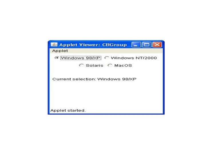
Checkbox Group • It is possible to create a set of mutually exclusive check boxes in which one and only one check box in the group can be checked at any one time. • These check boxes are often called radio button. • Check box groups are objects of type Checkbox. Group. • Only the default constructor is defined, which creates an empty group.
 void set. Selected. Checkbox(Checkbox wh)")
Methods Checkbox get. Selected. Checkbox( ) void set. Selected. Checkbox(Checkbox wh)
 { import java. awt. *; cbg = new Checkbox. Group(); import")
public void init() { import java. awt. *; cbg = new Checkbox. Group(); import java. applet. *; Win 98 = new Checkbox("Windows 98/XP", cbg, /* true); <applet code="CBGroup" width=250 height=200> win. NT = new Checkbox("Windows NT/2000", </applet> cbg, false); */ solaris = new Checkbox("Solaris", cbg, public class CBGroup extends Applet false); { mac = new Checkbox("Mac. OS", cbg, false); String msg = ""; Checkbox Win 98, win. NT, add(Win 98); add(win. NT); solaris, mac; add(solaris); add(mac); } Checkbox. Group cbg; public void paint(Graphics g) { msg = "Current selection: "; msg += cbg. get. Selected. Checkbox(). get. Label(); g. draw. String(msg, 6, 100); }}

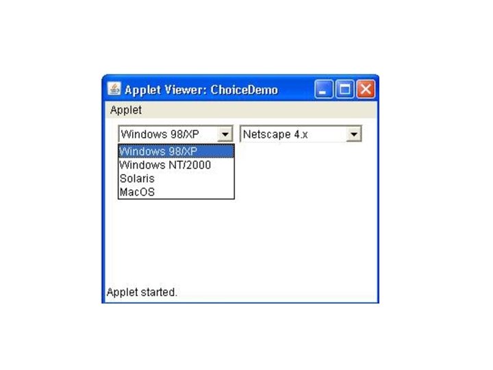
Choice Controls • The Choice class is used to create a pop-up list of items from which the user may choose. • Thus, a Choice control is a form of menu. • Each item in the list is a string that appears as a left justified label in the order it is added to the Choice object.
 String get. Selected. Item( ) int get. Selected. Index( )")
Methods void add(String name) String get. Selected. Item( ) int get. Selected. Index( ) int get. Item. Count( ) void select(int index) void select(String name) String get. Item(int index)

import java. awt. *; import java. applet. *; /* <applet code="Choice. Demo" width=300 height=180> </applet> */ public class Choice. Demo extends Applet { Choice os, browser; String msg = ""; public void init() { os = new Choice(); browser = new Choice(); os. add("Windows 98/XP"); os. add("Windows NT/2000"); os. add("Solaris"); os. add("Mac. OS"); browser. add("Netscape 3. x"); 4. x"); 5. x"); 6. x"); browser. add("Internet Explorer 4. 0"); browser. add("Internet Explorer 5. 0"); browser. add("Internet Explorer 6. 0"); browser. add("Lynx 2. 4"); browser. select("Netscape 4. x"); add(os); add(browser); } public void paint(Graphics g) {}}

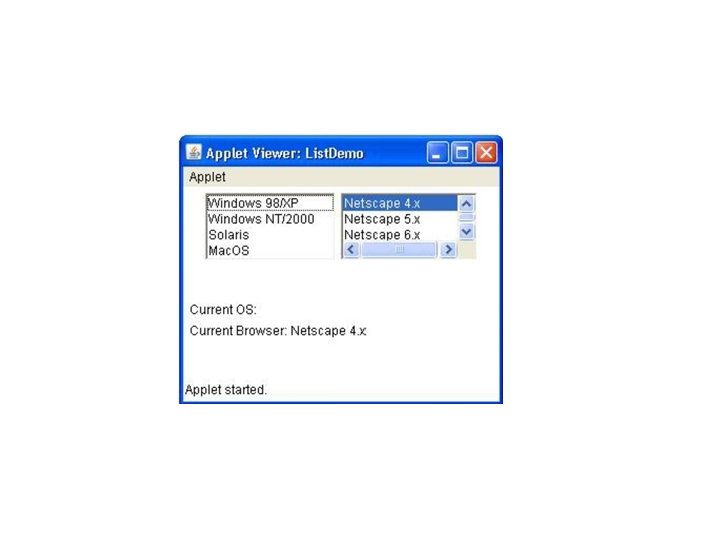
Lists • The List class provides a compact, multiple-choice, scrolling selection list. • Unlike the Choice object, which shows only the single selected item in the menu, a List object can be constructed to show any number of choices in the visible Window. • It can also be created to allow multiple selections.
 • List(int num. Rows, boolean multiple. Select) • The first")
List • List( ) • List(int num. Rows, boolean multiple. Select) • The first version creates a List control that allows only one item to be selected at any one time. • In the second form, the value of num. Rows specifies the number of entries in the list that will always be visible (others can be scrolled into view as needed). • In the third form, if multiple. Select is true, then the user may select two or more items at a time.
 void add(String name, int index) String get. Selected. Item( )")
Methods void add(String name) void add(String name, int index) String get. Selected. Item( ) int get. Selected. Index( ) String[ ] get. Selected. Items( ) int[ ] get. Selected. Indexes( ) int get. Item. Count( ) void select(int index) String get. Item(int index)

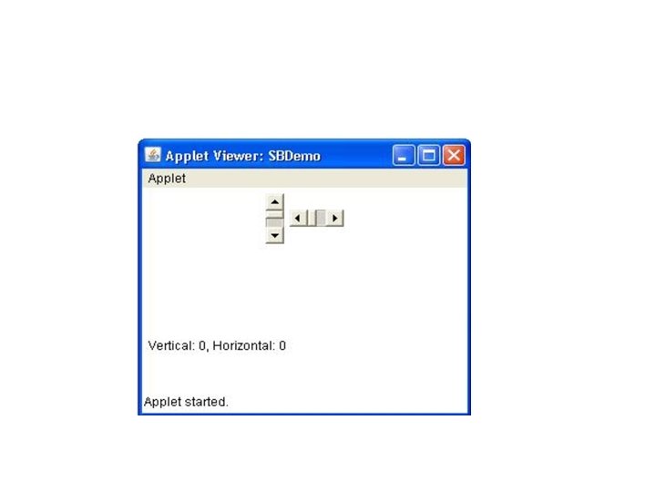
Scroll. Bars • Scroll bars are used to select continuous values between a specified minimum and maximum. • Scroll bars may be oriented horizontally or vertically. • A scroll bar is actually a composite of several individual parts. • slider box (or thumb) for the scroll bar. • The slider box can be dragged by the user to a new position, this action translates into some form of page up and page down.
 • Scrollbar(int style, int i. Value, int t. Size, int")
Constructors • Scrollbar( ) • Scrollbar(int style, int i. Value, int t. Size, int min, int max) • The first form creates a vertical scroll bar. • The second and third forms allow us to specify style Scrollbar. VERTICAL, Scrollbar. HORIZONTAL. • In the third form, the initial value of the scroll bar is passed in i. Value. The number of units represented by the height of the thumb is passed in t. Size. The minimum and maximum values for the scroll bar are specified by min and max.
 int")
Methods void set. Values(int i. Value, int t. Size, int min, int max) int get. Value( ) void set. Value(int new. Value) int get. Minimum( ) int get. Maximum( ) void set. Unit. Increment(int new. Incr) void set. Block. Increment(int new. Incr)

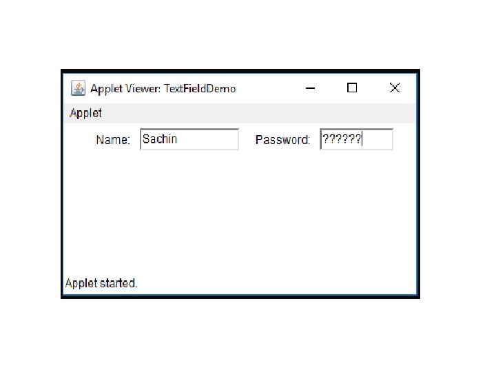
Text. Field • The Text. Field class implements a single-line text-entry area, called an edit control. • Text fields allow the user to enter strings and to edit the text using the arrow keys, cut and paste keys, and mouse selections. • Text. Field is a subclass of Text. Component.
 • Text. Field(int num. Chars) • Text.")
Text. Field Constructors • Text. Field( ) • Text. Field(int num. Chars) • Text. Field(String str, int num. Chars)
 • void set. Text(String str) •")
Text. Field Methods • String get. Text( ) • void set. Text(String str) • String get. Selected. Text( ) • void select(int start. Index, int end. Index) • boolean is. Editable( ) • void set. Editable(boolean can. Edit) • void set. Echo. Char(char ch) • boolean echo. Char. Is. Set( ) • char get. Echo. Char( )

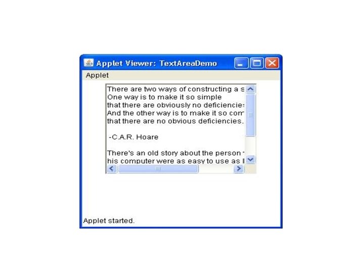
Text. Area • Sometimes a single line of text input is not enough for a given task. To handle these situations, the AWT includes a simple multiline editor called Text. Area. • Following are the constructors for Text. Area: • Text. Area( ) • Text. Area(int num. Lines, int num. Chars) • Text. Area(String str, int num. Lines, int num. Chars, int s. Bars) s. Bars must be one of these values: SCROLLBARS_BOTH, SCROLLBARS_NONE, SCROLLBARS_HORIZONTAL_ONLY, SCROLLBARS_VERTICAL_ONLY

Methods • Text. Area is a subclass of Text. Component. • Therefore, it supports the get. Text( ), set. Text( ), get. Selected. Text( ), select( ), is. Editable( ), and set. Editable( ) methods as of Text. Field. • Text. Area adds the following methods: • void append(String str) • void insert(String str, int index) • void replace. Range(String str, int start. Index, int end. Index)

Layout Managers • Layout means arranging the components within the container. • The task of lay outing can be done automatically by the Layout manager. • The layout manager is set by the set. Layout( ) method. • If no call to set. Layout( ) is made, then the default layout manager is used. • Whenever a container is resized (or sized for the first time), the layout manager is used to position each of the components within it.
 method has the following general form: • void")
• The set. Layout( ) method has the following general form: • void set. Layout(Layout. Manager layout. Obj) • Here, layout. Obj is a reference to the desired layout manager. • If we wish to disable the layout manager and position components manually, pass null for layout. Obj.

Layout. Manager • Layout. Manager is an interface that is implemented by all the classes of layout managers. There are following classes that represents the layout managers: • Flow. Layout • Border. Layout • Grid. Layout • Card. Layout • Grid. Bag. Layout

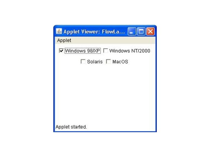
Flow. Layout • Flow. Layout is the default layout manager. • Flow. Layout implements a simple layout style, which is similar to how words flow in a text editor. • Components are laid out from the upper-left corner, left to right and top to bottom. • When no more components fit on a line, the next one appears on the next line. • A small space is left between each component, above and below, as well as left and right.
 • Flow. Layout(int how, int horz, int")
Flow. Layout Constructors • Flow. Layout( ) • Flow. Layout(int how, int horz, int vert) • The first is default, which centers components and leaves five pixels of space between each component. • The second form lets us specify how each line is aligned. Valid values for how are as follows: • Flow. Layout. LEFT • Flow. Layout. CENTER • Flow. Layout. RIGHT • The third form allows us to specify the horizontal and vertical space left between components
 • int get. Hgap() • int get.")
Flow. Layout Methods • int get. Alignment() • int get. Hgap() • int get. Vgap() • int set. Alignment(int align) • int set. Hgap(int hgap) • int set. Vgap(int vgap)

public class Flow. Layout. Demo extends Applet { Checkbox Win 98, win. NT, solaris, mac; public void init() { Win 98 = new Checkbox("Windows 98/XP", null, true); win. NT = new Checkbox("Windows NT/2000"); solaris = new Checkbox("Solaris"); mac = new Checkbox("Mac. OS"); set. Layout(new Flow. Layout(Flow. Layout. CENTER)); add(Win 98); add(win. NT); add(solaris); add(mac); }}

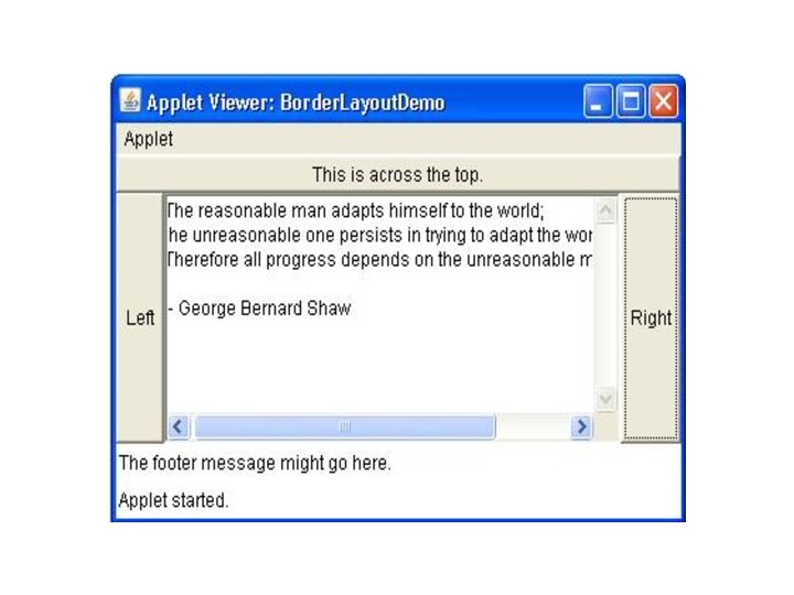
Border. Layout • The Border. Layout class implements a common layout style for top-level windows. • It has four narrow, fixed-width components at the edges and one large area in the center. • The four sides are referred to as • north, • south, • east, and • west. • The middle area is called the center.
 • Border. Layout(int horz, int vert) •")
Border. Layout Constructors • Border. Layout( ) • Border. Layout(int horz, int vert) • The first form creates a default border layout. • The second allows us to specify the horizontal and vertical space left between components in horz and vert, respectively.

Border. Layout • Border. Layout defines the following constants that specify the regions: • Border. Layout. CENTER • Border. Layout. SOUTH • Border. Layout. EAST • Border. Layout. WEST • Border. Layout. NORTH • To add components, we use these constants with the following form of add( ), which is defined by Container: • void add(Component comp. Obj, Object region); • Here, comp. Obj is the component to be added, and region specifies where the component will be added.
 { set. Layout(new")
public class Border. Layout. Demo extends Applet { public void init() { set. Layout(new Border. Layout()); add(new Button("This is across the top. "), Border. Layout. NORTH); add(new Label("The footer message. "), Border. Layout. SOUTH); add(new Button("Right"), Border. Layout. EAST); add(new Button("Left"), Border. Layout. WEST); String msg = "The reasonable man adapts himself to the world; n" + "the unreasonable one persists in trying to adapt the world to himself. n" + "Therefore all progress depends on the unreasonable man. nn" + " - George Bernard Shawnn"; add(new Text. Area(msg), Border. Layout. CENTER); } }

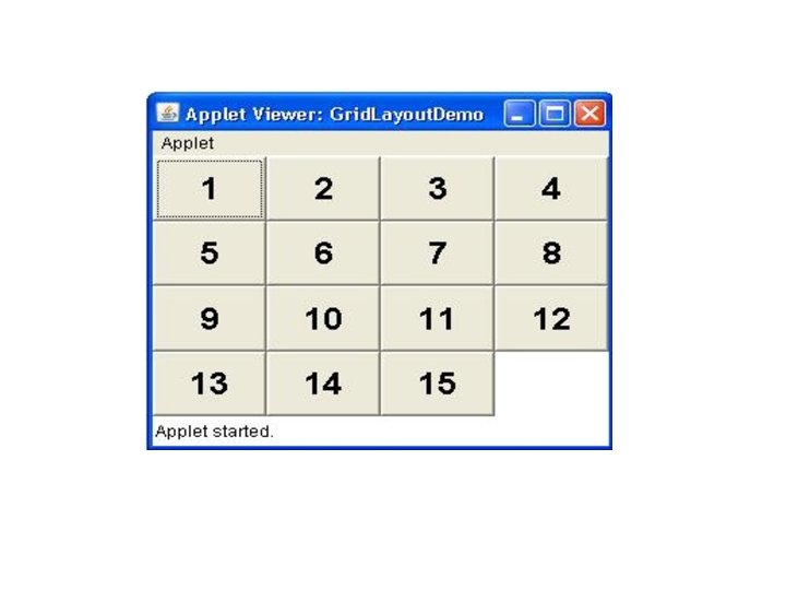
Grid. Layout • Grid. Layout lays out components in a twodimensional grid. • When we instantiate a Grid. Layout, we define the number of rows and columns.
 • Grid. Layout(int num. Rows, int num.")
Grid. Layout constructors • Grid. Layout( ) • Grid. Layout(int num. Rows, int num. Columns, int horz, int vert) • The first form creates a single-column grid layout. • The second creates a grid layout with specified number of rows and columns. • Either num. Rows or num. Columns can be zero. • Specifying num. Rows as zero allows for unlimited-length columns. • Specifying num. Columns as zero allows for unlimited-length rows.

public class Grid. Layout. Demo extends Applet { static final int n = 4; public void init(){ set. Layout(new Grid. Layout(n, n)); set. Font(new Font("Sans. Serif", Font. BOLD, 24)); for(int i = 0; i < n; i++){ for(int j = 0; j < n; j++){ int k = i * n + j; if(k > 0) add(new Button("" + k)); } }}}

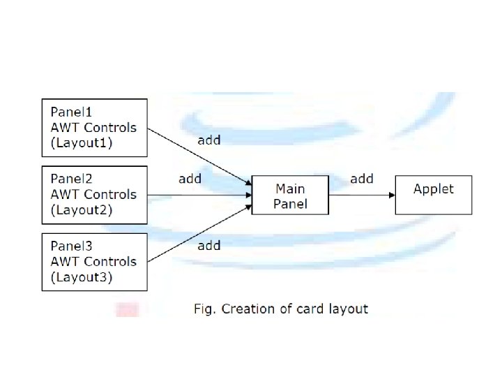
Card. Layout • The Card. Layout class is unique among the other layout managers in that it stores several different layouts. • Each layout can be thought of as being on a separate index card in a deck that can be shuffled so that any card is on top at a given time. • This can be useful for user interfaces with optional components that can be dynamically enabled and disabled upon user input. • We can prepare the other layouts and have them hidden, ready to be activated when needed.
 • Card.")
• Card. Layout provides these two constructors: • Card. Layout( ) • Card. Layout(int horz, int vert) • The first form creates a default card layout. • The second form allows us to specify the horizontal and vertical space left between components.
; • Here name is a string")
Methods • void add(Component panel. Obj, Object name); • Here name is a string that specifies the name of the card whose panel is specified by panel. Obj. After we have created a deck, our program activates a card by calling one of the following methods: • void first(Container deck) • void last(Container deck) • void next(Container deck) • void previous(Container deck) • void show(Container deck, String card. Name) • deck is a reference to the container (usually a panel) that holds the cards, and card. Name is the name of a card.

• // Demonstrate Card. Layout. import java. awt. *; import java. awt. event. *; public class Card. Layout. Example extends Frame implements Action. Listener{ Card. Layout card; Button b 1, b 2, b 3; Card. Layout. Example(){ card=new Card. Layout(40, 30); set. Layout(card);
; b 2=new Button(\"Boy\"); b 3=new Button(\"Cat\"); b 1. add. Action.")
b 1=new Button("Apple"); b 2=new Button("Boy"); b 3=new Button("Cat"); b 1. add. Action. Listener(this); b 2. add. Action. Listener(this); b 3. add. Action. Listener(this); add(b 1, ”card 1”); add(b 2, ”card 2”); add(b 3, ”card 3”); } public void action. Performed(Action. Event e) { card. next(this); } public static void main(String[] args) { Card. Layout. Example cl=new Card. Layout. Example(); cl. set. Size(400, 400); cl. set. Visible(true); } }

Grid. Bag. Layout • Each Grid. Bag. Layout object maintains a dynamic rectangular grid of cells, with each component occupying one or more cells, called its display area. • Each component managed by a grid bag layout is associated with an instance of Grid. Bag. Constraints that specifies how the component is laid out within its display area.

• For customize a Grid. Bag. Constraints object by setting one or more of its instance variables: • gridx, gridy: Specifies the cell at the upper left of the component's display area, where the upper-leftmost cell has address gridx = 0, gridy = 0. • gridwidth, gridheight: Specifies the number of cells in a row (for gridwidth) or column (for gridheight) in the component's display area. The default value is 1. • fill: Used when the component's display area is larger than the component's requested size to determine whether (and how) to resize the component.

import java. awt. *; import java. util. *; import java. applet. Applet; public class Grid. Bag. Ex 1 extends Applet { protected void makebutton(String name, Grid. Bag. Layout gridbag, Grid. Bag. Constraints c) { Button button = new Button(name); gridbag. set. Constraints(button, c); add(button); } public void init() { Grid. Bag. Layout gridbag = new Grid. Bag. Layout(); Grid. Bag. Constraints c = new Grid. Bag. Constraints(); set. Layout(gridbag);

c. fill = Grid. Bag. Constraints. BOTH; c. weightx = 1. 0; makebutton("Button 1", gridbag, c); makebutton("Button 2", gridbag, c); makebutton("Button 3", gridbag, c); c. gridwidth = Grid. Bag. Constraints. REMAINDER; //end row makebutton("Button 4", gridbag, c); c. weightx = 0. 0; //reset to the default makebutton("Button 5", gridbag, c); //another row } public static void main(String args[]) { Frame f = new Frame("Grid. Bag Layout Example"); Grid. Bag. Ex 1 ex 1 = new Grid. Bag. Ex 1(); ex 1. init(); f. add("Center", ex 1); f. resize(f. preferred. Size()); f. show(); } } f. pack();

Menu Bars and Menus • A menu bar displays a list of top-level menu choices. Each choice is associated with a dropdown menu. • This concept is implemented in Java by the following classes: • Menu. Bar, Menu, and Menu. Item. • In general, a menu bar contains one or more Menu objects. Each Menu object contains a list of Menu. Item objects. Each Menu. Item object represents something that can be selected by the user.
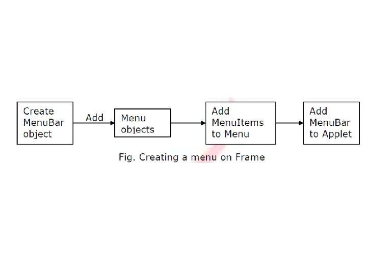

• Menu. Bar Class Defines only default constructor. • Menu Class Constructors • Menu( ) • Menu(String option. Name, boolean removable) • Here, option. Name specifies the name of the menu selection. • Individual menu items constructors: • Menu. Item( ) • Menu. Item(String item. Name, Menu. Shortcut key. Accel)

Methods • Disable or enable a menu item by using: • void set. Enabled(boolean enabled. Flag) • boolean is. Enabled( ) • Label set and get using: • void set. Label(String new. Name) • String get. Label( ) • Checkable menu item by using a subclass of Menu. Item called Checkbox. Menu. Item. : • Checkbox. Menu. Item( ) • Checkbox. Menu. Item(String item. Name, boolean on)
 • void")
Methods • Status about checkable Menu. Item: • boolean get. State( ) • void set. State(boolean checked) • For add Menu. Item: • Menu. Item add(Menu. Item item) • For add Menu. Bar • Menu add(Menu menu) • To get Item from Menu: • Object get. Item( )
{ Frame f= new Frame(\"Menu")
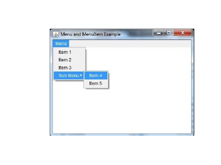
import java. awt. *; class Menu. Example { Menu. Example(){ Frame f= new Frame("Menu Example"); Menu. Bar mb=new Menu. Bar(); Menu menu=new Menu("Menu"); Menu submenu=new Menu("Sub Menu"); Menu. Item i 1=new Menu. Item("Item 1"); Menu. Item i 2=new Menu. Item("Item 2"); Menu. Item i 3=new Menu. Item("Item 3"); Menu. Item i 4=new Menu. Item("Item 4"); Menu. Item i 5=new Menu. Item("Item 5"); menu. add(i 1); menu. add(i 2); menu. add(i 3); submenu. add(i 4); submenu. add(i 5); menu. add(submenu); mb. add(menu); f. set. Menu. Bar(mb); f. set. Size(400, 400); f. set. Layout(null); f. set. Visible(true); } public static void main(String args[]) { new Menu. Example(); } }

Dialog. Box • Dialog boxes are primarily used to obtain user input. • They are similar to frame windows, except that dialog boxes are always child windows of a top-level window. • Dialog boxes don’t have menu bars. • In other respects, dialog boxes function like frame windows. • Dialog boxes may be modal or modeless. • When a modal dialog box is active, all input is directed to it until it is closed. • When a modeless dialog box is active, input focus can be directed to another window in your program.
 • Dialog(Frame parent. Window,")
• Constructors: . • Dialog(Frame parent. Window, boolean mode) • Dialog(Frame parent. Window, String title, boolean mode) • To create Dialog Box: • Create Frame or Applet • Create another class which extends Dialog class. • Call this new class from Frame/Applet class. • In constructor of Extended Dialog class, use super method and pass vales to constructor of Dialog

import java. awt. *; import java. awt. event. *; public class Dialog. Example { private static Dialog d; Dialog. Example() { Frame f= new Frame(); d = new Dialog(f , "Dialog Example", true); d. set. Layout( new Flow. Layout() ); Button b = new Button ("OK"); b. add. Action. Listener ( new Action. Listener() { public void action. Performed( Action. Event e ) { Dialog. Example. d. set. Visible(false); } }); d. add( new Label ("Click button to continue. ")); d. add(b); d. set. Size(300, 300); d. set. Visible(true); }

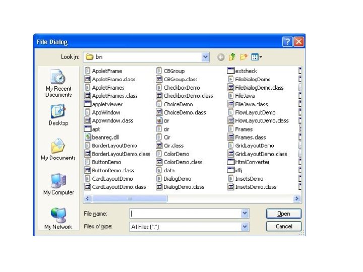
File. Dialog • Java provides a built-in dialog box that lets the user specify a file. • To create a file dialog box, instantiate an object of type File. Dialog. • Constructor: • File. Dialog(Frame parent, String box. Name) • File. Dialog(Frame parent, String box. Name, int how) • File. Dialog(Frame parent) • Int how: File. Dialog. LOAD, File. Dialog. SAVE • Methods: • String get. Directory( ) • String get. File( )
{ super(title);")
import java. awt. *; class Sample. Frame extends Frame { Sample. Frame(String title){ super(title); }} class File. Dialog. Demo {public static void main(String args[]){ Frame f = new Sample. Frame("File Dialog Demo"); f. set. Visible(true); f. set. Size(100, 100); File. Dialog fd = new File. Dialog(f, "File Dialog"); fd. set. Visible(true); }}
- Slides: 96