A Power Point about how to Create Power

A Power. Point about how to Create Power. Points Basic Presentation Tools Essential Level workshop on the Pathway to Instructional Excellence by Adam Voyton

Workshop Learning Objectives • Review design templates • Build well readable and easily understandable title slide, new slides and presentations for lecturing and presenting • Develop a Power. Point with bulleted text, images, hyperlinking • Choose animations, visualizations, and graphic design concepts to improve your power point • Review best practice of presenting focusing on the presenter being more important than the slides • Utilize PPT features to maximize the message

Table of Contents 1. Overview of Power. Point 2. 18 Real Examples of Slide Layouts 3. Building your Power. Point - Add different types of content and multimedia 4. Graphic Design – Add a theme and select a color scheme 5. Adding animations and cinematic effects between slide transitions 6. Further Reading on Presentation Skills 7. Frequently Asked Questions

What is Power. Point? • A good analogy for a Power. Point presentation is it’s an electronic version of a paper flip chart. • It’s a visual aid meant to enhance the quality of your presentation

What can faculty members use it for? Instructional uses • Creating lecture notes / slide deck • Record a virtual lecture via screencasting technology such as Kaltura • Tutorial (i. e. , screenshots of how to make a chart in Excel) • Interactive Game-based templates like Jeopardy Other uses • Create a photo slideshow that automatically loops – nice for weddings or other special events • Group projects • Work presentations to colleagues

Explain it to me like I’m 5 years old Terminology • A slide is a virtual representation of a physical page on a paper flip chart • You can have as many slides as you’d like in your Power. Point presentation • Simply click inside a textbox and type to add content to your slides • A slide can have a design layout, which controls where the content appears on a slide (see examples on next slides) • When you save a Power. Point, you are creating a new virtual flip chart. • Each new Power. Point file is a new virtual flip chart • You can upload your Power. Point to Blackboard for your students to download

The Objective • It’s a visual aid not a foundation Your Power. Point presentation is a visual aid to your lecture. It is not meant to carry the whole thing. Please do not flood the slides with text. Your skill as an adjunct is to lecture and convey the information, not have them read slides while you recite the text verbatim. • Possibly meaningless without you Since you are limiting your text, some Power. Points may be worthless without the lecture supporting it. You can still have these presentations on Blackboard along with a study guide that you use when giving the lecture. • Have it fit your use Putting stuff that does not pertain to the chapter or lecture will only clutter the presentation.

Printing Options 1. Click the “File” tab in the top left corner of the Power. Point application 2. Click Print 3. By default, it will print 1 slide per page. This is typically a waste of paper. Consider printing multiple slides on each page. 4. If you want your notes printed out below each slide, select the Notes Pages option.

Printing Options 5. A print preview will now appear 6. As long as everything looks good in the Preview, then click Print

Table of Contents 1. Overview of Power. Point 2. 18 Real Examples of Slide Layouts 3. Building your Power. Point - Add different types of content and multimedia 4. Graphic Design – Add a theme and select a color scheme 5. Adding animations and cinematic effects between slide transitions 6. Further Reading on Presentation Skills 7. Frequently Asked Questions

Slide Layout example 1: Title Slide • Title slides should be like a summer romance: short and sweet. • Like an executive summary, tell the gist of the presentation with a minimum of words

Slide Layout example 2: Title and Content • This is the most common type of slide layout. It simply has a large heading for the main point of the slide. And then a large area for bulleted lists, charts, or other types of content

Slide Layout example 3: Section Header Sections are like chapters in a book. They organize your content into logical chunks.

Slide Layout example 4: Two Content Typically used to compare and contrast things

Slide Layout example 5: Comparison Use lists to organize content. Each column has an extra box for a heading

Slide Layout example 6: Title Only Great when you only want a heading. This is useful for having 1 or more images on a slide

Slide Layout example 7: Blank The most flexible of all layouts. The blank template literally comes without any pre-populated layout boxes. • It won’t prompt you to click to add text. Instead, draw your own texts boxes or insert multimedia using the Insert tab • Often this layout is used to have a large image take up the full screen

Slide Layout example 8: Photo with Caption • The “Content with Caption” layout and “Picture with Caption” are not commonly used • This slide is an example of the layout. It’s a bit odd that the one text box is significantly larger by default. • Could be good for an Instructor introduction slide to provide a photo and some biographical information to your students

Slide Layout example 9: Questions Slide • Commonly used at the end of presentation to allow a few minutes for the audience to ask questions or provide feedback • Summarizing the main points of the presentation may help foster the conversation

Slide Layout example 10: References Slide • Typically the final slide in your Power. Point, this simply lists any sources you used

Slide Layout example 11: Table of Contents For longer presentations, it may be better to use a Table of Contents instead of section headings. Highlight the section you’re about to start for added effect

Why Create a Table of Contents? • Manage the audience’s expectations - Your audience may be more interested in a certain section of your presentation – the table of contents lets them know when they need to pay extra attention. • Provide a high level overview of the content - Make your presentation digestible into logical chunks. People will know how far into the presentation you are. • Make a good impression - A document with a table of contents has a more professional appearance • Easier to discuss - With any questions from the audience, it’s easy to remember a section.

Slide Layout example 12: Visual Metaphor • They say a picture’s worth a thousand words • Pictures are easy to understand ‘at a glance’ without reading This version use images to reinforce the idea behind the words. Also the customized design template may capture the audience’s attention more than the out of the box PPT template

Images should serve a Purpose • Add impact • Human faces help people connect • Images should not clutter the slides • They say a picture’s worth a thousand words. • But it takes a while to read 1, 000 words. • So why waste the audience’s time including superfluous imagery? • They’ll waste time trying to understand why you included a trivial clipart image. • It may distract the audience and take their attention away from you, the presenter • Images should have a consistent look Admit it! My cheerful demeanor distracted you from reading the more important bullet points above.

Slide Layout example 13: Charts • Your chart should tell a simple story • It should be able to be understood ‘at a glance’

Slide Layout example 14: Data If the data is not easy to understand, summarize any trends or noteworthy points Explanation of the data: Facebook was like a hurricane. It had huge fluxuations. It could be doing great one week, then plummet back down…only to rise right back up again. Ironically, when I sold it was only for about a dollar less than I purchased it for. You can see that right around the last week of October, it reached it’s highest value of $80. 77. But 2 weeks before that, it was at it’s lowest closing price of $72. 63.

Not So Good Charts • Too much content to understand what the point is • Consider putting each bar graph on it’s own slide to improve readability

Not So Good Charts This chart is probably the best example of a crowded slide. If you think it looks like a government program, yes, it was used by the Pentagon.

Slide Layout example 15: Workflow / Process Overview Less is more! Consider using Smart. Art to provide a high level overview, then add the details for each element on the flow chart on its own slide

Slide Layout example 16: You. Tube Videos • Embedding a You. Tube video into a Power. Point is tricky and doesn't consistently work between all versions. • Thus, I recommend a simpler approach: add the link to a slide, then simply click the link and watch the video on You. Tube • You can also embed the link on the thumbnail of a video clip to emulate the look and feel of a You. Tube video Video link: http: //youtu. be/s. UGcf. Cguo. Qs

Embedding You. Tube videos still doesn’t work all the time

Slide Layout example 17: Tables for Summarizing Dense Information

Slide Layout Example 18: Branded Contact Ed. Tech@wilmu. edu to request a full copy of the branded template, with many different layout to WU options • Matches institutional colors guidelines - Emerald green headings • Uses Arial font, in alignment with the WU Brand -Guide - a consistent visual brand is vital on all corporate materials to promote brand recognition for internal and external audiences • Official WU logo appears on each slide

Table of Contents 1. Overview of Power. Point 2. 18 Real Examples of Slide Layouts 3. Building your Power. Point - Add different types of content and multimedia 4. Graphic Design – Add a theme and select a color scheme 5. Adding animations and cinematic effects between slide transitions 6. Further Reading on Presentation Skills 7. Frequently Asked Questions

Your version of Power. Point may look a bit different, but that’s okay. Features and tabs will work if you follow the outlined steps • The screenshots in the following tutorials are using the 2016 version of Microsoft Office. • The Wilm. U computers are running version 2013. • You may have a different version entirely. • Keep in mind that the versions may be different, but these features will work in any version that is 2010 or above. The user interface may look a bit different, but the buttons and tabs will be the same. • Contact Ed. Tech@wilmu. edu if you need to request a one-on-one training appointment.

Editing Slides and the Power. Point user interface • The left column in the navigation area. It's controls the sequence in which the slides are displayed. Each slide has a number. To reorder a slide, simply click and hold down the click button on the slide you want to move to another location and drag your cursor to a new spot. • Click a slide on the navigation pane to bring up that slide’s content. Click anywhere on the slide to edit the content.

How to add a new Slide • Slide layouts are a way of organizing your content on a slide. There are 9 generic layouts to choose from*. • The screenshot on the right shows how to create a new slide, as well as select the slide’s layout *The example layouts 9 – 18 are a bit tricky to set up. Contact Ed. Tech@wilmu. edu to request a Power. Point consultation meeting.

How to add content to a Slide! • Simply click in a box and start typing to add text. • Remember to keep your content inside the box, otherwise it will not be displayed when we go into full screen Presentation mode. • You can resize the size of the box by clicking on the box’s corner and holding down the click button. Then move your mouse to resize.

How to reorder slides faster • By default, you’re in the “Normal” view. This is ideal for editing your Power. Point. • For larger Power. Points, it may be easier to change to the “Slide Sorter” view. This brings up a small thumbnail for all of your slides. • You can then easily drag and drop the slides to reorder their position on the presentation’s navigation

Example of Slide Sorter View • Notice how it now displays a larger number of slides on the screen at once, making it easier to change the sequence of your slides. • Try zooming out to see even more slides! Remember to click the + sign to zoom back in.

2 ways to Switch Back to Normal View

How do I add a Section slide?

What’s a Bullet Point? Just a fancy name for a list! Lists where order doesn’t matter Sequential / numeric lists For example, for the school trip on week, children need to bring: • Waterproof clothing in case of rain • Packed lunch • Notebook and pen • Walking shoes Here is the agenda for the next PTA meeting: 1. Minutes from last meeting 2. Fund-raising initiatives 3. Other concerns 4. Date of next meeting Use Bullet points when it’s not important that the items in the list are in any particular order Numbered points show order, like step by step directions (sequence matters)

Adding Bullet Points and Changing the Type of Bullet • On the home tab, click the down area to open a drop down menu. • This menu has various bullet formatting options.

Adding Images saved on your computer 1. Go to the insert tab 2. Click Pictures 3. This will bring up all of the documents and folders saved onto your computer. Go to the folder with the image you want to add. Click on the image 4. Click insert to add it onto your slide.

Adding Images from the Microsoft Clipart Library 1. Go to the insert tab 2. Click Online Pictures 3. Type a keyword / subject in the search bar 4. Click the magnifying glass icon 5. Click on the image you want to download into your Power. Point 6. Click insert

Adding Hyperlinks: Option 1: Copy and paste from a URL into a slide’s content area. Once you paste it, press space one time on the keyboard. It will turn blue and will now be underlined. • Links will only open up in a web browser when you are in full screen mode. Example: Wilmington University Notice how it displays the text Wilmington University, but it opens up the www. wilmu. edu website when clicked on (again, only in full screen presentation mode.

Adding Hyperlinks: Option 2 1. Click the insert tab 2. Click “Hyperlink” 3. Enter the text that will display on the slide. This can differ from the URL/website link 4. Paste in the URL you want to link to 5. Click OK

Adding Charts – great for easily understanding patterns and trends 1. Click insert 2. Click Chart 3. Select the type of chart you want to create 4. Click OK

Final Step: Plug your data into the chart Sales 5. Now add in your data to populate the spreadsheet to update the chart*. Click X once the data is plugged in. 1 st Qtr 2 nd Qtr 3 rd Qtr 4 th Qtr *Contact Ed. Tech@wilmu. edu for help in creating high quality charts, as it can be tricky to get them configured and looking nice.

If you need to modify the spreadsheet’s content after you click X on the spreadsheet: 1. Click on the chart 2. Click the “Chart Tools” contextual tab. This tab will only appear when you click on a chart. It will automatically be hidden until you click the chart. 3. Click Edit Data to bring up the spreadsheet.

Smart Art What is Smart Art? 1. On a new Slide, simply click the Smart Art icon: • Smart Art graphics visually communicate information • An example is the Slide Layout example 15: Workflow / Process Overview • Sometimes configuring and designing a Smart Art graphic can be tedious and hard to learn. Contact Ed. Tech@wilmu. edu for support.

How to Create Smart Art graphics

Once you’ve created the Smart Art graphic, simply click in the box that says [text] to modify the verbiage. Try it out in the Smart Art below!

Don’t have content outside the box! • A best practice is to keep all of your content within the white area of the slide. • See the image to the right? Notice how it’s leaking over the right edge? This is bad because when we go full screen, it will be cut off and will not display properly. • Just like driving a car: stay in your lane!

Using Notes • Notes can be added to a slide. • Notes are not displayed to the audience, they’re for your eyes only • You could use notes to write a script for what you’ll say during the presentation, in case you forget • You can, however, print so that your notes will appear beneath each slide. • Follow these steps to enable the notes feature.

Table of Contents 1. Overview of Power. Point 2. 18 Real Examples of Slide Layouts 3. Building your Power. Point - Add different types of content and multimedia 4. Graphic Design – Add a theme and select a color scheme 5. Adding animations and cinematic effects between slide transitions 6. Further Reading on Presentation Skills 7. Frequently Asked Questions

Choose a Design Theme • Power. Point comes stocked with ‘themes’. A theme provides: • • • A particular aesthetic, or ‘look and feel’. Specific font sizes and font types (i. e. , Times New Roman) Background designs Different slide layouts (meaning where content is positioned on the slide) Something to consider: sometimes when you pick a new theme, it will mess up your content. It may overlap an image on top of text, where it previously looked just fine. Be sure to review your Power. Point to verify that content has not shifted in unexpected ways.

How to change to a new theme • Click the Design tab and a few options will pop up. • Choose one of these, or click the small down arrow to expand the number of available themes. You can change themes at anytime, but review your Power. Point to verify that content is still positioned correctly on the slide.
")
Selecting a theme (continued)

Color palettes AKA Variants • Each theme also offers a huge set of color variations! • You can change at any time and all of your slides will be updated

Other Templates options and considerations • Make your own! • Download a free online template • Just be careful you don’t choose one with an overly busy background

Good Backgrounds

Not So Good Backgrounds

Fonts • Choose ones that come with template • Choose ones that are universally available • No more than two • Easy to read • You can mix serif and sans serif

Good Fonts Anything that is clearly readable!

Not So Good Fonts Used for special effects is okay, but not all text

Colors • Stick with solids or smooth gradations • No more than three of four • Good combinations • Be aware of audience members
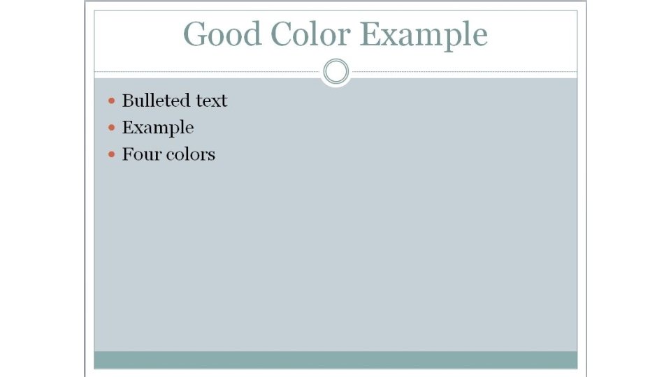
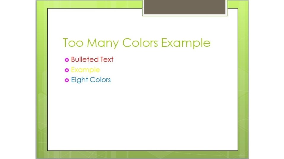

Table of Contents 1. Overview of Power. Point 2. 18 Real Examples of Slide Layouts 3. Building your Power. Point - Add different types of content and multimedia 4. Graphic Design – Add a theme and select a color scheme 5. Adding animations and cinematic effects between slide transitions 6. Further Reading on Presentation Skills 7. Frequently Asked Questions

Transitions - special effects between each slide • Transitions are motion effects that when in Slide Show view add movement to your slides as you advance from one slide to another. • There are many transitions to choose from, each one of which allows you to control the speed and even add sound. In this lesson, you'll learn how to apply and customize slide transitions.

How to add a Transition 1. Go to the Slide you want to add the Transition to. IF you want to add the same transition to all of your slides, then click on 1 slide in the navigation area, then click Ctrl + A to highlight all of the slides. 2. Click the Transitions tab 3. Select a Transition. We recommend using the “Subtle” category. The exciting transitions look cool, but can be distracting.

Screenshot of how to add transitions

Animations can be used to Control Order in which content appears on a slide while in Full screen presentation mode • Notice on this slide, this bullet did not appear automatically. Only the title heading above appeared, until you clicked space bar or the directional arrow on the keyboard • Then when you progress again, this bullet point appears. You can use this to control the flow of content. • Basically, we recommend using this when you don’t want your audience to read ahead. Use animations to keep the focus on you!

How to Add Animations 1. First, add your bulleted list. Then click on the outline of the box which holds all of the bullet points. Otherwise, you have to add the animation manually to each bullet point, which is tedious to set up. 2. Then Click the Animations tab 3. Finally, select the animation you want to add. 4. You’ll notice little numbers appear next to each bullet point, which automatically go away in full screen presentation mode. These are reminders of the order in which the bullet points will appear on the screen.

Screenshots of how to add Animations

Table of Contents 1. Overview of Power. Point 2. 18 Real Examples of Slide Layouts 3. Building your Power. Point - Add different types of content and multimedia 4. Graphic Design – Add a theme and select a color scheme 5. Adding animations and cinematic effects between slide transitions 6. Further Reading on Presentation Skills 7. Frequently Asked Questions

Best Practices to Typically Follow • Seven and seven - When designing your slides use no more than seven bullets per slide and seven words per bullet. • Consistent transitions and animations - Stay consistent with your slide transitions and bullet animations. You can use different ones for specialty slides, but if you keep changing it every slide, you will lose your audience. They won’t pay attention by the material, they will be looking for what special effect is next. • Sound…probably not - Using silly sounds for each transition or bullet is cheesy. Use them only, and we do mean only, if needed. • Well balanced - A slide full of material is not using space wisely. The type may be too small and will be hard to read. Crowding it with pictures isn’t always the best option. • Use negative space, less is more - Keeping the slides well designed will keep your audience’s attention. Of course there will be times that maybe a quote or sentence from the material will have to be used in a slide. That is fine, but don’t make a bad habit of it.

Power. Point Operational Tips • Use F 5 to start your presentation in full screen mode • Press Esc to get out of full screen mode • Use the keyboard directional arrows to progress slides

Pro Power. Point Tips • Always load your PPT files onto the desktop before class, then remove your thumb drive and put it back in your bag this way you won’t leave it behind • Use a Power. Point remote so you’re not stuck behind the podium • Proof your Power. Point! Press F 7 to bring up the built-in speller checker

Know Your Audience and Location • Gear your material to your audience • Get to the classroom early to troubleshoot or get help with any technical surprises or limitations

10 Do's and Don'ts of Presenting with Power. Point 1. 2. 3. 4. 5. 6. 7. 8. 9. 10. Hold up your end with compelling material. Keep it simple Minimize numbers in slides. Don't parrot Power. Point Time your remarks Give it a rest Use vibrant colors Import other images and graphics Distribute handouts at the end—not during the presentation. Edit ruthlessly before presenting. Source: http: //www. microsoft. com/en-us/business/articles/10 -dos-and-don%27 ts-of-presenting-with-powerpoint? CR_CC=200629167

Table of Contents 1. Overview of Power. Point 2. 18 Real Examples of Slide Layouts 3. Building your Power. Point - Add different types of content and multimedia 4. Graphic Design – Add a theme and select a color scheme 5. Adding animations and cinematic effects between slide transitions 6. Further Reading on Presentation Skills 7. Frequently Asked Questions

Q: Can I add audio narration to slides? A: Yes! You actually have two options : Option 1: Take the Advanced Presentation Tools workshop to learn how to create and add MP 3 files to each slide. Option 2: Take the Kaltura Basics workshop to learn how to make a full length video by screencasting your Power. Point. This movie can then be embed into your Blackboard courses.

Help and Support Need one-on-one assistance or another set of eyes to review your Power. Point? Our team is devoted to assisting our faculty members. If you require training, please reach out to us at edtech@wilmu. edu. Additional Resources: • Wilmington University Classroom Help classroomtechnology@wilmu. edu • Microsoft Office Templates http: //office. microsoft. com/en-us/templates/ • Free Templates http: //slidehunter. com/
- Slides: 86