A lesson in line color and rhythm To


")


 •")
- Slides: 33
§ A lesson in line, color and rhythm.
§ To learn about the elements of line, color, value and space and how to apply them to create the principles of rhythm, repetition, pattern in a work of art. §.
§ Lets talk about the Elements of Art § The Elements of Art are the building blocks that we use in a piece of art to create Principles of Art. § The Elements of Art can be compared to letters of the alphabet. We use these elements to create Principles of Art § Watch this movie, it may seem a little rudimentary, but has great information.
http: //safeshare. tv/w/fn. CUZCbyme
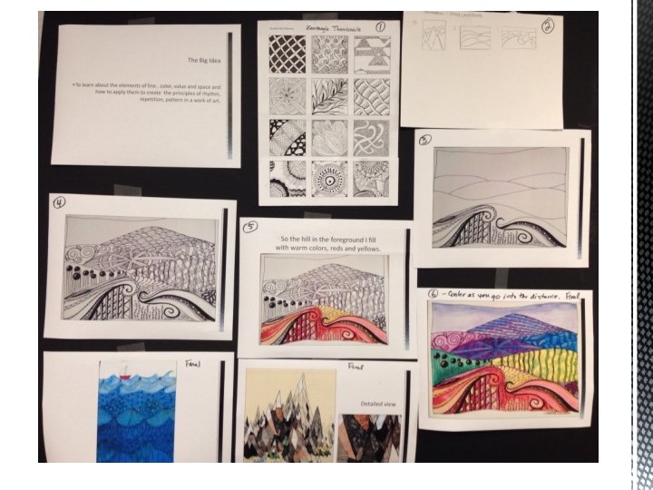
In your thumbnails, make at least 6 patterns to use in your landscape. Then experiment with different landscapes until you find one you would like to use in your final work of art.
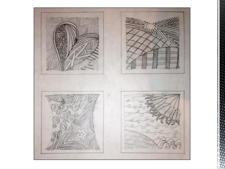
Create thumbnail designs using the worksheet provided. Use the doodle starter idea sheets to help you get started. Create your own doodles by using simple lines and adding detail to create visual interest.
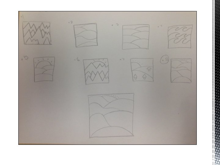
Using the Landscape Thumbnail sheets create at least 3 thumbnail landscapes to choose from. Create as many landscapes as you need until you get one that you like. Remember as shapes recede into the distance they should get smaller and overlap
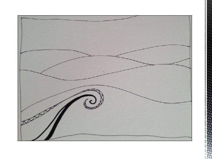
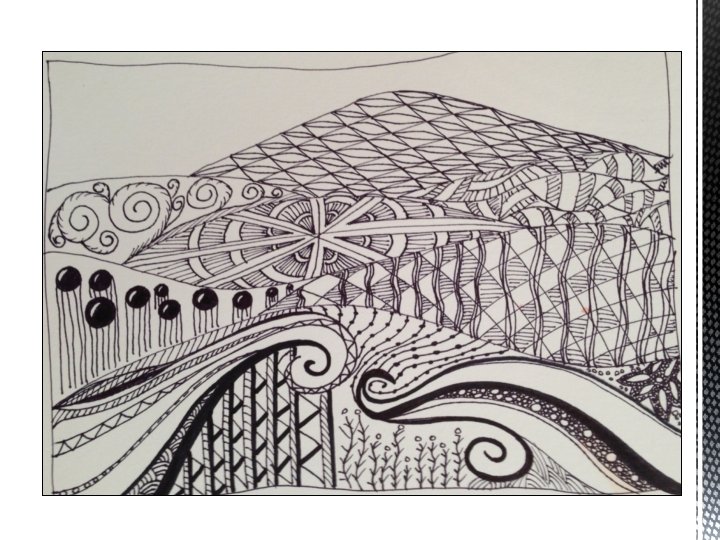
Using watercolor paper and pencil re-create your make believe landscape using one of your thumbnails. Then outline your landscape in Sharpie Marker.
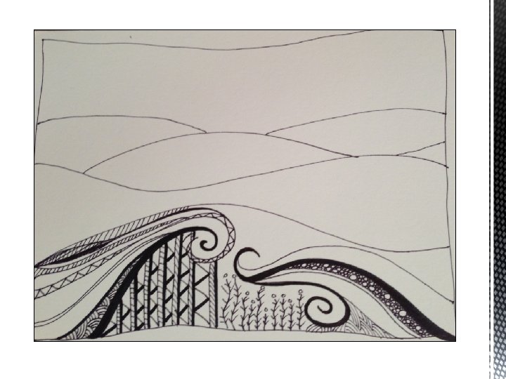
Using a Sharpie marker, or other waterproof marker, begin to fill in your hills with different doodle patterns. Change the pattern on each hill. Use your thumbnails for ideas. Line is an element of art, using them in this piece will create rhythm which is a principle of art.
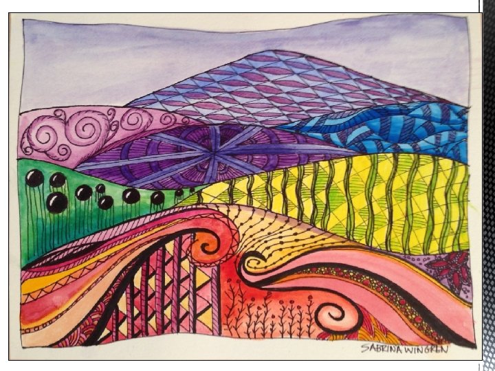
Using watercolor paint, or colored pencils we will color in the doodles. The foreground will be warm colors, (reds, oranges, and yellows) The background should get cooler (blues and greens) as the hills recede into the distance. This adds to the illusion of depth to your Doodle landscape, and to any piece you may work on in the future. This is called atmospheric perspective.
More about Warm and Cool Colors An easy way to remember warm colors are to think of the colors of the sun and fire like yellow and reds and some violets. When you think of cool colors think of cool water and grass, blues and greens.
So the hill in the foreground I fill with warm colors, reds and yellows.
You can glaze your colors, whether you are using colored pencil, or watercolor paint, by going over one color with another color. If you mix complementary colors, (red/green, yellow/violet, blue/orange) you will get some version of brown, so if you want to keep your landscape bright, avoid mixing those colors. Mixing yellow and red though will create a beautiful orange.
More about Color Mixing Primary Colors are RED, BLUE, YELLOW Mixing these creates the Secondary Colors: VIOLET, GREEN, ORANGE Intermediate Colors are created by mixing Primary with Secondary Colors to create: RED-VIOLET, BLUE-GREEN, YELLOW-ORANGE, RED-ORANGE,
Complementary Colors Are across from each other on the color wheel, for example: Red – Green Blue – Orange Violet – Yellow When mixed together they create a neutral color, like brown or gray. When used next to each other they vibrate and can create a focal point in a piece of art, because the eye tends to go to those areas first. Sports teams combine complementary colors for this reason.
Analogous Colors Are next to each other on the color wheel, for example: Red-Violet, Red-Orange When used together they create a sense of harmony or unity.
Create interest in your doodle landscape by using values (the dark and light shades) of your color. If you are using watercolor, add water to get lighter values of the same color. If you are using colored pencils color more lightly in some areas and darker in others.
More about Value In this color wheel you can see all the colors dark to light. As the colors go toward the center you can see they get lighter. So if you look at the green you can see all the different values of that color from dark to light.
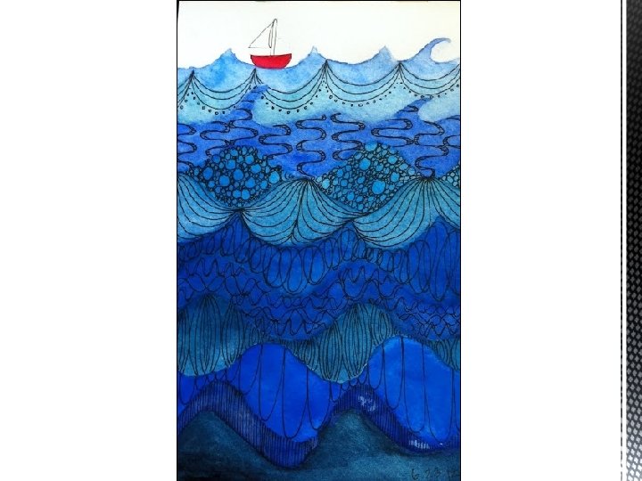
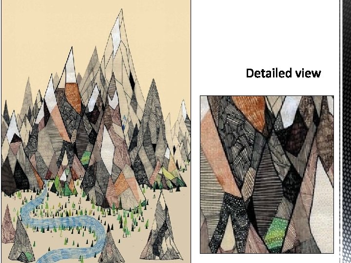
When you are finished you should have something that looks a little like this, but completely different because it will be your own doodle landscape.
http: //safeshare. tv/w/o. Wxvv. QYGUL http: //safeshare. tv/w/uxwqa. YUZpj http: //safeshare. tv/w/AAjzrh. Xm. Yo
Rhythm: Rhythm is a principle of art, it is created through the repeated use of lines, shapes or colors. It lends movement to a piece of art. Unity: Unity is achieved in a piece of art when a composition looks or feels complete, balanced and like it’s done. Complementary Colors: Colors across from each other on the color wheel. Red/Green, Yellow/Violet, Blue/Orange. Primary Colors: The colors from which all other colors are created, in pigment they are Red, Yellow and Blue. Secondary Colors: Are the colors that are achieved by mixing the primary colors. Green, Orange and Violet Intermediate Colors: Are the colors that are achieved by mixing Secondary Colors. Line: An Element of Art. It is literally the extension of a dot. However, when the line intersects itself, it becomes a shape. Warm & Cool Colors: Warm colors are the colors of the sun, Yellow, Orange and Red. Cool colors are the colors of water and grass, Blues and Greens.
Space: The area between or around objects. The space around objects is often called negative space; negative space has shape. Space can also refer to the feeling of depth. Real space is three-dimensional; in visual art when we can create the feeling or illusion of depth we call it space. Texture: The surface quality that can be seen or felt. Actual texture can be felt, implied texture is seen. Value: The relationship between light and dark. Change of value can be seen in high, low and medium contrast areas. Shape: A closed line. Shapes can be geometric, like squares and rectangles, or organic, like free-formed shapes or natural shapes. Shapes are flat and can express length and width. Form: Three-dimensional shapes, expressing length, width, depth. Balls, Cylinders and Boxes are examples of forms.
Grading Guidelines: • Different patterns in each section of your landscape. (25 points) • Used color pencils to help emphasize the colors of your landscape. (25 points) • Uses watercolors to add color and not cover up your design. (25 points) • Clear use of craftsmanship (it looks neat and tidy and it is obvious you spent plenty of time on it). (25 points)