A Designers Dozen Tips District 203 Communications Workshop




- Slides: 42

A Designer’s Dozen Tips District 203 Communications Workshop Publication Design from a Practical Perspective

Four Cs of Practical Publication Design Clarity Consistency Creativity Cost

Clarity Form should follow function (just not in the dictionary)

Clarity Clear content presentation should be the reason for the design, not the other way around Form should follow function (just not in the dictionary) 1

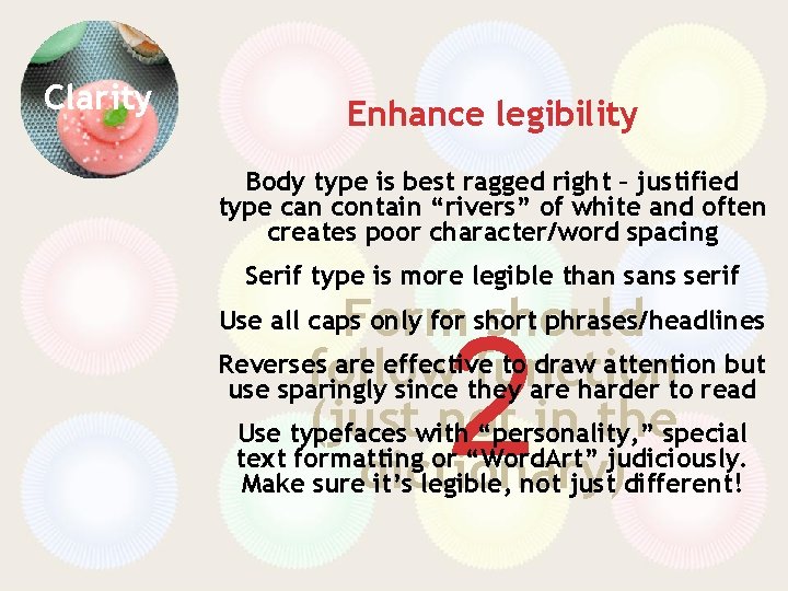
Clarity Enhance legibility Form should follow function (just not in the dictionary) 2

Clarity Enhance legibility Body type is best ragged right – justified type can contain “rivers” of white and often creates poor character/word spacing Serif type is more legible than sans serif Form should Reverses are effective to draw attention but follow function use sparingly since they are harder to read (justwith not in thespecial Use typefaces “personality, ” text formatting or “Word. Art” judiciously. Make suredictionary) it’s legible, not just different! Use all caps only for short phrases/headlines 2

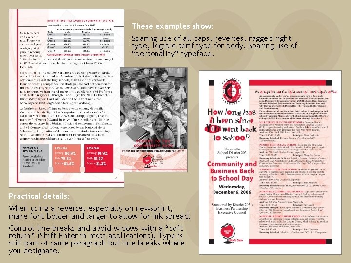
These examples show: Sparing use of all caps, reverses, ragged right type, legible serif type for body. Sparing use of “personality” typeface. Practical details: When using a reverse, especially on newsprint, make font bolder and larger to allow for ink spread. Control line breaks and avoid widows with a “soft return” (Shift-Enter in most applications). Type is still part of same paragraph but line breaks where you designate.

Four Cs of Practical Publication Design Clarity Consistency Creativity Cost

Consistency Reduce (cost) Reuse (ideas) Recycle (effort)

Consistency Branding is Beautiful Reduce (cost) Reuse (ideas) Recycle (effort) 3

Consistency Branding is Beautiful Reuse color, design elements (logo, graphics, photos) and layout styles to present a unified and consistent look Develop one encompassing Reduce (cost) brand for the organization Reuse (ideas) Develop additional unique looks for sub-campaigns Recycle (effort) within the organization 3

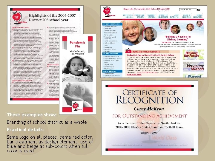
These examples show: Branding of school district as a whole Practical details: Same logo on all pieces, same red color, bar treatment as design element, use of blue and beige as sub-colors when full color is used

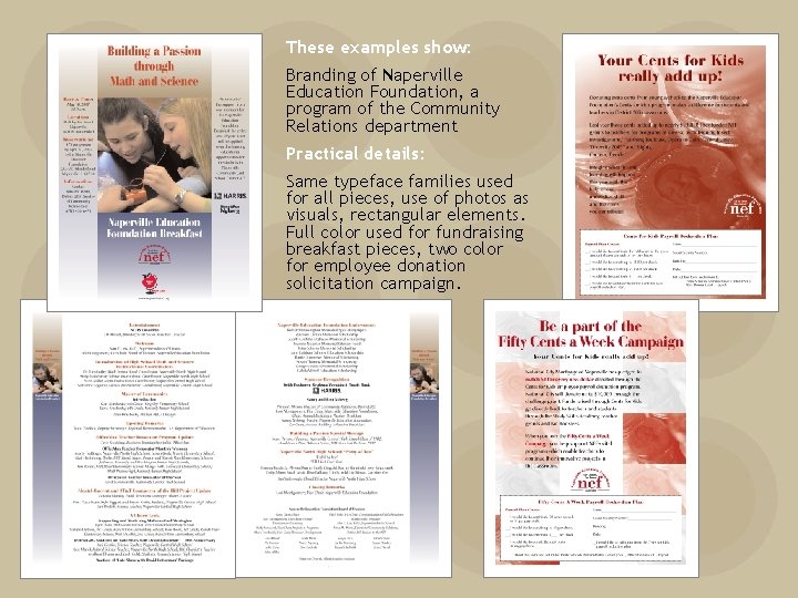
These examples show: Branding of Naperville Education Foundation, a program of the Community Relations department Practical details: Same typeface families used for all pieces, use of photos as visuals, rectangular elements. Full color used for fundraising breakfast pieces, two color for employee donation solicitation campaign.

Consistency Style sheets and templates are your best friends Reduce (cost) Reuse (ideas) Recycle (effort) 4

Consistency Style sheets and templates are your best friends If you only remember one tip from this presentation, make it the one above! Reduce (cost) Reuse (ideas) Every. Recycle piece of text on(effort) a document should Styles and templates ensure consistency of look throughout the document (and from one document to another) and can save huge amounts of time during revisions. 4 be tagged with a style.

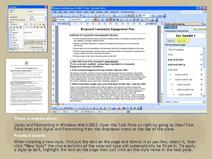
These examples show: Styles and Formatting in Windows Word 2003. Open the Task Pane at right by going to View/Task Pane then pick Styles and Formatting from the dropdown menu at the top of the pane. Practical details: When creating a new style, first put the text on the page and format it as you like, select it, then click “New Style” the characteristics of the selected type will automatically be filled in. To apply a style to text, highlight the text on the page then just click on the style name in the task pane.

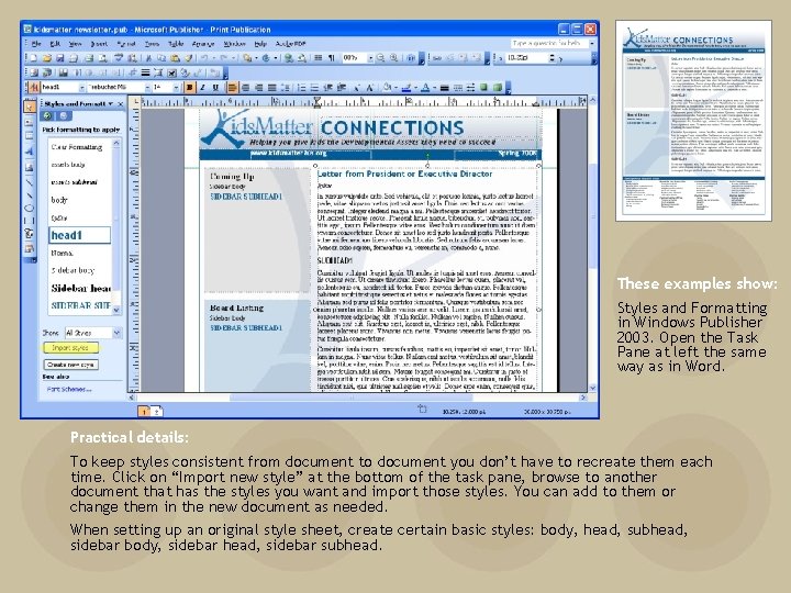
These examples show: Styles and Formatting in Windows Publisher 2003. Open the Task Pane at left the same way as in Word. Practical details: To keep styles consistent from document to document you don’t have to recreate them each time. Click on “Import new style” at the bottom of the task pane, browse to another document that has the styles you want and import those styles. You can add to them or change them in the new document as needed. When setting up an original style sheet, create certain basic styles: body, head, subhead, sidebar body, sidebar head, sidebar subhead.

Consistency Be consistent in the use of design elements Reduce (cost) Reuse (ideas) Recycle (effort) 5

Consistency Be consistent in the use of design elements Logo, color, typefaces, styles, images Logo should include image and type in one uneditable file Reduce (cost) Choose two font families Reuse and use them (ideas) for everything Recycle (effort) 5

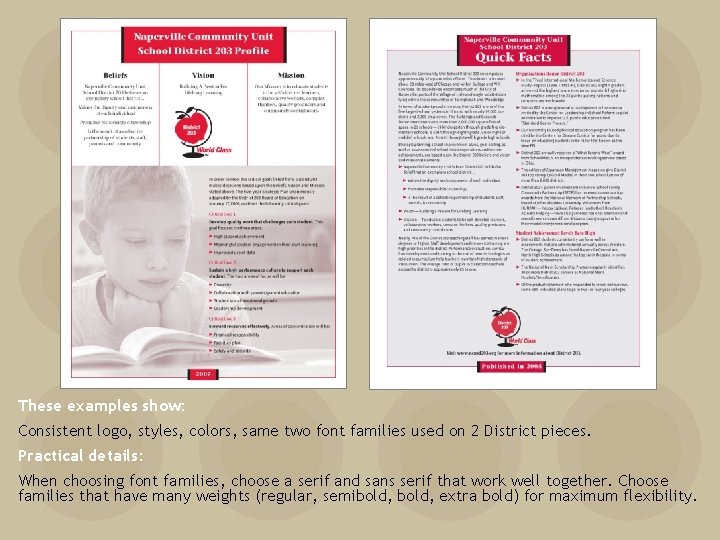
These examples show: Consistent logo, styles, colors, same two font families used on 2 District pieces. Practical details: When choosing font families, choose a serif and sans serif that work well together. Choose families that have many weights (regular, semibold, extra bold) for maximum flexibility.

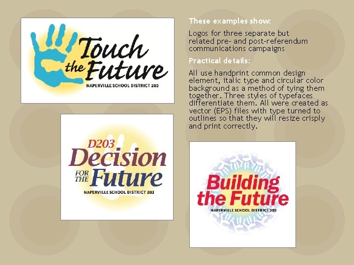
These examples show: Logos for three separate but related pre- and post-referendum communications campaigns Practical details: All use handprint common design element, italic type and circular color background as a method of tying them together. Three styles of typefaces differentiate them. All were created as vector (EPS) files with type turned to outlines so that they will resize crisply and print correctly.

Four Cs of Practical Publication Design Clarity Consistency Creativity Cost

Creativity Less is more (when directing the eye)

Creativity White space is not a waste – it brings focus to what is important Less is more (when directing the eye) 6

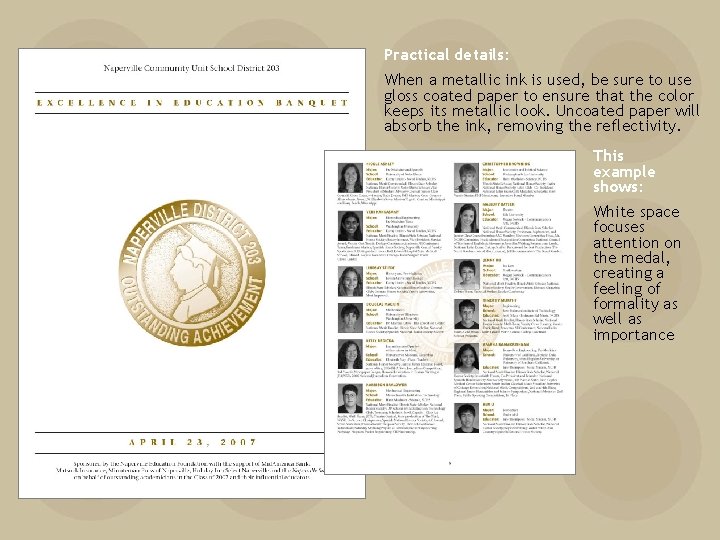
Practical details: When a metallic ink is used, be sure to use gloss coated paper to ensure that the color keeps its metallic look. Uncoated paper will absorb the ink, removing the reflectivity. This example shows: White space focuses attention on the medal, creating a feeling of formality as well as importance

Creativity A flexible layout grid “holds the look together” while allowing for a varied layout within one piece Less is more (when directing the eye) 7

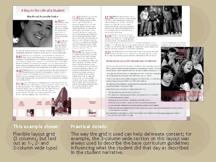
This example shows: Practical details: Flexible layout grid (3 columns, but laid out as 1 -, 2 - and 3 -column wide type) The way the grid is used can help delineate content; for example, the 3 -column wide section on this layout was always used to describe the base curriculum guidelines influencing what the student did that day as described in the student narrative.

Creativity Use type as a design element Less is more (when directing the eye) 8

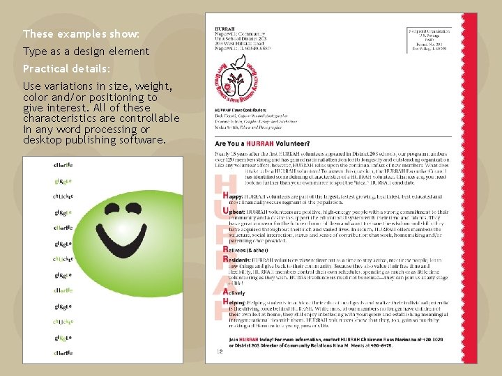
Creativity Use type as a design element Callouts Drop caps Inline word emphasis Less is more (when directing the eye) 8 Use “personality” typefaces (and classic ones as well) as art: letterforms as images

These examples show: Type as a design element Practical details: Use variations in size, weight, color and/or positioning to give interest. All of these characteristics are controllable in any word processing or desktop publishing software.

Four Cs of Practical Publication Design Clarity Consistency Creativity Cost

Cost But you can do more for less (dollars, that is)

Cost Design with multiple purposes in mind But you can do more for less (dollars, that is) 9

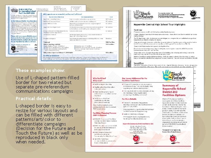
These examples show: Use of L-shaped pattern-filled border for two related but separate pre-referendum communications campaigns Practical details: L-shaped border is easy to resize for various layouts and can be filled with different patterns/art/color to differentiate campaigns (Decision for the Future and Touch the Future) as well as be reproduced in black only when needed.

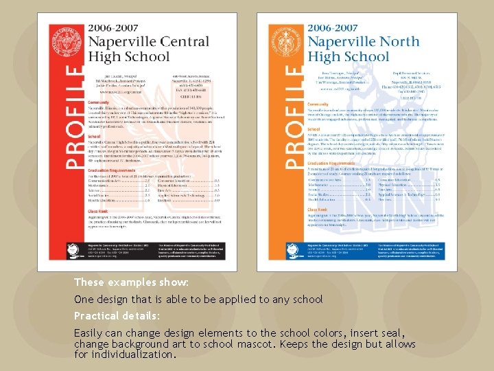
These examples show: One design that is able to be applied to any school Practical details: Easily can change design elements to the school colors, insert seal, change background art to school mascot. Keeps the design but allows for individualization.

Cost Use PDFs for proofing and distribution But you can do more for less (dollars, that is) 10

Cost Plan your printing wisely But you can do more for less (dollars, that is) 11

Cost Plan your printing wisely Use two color rather than full color – be responsible with printing dollars Use house paper (check with your printer) But you can do Usemore bleeds onlyfor when less necessary Two colors can look like more: (dollars, use screens, that duotones is) 11

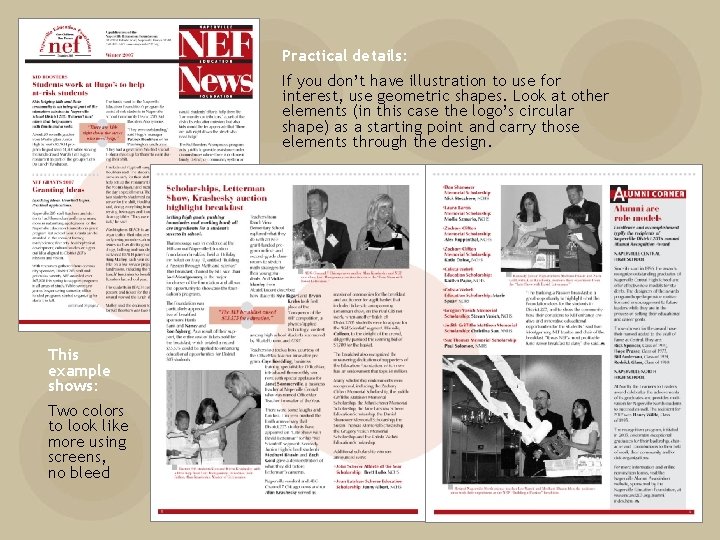
Practical details: If you don’t have illustration to use for interest, use geometric shapes. Look at other elements (in this case the logo’s circular shape) as a starting point and carry those elements through the design. This example shows: Two colors to look like more using screens, no bleed

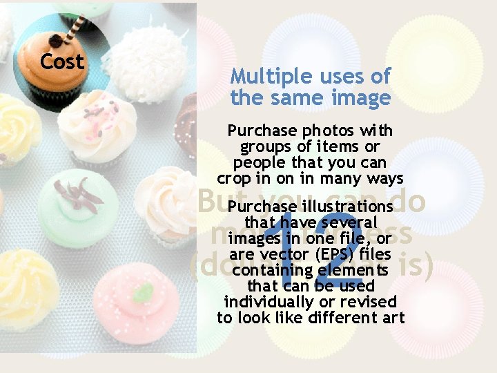
Cost Multiple uses of the same image But you can do more for less (dollars, that is) 12

Cost Multiple uses of the same image Purchase photos with groups of items or people that you can crop in on in many ways Purchase illustrations But you can do that have several images infor one file, or more less are vector (EPS) files containing elements (dollars, that is) that can be used 12 individually or revised to look like different art

This dozen’s to go! Cooked up by Deanne Fulner Naperville Community Unit School District 203 dfulner@naperville 203. org 630 -420 -6964