9 L 3 Scatter Graph Lesson 1 Thursday

- Slides: 30

9 L 3 Scatter Graph Lesson 1 Thursday 24 th June

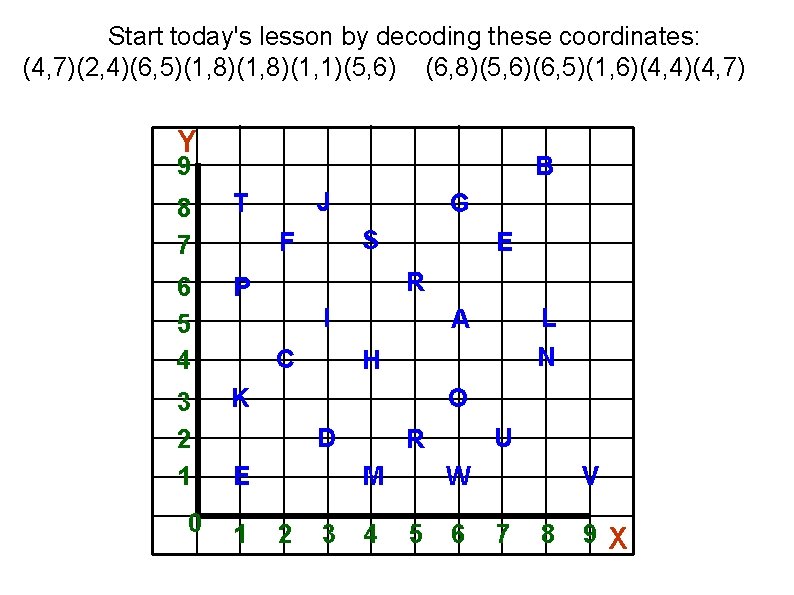
Start today's lesson by decoding these coordinates: (4, 7)(2, 4)(6, 5)(1, 8)(1, 1)(5, 6) (6, 8)(5, 6)(6, 5)(1, 6)(4, 4)(4, 7) Y 9 B 8 7 T 6 5 4 P 3 2 1 K 0 J G S F E R I C H O D E 1 L N A M 2 3 U R 4 W 5 6 V 7 8 9 X

Watch the video on scatter graphs on the school website. 9 L 3 June 25 video clip scatter graph 1 It is a very good video on scatter graphs but I do apologise for the video quality. Todays lesson is an interactive lesson After todays lesson you will be having two more lessons on scatter graphs and then will have a topic test on 6 th July. Make sure you have plenty of practice with the worksheets for next two lessons on 29 June and 3 July. Always check your answers and email me with any difficulties.

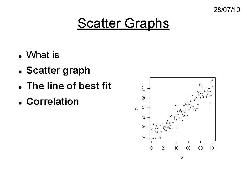
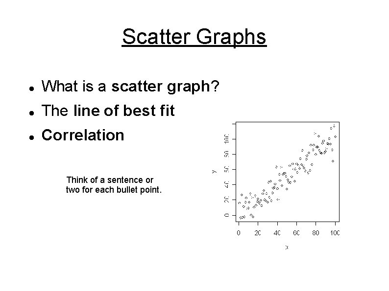
28/07/10 Scatter Graphs What is Scatter graph The line of best fit Correlation

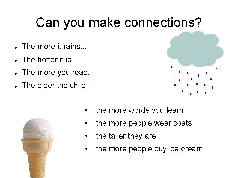
Can you make connections? The more it rains. . . The hotter it is. . . The more you read. . . The older the child. . . • the more words you learn • the more people wear coats • the taller they are • the more people buy ice cream

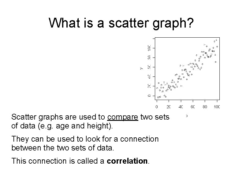
What is a scatter graph? Scatter graphs are used to compare two sets of data (e. g. age and height). They can be used to look for a connection between the two sets of data. This connection is called a correlation.

Plot a Scatter Graph.

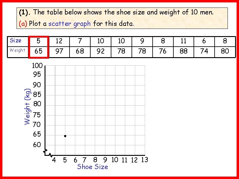
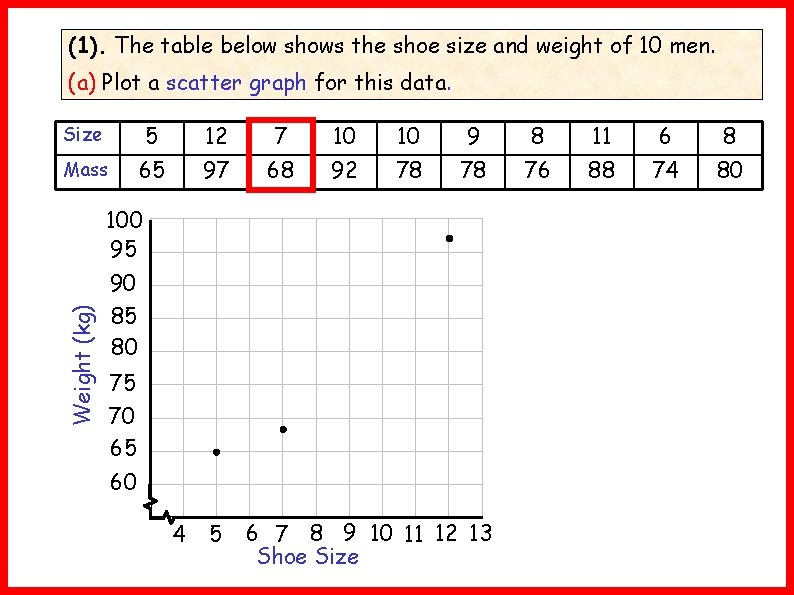
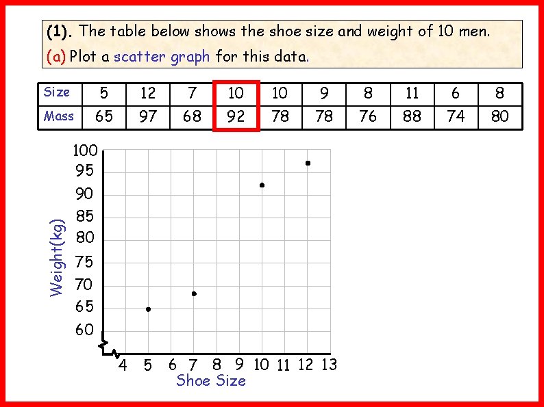
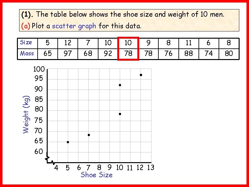
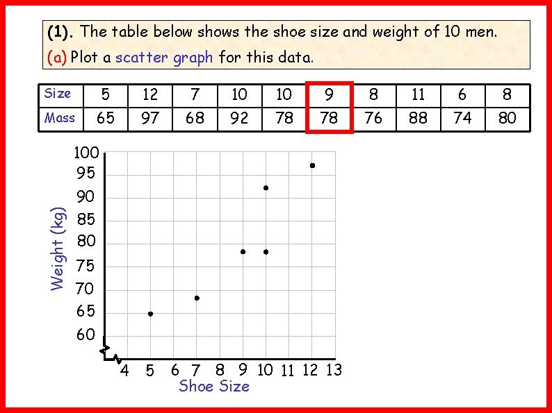
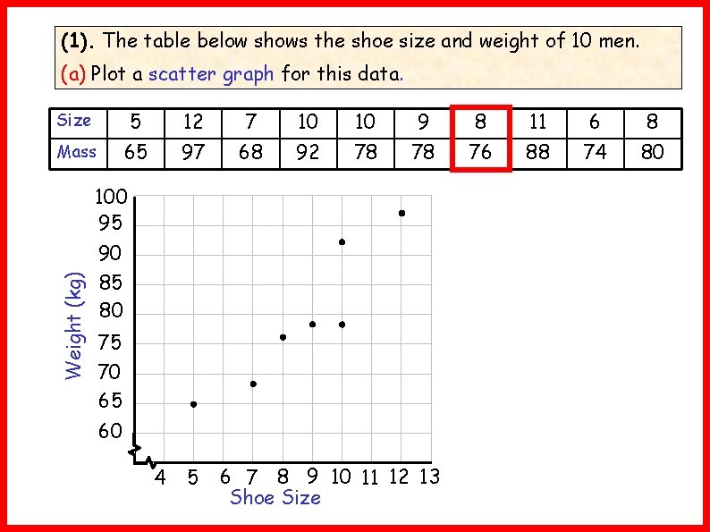
(1). The table below shows the shoe size and weight of 10 men. (a) Plot a scatter graph for this data. Size Weight 5 12 7 10 10 9 8 11 6 8 65 97 68 92 78 78 76 88 74 80 Weight (kg) 100 95 90 85 80 75 70 65 60 4 5 6 7 8 9 10 11 12 13 Shoe Size

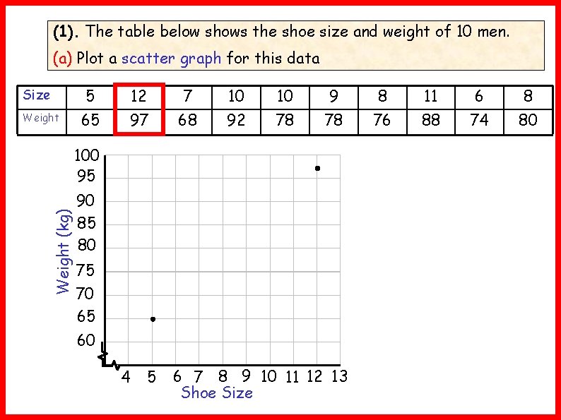
(1). The table below shows the shoe size and weight of 10 men. (a) Plot a scatter graph for this data Size Weight 5 12 7 10 10 9 8 11 6 8 65 97 68 92 78 78 76 88 74 80 Weight (kg) 100 95 90 85 80 75 70 65 60 4 5 6 7 8 9 10 11 12 13 Shoe Size

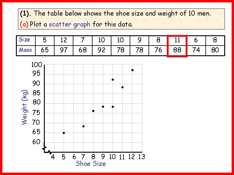
(1). The table below shows the shoe size and weight of 10 men. (a) Plot a scatter graph for this data. Size 5 12 7 10 10 9 8 11 6 8 Mass 65 97 68 92 78 78 76 88 74 80 Weight (kg) 100 95 90 85 80 75 70 65 60 4 5 6 7 8 9 10 11 12 13 Shoe Size

(1). The table below shows the shoe size and weight of 10 men. (a) Plot a scatter graph for this data. Size 5 12 7 10 10 9 8 11 6 8 Mass 65 97 68 92 78 78 76 88 74 80 Weight(kg) 100 95 90 85 80 75 70 65 60 4 5 6 7 8 9 10 11 12 13 Shoe Size

(1). The table below shows the shoe size and weight of 10 men. (a) Plot a scatter graph for this data. Size 5 12 7 10 10 9 8 11 6 8 Mass 65 97 68 92 78 78 76 88 74 80 Weight (kg) 100 95 90 85 80 75 70 65 60 4 5 6 7 8 9 10 11 12 13 Shoe Size

(1). The table below shows the shoe size and weight of 10 men. (a) Plot a scatter graph for this data. Size 5 12 7 10 10 9 8 11 6 8 Mass 65 97 68 92 78 78 76 88 74 80 Weight (kg) 100 95 90 85 80 75 70 65 60 4 5 6 7 8 9 10 11 12 13 Shoe Size

(1). The table below shows the shoe size and weight of 10 men. (a) Plot a scatter graph for this data. Size 5 12 7 10 10 9 8 11 6 8 Mass 65 97 68 92 78 78 76 88 74 80 Weight (kg) 100 95 90 85 80 75 70 65 60 4 5 6 7 8 9 10 11 12 13 Shoe Size

(1). The table below shows the shoe size and weight of 10 men. (a) Plot a scatter graph for this data. Size 5 12 7 10 10 9 8 11 6 8 Mass 65 97 68 92 78 78 76 88 74 80 Weight (kg) 100 95 90 85 80 75 70 65 60 4 5 6 7 8 9 10 11 12 13 Shoe Size

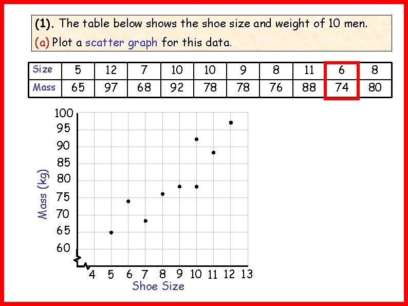
(1). The table below shows the shoe size and weight of 10 men. (a) Plot a scatter graph for this data. Size 5 12 7 10 10 9 8 11 6 8 Mass 65 97 68 92 78 78 76 88 74 80 Mass (kg) 100 95 90 85 80 75 70 65 60 4 5 6 7 8 9 10 11 12 13 Shoe Size

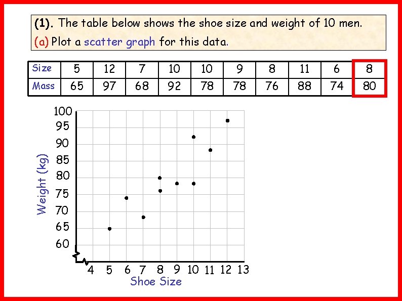
(1). The table below shows the shoe size and weight of 10 men. (a) Plot a scatter graph for this data. Size 5 12 7 10 10 9 8 11 6 8 Mass 65 97 68 92 78 78 76 88 74 80 Weight (kg) 100 95 90 85 80 75 70 65 60 4 5 6 7 8 9 10 11 12 13 Shoe Size

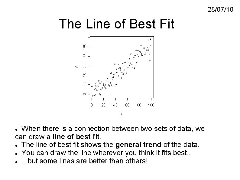
28/07/10 The Line of Best Fit When there is a connection between two sets of data, we can draw a line of best fit. The line of best fit shows the general trend of the data. You can draw the line wherever you think it fits best. . . but some lines are better than others!

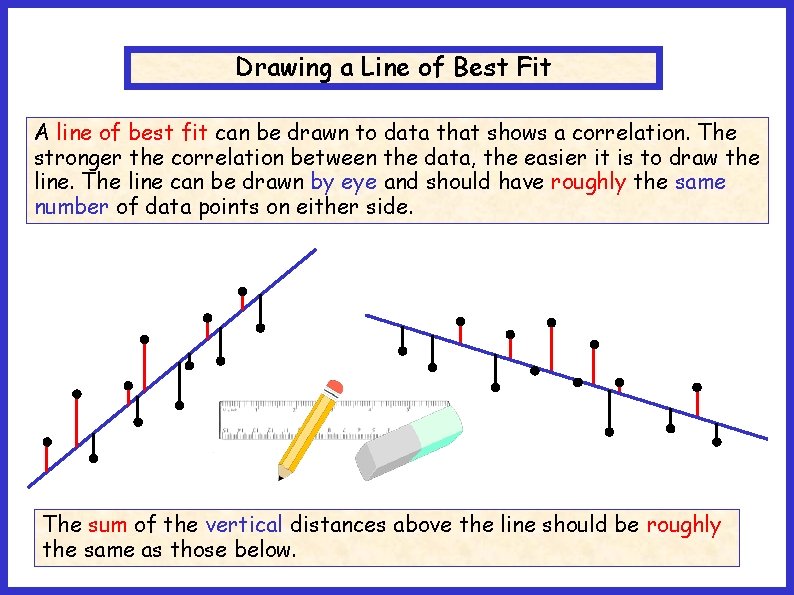
Drawing a Line of Best Fit A line of best fit can be drawn to data that shows a correlation. The stronger the correlation between the data, the easier it is to draw the line. The line can be drawn by eye and should have roughly the same number of data points on either side. Lobf The sum of the vertical distances above the line should be roughly the same as those below.

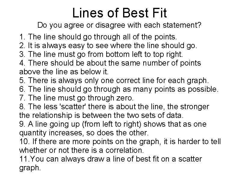
Lines of Best Fit Do you agree or disagree with each statement? 1. The line should go through all of the points. 2. It is always easy to see where the line should go. 3. The line must go from bottom left to top right. 4. There should be about the same number of points above the line as below it. 5. There is always only one correct line for each graph. 6. The line should go through as many points as possible. 7. The line must go through zero. 8. The less 'scatter' there is about the line, the stronger the relationship is between the two sets of data. 9. A line going up (from left to right) shows that as one quantity increases, so does the other. 10. If there are more points on the graph, it is harder to tell whether or not there is a correlation. 11. You can always draw a line of best fit on a scatter graph.

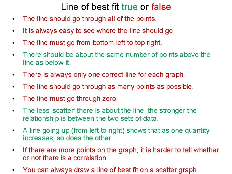
Line of best fit true or false • The line should go through all of the points. • It is always easy to see where the line should go • The line must go from bottom left to top right. • There should be about the same number of points above the line as below it. • There is always only one correct line for each graph. • The line should go through as many points as possible. • The line must go through zero. • The less 'scatter' there is about the line, the stronger the relationship is between the two sets of data. • A line going up (from left to right) shows that as one quantity increases, so does the other. • If there are more points on the graph, it is harder to tell whether or not there is a correlation. • You can always draw a line of best fit on a scatter graph

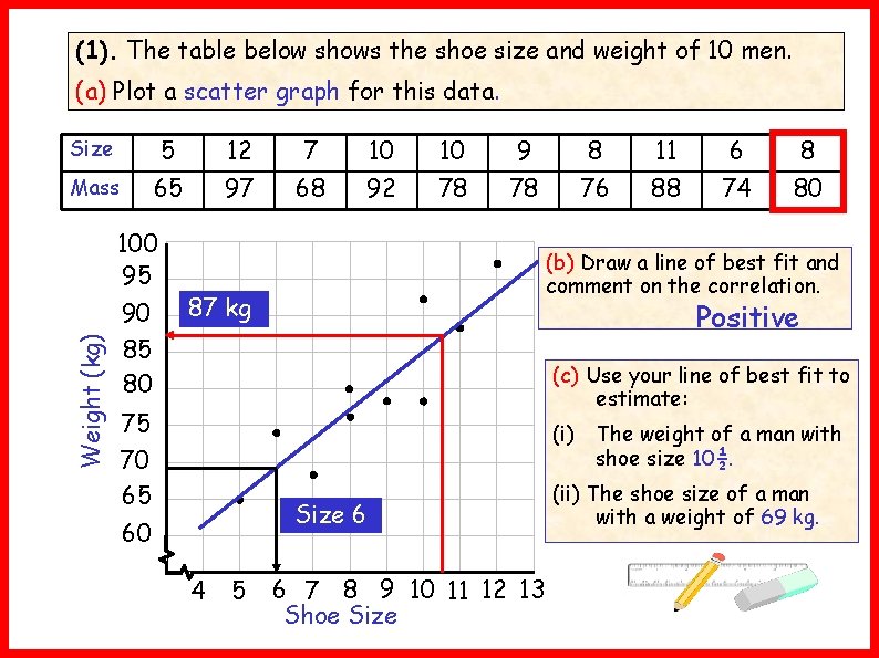
(1). The table below shows the shoe size and weight of 10 men. (a) Plot a scatter graph for this data. Size 5 12 7 10 10 9 8 11 6 8 Mass 65 97 68 92 78 78 76 88 74 80 Weight (kg) 100 95 90 85 80 (b) Draw a line of best fit and comment on the correlation. 87 kg Positive (c) Use your line of best fit to estimate: 75 70 65 (i) The weight of a man with shoe size 10½. Size 6 60 4 5 6 7 8 9 10 11 12 13 Shoe Size (ii) The shoe size of a man with a weight of 69 kg.

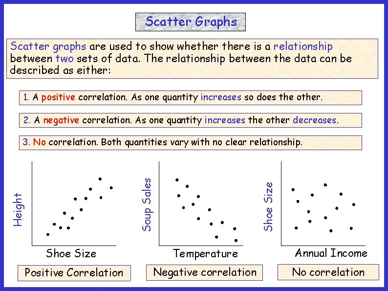
Scatter Graphs Scatter graphs are used to show whethere is a relationship between two sets of data. The relationship between the data can be described as either: 1. A positive correlation. As one quantity increases so does the other. 2. A negative correlation. As one quantity increases the other decreases. Shoe Size Height Soup Sales 3. No correlation. Both quantities vary with no clear relationship. Shoe Size Temperature Annual Income Positive Correlation Negative correlation No correlation

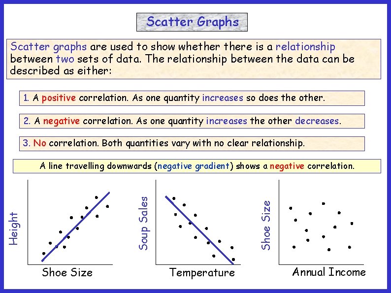
Scatter Graphs Scatter graphs are used to show whethere is a relationship between two sets of data. The relationship between the data can be described as either: 1. A positive correlation. As one quantity increases so does the other. 2. A negative correlation. As one quantity increases the other decreases. 3. No correlation. Both quantities vary with no clear relationship. Shoe Size Height Soup Sales AA line travelling downwards upwards (positive (negativegradient)showsa apositive negative correlation. Temperature Annual Income

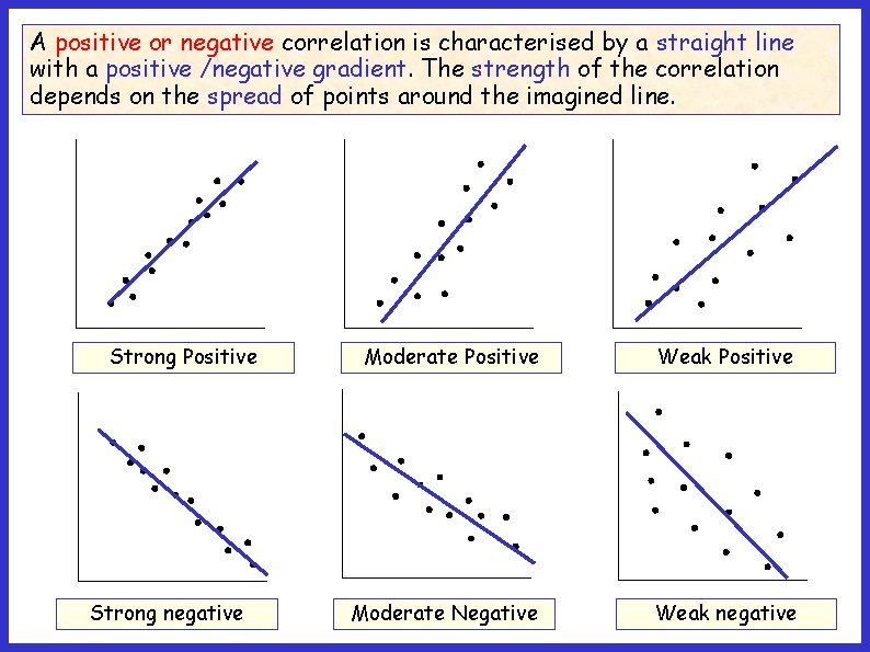
A positive or negative correlation is characterised by a straight line with a positive /negative gradient. The strength of the correlation depends on the spread of points around the imagined line. Strong Positive Strong negative Moderate Positive Weak Positive Moderate Negative Weak negative

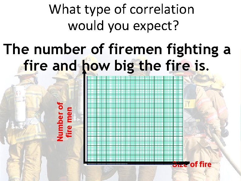
What type of correlation would you expect? Number of fire men The number of firemen fighting a fire and how big the fire is. Size of fire

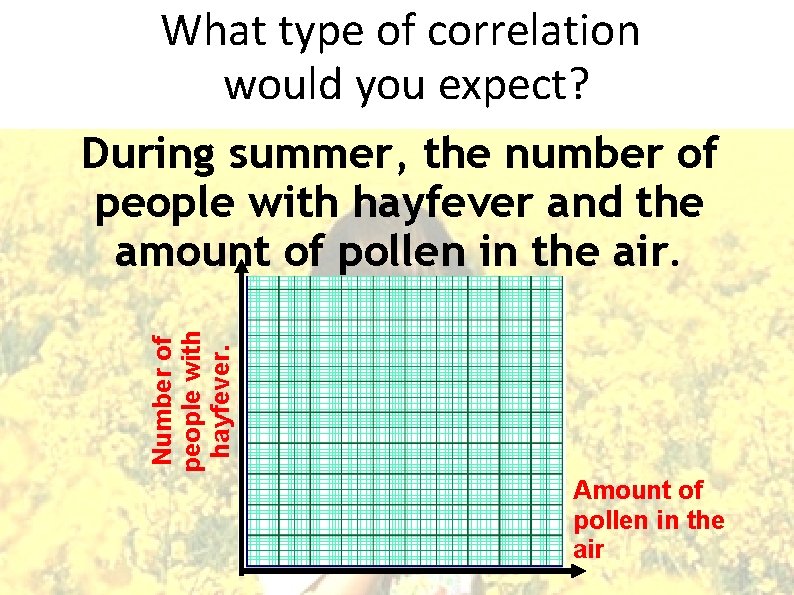
What type of correlation would you expect? Number of people with hayfever. During summer, the number of people with hayfever and the amount of pollen in the air. Amount of pollen in the air

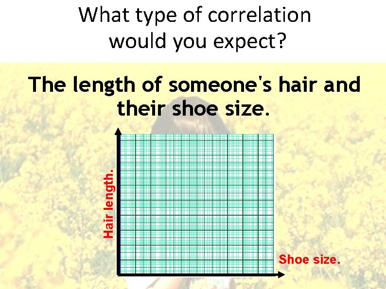
What type of correlation would you expect? Hair length. The length of someone's hair and their shoe size. Shoe size.

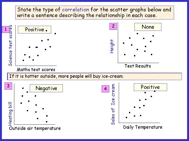
2 None Height Positive Test Results 3 Negative Outside air temperature 4 Sales of Ice cream Maths test scores There no relationship between test results and the height oflower. students. People with higher maths scores tend to get higher science scores. If it isis hotter outside, more people will buy ice-cream. As the outside air temperature increases, heating bills will be Heating bill 1 Science test scores State the type of correlation for the scatter graphs below and write a sentence describing the relationship in each case. Positive Daily Temperature

Scatter Graphs What is a scatter graph? The line of best fit Correlation Think of a sentence or two for each bullet point.