5 7 Scatter Plots Scatter Plots SCATTER plots
- Slides: 8

5 -7 Scatter Plots

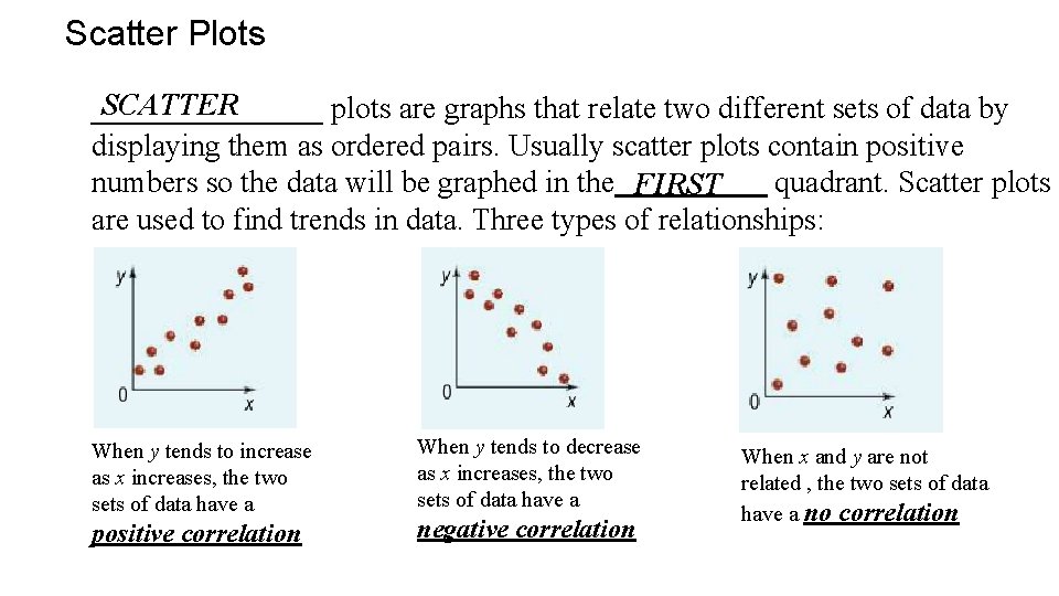
Scatter Plots SCATTER ________ plots are graphs that relate two different sets of data by displaying them as ordered pairs. Usually scatter plots contain positive numbers so the data will be graphed in the FIRST quadrant. Scatter plots are used to find trends in data. Three types of relationships: When y tends to increase as x increases, the two sets of data have a positive correlation When y tends to decrease as x increases, the two sets of data have a negative correlation When x and y are not related , the two sets of data have a no correlation

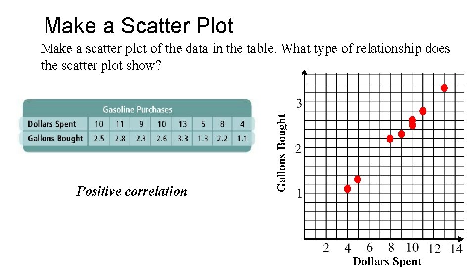
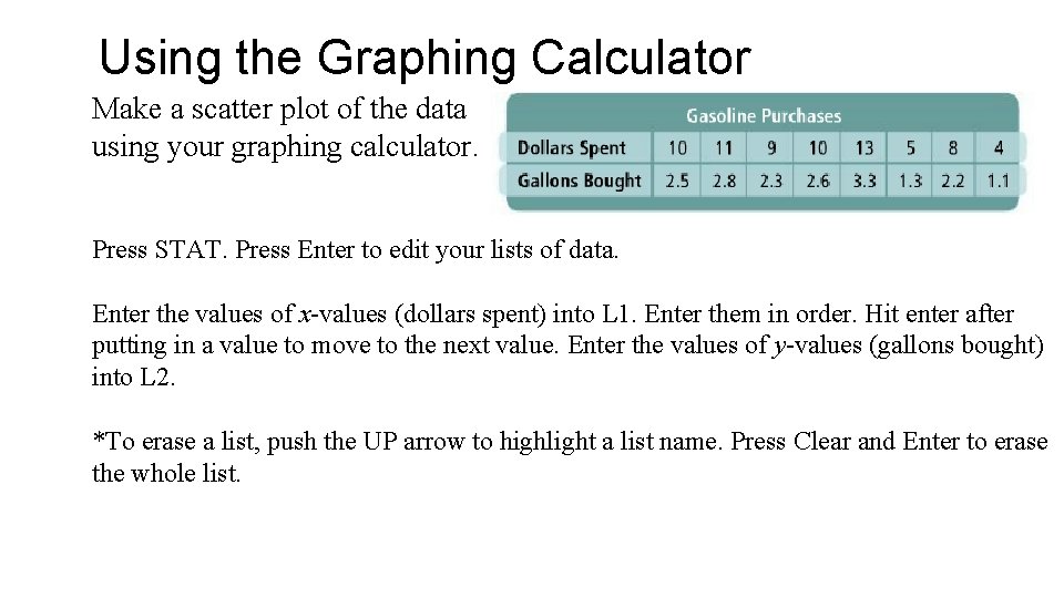
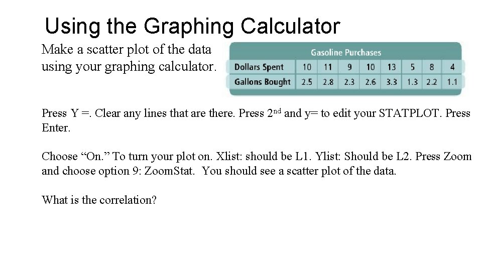
Make a Scatter Plot Positive correlation Gallons Bought Make a scatter plot of the data in the table. What type of relationship does the scatter plot show? Dollars Spent

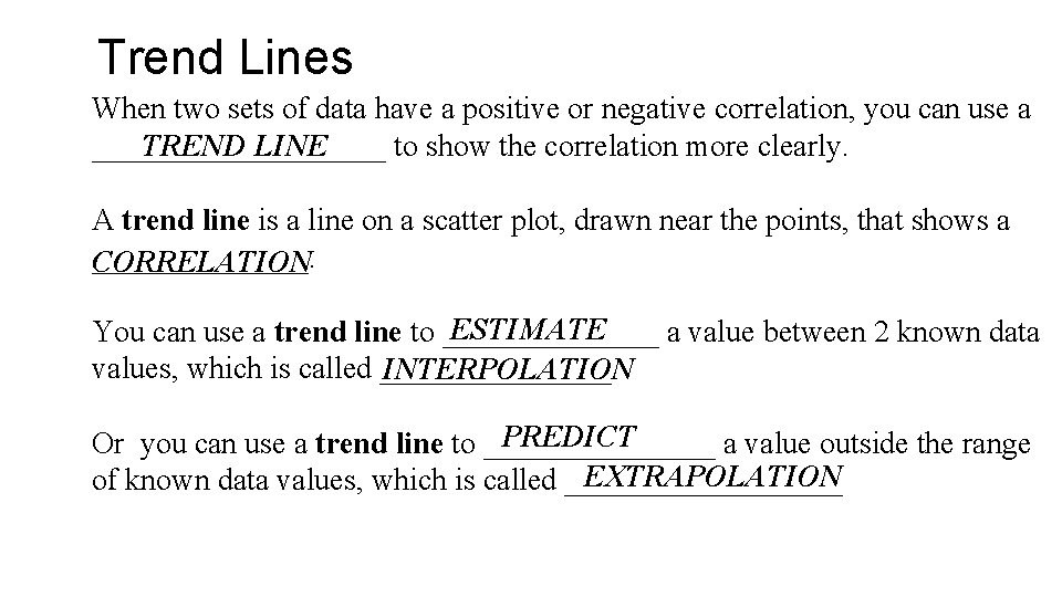
Trend Lines When two sets of data have a positive or negative correlation, you can use a TREND LINE __________ to show the correlation more clearly. A trend line is a line on a scatter plot, drawn near the points, that shows a _______. CORRELATION ESTIMATE You can use a trend line to _______ a value between 2 known data values, which is called ________ INTERPOLATION PREDICT Or you can use a trend line to ________ a value outside the range EXTRAPOLATION of known data values, which is called _________

Using the Graphing Calculator Make a scatter plot of the data using your graphing calculator. Press STAT. Press Enter to edit your lists of data. Enter the values of x-values (dollars spent) into L 1. Enter them in order. Hit enter after putting in a value to move to the next value. Enter the values of y-values (gallons bought) into L 2. *To erase a list, push the UP arrow to highlight a list name. Press Clear and Enter to erase the whole list.

Using the Graphing Calculator Make a scatter plot of the data using your graphing calculator. nd and y= to edit your STATPLOT. Press Y =. Clear any lines that are there. Press 2 Enter. Choose “On. ” To turn your plot on. Xlist: should be L 1. Ylist: Should be L 2. Press Zoom and choose option 9: Zoom. Stat. You should see a scatter plot of the data. What is the correlation?

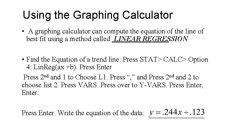
Using the Graphing Calculator • A graphing calculator can compute the equation of the line of best fit using a method called LINEAR REGRESSION • Find the Equation of a trend line: Press STAT> CALC> Option 4: Lin. Reg(ax +b). Press Enter Press 2 nd and 1 to Choose L 1. Press “, ” and Press 2 nd and 2 to choose list 2. Press VARS. Press over to Y-VARS. Press Enter, Enter. Press Enter. Write the equation of the data:

Homework: p. 368 -369 #’s 8 -15, 19, 20