36 x 72 Poster Template with Tips CSUF

- Slides: 1

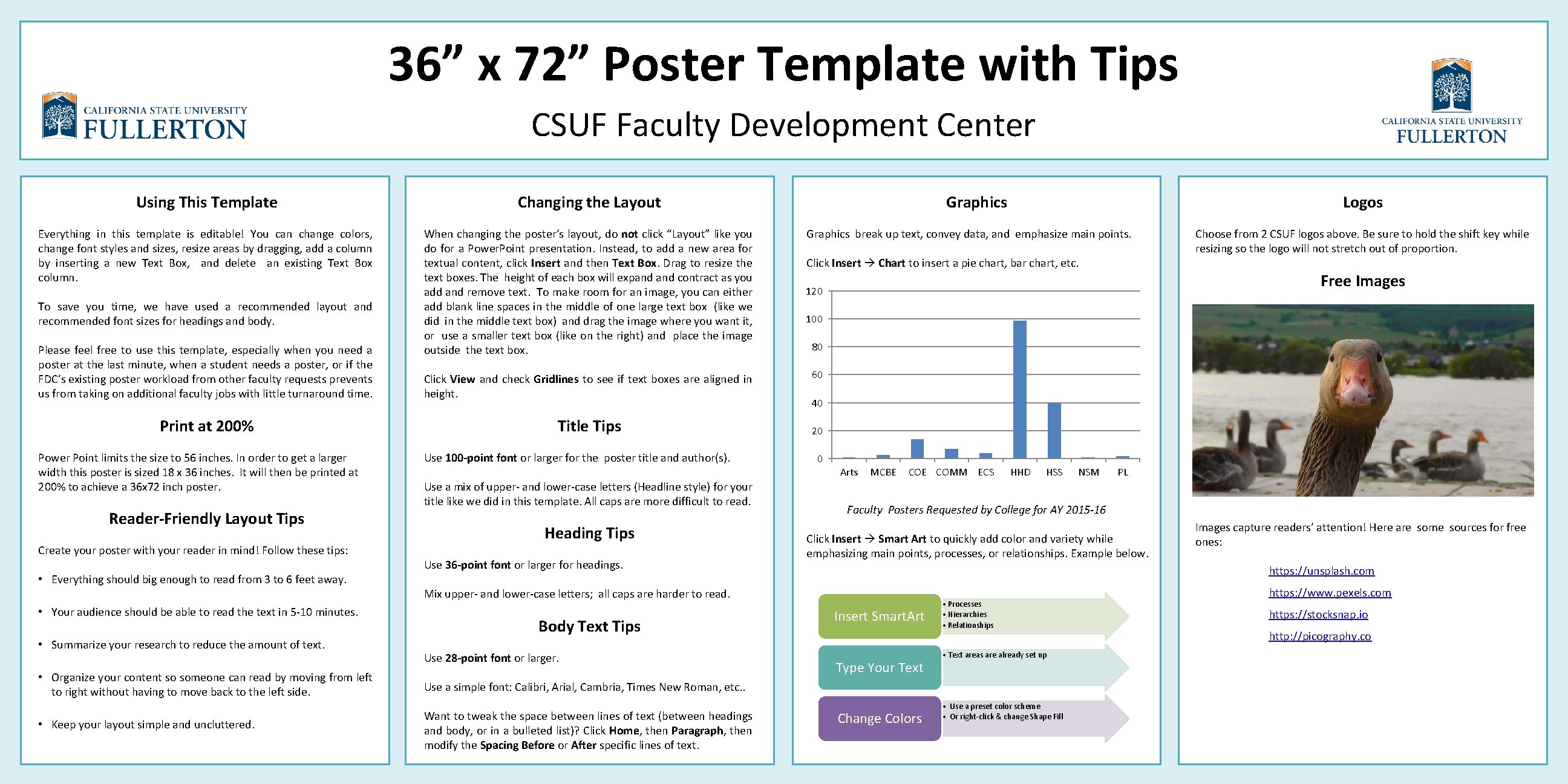
36” x 72” Poster Template with Tips CSUF Faculty Development Center Using This Template Changing the Layout Everything in this template is editable! You can change colors, change font styles and sizes, resize areas by dragging, add a column by inserting a new Text Box, and delete an existing Text Box column. When changing the poster’s layout, do not click “Layout” like you do for a Power. Point presentation. Instead, to add a new area for textual content, click Insert and then Text Box. Drag to resize the text boxes. The height of each box will expand contract as you add and remove text. To make room for an image, you can either add blank line spaces in the middle of one large text box (like we did in the middle text box) and drag the image where you want it, or use a smaller text box (like on the right) and place the image outside the text box. To save you time, we have used a recommended layout and recommended font sizes for headings and body. Please feel free to use this template, especially when you need a poster at the last minute, when a student needs a poster, or if the FDC’s existing poster workload from other faculty requests prevents us from taking on additional faculty jobs with little turnaround time. Print at 200% Power Point limits the size to 56 inches. In order to get a larger width this poster is sized 18 x 36 inches. It will then be printed at 200% to achieve a 36 x 72 inch poster. Reader-Friendly Layout Tips Create your poster with your reader in mind! Follow these tips: • Everything should big enough to read from 3 to 6 feet away. • Your audience should be able to read the text in 5 -10 minutes. • Summarize your research to reduce the amount of text. • Organize your content so someone can read by moving from left to right without having to move back to the left side. • Keep your layout simple and uncluttered. Click View and check Gridlines to see if text boxes are aligned in height. Title Tips Use 100 -point font or larger for the poster title and author(s). Use a mix of upper- and lower-case letters (Headline style) for your title like we did in this template. All caps are more difficult to read. Heading Tips Use 36 -point font or larger for headings. Graphics break up text, convey data, and emphasize main points. Click Insert Chart to insert a pie chart, bar chart, etc. Use 28 -point font or larger. 100 80 60 40 20 0 Arts MCBE COMM ECS HHD HSS NSM PL Faculty Posters Requested by College for AY 2015 -16 Click Insert Smart Art to quickly add color and variety while emphasizing main points, processes, or relationships. Example below. Images capture readers’ attention! Here are some sources for free ones: https: //unsplash. com Insert Smart. Art Type Your Text • Processes • Hierarchies • Relationships • Text areas are already set up Use a simple font: Calibri, Arial, Cambria, Times New Roman, etc. . Want to tweak the space between lines of text (between headings and body, or in a bulleted list)? Click Home, then Paragraph, then modify the Spacing Before or After specific lines of text. Choose from 2 CSUF logos above. Be sure to hold the shift key while resizing so the logo will not stretch out of proportion. Free Images 120 Mix upper- and lower-case letters; all caps are harder to read. Body Text Tips Logos Graphics Change Colors • Use a preset color scheme • Or right-click & change Shape Fill https: //www. pexels. com https: //stocksnap. io http: //picography. co