3 Line graph Line graphs are commonly used


- Slides: 19


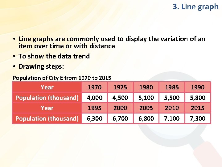
3. Line graph • Line graphs are commonly used to display the variation of an item over time or with distance • To show the data trend • Drawing steps: Population of City E from 1970 to 2015 Year 1970 1975 1980 1985 1990 Population (thousand) 4, 000 4, 500 5, 100 5, 500 5, 800 Year 1995 2000 2005 2010 2015 Population (thousand) 6, 300 6, 700 6, 800 7, 100 7, 300

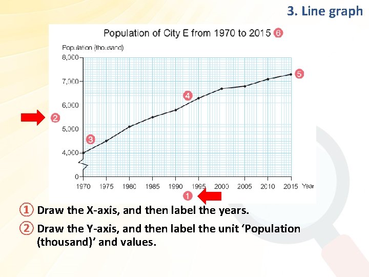
3. Line graph ① Draw the X-axis, and then label the years. ② Draw the Y-axis, and then label the unit ‘Population (thousand)’ and values.

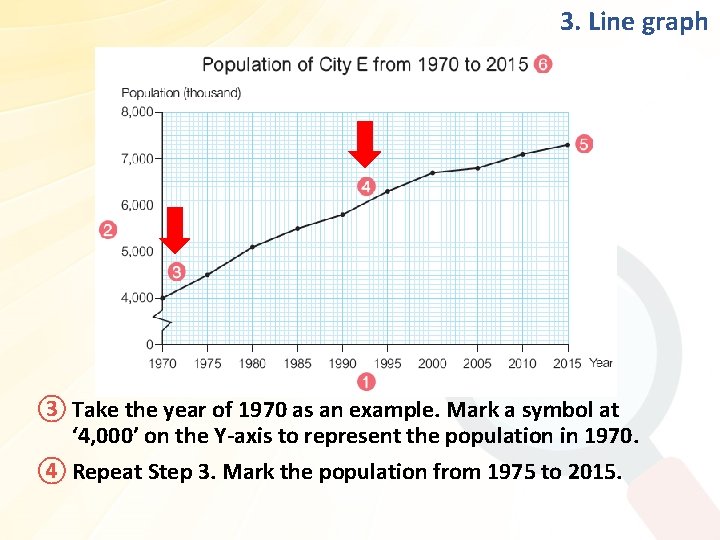
3. Line graph ③ Take the year of 1970 as an example. Mark a symbol at ‘ 4, 000’ on the Y-axis to represent the population in 1970. ④ Repeat Step 3. Mark the population from 1975 to 2015.

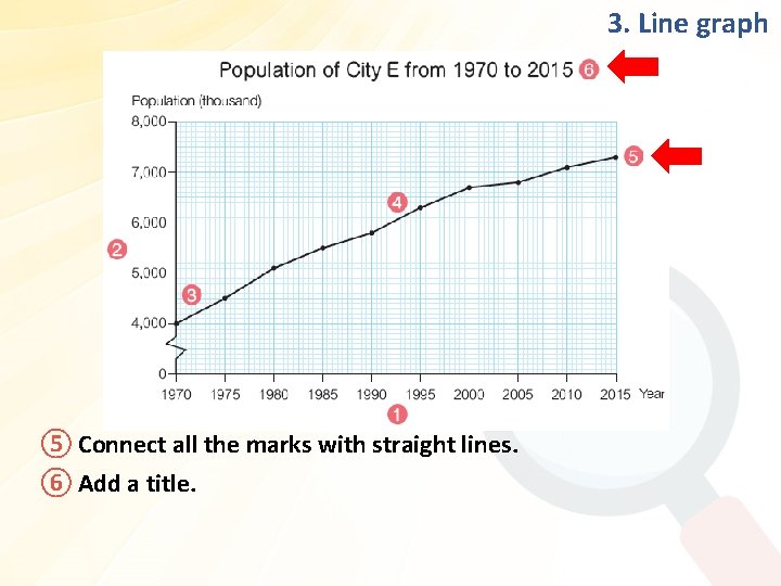
3. Line graph ⑤ Connect all the marks with straight lines. ⑥ Add a title.

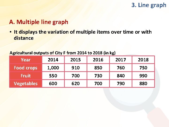
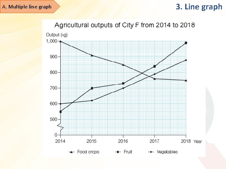
3. Line graph A. Multiple line graph • It displays the variation of multiple items over time or with distance Agricultural outputs of City F from 2014 to 2018 (in kg) Year 2014 2015 2016 2017 2018 Food crops 1, 000 910 850 760 750 Fruit 550 700 730 840 990 Vegetables 600 620 700 790 880

A. Multiple line graph 3. Line graph

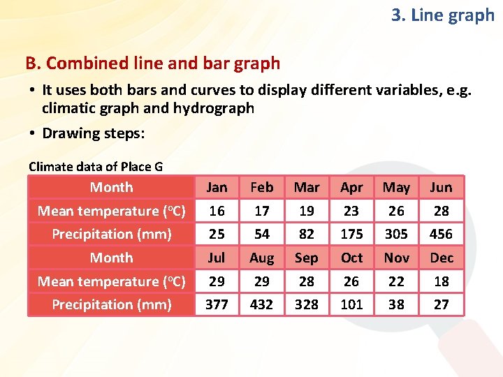
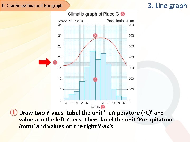
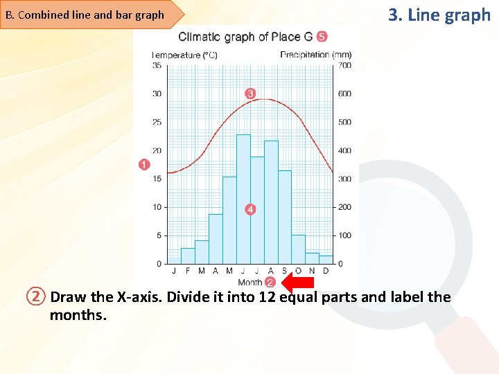
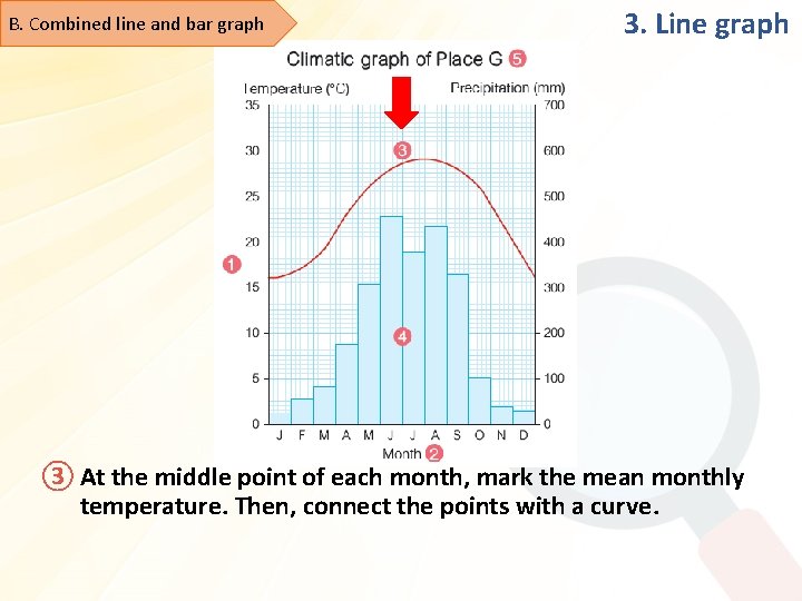
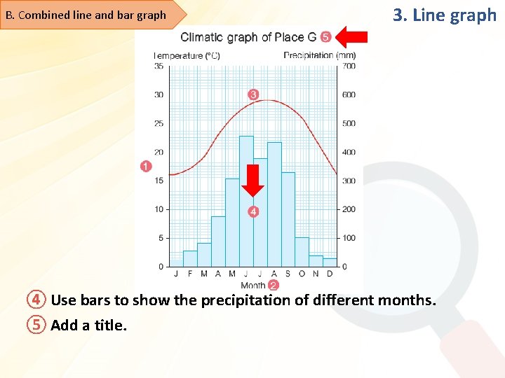
3. Line graph B. Combined line and bar graph • It uses both bars and curves to display different variables, e. g. climatic graph and hydrograph • Drawing steps: Climate data of Place G Month Jan Feb Mar Apr May Jun Mean temperature (o. C) 16 17 19 23 26 28 Precipitation (mm) 25 54 82 175 305 456 Month Jul Aug Sep Oct Nov Dec Mean temperature (o. C) 29 29 28 26 22 18 Precipitation (mm) 377 432 328 101 38 27

B. Combined line and bar graph 3. Line graph ① Draw two Y-axes. Label the unit ‘Temperature (o. C)’ and values on the left Y-axis. Then, label the unit ‘Precipitation (mm)’ and values on the right Y-axis.

B. Combined line and bar graph 3. Line graph ② Draw the X-axis. Divide it into 12 equal parts and label the months.

B. Combined line and bar graph 3. Line graph ③ At the middle point of each month, mark the mean monthly temperature. Then, connect the points with a curve.

B. Combined line and bar graph 3. Line graph ④ Use bars to show the precipitation of different months. ⑤ Add a title.

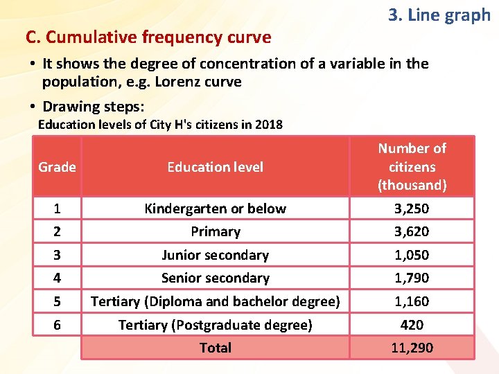
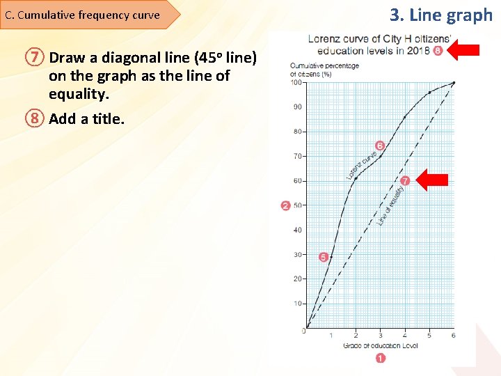
C. Cumulative frequency curve 3. Line graph • It shows the degree of concentration of a variable in the population, e. g. Lorenz curve • Drawing steps: Education levels of City H's citizens in 2018 Grade Education level Number of citizens (thousand) 1 Kindergarten or below 3, 250 2 Primary 3, 620 3 Junior secondary 1, 050 4 Senior secondary 1, 790 5 Tertiary (Diploma and bachelor degree) 1, 160 6 Tertiary (Postgraduate degree) 420 Total 11, 290

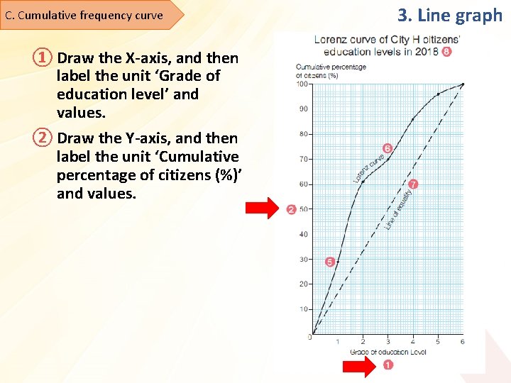
C. Cumulative frequency curve ① Draw the X-axis, and then label the unit ‘Grade of education level’ and values. ② Draw the Y-axis, and then label the unit ‘Cumulative percentage of citizens (%)’ and values. 3. Line graph

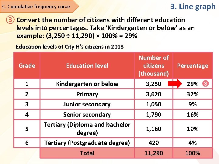
3. Line graph C. Cumulative frequency curve ③ Convert the number of citizens with different education levels into percentages. Take ‘Kindergarten or below’ as an example: (3, 250 ÷ 11, 290) × 100% = 29% Education levels of City H's citizens in 2018 Grade Education level Number of citizens (thousand) 1 Kindergarten or below 3, 250 29% 2 Primary 3, 620 32% 3 Junior secondary 1, 050 9% 4 Senior secondary 1, 790 16% 5 Tertiary (Diploma and bachelor degree) 1, 160 10% 6 Tertiary (Postgraduate degree) 420 4% Total 11, 290 100% Percentage

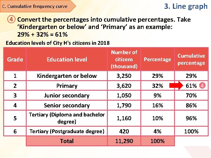
3. Line graph C. Cumulative frequency curve ④ Convert the percentages into cumulative percentages. Take ‘Kindergarten or below’ and ‘Primary’ as an example: 29% + 32% = 61% Education levels of City H's citizens in 2018 Grade Education level Number of citizens (thousand) 1 Kindergarten or below 3, 250 29% 2 Primary 3, 620 32% 61% 3 Junior secondary 1, 050 9% 70% 4 Senior secondary 1, 790 16% 86% 5 Tertiary (Diploma and bachelor degree) 1, 160 10% 96% 6 Tertiary (Postgraduate degree) 420 4% 100% Total 11, 290 100% Percentage Cumulative percentage

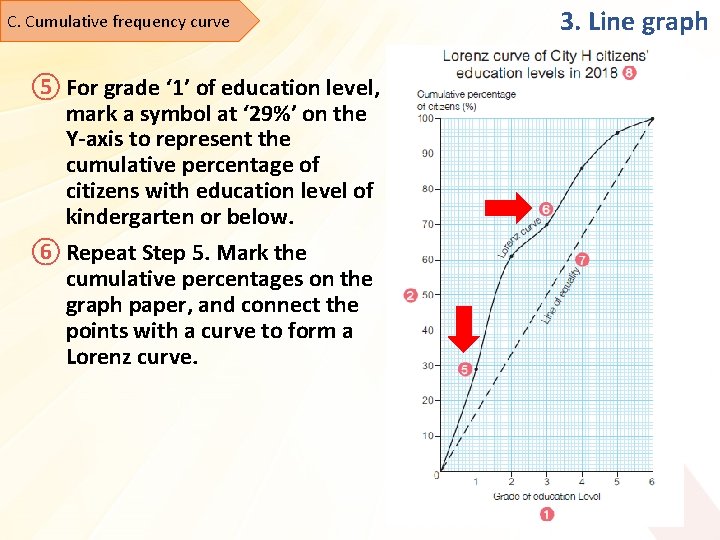
C. Cumulative frequency curve ⑤ For grade ‘ 1’ of education level, mark a symbol at ‘ 29%’ on the Y-axis to represent the cumulative percentage of citizens with education level of kindergarten or below. ⑥ Repeat Step 5. Mark the cumulative percentages on the graph paper, and connect the points with a curve to form a Lorenz curve. 3. Line graph

C. Cumulative frequency curve ⑦ Draw a diagonal line (45 o line) on the graph as the line of equality. ⑧ Add a title. 3. Line graph

End