3 Basics of R cont Summarising Statistical Data
3. Basics of R – cont. Summarising Statistical Data Graphical Displays 4. Basic distributions with R CA 200 (based on the book by Prof. Jane M. Horgan) 1
![Basics – 6+7*3/2 [1] 16. 5 – x <- 1: 4 x [1] 1 Basics – 6+7*3/2 [1] 16. 5 – x <- 1: 4 x [1] 1](http://slidetodoc.com/presentation_image_h2/42dd81bb3fdf438eb4787855c49de20b/image-2.jpg)
Basics – 6+7*3/2 [1] 16. 5 – x <- 1: 4 x [1] 1 2 3 4 – x 2 <- x**2 x 2 [1] 1 4 9 16 #general expression – X <- 10 prod 1 <- X*x prod 1 [1] 10 20 30 40 #case sensitive! #integers are assigned to the vector x #print x #square the element, or x 2<-x^2 CA 200 2

Getting Help • • click the Help button on the toolbar help() help. start() demo() ? read. table help. search ("data. entry") apropos (“boxplot”) - "boxplot", "boxplot. default", "boxplot. stat” CA 200 3
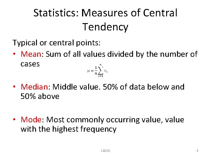
Statistics: Measures of Central Tendency Typical or central points: • Mean: Sum of all values divided by the number of cases • Median: Middle value. 50% of data below and 50% above • Mode: Most commonly occurring value, value with the highest frequency CA 200 4
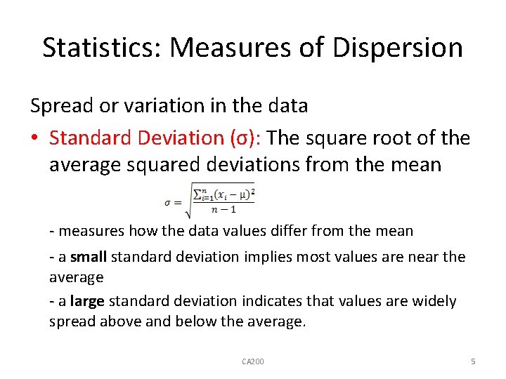
Statistics: Measures of Dispersion Spread or variation in the data • Standard Deviation (σ): The square root of the average squared deviations from the mean - measures how the data values differ from the mean - a small standard deviation implies most values are near the average - a large standard deviation indicates that values are widely spread above and below the average. CA 200 5
Statistics: Measures of Dispersion Spread or variation in the data • Range: Lowest and highest value • Quartiles: Divides data into quarters. 2 nd quartile is median • Interquartile Range: 1 st and 3 rd quartiles, middle 50% of the data. CA 200 6
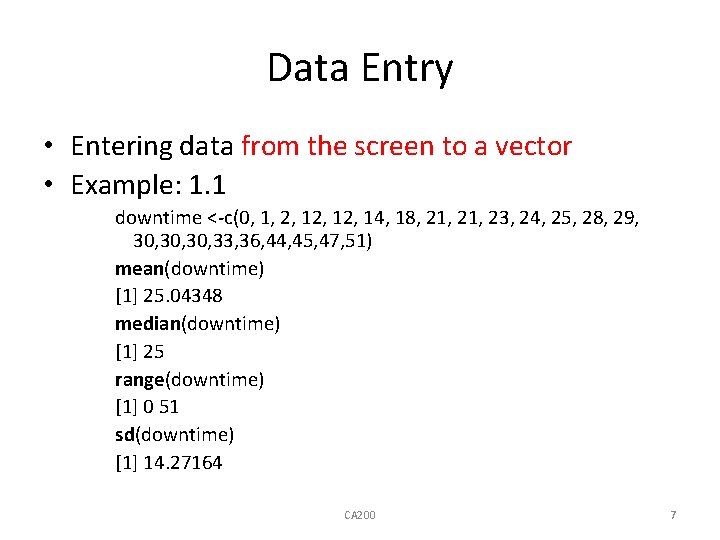
Data Entry • Entering data from the screen to a vector • Example: 1. 1 downtime <-c(0, 1, 2, 12, 14, 18, 21, 23, 24, 25, 28, 29, 30, 30, 33, 36, 44, 45, 47, 51) mean(downtime) [1] 25. 04348 median(downtime) [1] 25 range(downtime) [1] 0 51 sd(downtime) [1] 14. 27164 CA 200 7
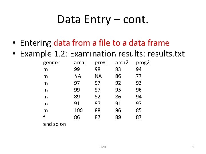
Data Entry – cont. • Entering data from a file to a data frame • Example 1. 2: Examination results: results. txt gender m m m m f and so on arch 1 99 NA 97 99 89 91 100 86 prog 1 98 NA 97 97 92 97 88 82 CA 200 arch 2 83 86 92 95 86 91 96 89 prog 2 94 77 93 96 94 97 85 87 8
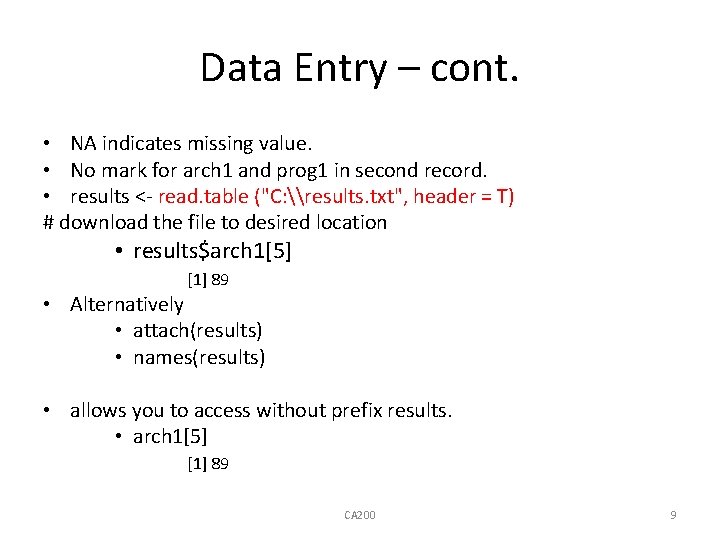
Data Entry – cont. • NA indicates missing value. • No mark for arch 1 and prog 1 in second record. • results <- read. table ("C: \results. txt", header = T) # download the file to desired location • results$arch 1[5] [1] 89 • Alternatively • attach(results) • names(results) • allows you to access without prefix results. • arch 1[5] [1] 89 CA 200 9
![Data Entry – Missing values • mean(arch 1) [1] NA • • • #no Data Entry – Missing values • mean(arch 1) [1] NA • • • #no](http://slidetodoc.com/presentation_image_h2/42dd81bb3fdf438eb4787855c49de20b/image-10.jpg)
Data Entry – Missing values • mean(arch 1) [1] NA • • • #no result because some marks are missing na. rm = T (not available, remove) or na. rm = TRUE mean(arch 1, na. rm = T) [1] 83. 33333 • mean(prog 1, na. rm = T) [1] 84. 25 • mean(arch 2, na. rm = T) • mean(prog 2, na. rm = T) • mean(results, na. rm = T) gender arch 1 prog 1 arch 2 prog 2 NA 94. 42857 93. 00000 89. 75000 90. 37500 10
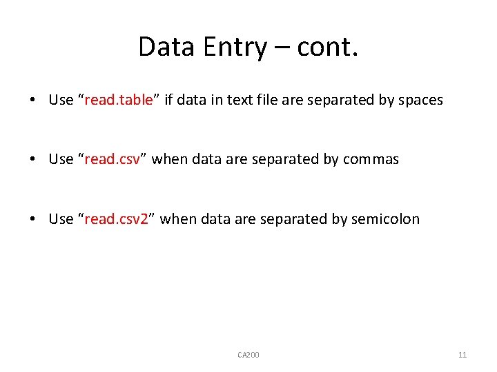
Data Entry – cont. • Use “read. table” if data in text file are separated by spaces • Use “read. csv” when data are separated by commas • Use “read. csv 2” when data are separated by semicolon CA 200 11
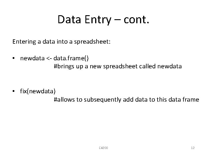
Data Entry – cont. Entering a data into a spreadsheet: • newdata <- data. frame() #brings up a new spreadsheet called newdata • fix(newdata) #allows to subsequently add data to this data frame CA 200 12

Summary Statistics Example 1. 1: Downtime: summary(downtime) Min. 0. 00 1 st Qu. 16. 00 Median Mean 25. 00 25. 04 3 rd Qu. Max. 31. 50 51. 00 Example 1. 2: Examination Results: summary(results) Gender arch 1 f: 4 Min. : 3. 00 m: 22 1 st Qu. : 79. 25 Median : 89. 00 Mean : 83. 33 3 rd Qu. : 96. 00 Max. : 100. 00 NA's : 2. 00 NA's prog 1 Min. : 65. 00 1 st Qu. : 80. 75 Median : 82. 50 Mean : 84. 25 3 rd Qu. : 90. 25 Max. : 98. 00 : 2. 00 arch 2 Min. : 56. 00 1 st Qu. : 77. 75 Median : 85. 50 Mean : 81. 15 3 rd Qu. : 91. 00 Max. : 96. 00 prog 2 Min. : 63. 00 1 st Qu. : 77. 50 Median : 84. 00 Mean : 83. 85 3 rd Qu. : 92. 50 Max. : 97. 00
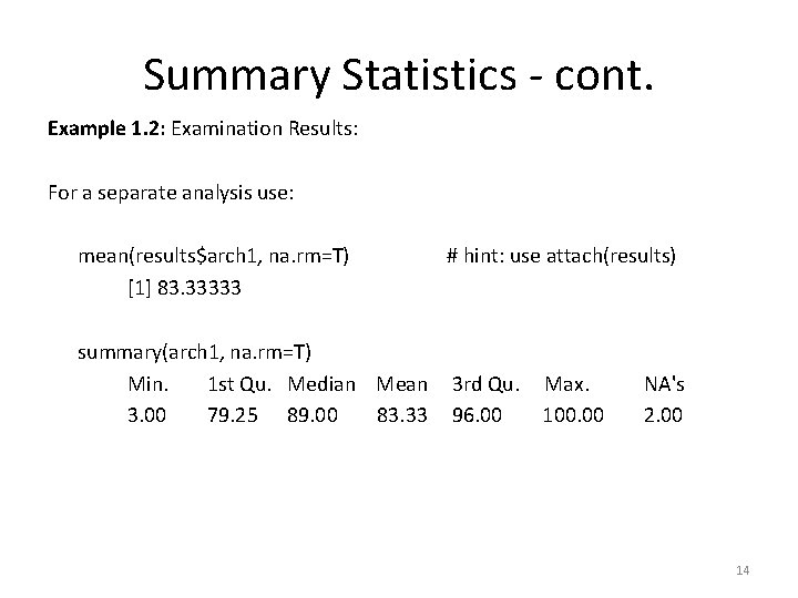
Summary Statistics - cont. Example 1. 2: Examination Results: For a separate analysis use: mean(results$arch 1, na. rm=T) [1] 83. 33333 summary(arch 1, na. rm=T) Min. 1 st Qu. Median Mean 3. 00 79. 25 89. 00 83. 33 # hint: use attach(results) 3 rd Qu. 96. 00 Max. 100. 00 NA's 2. 00 14
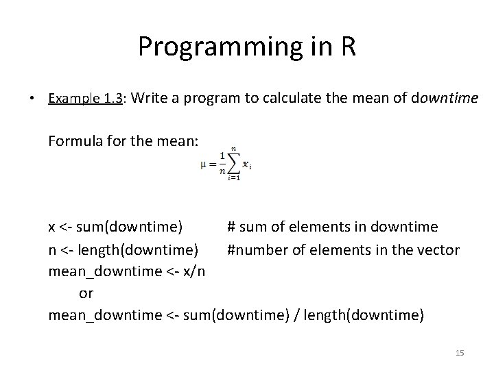
Programming in R • Example 1. 3: Write a program to calculate the mean of downtime Formula for the mean: x <- sum(downtime) # sum of elements in downtime n <- length(downtime) #number of elements in the vector mean_downtime <- x/n or mean_downtime <- sum(downtime) / length(downtime) 15
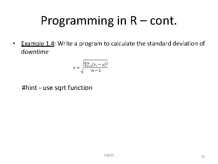
Programming in R – cont. • Example 1. 4: Write a program to calculate the standard deviation of downtime #hint - use sqrt function CA 200 16

Graphical displays - Boxplots • Boxplot – a graphical summary based on the median, quartile and extreme values boxplot(downtime) • box represents the interquartile range which contains 50% of cases • whiskers are lines that extend from max and min value • line across the box represents median • extreme values are cases on more than 1. 5 box length from max/min value CA 200 17
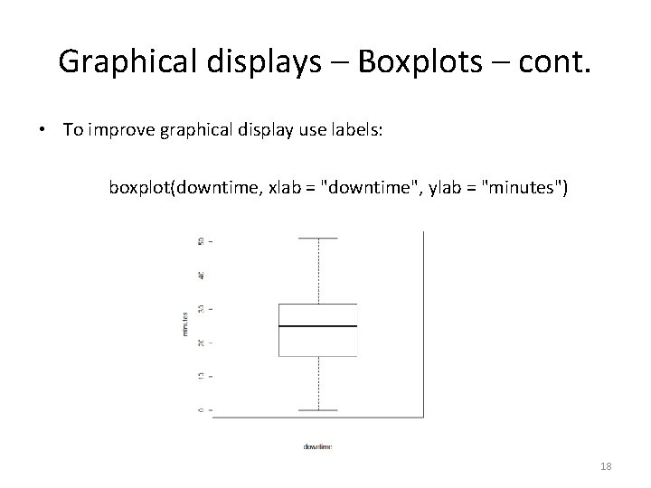
Graphical displays – Boxplots – cont. • To improve graphical display use labels: boxplot(downtime, xlab = "downtime", ylab = "minutes") 18

Graphical displays – Multiple Boxplots • Multiple boxplots at the same axis - by adding extra arguments to boxplot function: boxplot(results$arch 1, results$arch 2, xlab = " Architecture, Semesters 1 and 2" ) • Conclusions: – marks are lower in sem 2 – Range of marks in narrower in sem 2 • Note outliers in sem 1! 1. 5 box length from max/min value. Atypical values.

Graphical displays – Multiple Boxplots – cont. • Displays values per gender: boxplot(arch 1~gender, xlab = "gender", ylab = "Marks(%)", main = "Architecture Semester 1") • Note the effect of using: main = "Architecture Semester 1”
Par Display plots using par function • par (mfrow = c(2, 2)) #outputs are displayed in 2 x 2 array • boxplot (arch 1~gender, main = "Architecture Semester 1") • boxplot(arch 2~gender, main = "Architecture Semester 2") • boxplot(prog 1~gender, main = "Programming Semester 1") • boxplot(prog 2~gender, main = "Programming Semester 2") To undo matrix type: • par(mfrow = c(1, 1)) #restores graphics to the full screen 21
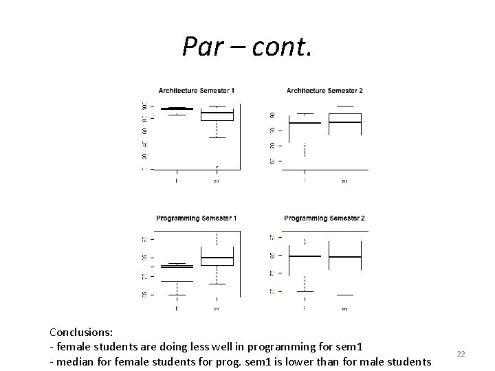
Par – cont. Conclusions: - female students are doing less well in programming for sem 1 - median for female students for prog. sem 1 is lower than for male students 22

Histograms • A histogram is a graphical display of frequencies in the categories of a variable hist(arch 1, breaks = 5, xlab ="Marks(%)", ylab = "Number of students", main = "Architecture Semester 1“ ) • Note: A histogram with five breaks equal width - count observations that fill within categories or “bins” 23
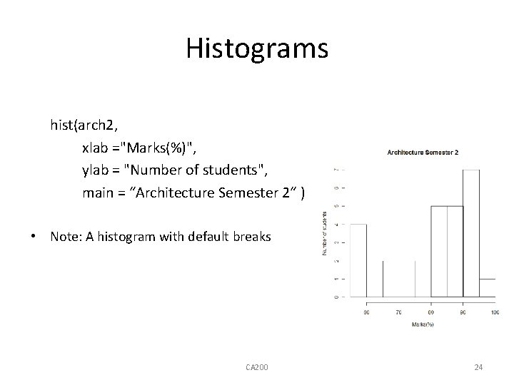
Histograms hist(arch 2, xlab ="Marks(%)", ylab = "Number of students", main = “Architecture Semester 2“ ) • Note: A histogram with default breaks CA 200 24
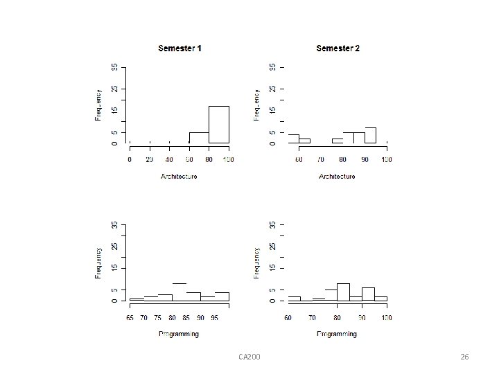
Using par with histograms • The par can be used to represent all the subjects in the diagram • par (mfrow = c(2, 2)) • hist(arch 1, xlab = "Architecture", main = " Semester 1", ylim = c(0, 35)) • hist(arch 2, xlab = "Architecture", main = " Semester 2", ylim = c(0, 35)) • hist(prog 1, xlab = "Programming", main = " ", ylim = c(0, 35)) • hist(prog 2, xlab = "Programming", main = " ", ylim = c(0, 35)) Note: ylim = c(0, 35) ensures that the y-axis is the same scale for all four objects! CA 200 25
CA 200 26
Stem and leaf • Stem and leaf – more modern way of displaying data! Like histograms: diagrams gives frequencies of categories but gives the actual values in each category • Stem usually depicts the 10 s and the leaves depict units. stem (downtime, scale = 2) The decimal point is 1 digit(s) to the right of the | 012 1 | 2248 2 | 1134589 3 | 00036 4 | 457 5|1 CA 200 27

Stem and leaf – cont. • stem(prog 1, scale = 2) The decimal point is 1 digit(s) to the right of the | 6|5 7 | 12 7 | 66 8 | 01112223 8 | 5788 9 | 012 9 | 7778 Note: e. g. there are many students with mark 80%-85% CA 200 28
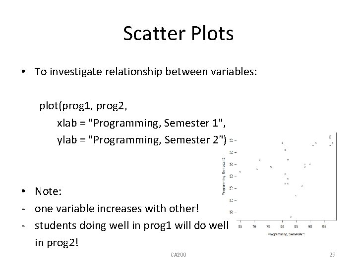
Scatter Plots • To investigate relationship between variables: plot(prog 1, prog 2, xlab = "Programming, Semester 1", ylab = "Programming, Semester 2") • Note: - one variable increases with other! - students doing well in prog 1 will do well in prog 2! CA 200 29
![Pairs • If more than two variables are involved: courses <- results[2: 5] pairs(courses) Pairs • If more than two variables are involved: courses <- results[2: 5] pairs(courses)](http://slidetodoc.com/presentation_image_h2/42dd81bb3fdf438eb4787855c49de20b/image-30.jpg)
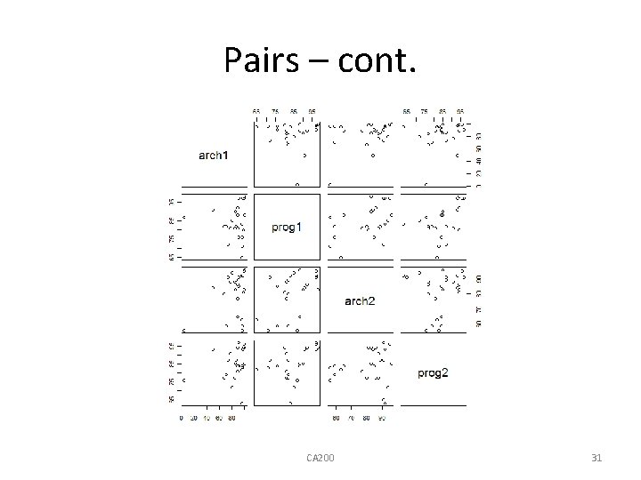
Pairs • If more than two variables are involved: courses <- results[2: 5] pairs(courses) #scatter plots for all possible pairs or pairs(results[2: 5]) CA 200 30
Pairs – cont. CA 200 31
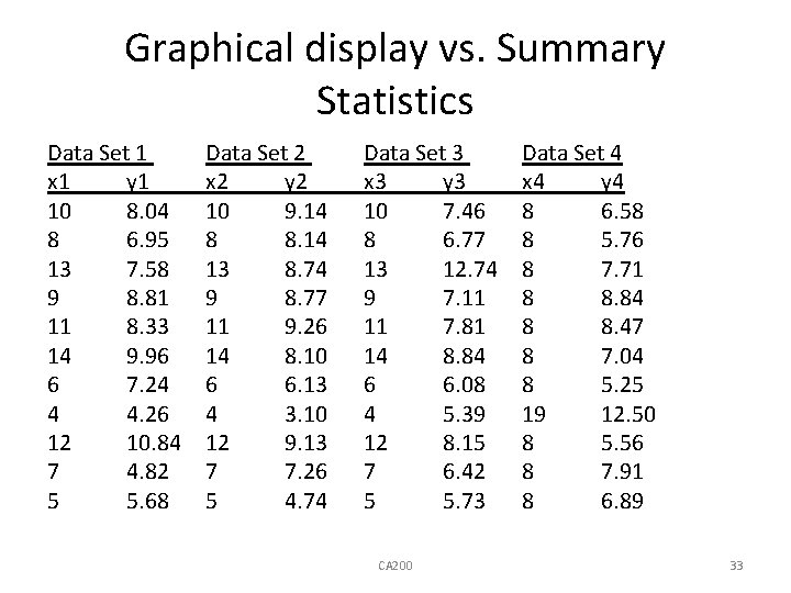
Graphical display vs. Summary Statistics • Importance of graphical display to provide insight into the data! • Anscombe(1973), four data sets • Each data set consist of two variables on which there are 11 observations CA 200 32
Graphical display vs. Summary Statistics Data Set 1 x 1 y 1 10 8. 04 8 6. 95 13 7. 58 9 8. 81 11 8. 33 14 9. 96 6 7. 24 4 4. 26 12 10. 84 7 4. 82 5 5. 68 Data Set 2 x 2 y 2 10 9. 14 8 8. 14 13 8. 74 9 8. 77 11 9. 26 14 8. 10 6 6. 13 4 3. 10 12 9. 13 7 7. 26 5 4. 74 Data Set 3 x 3 y 3 10 7. 46 8 6. 77 13 12. 74 9 7. 11 11 7. 81 14 8. 84 6 6. 08 4 5. 39 12 8. 15 7 6. 42 5 5. 73 CA 200 Data Set 4 x 4 y 4 8 6. 58 8 5. 76 8 7. 71 8 8. 84 8 8. 47 8 7. 04 8 5. 25 19 12. 50 8 5. 56 8 7. 91 8 6. 89 33
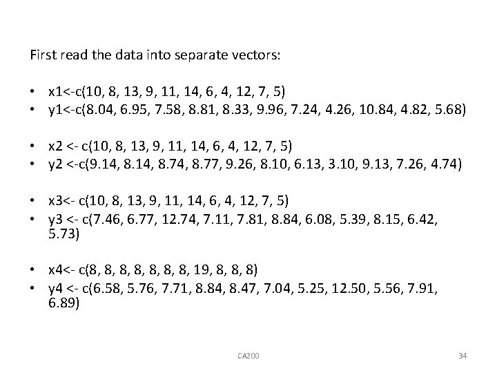
First read the data into separate vectors: • x 1<-c(10, 8, 13, 9, 11, 14, 6, 4, 12, 7, 5) • y 1<-c(8. 04, 6. 95, 7. 58, 8. 81, 8. 33, 9. 96, 7. 24, 4. 26, 10. 84, 4. 82, 5. 68) • x 2 <- c(10, 8, 13, 9, 11, 14, 6, 4, 12, 7, 5) • y 2 <-c(9. 14, 8. 74, 8. 77, 9. 26, 8. 10, 6. 13, 3. 10, 9. 13, 7. 26, 4. 74) • x 3<- c(10, 8, 13, 9, 11, 14, 6, 4, 12, 7, 5) • y 3 <- c(7. 46, 6. 77, 12. 74, 7. 11, 7. 81, 8. 84, 6. 08, 5. 39, 8. 15, 6. 42, 5. 73) • x 4<- c(8, 8, 19, 8, 8, 8) • y 4 <- c(6. 58, 5. 76, 7. 71, 8. 84, 8. 47, 7. 04, 5. 25, 12. 50, 5. 56, 7. 91, 6. 89) CA 200 34
For convenience, group the data into frames: • • dataset 1 <- data. frame(x 1, y 1) dataset 2 <- data. frame(x 2, y 2) dataset 3 <- data. frame(x 3, y 3) dataset 4 <- data. frame(x 4, y 4) CA 200 35
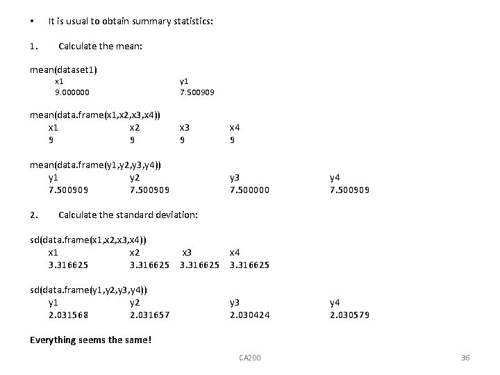
• 1. It is usual to obtain summary statistics: Calculate the mean: mean(dataset 1) x 1 9. 000000 mean(data. frame(x 1, x 2, x 3, x 4)) x 1 x 2 9 9 y 1 7. 500909 x 3 9 mean(data. frame(y 1, y 2, y 3, y 4)) y 1 y 2 7. 500909 2. x 4 9 y 3 7. 500000 y 4 7. 500909 Calculate the standard deviation: sd(data. frame(x 1, x 2, x 3, x 4)) x 1 x 2 3. 316625 sd(data. frame(y 1, y 2, y 3, y 4)) y 1 y 2 2. 031568 2. 031657 x 3 3. 316625 x 4 3. 316625 y 3 2. 030424 y 4 2. 030579 Everything seems the same! CA 200 36
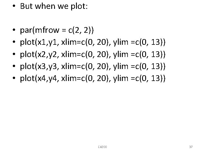
• But when we plot: • • • par(mfrow = c(2, 2)) plot(x 1, y 1, xlim=c(0, 20), ylim =c(0, 13)) plot(x 2, y 2, xlim=c(0, 20), ylim =c(0, 13)) plot(x 3, y 3, xlim=c(0, 20), ylim =c(0, 13)) plot(x 4, y 4, xlim=c(0, 20), ylim =c(0, 13)) CA 200 37
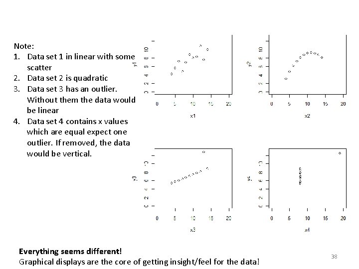
Note: 1. Data set 1 in linear with some scatter 2. Data set 2 is quadratic 3. Data set 3 has an outlier. Without them the data would be linear 4. Data set 4 contains x values which are equal expect one outlier. If removed, the data would be vertical. Everything seems different! Graphical displays are the core of getting insight/feel for the data! 38
- Slides: 38