2 Describing Data Qualitatively Visual Description Dot Plots
2 Describing Data Qualitatively Visual Description Dot Plots Bar Charts Scatter Plots Pie Charts Deceptive Graphs Mc. Graw-Hill/Irwin © 2008 The Mc. Graw-Hill Companies, Inc. All rights reserved.
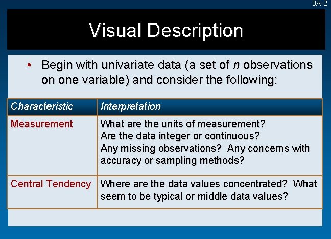
3 A-2 Visual Description • Begin with univariate data (a set of n observations on one variable) and consider the following: Characteristic Interpretation Measurement What are the units of measurement? Are the data integer or continuous? Any missing observations? Any concerns with accuracy or sampling methods? Central Tendency Where are the data values concentrated? What seem to be typical or middle data values?
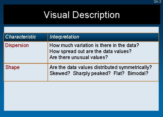
3 A-3 Visual Description Characteristic Interpretation Dispersion How much variation is there in the data? How spread out are the data values? Are there unusual values? Shape Are the data values distributed symmetrically? Skewed? Sharply peaked? Flat? Bimodal?
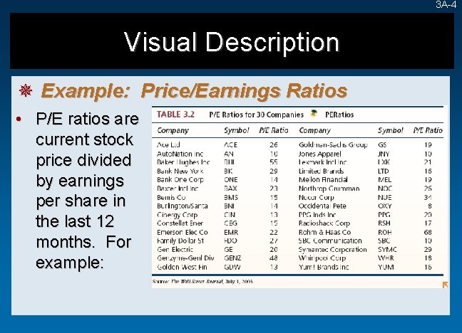
3 A-4 Visual Description ¯ Example: Price/Earnings Ratios • P/E ratios are current stock price divided by earnings per share in the last 12 months. For example:
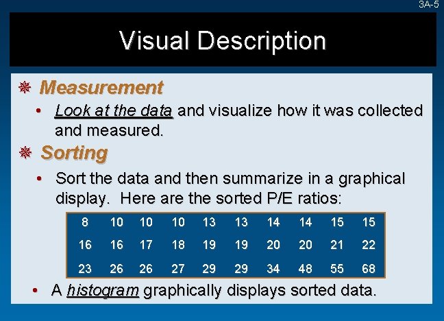
3 A-5 Visual Description ¯ Measurement • Look at the data and visualize how it was collected and measured. ¯ Sorting • Sort the data and then summarize in a graphical display. Here are the sorted P/E ratios: 8 10 10 10 13 13 14 14 15 15 16 16 17 18 19 19 20 20 21 22 23 26 26 27 29 29 34 48 55 68 • A histogram graphically displays sorted data.
3 A-6 Dot Plots • A dot plot is the simplest graphical display of n individual values of numerical data. - Easy to understand - Not good for large samples (e. g. , > 5, 000). ¯ Steps in Making a Dot Plot 1. 2. 3. Make a scale that covers the data range Mark the axes and label them Plot each data value as a dot above the scale at its approximate location If more than one data value lies at about the same axis location, the dots are piled up vertically.
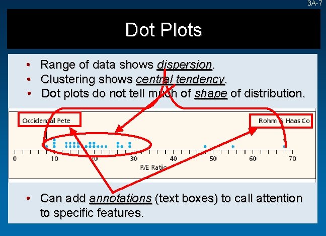
3 A-7 Dot Plots • • • Range of data shows dispersion. Clustering shows central tendency. Dot plots do not tell much of shape of distribution. • Can add annotations (text boxes) to call attention to specific features.
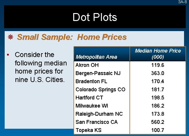
3 A-8 Dot Plots ¯ Small Sample: Home Prices • Consider the following median home prices for nine U. S. Cities. Metropolitan Area Median Home Price (000) Akron OH 119. 6 Bergen-Passaic NJ 363. 0 Bradenton FL 170. 4 Colorado Springs CO 181. 7 Hartford CT 198. 5 Milwaukee WI 186. 2 Raleigh-Durham NC 173. 8 San Francisco CA 560. 2 Topeka KS 100. 7
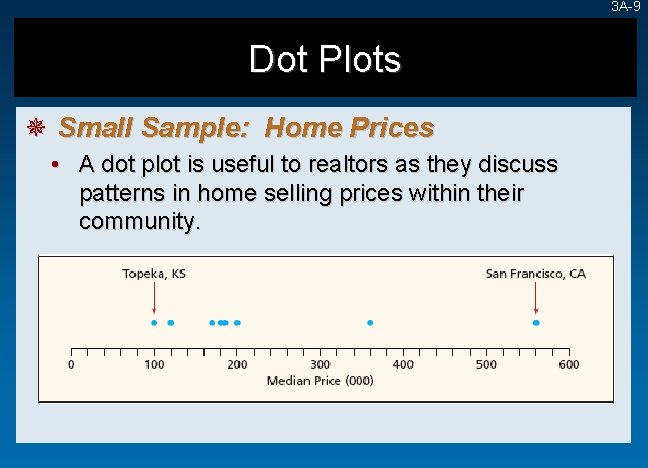
3 A-9 Dot Plots ¯ Small Sample: Home Prices • A dot plot is useful to realtors as they discuss patterns in home selling prices within their community.
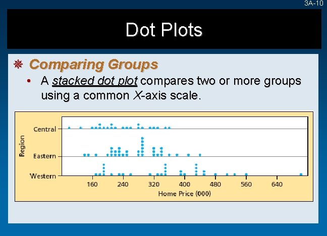
3 A-10 Dot Plots ¯ Comparing Groups • A stacked dot plot compares two or more groups using a common X-axis scale.
Frequency Distributions and Histograms ¯ Histograms • A histogram is a graphical representation of a frequency distribution. Y-axis shows frequency within each bin. • A histogram is a bar chart. X-axis ticks shows end points of each bin. 3 A-11
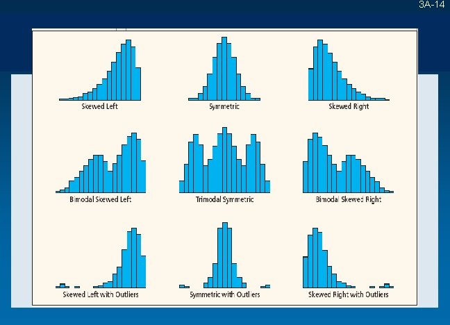
Frequency Distributions and Histograms 3 A-12 ¯ Modal Class • A histogram bar that is higher than those on either side. • Monomodal – a single modal class. • Bimodal – two modal classes. • Multimodal – more than two modal classes. • Modal classes may be artifacts of the way bin limits are chosen.
Frequency Distributions and Histograms 3 A-13 ¯ Shape • • • A histogram suggests the shape of the population. It is influenced by number of bins and bin limits. Skewness – indicated by the direction of the longer tail of the histogram. Left-skewed – (negatively skewed) a longer left tail. Right-skewed – (positively skewed) a longer right tail. Symmetric – both tail areas approximately the same.
3 A-14
3 B-15 Scatter Plots • A scatter plot shows n pairs of observations as dots (or some other symbol) on an XY graph. • A starting point for bivariate data analysis. • Allows observations about the relationship between two variables. • Answers the question: Is there an association between the two variables and if so, what kind of association?
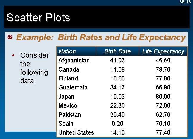
3 B-16 Scatter Plots ¯ Example: Birth Rates and Life Expectancy • Consider the following data: Nation Afghanistan Birth Rate 41. 03 Life Expectancy 46. 60 Canada Finland 11. 09 10. 60 79. 70 77. 80 Guatemala Japan 34. 17 10. 03 66. 90 80. 90 Mexico Pakistan 22. 36 30. 40 72. 00 62. 70 Spain United States 9. 29 14. 10 79. 10 77. 40
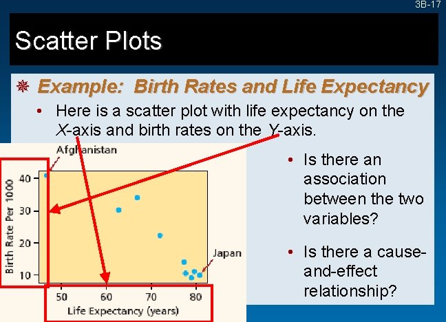
3 B-17 Scatter Plots ¯ Example: Birth Rates and Life Expectancy • Here is a scatter plot with life expectancy on the X-axis and birth rates on the Y-axis. • Is there an association between the two variables? • Is there a causeand-effect relationship?
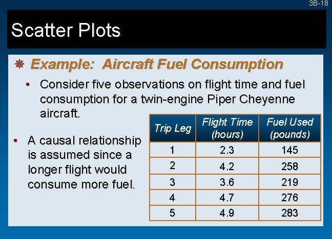
3 B-18 Scatter Plots ¯ Example: Aircraft Fuel Consumption • Consider five observations on flight time and fuel consumption for a twin-engine Piper Cheyenne aircraft. • A causal relationship is assumed since a longer flight would consume more fuel. Trip Leg 1 2 3 4 5 Flight Time (hours) 2. 3 Fuel Used (pounds) 145 4. 2 3. 6 258 219 4. 7 4. 9 276 283
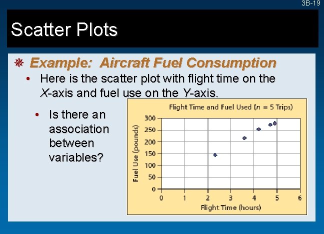
3 B-19 Scatter Plots ¯ Example: Aircraft Fuel Consumption • Here is the scatter plot with flight time on the X-axis and fuel use on the Y-axis. • Is there an association between variables?
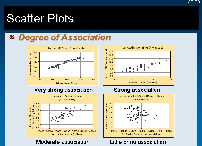
3 B-20 Scatter Plots ¯ Degree of Association Very strong association Strong association Moderate association Little or no association
3 B-21 Pie Charts ¯ An Oft-Abused Chart • A pie chart can only convey a general idea of the data. • Pie charts should be used to portray data which sum to a total (e. g. , percent market shares). • A pie chart should only have a few (i. e. , 2 or 3) slices. • Each slice should be labeled with data values or percents.
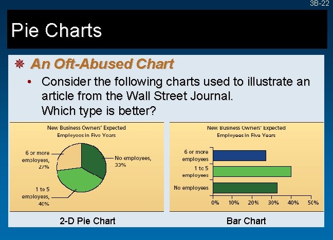
3 B-22 Pie Charts ¯ An Oft-Abused Chart • Consider the following charts used to illustrate an article from the Wall Street Journal. Which type is better? 2 -D Pie Chart Bar Chart
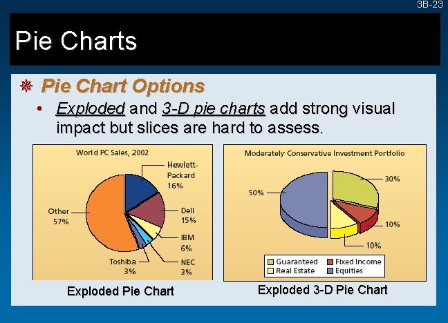
3 B-23 Pie Charts ¯ Pie Chart Options • Exploded and 3 -D pie charts add strong visual impact but slices are hard to assess. Exploded Pie Chart Exploded 3 -D Pie Chart
3 B-24 Pie Charts ¯ Common Errors in Pie Chart Usage • Pie charts can only convey a general idea of the data values. • Pie charts are ineffective when they have too many slices. • Pie chart data must represent parts of a whole (e. g. , percent market share).
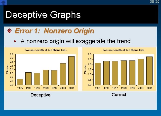
3 B-25 Deceptive Graphs ¯ Error 1: Nonzero Origin • A nonzero origin will exaggerate the trend. Deceptive Correct
- Slides: 25