12 5 Scatter Plots Correlation In statistics it
- Slides: 13

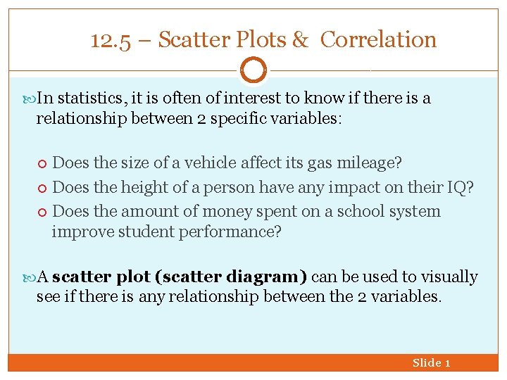
12. 5 – Scatter Plots & Correlation In statistics, it is often of interest to know if there is a relationship between 2 specific variables: Does the size of a vehicle affect its gas mileage? Does the height of a person have any impact on their IQ? Does the amount of money spent on a school system improve student performance? A scatter plot (scatter diagram) can be used to visually see if there is any relationship between the 2 variables. Slide 1

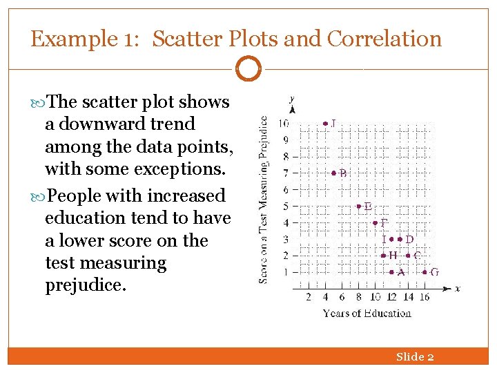
Example 1: Scatter Plots and Correlation The scatter plot shows a downward trend among the data points, with some exceptions. People with increased education tend to have a lower score on the test measuring prejudice. Slide 2

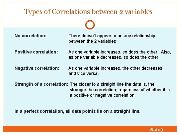
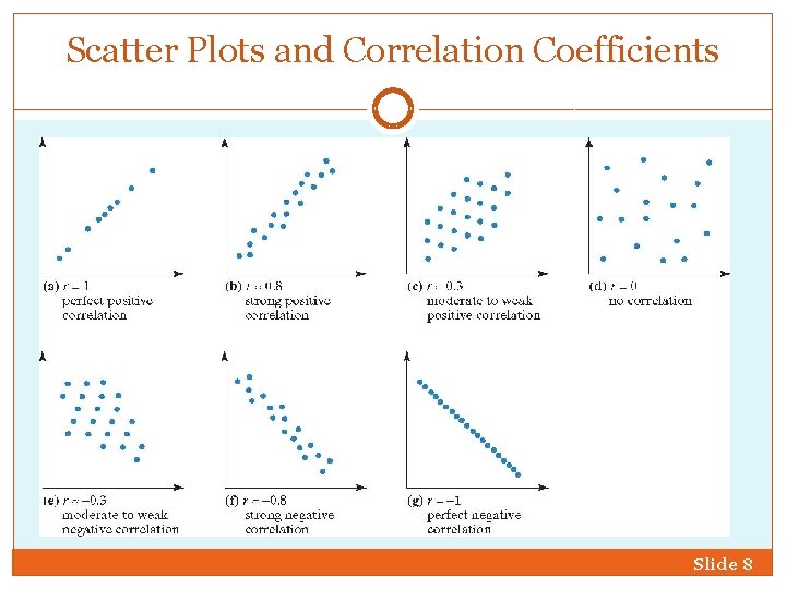
Types of Correlations between 2 variables No correlation: There doesn’t appear to be any relationship between the 2 variables Positive correlation: As one variable increases, so does the other. Also, as one variable decreases, so does the other. Negative correlation: As one variable increases, the other decreases, and vice versa. Strength of a correlation: The closer to a straight line the data is, the stronger the correlation, regardless of whether it is a positive or negative correlation In a perfect correlation, all data points lie on a straight line. Slide 3

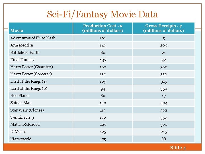
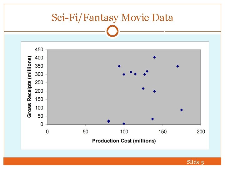
Sci-Fi/Fantasy Movie Data Production Cost - x (millions of dollars) Gross Receipts - y (millions of dollars) Adventures of Pluto Nash 100 5 Armageddon 140 200 Battlefield Earth 80 21 Final Fantasy 137 32 Harry Potter (Chamber) 100 300 Harry Potter (Sorcerer) 130 320 Lord of the Rings (1) 109 315 Lord of the Rings (2) 94 350 Red Planet 80 17 Spider-Man 140 404 Star Wars (Clones) 115 302 Terminator 3 170 350 Matrix Reloaded 127 300 X-Men 2 125 215 Waterworld 175 88 Movie Slide 4

Sci-Fi/Fantasy Movie Data Slide 5

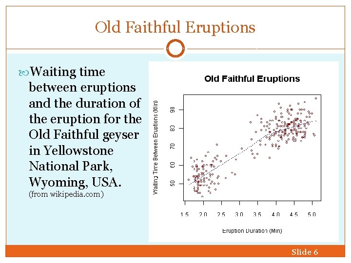
Old Faithful Eruptions Waiting time between eruptions and the duration of the eruption for the Old Faithful geyser in Yellowstone National Park, Wyoming, USA. (from wikipedia. com) Slide 6

Regression Lines and Correlation Coefficients Regression line is a line that best fits the data points in a scatter plot. Correlation coefficient, designated by r, is a measure that is used to describe the strength and direction of a relationship between variables whose data points lie on or near a line. Slide 7

Scatter Plots and Correlation Coefficients Slide 8

Correlation and Causal Connections Although the scatter plot shows a correlation between education and prejudice, we cannot conclude that increased education causes a person’s level of prejudice to decrease. 1. The correlation could be simply a coincidence. 2. Education usually involves classrooms with a variety of different kinds of people. Increased exposure to diversity in the classroom might be an underlying cause. 3. Education requires people to look at new ideas and see things in different ways. Thus, education causes one to be more tolerant and less prejudiced. Correlation is not necessarily causation. Slide 9

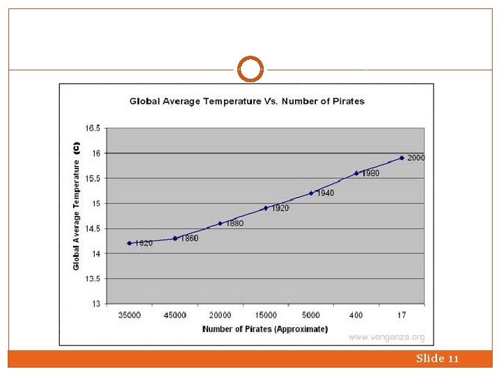
Does Correlation = Causation? In the early 1800's (1820 to be scientifically accurate according to our accumulated evidence) the number of active pirates was around 35, 000. By the end of the twenty century that number had decreased substantially to around 17, give or take a couple of hundred. Coupled with that knowledge, it is obvious that mean global temperatures had also changed from around 14. 25 degrees Centigrade to around 15. 9 degrees Centigrade. The following graph supplied (albeit unknowingly) by the fine blog Mish Mash by Ryan Shea cannot be denied. Slide 10

Slide 11

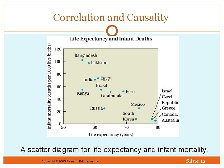
Correlation and Causality A scatter diagram for life expectancy and infant mortality. Copyright © 2005 Pearson Education, Inc. Slide 12

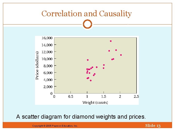
Correlation and Causality A scatter diagram for diamond weights and prices. Copyright © 2005 Pearson Education, Inc. Slide 13