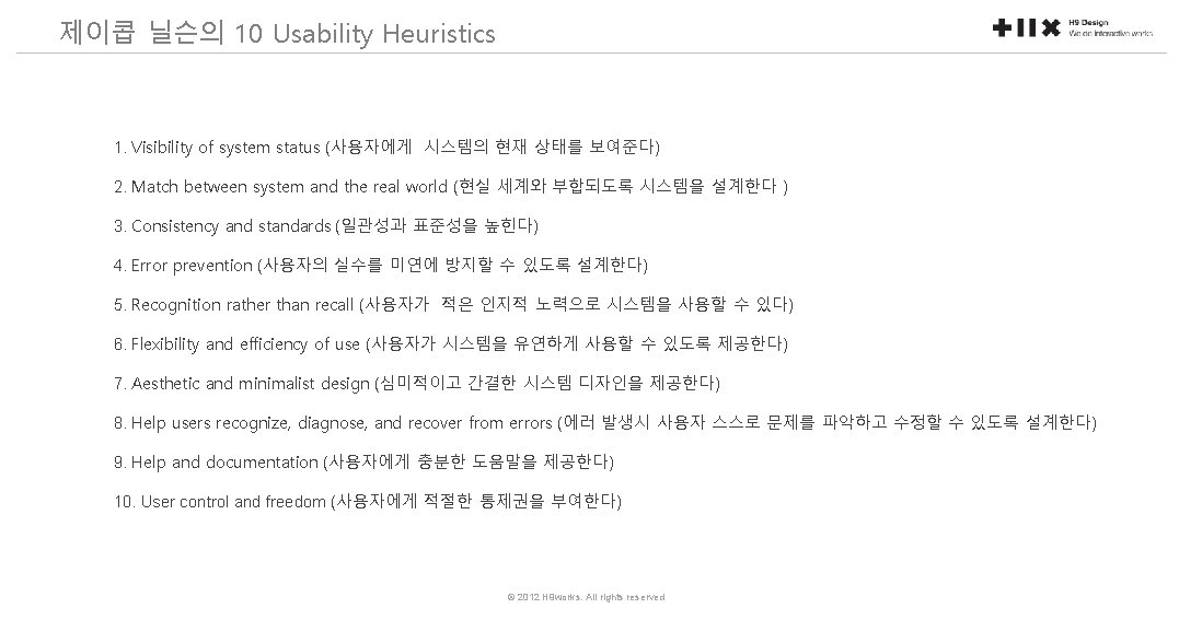
10 Usability Heuristics Ben Shneiderman 8 Golden Rules
의 8")
- 휴리스틱 평가 - 제이콥 닐슨의 10 Usability Heuristics - 벤 슈나이더맨(Ben Shneiderman)의 8 Golden Rules of Interface Design - Tailored Checklist of One Example © 2012 H 9 works. All rights reserved
의 8 Golden Rules of Interface Design 1. Strive for consistency. 2.")
벤 슈나이더맨(Ben Shneiderman)의 8 Golden Rules of Interface Design 1. Strive for consistency. 2. Enable frequent users to use shortcuts. 3. Offer informative feedback. 4. Design dialog to yield closure 5. Offer simple error handling 6. Permit easy reversal of actions. 7. Support internal locus of control. 8. Reduce short-term memory load. © 2012 H 9 works. All rights reserved
의 8 Golden Rules of Interface Design 1. Strive for consistency. 비슷한")
벤 슈나이더맨(Ben Shneiderman)의 8 Golden Rules of Interface Design 1. Strive for consistency. 비슷한 사항에서 일관적이며 연속적인 Action가 필요하다. 동일한 용어와 메뉴, help 화면 그리고 일관적인 명령이 전체적으로 적용되어야 한다. Consistent sequences of actions should be required in similar situations; identical terminology should be used in prompts, menus, and help screens; and consistent commands should be employed throughout. 2. Enable frequent users to use shortcuts. 사용의 빈도가 증가함에 따라, 상호작용의 회수가 줄기를 바라고, 상호작용의 속도가 증가하기 바란다. 함축어, 기능 키, 숨겨진 명령 그리고 매크로 기능은 전문가와 같은 사용자에게 도움이 된다. As the frequency of use increases, so do the user's desires to reduce the number of interactions and to increase the pace of interaction. Abbreviations, function keys, hidden commands, and macro facilities are very helpful to an expert user. © 2012 H 9 works. All rights reserved
의 8 Golden Rules of Interface Design 3. Offer informative feedback. 모든")
벤 슈나이더맨(Ben Shneiderman)의 8 Golden Rules of Interface Design 3. Offer informative feedback. 모든 사용자의 작용에 대하여, 시스템은 반응을 해야 한다. 사소하면서도 자주 발생하는 작용에 대하여서도 반응이 비약할 수 있지만, 중요한 작용이나 드문 액션에 대한 응답은 상당히 중요하다. For every operator action, there should be some system feedback. For frequent and minor actions, the response can be modest, while for infrequent and major actions, the response should be more substantial 4. Design dialog to yield closure. 한 태스크의 사용의 시작과 끝을 명확하게 알려야 한다. 연속적인 작용은 시작, 중간, 끝이라는 상태로 이루어져야 한다. 동작의 완료 시 유용한 정보를 제공하여 사용자의 달성에 만족을 주어야 한다. Sequences of actions should be organized into groups with a beginning, middle, and end. The informative feedback at the completion of a group of actions gives the operators the satisfaction of accomplishment, a sense of relief, the signal to drop contingency plans and options from their minds, and an indication that the way is clear to prepare for the next group of actions © 2012 H 9 works. All rights reserved
의 8 Golden Rules of Interface Design 5. Offer simple error handling.")
벤 슈나이더맨(Ben Shneiderman)의 8 Golden Rules of Interface Design 5. Offer simple error handling. 가능하다면 사용자가 심각한 오류를 발생하지 않도록 디자인해야 한다. 만약 오류가 발생한다면, 시스템은 오류를 탐색할 수 있어야 하며 이를 해결하기 위하여 간단하고 이해할만한 메커니즘을 제공해야 한다. As much as possible, design the system so the user cannot make a serious error. If an error is made, the system should be able to detect the error and offer simple, comprehensible mechanisms for handling the error. 6. Permit easy reversal of actions. 실행, 최소 등을 제공하고 사용자가 실수를 해도 괜찮은 여유를 제공. 이런 특징은 사용자에게 걱정을 덜어준다. 왜냐하면, 사용자가 에러를 되돌릴 수 있다는 것을 안다. 그러므로 사용자가 익숙하지 않는 옵션에 대하여 탐색할 수 있도록 도와준다. This feature relieves anxiety, since the user knows that errors can be undone; it thus encourages exploration of unfamiliar options. The units of reversibility may be a single action, a data entry, or a complete group of actions. © 2012 H 9 works. All rights reserved
의 8 Golden Rules of Interface Design 7. Support internal locus of")
벤 슈나이더맨(Ben Shneiderman)의 8 Golden Rules of Interface Design 7. Support internal locus of control. (내적 통제감) 경험있는 사용자들은 시스템에 대한 통제를 하고 있다는 느낌을 느끼기를 바란다. 그리고 그 시스템이 그들의 작용에 반응하기를 희망한다. 사용자를 단순 반응자보다 작용의 시작자로 만들도록 디자인하라. Experienced operators strongly desire the sense that they are in charge of the system and that the system responds to their actions. Design the system to make users the initiators of actions rather than the responders. 8. Reduce short-term memory load. 단기 기억에 있는 인간 정보처리의 제한으로, 여러 페이지 화면을 간단하고 여러 페이지를 일관성있게 표현해 주기를 원한다. The limitation of human information processing in short-term memory requires that displays be kept simple, multiple page displays be consolidated, © 2012 H 9 works. All rights reserved

MATCHING ONE 1. Visibility of system status 2. Match between system and the real 1. Strive for consistency world 2. Enable frequent users to use shortcuts 3. User control and freedom 3. Offer informative feedback 4. Consistency and standards 4. Design dialog to yield closure 5. Error prevention 5. Offer simple error handling 6. Recognition rather than recall 6. Permit easy reversal of actions 7. Flexibility and efficiency of use 7. Support internal locus of control 8. Aesthetic and minimalistic design 8. Reduce short-term memory load 9. Help users recognize, diagnose, and recover from errors 10. Help and documentation © 2012 H 9 works. All rights reserved

An integrated version 1. Visibility of system status = Offer informative feedback 2. Match between system and the real world 3. User control and freedom = Permit easy reversal of actions 4. Consistency and standards = Strive for consistency 5. Error prevention 6. Recognition rather than recall = Reduce short-term memory load 7. Flexibility and efficiency of use = Enable frequent users to use shortcuts 8. Aesthetic and minimalistic design 9. Help users recognize, diagnose, and recover from errors = Offer simple error handling 10. Help and documentation 11. Design dialog to yield closure 12. Support internal locus of control © 2012 H 9 works. All rights reserved

Tailored checklist Where to use these heuristics : - To learn general principles of user interface design - To use it as sources to make UI design checklist specifically tailored to your design problem © 2012 H 9 works. All rights reserved

Tailored checklist : an EXAMPLE OF A MOBILE PHONE’S HOME SCREEN 1. Choose the applicable ones 1. Visibility of system status = Offer informative feedback 2. Match between system and the real world 3. User control and freedom = Permit easy reversal of actions 4. Consistency and standards = Strive for consistency 5. Error prevention 6. Recognition rather than recall = Reduce short-term memory load 7. Flexibility and efficiency of use = Enable frequent users to use shortcuts 8. Aesthetic and minimalistic design 9. Help users recognize, diagnose, and recover from errors = Offer simple error handling 10. Help and documentation 11. Design dialog to yield closure 12. Support internal locus of control © 2012 H 9 works. All rights reserved

Tailored checklist : an EXAMPLE OF A MOBILE PHONE’S HOME SCREEN 1. Choose the applicable ones 1. Visibility of system status = Offer informative feedback 2. Match between system and the real world 3. User control and freedom = Permit easy reversal of actions 4. Consistency and standards = Strive for consistency 5. Error prevention 6. Recognition rather than recall = Reduce short-term memory load 7. Flexibility and efficiency of use = Enable frequent users to use shortcuts 8. Aesthetic and minimalistic design 9. Help users recognize, diagnose, and recover from errors = Offer simple error handling 10. Help and documentation 11. Design dialog to yield closure 12. Support internal locus of control © 2012 H 9 works. All rights reserved

Tailored checklist : an EXAMPLE OF A MOBILE PHONE’S HOME SCREEN 2. Tailor Them to reflect your needs 1. Visibility of system status = Offer informative feedback - Is annunciator on the screen? 2. Match between system and the real world - Does the label of each icon match with its functionality? 7. Flexibility and efficiency of use = Enable frequent users to use shortcuts - Does it provide customizable icon re-arrangement? 10. Help and documentation - Does it provide help text for each icon? © 2012 H 9 works. All rights reserved

Tailored checklist : an EXAMPLE OF A MOBILE PHONE’S HOME SCREEN 3. Use it check your UI : inspection, new feature, decision making, etc - Is annunciator on the screen? - Does the label of each icon match with its functionality? - Does it provide customizable icon re-arrangement? - Does it provide help text for each icon? © 2012 H 9 works. All rights reserved
- Slides: 22