10 STRATEGY CHARTS How to use the most
- Slides: 33

10 STRATEGY CHARTS How to use the most powerful charts used by strategy professionals

10 Strategy Charts 1. Market map 2. Segment growth 3. Growth comparison 4. Customer segmentation 5. Competitive profitability 6. Profile 7. Change analysis 8. Segment drilldown 9. Trend analysis 10. Mix analysis 2

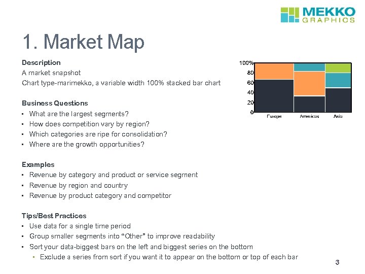
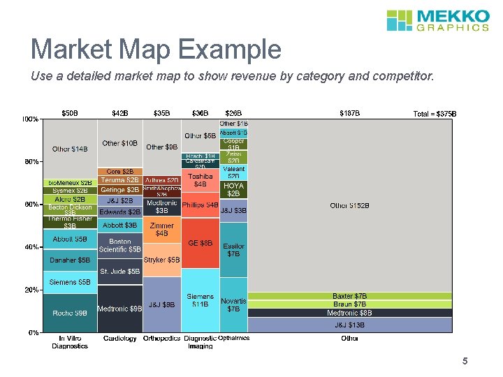
1. Market Map Description A market snapshot Chart type-marimekko, a variable width 100% stacked bar chart Business Questions • What are the largest segments? • How does competition vary by region? • Which categories are ripe for consolidation? • Where are the growth opportunities? Examples • Revenue by category and product or service segment • Revenue by region and country • Revenue by product category and competitor Tips/Best Practices • Use data for a single time period • Group smaller segments into “Other” to improve readability • Sort your data-biggest bars on the left and biggest series on the bottom • Exclude a series from sort if you want it to appear on the bottom or top of each bar 3

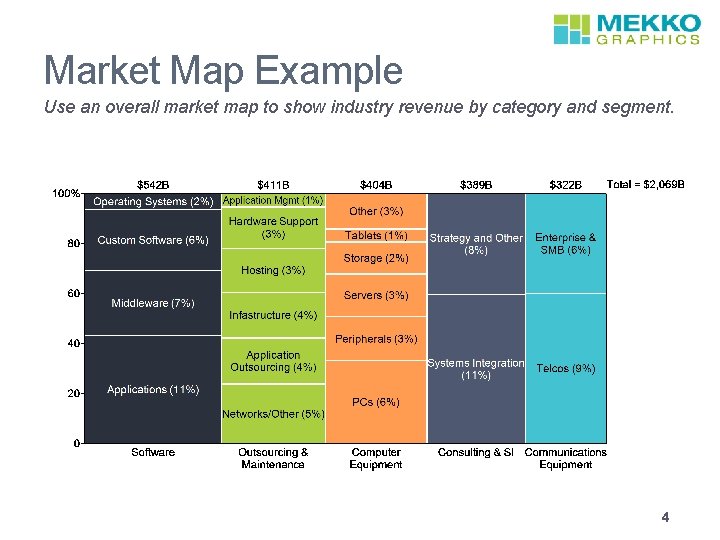
Market Map Example Use an overall market map to show industry revenue by category and segment. 4

Market Map Example Use a detailed market map to show revenue by category and competitor. 5

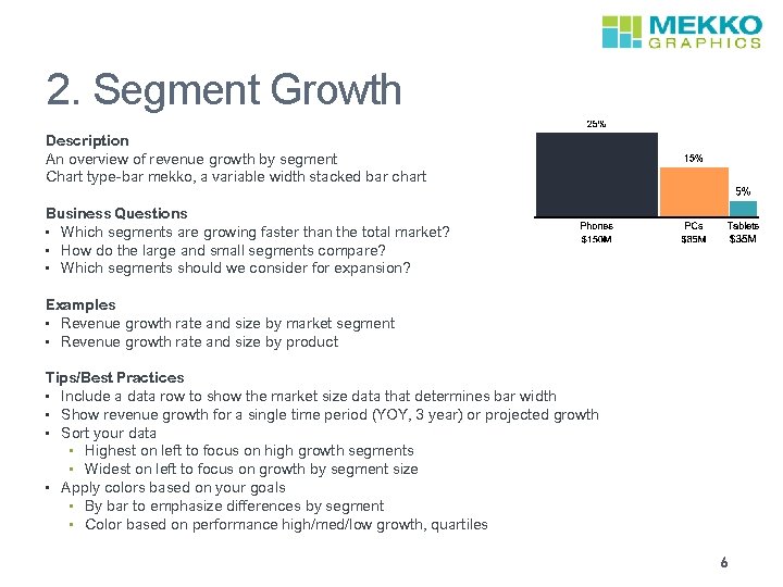
2. Segment Growth Description An overview of revenue growth by segment Chart type-bar mekko, a variable width stacked bar chart Business Questions • Which segments are growing faster than the total market? • How do the large and small segments compare? • Which segments should we consider for expansion? Examples • Revenue growth rate and size by market segment • Revenue growth rate and size by product Tips/Best Practices • Include a data row to show the market size data that determines bar width • Show revenue growth for a single time period (YOY, 3 year) or projected growth • Sort your data • Highest on left to focus on high growth segments • Widest on left to focus on growth by segment size • Apply colors based on your goals • By bar to emphasize differences by segment • Color based on performance high/med/low growth, quartiles 6

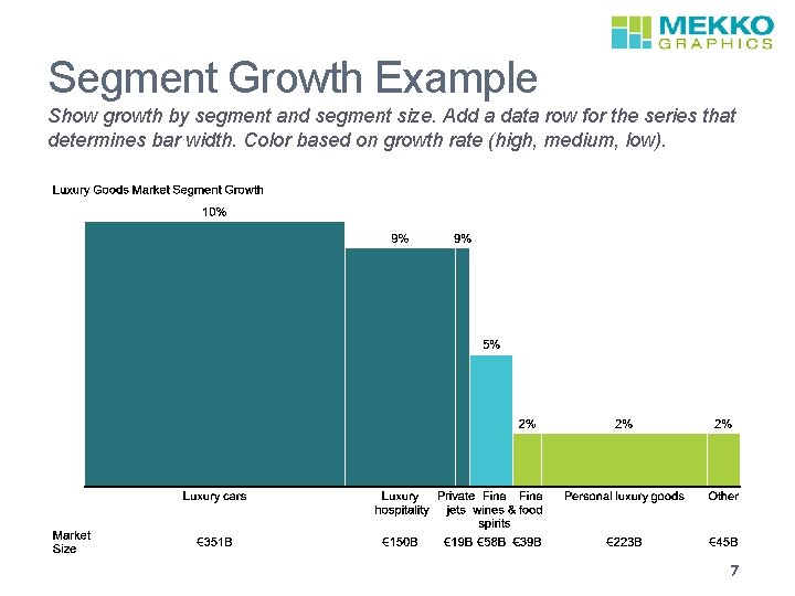
Segment Growth Example Show growth by segment and segment size. Add a data row for the series that determines bar width. Color based on growth rate (high, medium, low). 7

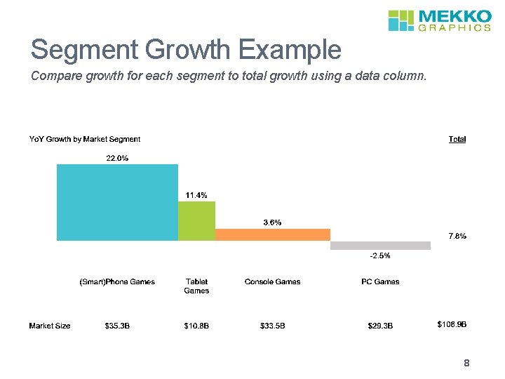
Segment Growth Example Compare growth for each segment to total growth using a data column. 8

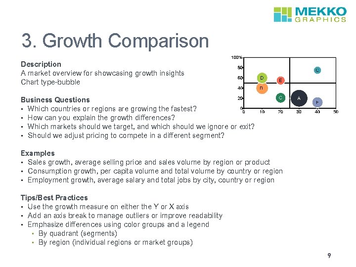
3. Growth Comparison Description A market overview for showcasing growth insights Chart type-bubble Business Questions • Which countries or regions are growing the fastest? • How can you explain the growth differences? • Which markets should we target, and which should we ignore or exit? • Should we adjust pricing to compete in a different segment? Examples • Sales growth, average selling price and sales volume by region or product • Consumption growth, per capita volume and total volume by country or region • Employment growth, average salary and total jobs by city, country or region Tips/Best Practices • Use the growth measure on either the Y or X axis • Add an axis break to manage outliers or improve readability • Emphasize differences using color groups and a legend • By quadrant (segments) • By region (individual regions or market groups) 9

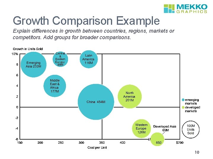
Growth Comparison Example Explain differences in growth between countries, regions, markets or competitors. Add groups for broader comparisons. 10

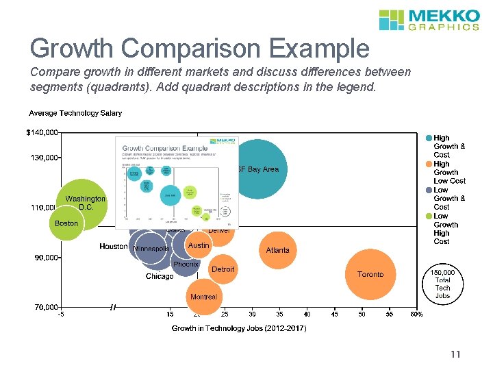
Growth Comparison Example Compare growth in different markets and discuss differences between segments (quadrants). Add quadrant descriptions in the legend. 11

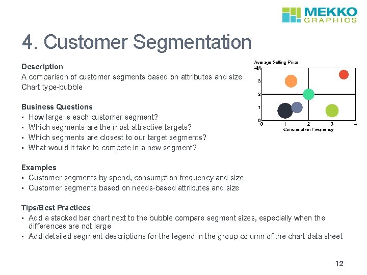
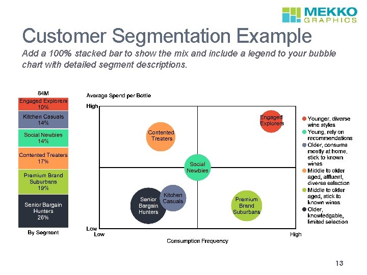
4. Customer Segmentation Description A comparison of customer segments based on attributes and size Chart type-bubble Business Questions • How large is each customer segment? • Which segments are the most attractive targets? • Which segments are closest to our target segments? • What would it take to compete in a new segment? Examples • Customer segments by spend, consumption frequency and size • Customer segments based on needs-based attributes and size Tips/Best Practices • Add a stacked bar chart next to the bubble compare segment sizes, especially when the differences are not large • Add detailed segment descriptions for the legend in the group column of the chart data sheet 12

Customer Segmentation Example Add a 100% stacked bar to show the mix and include a legend to your bubble chart with detailed segment descriptions. 13

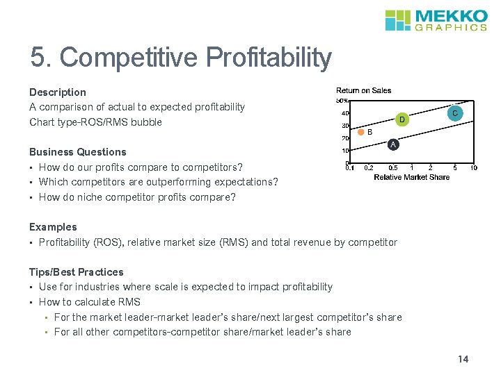
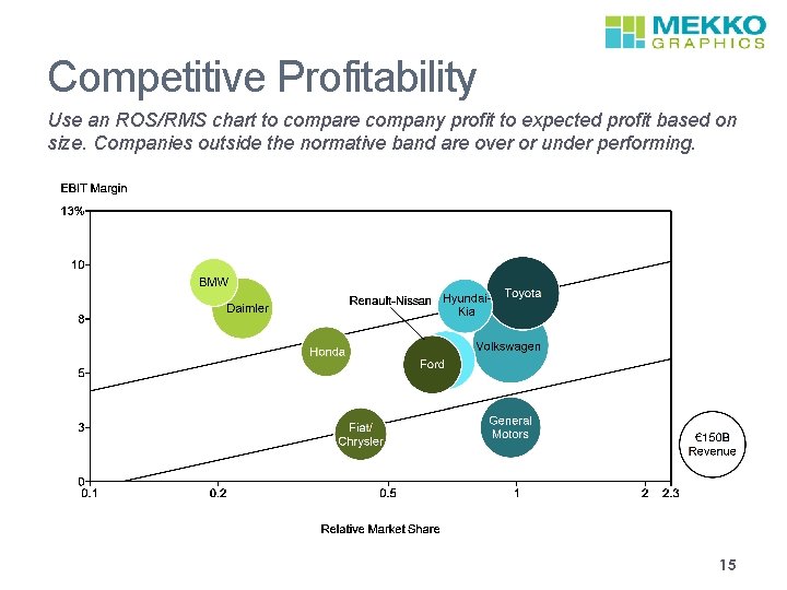
5. Competitive Profitability Description A comparison of actual to expected profitability Chart type-ROS/RMS bubble Business Questions • How do our profits compare to competitors? • Which competitors are outperforming expectations? • How do niche competitor profits compare? Examples • Profitability (ROS), relative market size (RMS) and total revenue by competitor Tips/Best Practices • Use for industries where scale is expected to impact profitability • How to calculate RMS • For the market leader-market leader’s share/next largest competitor’s share • For all other competitors-competitor share/market leader’s share 14

Competitive Profitability Use an ROS/RMS chart to compare company profit to expected profit based on size. Companies outside the normative band are over or under performing. 15

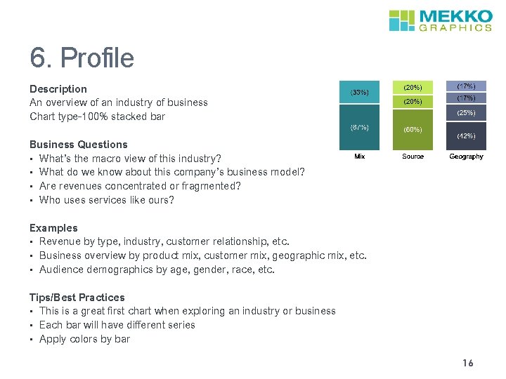
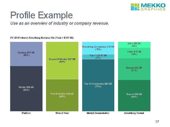
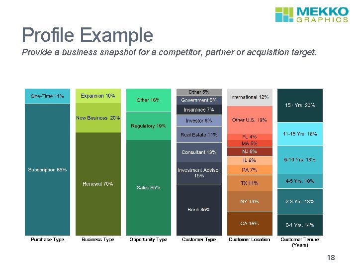
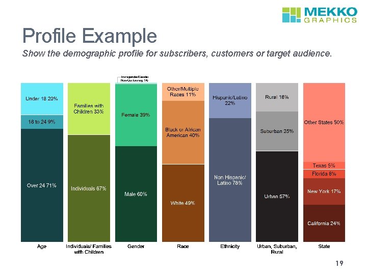
6. Profile Description An overview of an industry of business Chart type-100% stacked bar Business Questions • What’s the macro view of this industry? • What do we know about this company’s business model? • Are revenues concentrated or fragmented? • Who uses services like ours? Examples • Revenue by type, industry, customer relationship, etc. • Business overview by product mix, customer mix, geographic mix, etc. • Audience demographics by age, gender, race, etc. Tips/Best Practices • This is a great first chart when exploring an industry or business • Each bar will have different series • Apply colors by bar 16

Profile Example Use as an overview of industry or company revenue. 17

Profile Example Provide a business snapshot for a competitor, partner or acquisition target. 18

Profile Example Show the demographic profile for subscribers, customers or target audience. 19

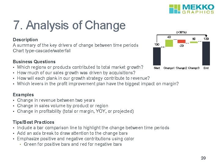
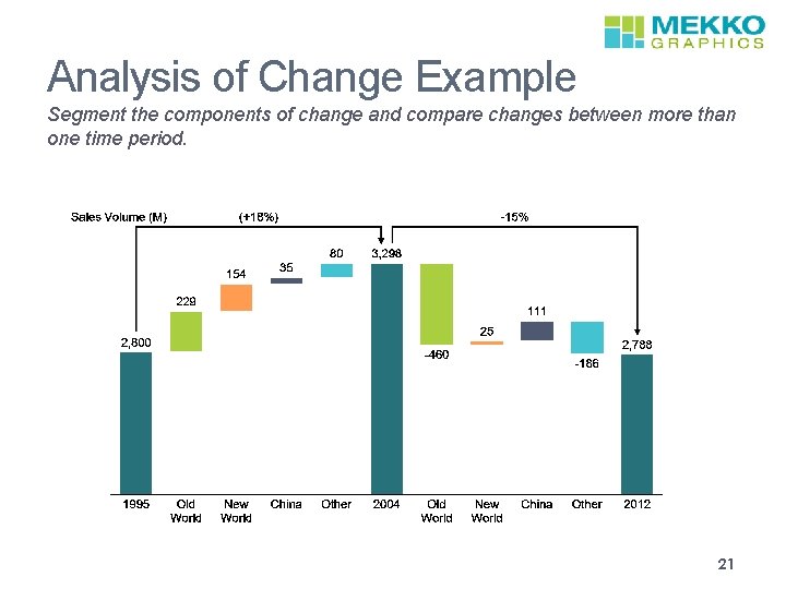
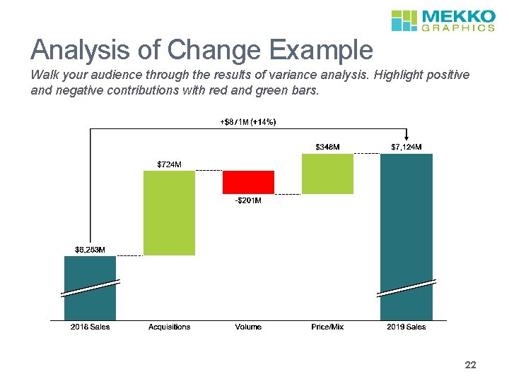
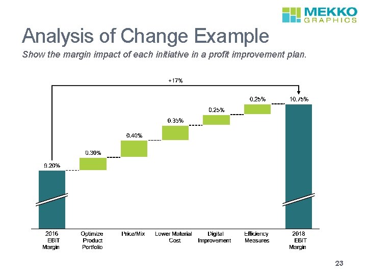
7. Analysis of Change Description A summary of the key drivers of change between time periods Chart type-cascade/waterfall Business Questions • Which regions or products contributed to total market growth? • How much of our sales growth was driven by acquisitions? • How will each plank in our growth strategy contribute to revenue? • Which levers in the profit improvement plan have the biggest impact on margin? Examples • Change in revenue between two years • Change in sales volume by product or region • Change in profitability (total or margin, YOY, or projected) Tips/Best Practices • Include a bar comparison line to highlight the change between time periods • Add an axis break to draw attention to the change bars • Emphasize positive and negative contributions using color • Green for positive bars and red for negative bars 20

Analysis of Change Example Segment the components of change and compare changes between more than one time period. 21

Analysis of Change Example Walk your audience through the results of variance analysis. Highlight positive and negative contributions with red and green bars. 22

Analysis of Change Example Show the margin impact of each initiative in a profit improvement plan. 23

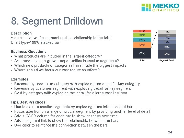
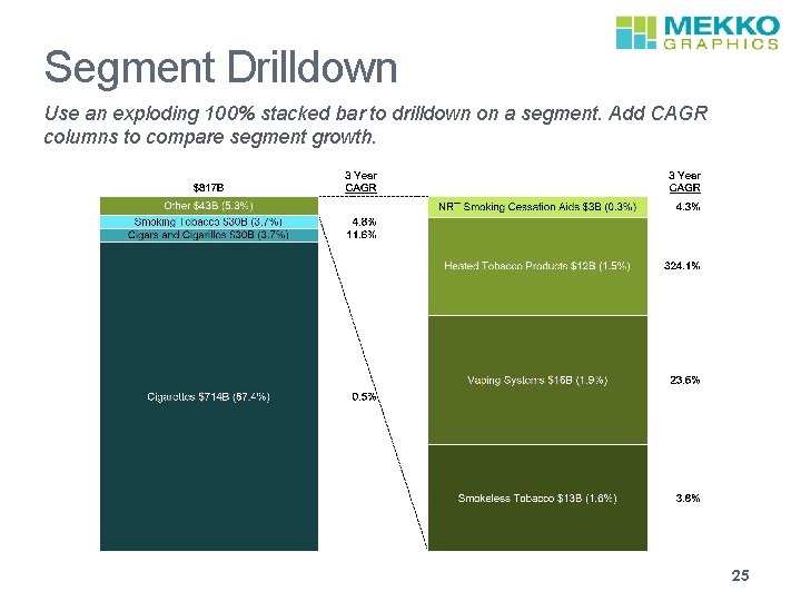
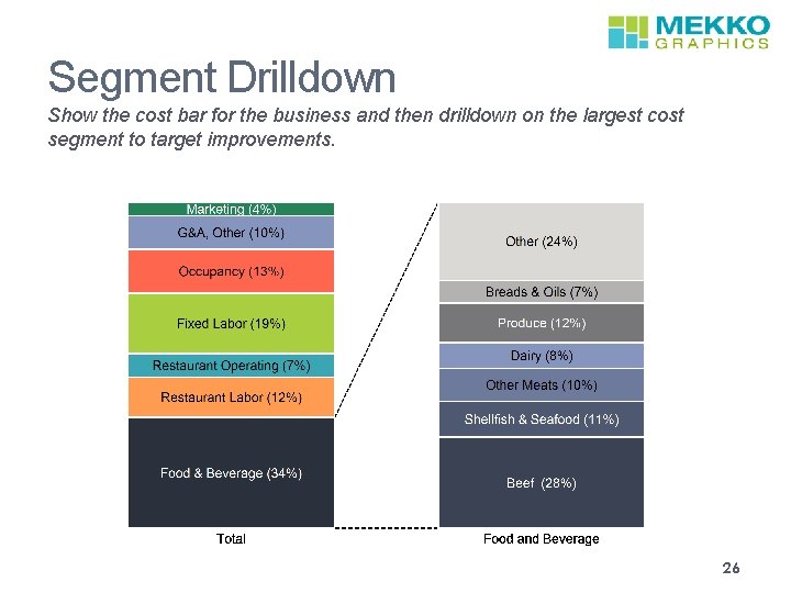
8. Segment Drilldown Description A detailed view of a segment and its relationship to the total Chart type-100% stacked bar Business Questions • What products are included in the largest category? • Are there any high-growth opportunities in smaller segments? • Which new products or categories have made the biggest impact? • Where should we focus our cost reduction efforts? Examples • Revenue by product or category with exploding bar detail for key category • Revenue by customer segment with exploding detail for key segment • Cost by category with exploding bar detail for a large cost line item Tips/Best Practices • Use to explore smaller segments by exploding them into a second bar • Focus attention on a large or crucial segment by providing another level of detail • Add a CAGR column for each bar to show changes over time • Add a segment link to show the relationship between the bars • Use color to reinforce the connection between the bars 24

Segment Drilldown Use an exploding 100% stacked bar to drilldown on a segment. Add CAGR columns to compare segment growth. 25

Segment Drilldown Show the cost bar for the business and then drilldown on the largest cost segment to target improvements. 26

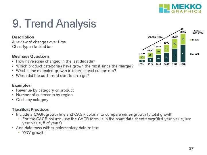
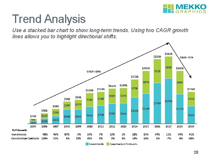
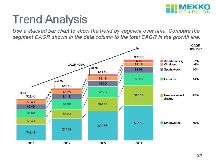
9. Trend Analysis Description A review of changes over time Chart type-stacked bar Business Questions • How have sales changed in the last decade? • Which product categories have grown the most since the merger? • What is the expected growth in international customers? • When did the cost trend start to change? Examples • Revenue by category or product • Number of customers by region • Costs by category Tips/Best Practices • Include a CAGR growth line and CAGR column to compare series growth to total growth • For the CAGR column, use the CAGR formula in the chart data sheet =cagr(first year value, last year value, # of years) • Add data rows with supplementary data or text • YOY growth 27

Trend Analysis Use a stacked bar chart to show long-term trends. Using two CAGR growth lines allows you to highlight directional shifts. 28

Trend Analysis Use a stacked bar chart to show the trend by segment over time. Compare the segment CAGR shown in the data column to the total CAGR in the growth line. 29

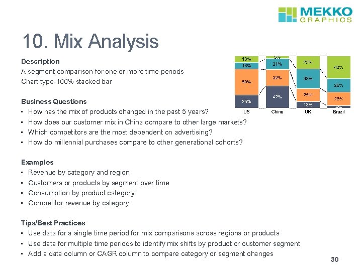
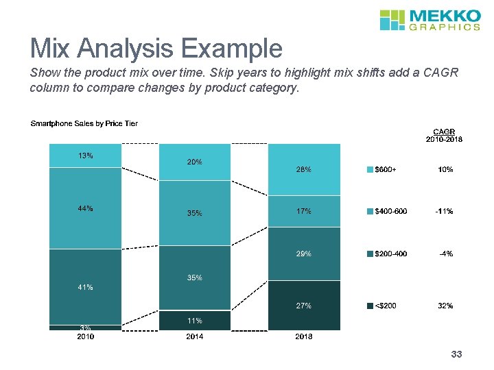
10. Mix Analysis Description A segment comparison for one or more time periods Chart type-100% stacked bar Business Questions • How has the mix of products changed in the past 5 years? • How does our customer mix in China compare to other large markets? • Which competitors are the most dependent on advertising? • How do millennial purchases compare to other generational cohorts? Examples • Revenue by category and region • Customers or products by segment over time • Consumption by product category • Competitor revenue by category Tips/Best Practices • Use data for a single time period for mix comparisons across regions or products • Use data for multiple time periods to identify mix shifts by product or customer segment • Add a data column or CAGR column to compare category or segment changes 30

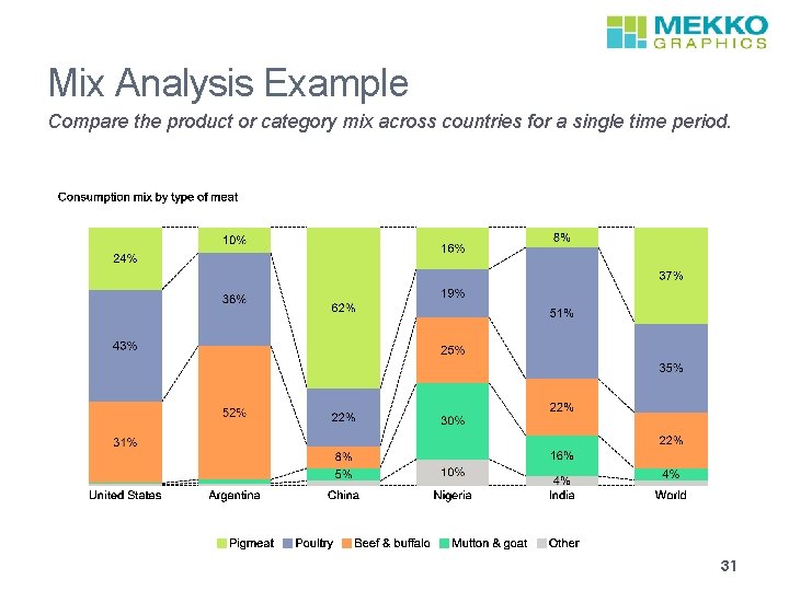
Mix Analysis Example Compare the product or category mix across countries for a single time period. 31

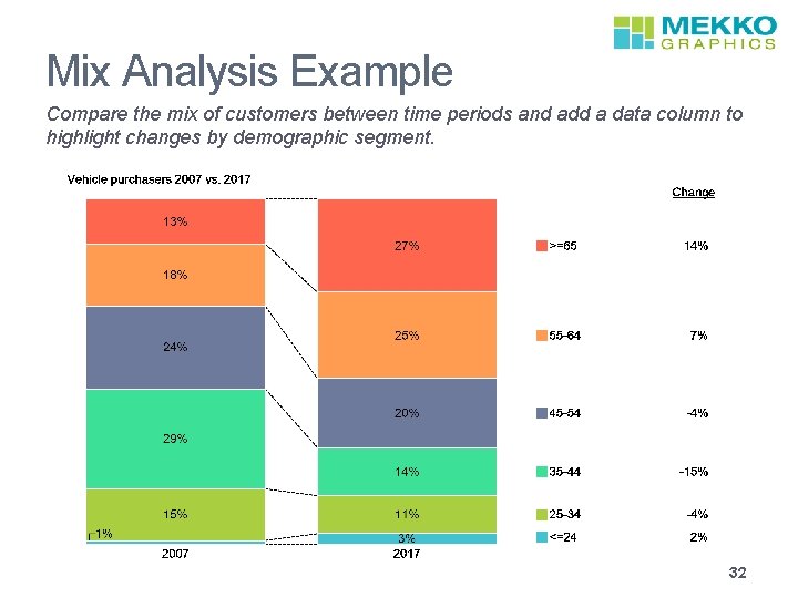
Mix Analysis Example Compare the mix of customers between time periods and add a data column to highlight changes by demographic segment. 32

Mix Analysis Example Show the product mix over time. Skip years to highlight mix shifts add a CAGR column to compare changes by product category. 33