1 TECHNICAL WRITING PROF DR MOHAMED REFAAT DIAB

1 TECHNICAL WRITING PROF. DR. MOHAMED REFAAT DIAB AHMED LECTURE FOUR GRAPHIC AIDS
LECTURE FOUR GRAPHIC AIDS 2 A. INTRODUCTION Being a mean of technical communication, technical writing displays quantities in form of numbers arranged in tables or depicted in figures Information can be presented into figures (line, surface, vectors, and contours), charts (e. g. bar chart), engineering drawings, and photographs.
The writer must take care of some points while selecting and using any graphical aid: Differentiating between dramatic (exciting) emphasis and communication. Knowing the best way in which the graphics can tell a significant conclusion. Establishing the proper relationship between the graphic aid and the text. othrough graphical display, the writer sells his product. So he should put it in the most impressive representation. The writer should much care about the resolution of the graphics; otherwise, it is useless. 3
The following practices should be observed: 4 If a graphic aid has a conclusion to be drawn, no matter how simple is, a reference is made to it in the text. An aid used solely for aesthetic or dramatic purposes need not to be mentioned. . The significant points shown by an "informational" graphic aid are commented on in the text, but minor details are not mentioned. Some directions are given on the reading and interpretation of a complex graphic aid. What 'complex' means depends on the reader.
Here are some tips the writer should care about: Graphics relevant information or arguments should be presented as close as possible to the graph. Other informational aids of a more general, supporting characters are put in an appendix, unless they are so few in number as to offer no serious interruption to the reading of the text. If the graphical aid is small enough, it may be placed "bordered or not" in the same page where text appears. Otherwise it can be put on a separate page to illustrate important details 5
B. CHARTS 6 According to the objective of the writer analysis and the message he is trying to tell the reader, he may choose between tables, charts, graphs, vector plot, contour plot, or all of these. He should Make sure the data on his worksheet is arranged properly for the type of chart he wants to use. All are means of presenting numerical quantities visually so that trends of, and relationships among; the numerical quantities can be easily grasped. Although a chart does not, in most respects, permit as accurate or detailed a presentation of data as a table, it has the advantage of making a significant point more readily and in a manner that is more easily remembered.

Figure 1 shows a sketch of available graphical aids. Fig. 1 General Schematic of the Different Graphical Aids 7
1. The Line Chart The line chart is a relation between a dependent and an independent variable. Whenever displaying the data in a line chart type is indicative, it will be the suitable type of graphical representation. Be careful of the following: - Chart axes (scale and title). - Style (symbols or lines). - Legends and its place. - Displaying grids or not. 8
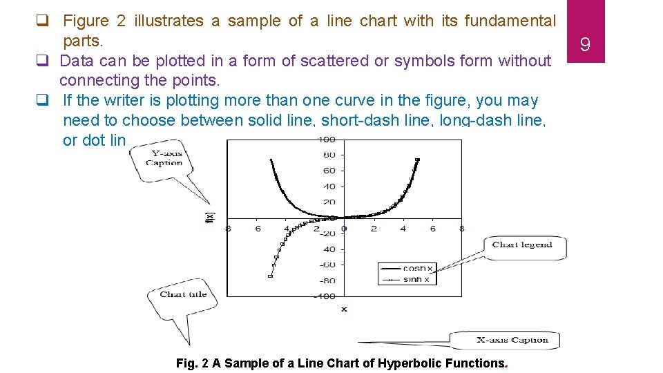
q Figure 2 illustrates a sample of a line chart with its fundamental parts. q Data can be plotted in a form of scattered or symbols form without connecting the points. q If the writer is plotting more than one curve in the figure, you may need to choose between solid line, short-dash line, long-dash line, or dot line to distinguish between the different curves. Fig. 2 A Sample of a Line Chart of Hyperbolic Functions. 9
10 Notice that a chart title must be used and placed below the figure with a figure number according to the numbered sections in the text. The figure title should be self-expressing to the figure contents. The line chart is the most commonly used. It is simple to plot and easy to be read. It is especially useful for plotting a considerable number of values for close reading or for plotting continuous data to show trend and movement.
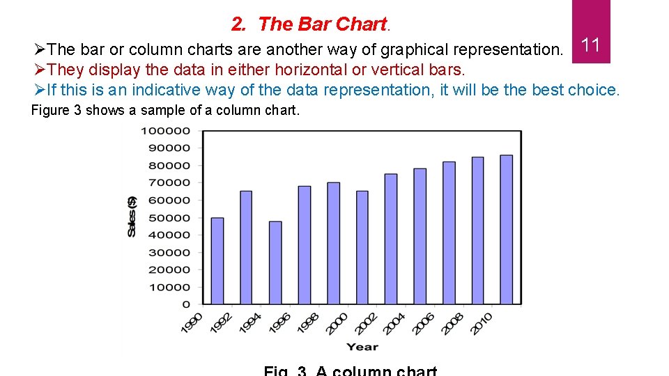
2. The Bar Chart. The bar or column charts are another way of graphical representation. 11 They display the data in either horizontal or vertical bars. If this is an indicative way of the data representation, it will be the best choice. Figure 3 shows a sample of a column chart.
The bar or column charts are useful for showing sizes or amounts at different times, the relative size or amount of several things at the same time, and the relative size or amount of the parts of a whole. The bar chart is preferable to the line chart for making dramatic comparisons if the items compared are limited in number. Arranged vertically (these are often called “column” charts), the bars are effective for representing the amount of a dependent variable at different periods; arranged horizontally, the bars are effective for representing different amounts of several items at one time. The bar or column charts can be plotted for many variables either with columns adjacent to each other or laid over each other. The bar or column charts can be used if there is no clear correlation can relate the x-variable with the y-variable. 12
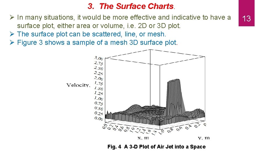
3. The Surface Charts. In many situations, it would be more effective and indicative to have a surface plot, either area or volume, i. e. 2 D or 3 D plot. The surface plot can be scattered, line, or mesh. Figure 3 shows a sample of a mesh 3 D surface plot. Fig. 4 A 3 -D Plot of Air Jet into a Space 13
This type of graphical representation is very helpful when 14 looking for a complete description of variable variation with two independent variables. A single-surface chart is constructed just like a line chart except that the area between the curve line and the base or zero line is shaded. Multiple-surface or strata charts are like multiple-line charts with the underneath areas shaded in differentiation patterns or colors; that is, the vertical widths of shaded, colored They can be satisfactorily used to achieve greater emphasis than is possible with a line chart of the same data when amount is
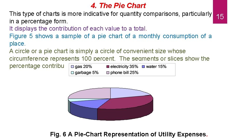
4. The Pie Chart This type of charts is more indicative for quantity comparisons, particularly 15 in a percentage form. It displays the contribution of each value to a total. Figure 5 shows a sample of a pie chart of a monthly consumption of a place. A circle or a pie chart is simply a circle of convenient size whose circumference represents 100 percent. The segments or slices show the percentage contribution to the whole. Fig. 6 A Pie-Chart Representation of Utility Expenses.
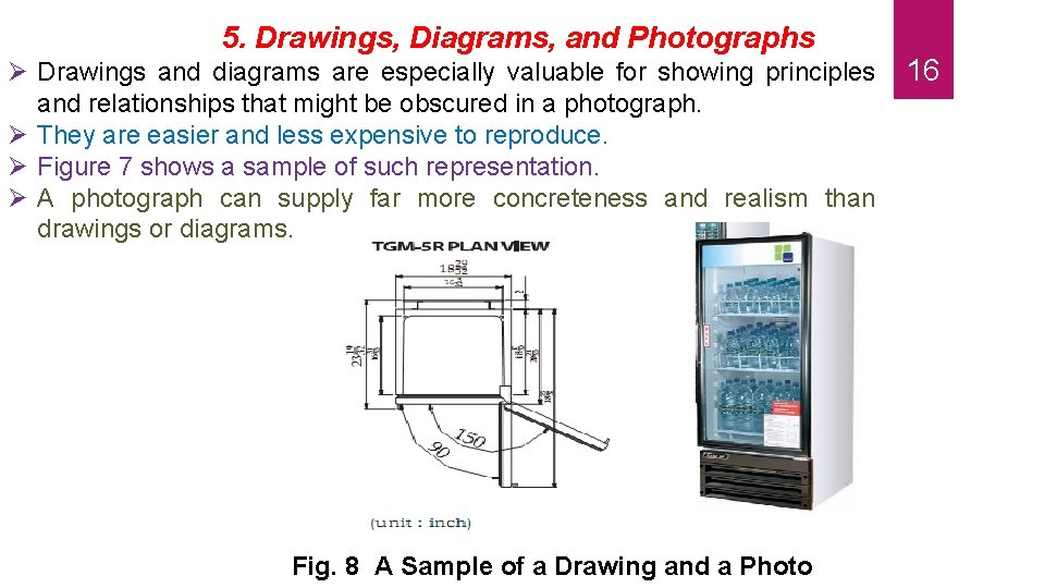
5. Drawings, Diagrams, and Photographs Drawings and diagrams are especially valuable for showing principles and relationships that might be obscured in a photograph. They are easier and less expensive to reproduce. Figure 7 shows a sample of such representation. A photograph can supply far more concreteness and realism than drawings or diagrams. Fig. 8 A Sample of a Drawing and a Photo 16
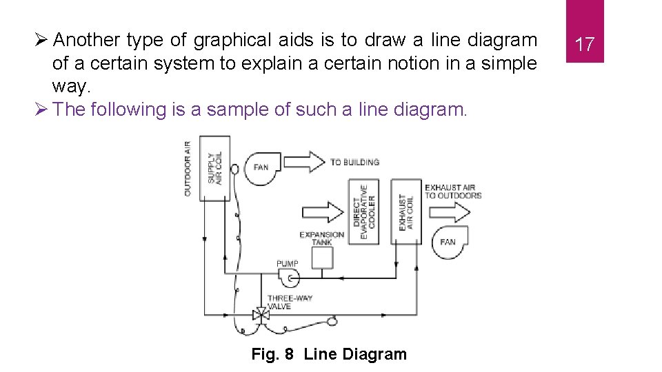
Another type of graphical aids is to draw a line diagram of a certain system to explain a certain notion in a simple way. The following is a sample of such a line diagram. Fig. 8 Line Diagram 17
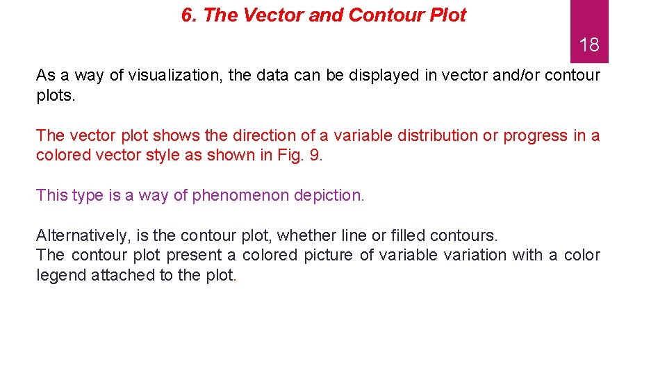
6. The Vector and Contour Plot 18 As a way of visualization, the data can be displayed in vector and/or contour plots. The vector plot shows the direction of a variable distribution or progress in a colored vector style as shown in Fig. 9. This type is a way of phenomenon depiction. Alternatively, is the contour plot, whether line or filled contours. The contour plot present a colored picture of variable variation with a color legend attached to the plot.
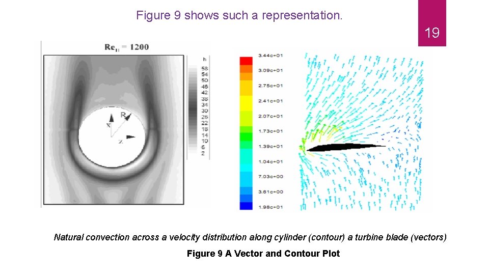
Figure 9 shows such a representation. 19 Natural convection across a velocity distribution along cylinder (contour) a turbine blade (vectors) Figure 9 A Vector and Contour Plot
C. Tables The table is a convenient method of presenting a large body of precise quantitative data in an easily understood form. Tables are read from the top down in the first column and to the right. The first, or left, column normally lists the independent variable (time, item, number, and so on) and the columns to the right list dependent variables (see Figure 10). 20
The table should be designed so as to be self-explanatory, but textual comments on it should be made according to the same principles that apply to the use of a chart. The title and the table number should appear at the top. It is advisable to use Arabic numerals for the table number if Roman numerals have been used in the same report for numbering other kinds of graphic aids, or vice versa. In separating parts of the table from one another- that is, one column from another, or one horizontal section from another- use single lines in most instances; but where the writer wishes to give special emphasis to a division, he may use a double line. Align columns of numerals on the decimal point, unless units of different quantities. Appear in the same column, in which case the column should be aligned on the right margin. 21
A heading should be written for each column, with the initial letter of important words capitalized. The headings should be written horizontally if possible. Indicate units in the heading so that the units will not have to be noted in the column. If the writer has data in different systems of units, he should convert all to the same system before entering them in the table. The following is a representation form of a tabulated data, either in a portrait or landscape style. 22
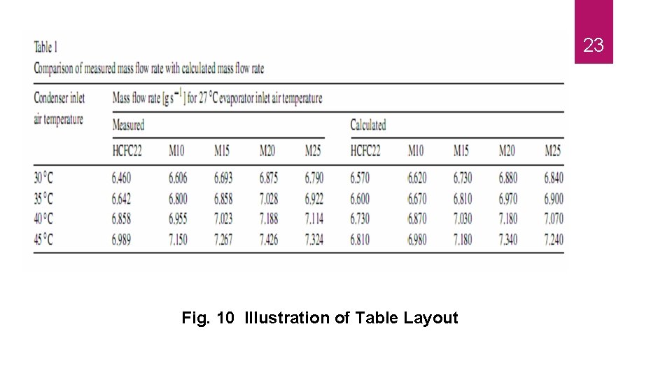
23 Fig. 10 Illustration of Table Layout
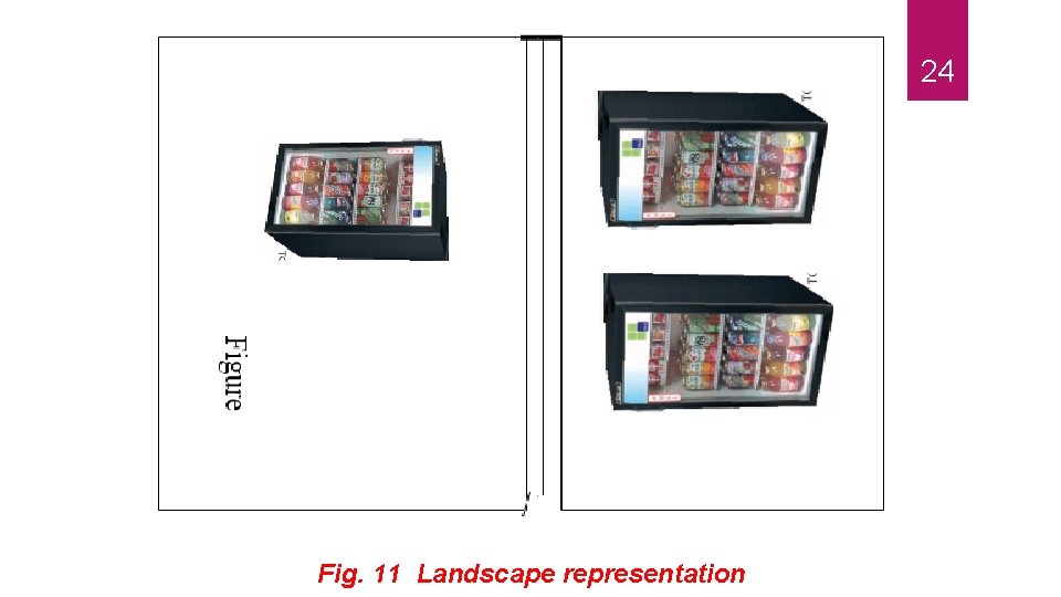
24 Fig. 11 Landscape representation
Finally, it is very important to display your graph in the proper way. You may have a portrait or a landscape style. It is very important to have your figure flows smoothly with the direction of the technical document. Figure 11 shows how you can put your figure and title for a landscape representation. 25
- Slides: 25