1 Overview and Descriptive Statistics Copyright Cengage Learning



- Slides: 65

1 Overview and Descriptive Statistics Copyright © Cengage Learning. All rights reserved.

1. 2 Pictorial and Tabular Methods in Descriptive Statistics Copyright © Cengage Learning. All rights reserved.

Pictorial and Tabular Methods in Descriptive Statistics Descriptive statistics can be divided into two general subject areas. In this section, we consider representing a data set using visual techniques. Many visual techniques may already be familiar to you: frequency tables, tally sheets, histograms, pie charts, bar graphs, scatter diagrams, and the like. Here we focus on a selected few of these techniques that are most useful and relevant to probability and inferential statistics. 3

Notation 4

Notation Some general notation will make it easier to apply our methods and formulas to a wide variety of practical problems. The number of observations in a single sample, that is, the sample size, will often be denoted by n, so that n = 4 for the sample of universities {Stanford, Iowa State, Wyoming, Rochester} and also for the sample of p. H measurements {6. 3, 6. 2, 5. 9, 6. 5}. If two samples are simultaneously under consideration, either m and n or n 1 and n 2 can be used to denote the numbers of observations. 5

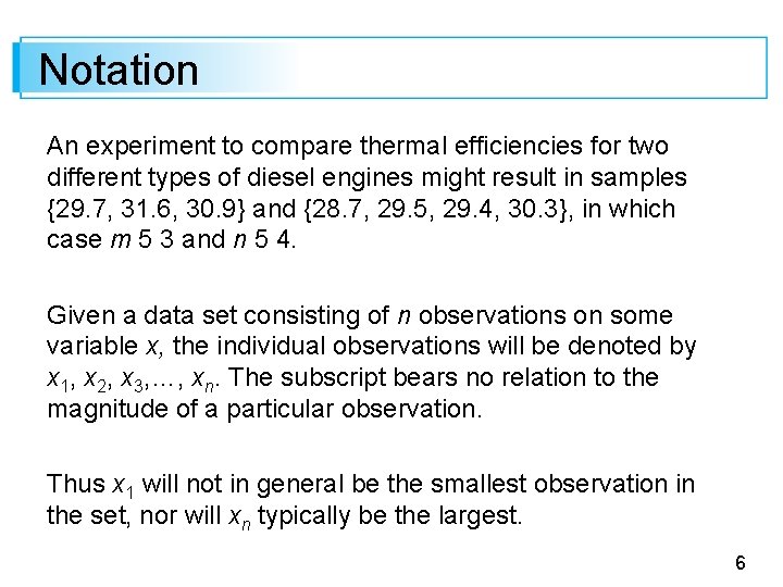
Notation An experiment to compare thermal efficiencies for two different types of diesel engines might result in samples {29. 7, 31. 6, 30. 9} and {28. 7, 29. 5, 29. 4, 30. 3}, in which case m 5 3 and n 5 4. Given a data set consisting of n observations on some variable x, the individual observations will be denoted by x 1, x 2, x 3, …, xn. The subscript bears no relation to the magnitude of a particular observation. Thus x 1 will not in general be the smallest observation in the set, nor will xn typically be the largest. 6

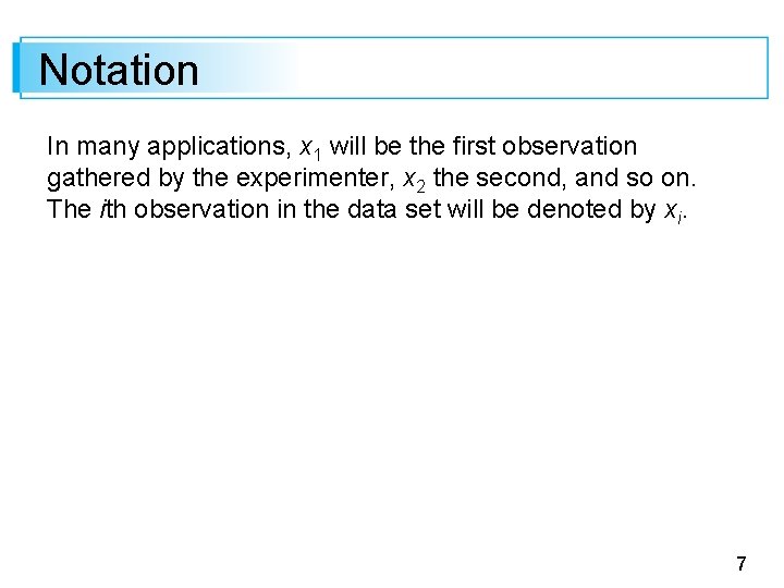
Notation In many applications, x 1 will be the first observation gathered by the experimenter, x 2 the second, and so on. The ith observation in the data set will be denoted by xi. 7

Stem-and-Leaf Displays 8

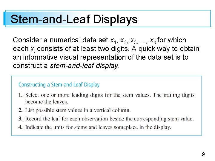
Stem-and-Leaf Displays Consider a numerical data set x 1, x 2, x 3, …, xn for which each xi consists of at least two digits. A quick way to obtain an informative visual representation of the data set is to construct a stem-and-leaf display. 9

Stem-and-Leaf Displays If the data set consists of exam scores, each between 0 and 100, the score of 83 would have a stem of 8 and a leaf of 3. If all exam scores are in the 90 s, 80 s, and 70 s use of the tens digit as the stem would give a display with three rows. In this case, it is desirable to stretch the display by repeating each stem value twice— 9 H, 9 L, 8 H, . . , 7 L—once for high leaves 9, . . , 5 and again for low leaves 4, . . . , 0. Then a score of 93 would have a stem of 9 L and leaf of 3. In general, a display based on between 5 and 20 stems is recommended. 10

Example 1. 6 A common complaint among college students is that they are getting less sleep than they need. The article “Class Start Times, Sleep, and Academic Performance in College: A Path Analysis” Chronobiology Intl. , 2012: 318– 335) investigated factors that impact sleep time. 11

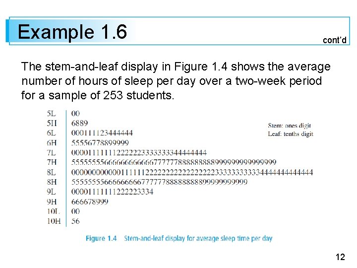
Example 1. 6 cont’d The stem-and-leaf display in Figure 1. 4 shows the average number of hours of sleep per day over a two-week period for a sample of 253 students. 12

Example 1. 6 cont’d The first observation in the top row of the display is 5. 0, corresponding to a stem of 5 and leaf of 0, and the last observation at the bottom of the display is 10. 6. Note that in the absence of a context, without the identification of stem and leaf digits in the display, we wouldn’t know whether the observation with stem 7 and leaf 9 was. 79, 7. 9, or 79. The leaves in each row are ordered from smallest to largest; this is commonly done by software packages but is not necessary if a display is created by hand. 13

Example 1. 6 cont’d The display suggests that a typical or representative sleep time is in the stem 8 L row, perhaps 8. 1 or 8. 2. The data is not highly concentrated about this typical value as would be the case if almost all students were getting between 7. 5 and 9. 5 hours of sleep on average. The display appears to rise rather smoothly to a peak in the 8 L row and then decline smoothly (we conjecture that the minor peak in the 6 L row would disappear if more data was available). 14

Example 1. 6 cont’d The general shape of the display is rather symmetric, bearing strong resemblance to a bell-shaped curve; it does not stretch out more in one direction than the other. The two smallest and two largest values seem a bit separated from the remainder of the data—perhaps they are very mild, but certainly not extreme, “outliers”. 15

Example 1. 6 cont’d A reference in the cited article suggests that individuals in this age group need about 8. 4 hours of sleep per day. So it appears that a substantial percentage of students in the sample are sleep deprived. 16

Stem-and-Leaf Displays A stem-and-leaf display conveys information about the following aspects of the data: • identification of a typical or representative value • extent of spread about the typical value • presence of any gaps in the data • extent of symmetry in the distribution of values • number and location of peaks • presence of any outlying values 17

Dotplots 18

Dotplots A dotplot is an attractive summary of numerical data when the data set is reasonably small or there are relatively few distinct data values. Each observation is represented by a dot above the corresponding location on a horizontal measurement scale. When a value occurs more than once, there is a dot for each occurrence, and these dots are stacked vertically. As with a stem-and-leaf display, a dotplot gives information about location, spread, extremes, and gaps. 19

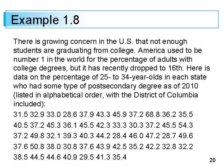
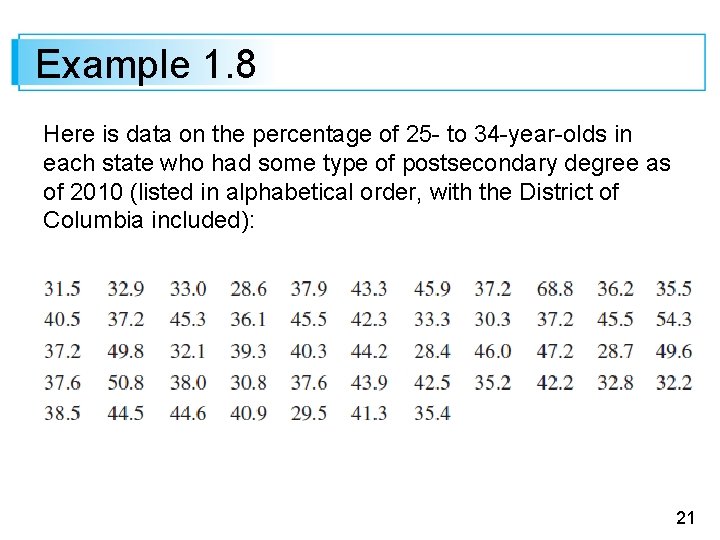
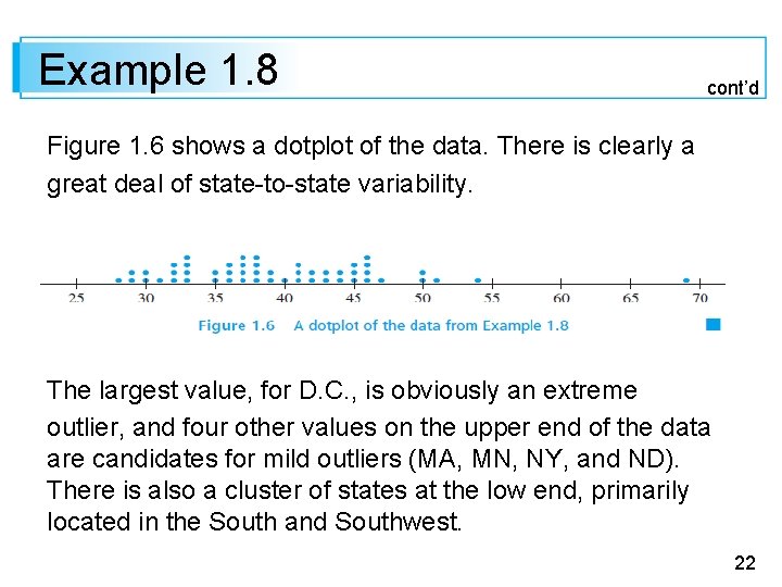
Example 1. 8 There is growing concern in the U. S. that not enough students are graduating from college. America used to be number 1 in the world for the percentage of adults with college degrees, but it has recently dropped to 16 th. Here is data on the percentage of 25 - to 34 -year-olds in each state who had some type of postsecondary degree as of 2010 (listed in alphabetical order, with the District of Columbia included): 31. 5 32. 9 33. 0 28. 6 37. 9 43. 3 45. 9 37. 2 68. 8 36. 2 35. 5 40. 5 37. 2 45. 3 36. 1 45. 5 42. 3 33. 3 30. 3 37. 2 45. 5 54. 3 37. 2 49. 8 32. 1 39. 3 40. 3 44. 2 28. 4 46. 0 47. 2 28. 7 49. 6 37. 6 50. 8 38. 0 30. 8 37. 6 43. 9 42. 5 35. 2 42. 2 32. 8 32. 2 38. 5 44. 6 40. 9 29. 5 41. 3 35. 4 20

Example 1. 8 Here is data on the percentage of 25 - to 34 -year-olds in each state who had some type of postsecondary degree as of 2010 (listed in alphabetical order, with the District of Columbia included): 21

Example 1. 8 cont’d Figure 1. 6 shows a dotplot of the data. There is clearly a great deal of state-to-state variability. The largest value, for D. C. , is obviously an extreme outlier, and four other values on the upper end of the data are candidates for mild outliers (MA, MN, NY, and ND). There is also a cluster of states at the low end, primarily located in the South and Southwest. 22

Dotplots The overall percentage for the entire country is 39. 3%; this is not a simple average of the 51 numbers but an average weighted by population sizes. A dotplot can be quite cumbersome to construct and look crowded when the number of observations is large. Our next technique is well suited to such situations. 23

Histograms 24

Histograms Some numerical data is obtained by counting to determine the value of a variable (the number of traffic citations a person received during the last year, the number of customers arriving for service during a particular period), whereas other data is obtained by taking measurements (weight of an individual, reaction time to a particular stimulus). The prescription for drawing a histogram is generally different for these two cases. 25

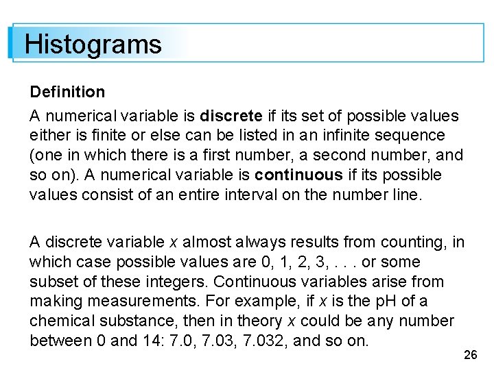
Histograms Definition A numerical variable is discrete if its set of possible values either is finite or else can be listed in an infinite sequence (one in which there is a first number, a second number, and so on). A numerical variable is continuous if its possible values consist of an entire interval on the number line. A discrete variable x almost always results from counting, in which case possible values are 0, 1, 2, 3, . . . or some subset of these integers. Continuous variables arise from making measurements. For example, if x is the p. H of a chemical substance, then in theory x could be any number between 0 and 14: 7. 0, 7. 032, and so on. 26

Histograms Of course, in practice there are limitations on the degree of accuracy of any measuring instrument, so we may not be able to determine p. H, reaction time, height, and concentration to an arbitrarily large number of decimal places. However, from the point of view of creating mathematical models for distributions of data, it is helpful to imagine an entire continuum of possible values. Consider data consisting of observations on a discrete variable x. The frequency of any particular x value is the number of times that value occurs in the data set. 27

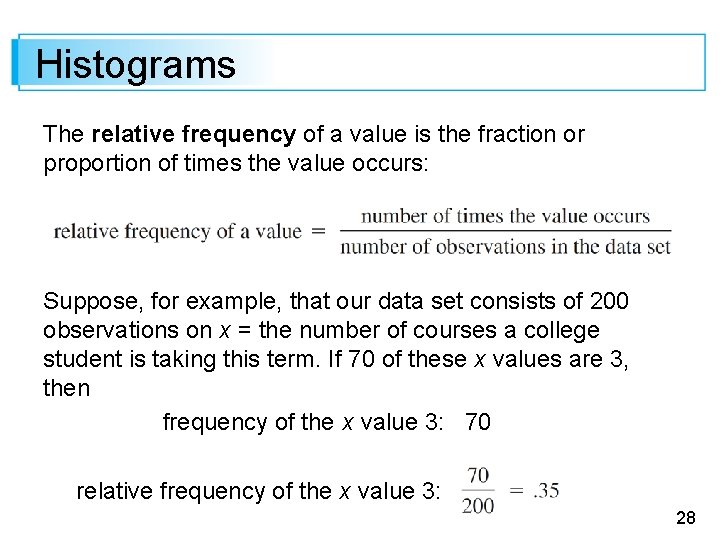
Histograms The relative frequency of a value is the fraction or proportion of times the value occurs: Suppose, for example, that our data set consists of 200 observations on x = the number of courses a college student is taking this term. If 70 of these x values are 3, then frequency of the x value 3: 70 relative frequency of the x value 3: 28

Histograms Multiplying a relative frequency by 100 gives a percentage; in the college-course example, 35% of the students in the sample are taking three courses. The relative frequencies, or percentages, are usually of more interest than the frequencies themselves. In theory, the relative frequencies should sum to 1, but in practice the sum may differ slightly from 1 because of rounding. A frequency distribution is a tabulation of the frequencies and/or relative frequencies. 29

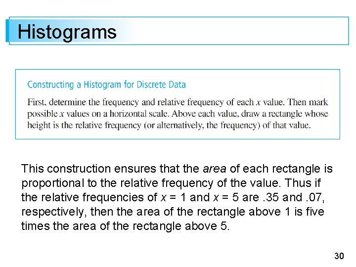
Histograms This construction ensures that the area of each rectangle is proportional to the relative frequency of the value. Thus if the relative frequencies of x = 1 and x = 5 are. 35 and. 07, respectively, then the area of the rectangle above 1 is five times the area of the rectangle above 5. 30

Example 1. 9 How unusual is a no-hitter or a one-hitter in a major league baseball game, and how frequently does a team get more than 10, 15, or even 20 hits? 31

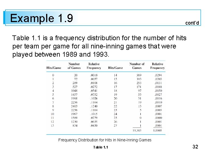
Example 1. 9 cont’d Table 1. 1 is a frequency distribution for the number of hits per team per game for all nine-inning games that were played between 1989 and 1993. Frequency Distribution for Hits in Nine-Inning Games Table 1. 1 32

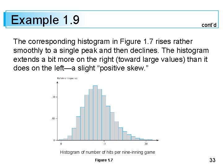
Example 1. 9 cont’d The corresponding histogram in Figure 1. 7 rises rather smoothly to a single peak and then declines. The histogram extends a bit more on the right (toward large values) than it does on the left—a slight “positive skew. ” Histogram of number of hits per nine-inning game Figure 1. 7 33

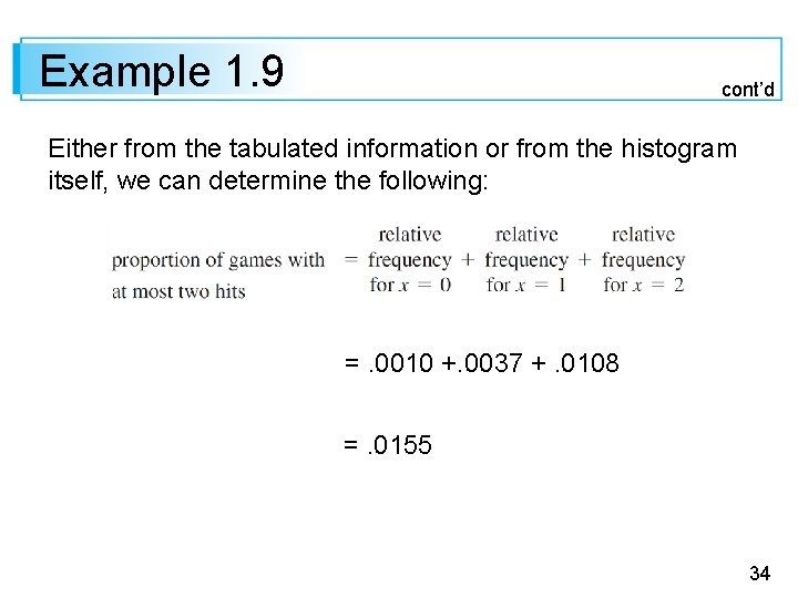
Example 1. 9 cont’d Either from the tabulated information or from the histogram itself, we can determine the following: =. 0010 +. 0037 +. 0108 =. 0155 34

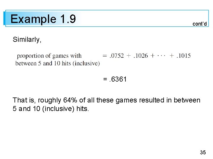
Example 1. 9 cont’d Similarly, =. 6361 That is, roughly 64% of all these games resulted in between 5 and 10 (inclusive) hits. 35

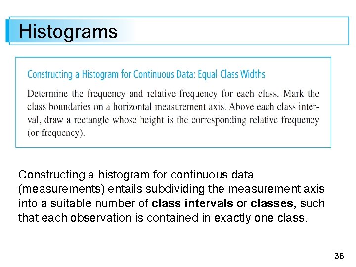
Histograms Constructing a histogram for continuous data (measurements) entails subdividing the measurement axis into a suitable number of class intervals or classes, such that each observation is contained in exactly one class. 36

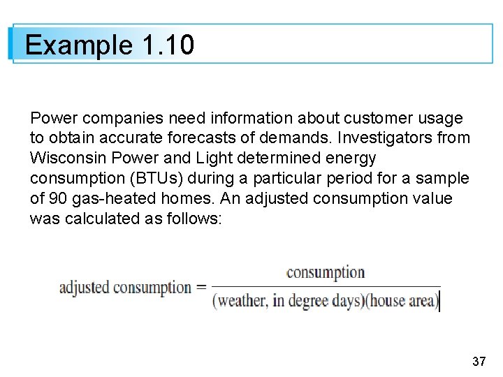
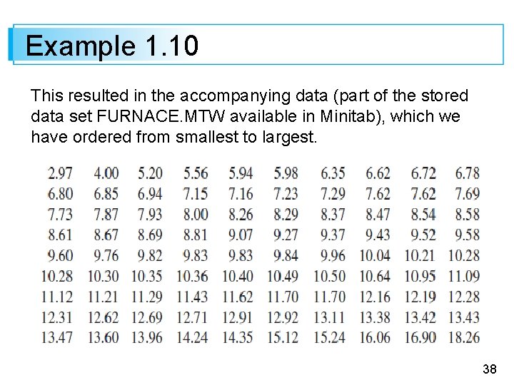
Example 1. 10 Power companies need information about customer usage to obtain accurate forecasts of demands. Investigators from Wisconsin Power and Light determined energy consumption (BTUs) during a particular period for a sample of 90 gas-heated homes. An adjusted consumption value was calculated as follows: 37

Example 1. 10 This resulted in the accompanying data (part of the stored data set FURNACE. MTW available in Minitab), which we have ordered from smallest to largest. 38

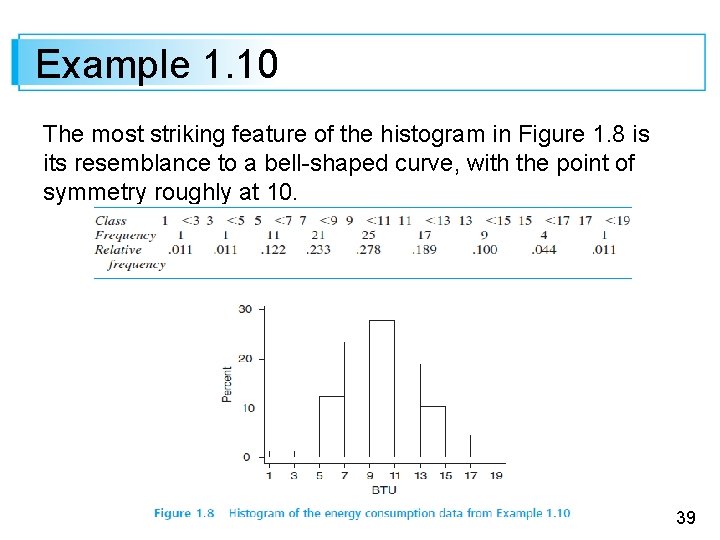
Example 1. 10 The most striking feature of the histogram in Figure 1. 8 is its resemblance to a bell-shaped curve, with the point of symmetry roughly at 10. 39

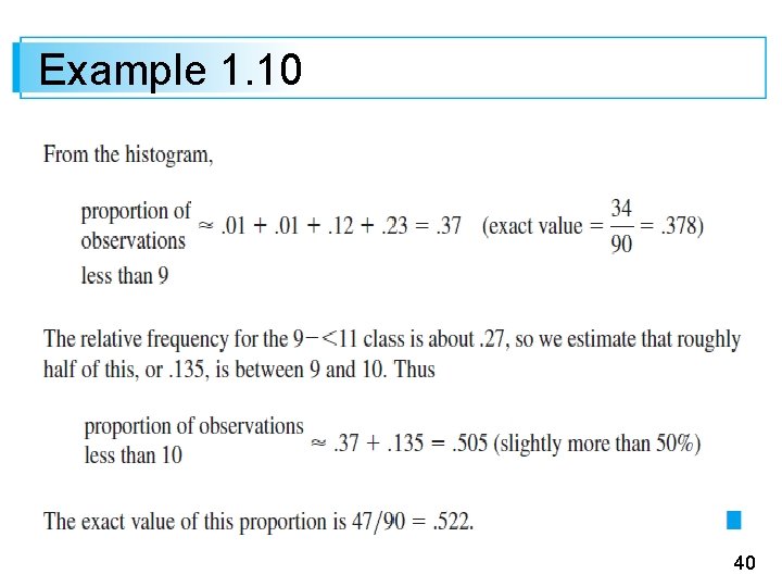
Example 1. 10 40

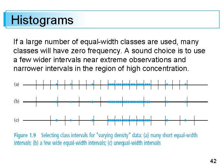
Histograms Equal-width classes may not be a sensible choice if there are some regions of the measurement scale that have a high concentration of data values and other parts where data is quite sparse. Figure 1. 9 shows a dotplot of such a data set; there is high concentration in the middle, and relatively few observations stretched out to either side. Using a small number of equal-width classes results in almost all observations falling in just one or two of the classes. 41

Histograms If a large number of equal-width classes are used, many classes will have zero frequency. A sound choice is to use a few wider intervals near extreme observations and narrower intervals in the region of high concentration. 42

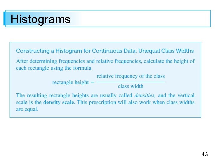
Histograms 43

Example 1. 11 Corrosion of reinforcing steel is a serious problem in concrete structures located in environments affected by severe weather conditions. For this reason, researchers have been investigating the use of reinforcing bars made of composite material. One study was carried out to develop guidelines for bonding glass-fiber-reinforced plastic rebars to concrete (“Design Recommendations for Bond of GFRP Rebars to Concrete, ” J. of Structural Engr. , 1996: 247– 254). 44

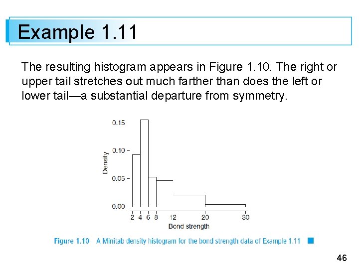
Example 1. 11 Consider the following 48 observations on measured bond strength: 45

Example 1. 11 The resulting histogram appears in Figure 1. 10. The right or upper tail stretches out much farther than does the left or lower tail—a substantial departure from symmetry. 46

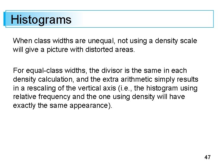
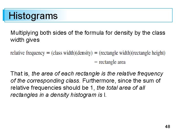
Histograms When class widths are unequal, not using a density scale will give a picture with distorted areas. For equal-class widths, the divisor is the same in each density calculation, and the extra arithmetic simply results in a rescaling of the vertical axis (i. e. , the histogram using relative frequency and the one using density will have exactly the same appearance). 47

Histograms Multiplying both sides of the formula for density by the class width gives That is, the area of each rectangle is the relative frequency of the corresponding class. Furthermore, since the sum of relative frequencies should be 1, the total area of all rectangles in a density histogram is l. 48

Histograms It is always possible to draw a histogram so that the area equals the relative frequency (this is true also for a histogram of discrete data)—just use the density scale. This property will play an important role in motivating models for distributions in Chapter 4. 49

Histogram Shapes 50

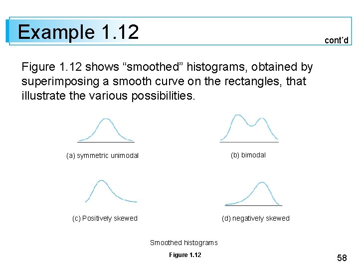
Histogram Shapes Histograms come in a variety of shapes. A unimodal histogram is one that rises to a single peak and then declines. A bimodal histogram has two different peaks. Bimodality can occur when the data set consists of observations on two quite different kinds of individuals or objects. For example, consider a large data set consisting of driving times for automobiles traveling between San Luis Obispo, California, and Monterey, California (exclusive of stopping time for sightseeing, eating, etc. ). 51

Histogram Shapes This histogram would show two peaks: one for those cars that took the inland route (roughly 2. 5 hours) and another for those cars traveling up the coast (3. 5– 4 hours). However, bimodality does not automatically follow in such situations. Only if the two separate histograms are “far apart” relative to their spreads will bimodality occur in the histogram of combined data. Thus a large data set consisting of heights of college students should not result in a bimodal histogram because the typical male height of about 69 inches is not far enough above the typical female height of about 64– 65 inches. 52

Histogram Shapes A histogram with more than two peaks is said to be multimodal. Of course, the number of peaks may well depend on the choice of class intervals, particularly with a small number of observations. The larger the number of classes, the more likely it is that bimodality or multimodality will manifest itself. 53

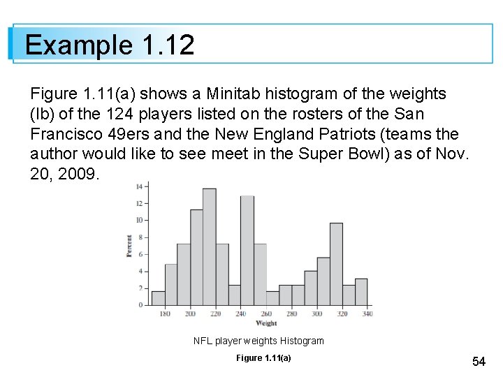
Example 1. 12 Figure 1. 11(a) shows a Minitab histogram of the weights (lb) of the 124 players listed on the rosters of the San Francisco 49 ers and the New England Patriots (teams the author would like to see meet in the Super Bowl) as of Nov. 20, 2009. NFL player weights Histogram Figure 1. 11(a) 54

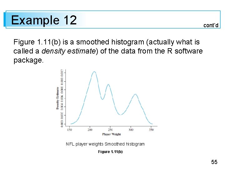
Example 12 cont’d Figure 1. 11(b) is a smoothed histogram (actually what is called a density estimate) of the data from the R software package. NFL player weights Smoothed histogram Figure 1. 11(b) 55

Example 1. 12 cont’d Both the histogram and the smoothed histogram show three distinct peaks; the on the right is for linemen, the middle peak corresponds to linebacker weights, and the peak on the left is for all other players (wide receivers, quarterbacks, etc. ). A histogram is symmetric if the left half is a mirror image of the right half. A unimodal histogram is positively skewed if the right or upper tail is stretched out compared with the left or lower tail and negatively skewed if the stretching is to the left. 56

Example 1. 12 cont’d A histogram is symmetric if the left half is a mirror image of the right half. A unimodal histogram is positively skewed if the right or upper tail is stretched out compared with the left or lower tail and negatively skewed if the stretching is to the left. 57

Example 1. 12 cont’d Figure 1. 12 shows “smoothed” histograms, obtained by superimposing a smooth curve on the rectangles, that illustrate the various possibilities. (b) bimodal (a) symmetric unimodal (c) Positively skewed (d) negatively skewed Smoothed histograms Figure 1. 12 58

Qualitative Data 59

Qualitative Data Both a frequency distribution and a histogram can be constructed when the data set is qualitative (categorical) in nature. In some cases, there will be a natural ordering of classes—for example, freshmen, sophomores, juniors, seniors, graduate students—whereas in other cases the order will be arbitrary—for example, Catholic, Jewish, Protestant, and the like. With such categorical data, the intervals above which rectangles are constructed should have equal width. 60

Example 1. 13 The Public Policy Institute of California carried out a telephone survey of 2501 California adult residents during April 2006 to ascertain how they felt about various aspects of K-12 public education. One question asked was “Overall, how would you rate the quality of public schools in your neighborhood today? ” 61

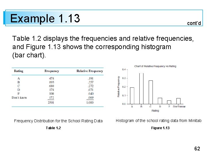
Example 1. 13 cont’d Table 1. 2 displays the frequencies and relative frequencies, and Figure 1. 13 shows the corresponding histogram (bar chart). Frequency Distribution for the School Rating Data Table 1. 2 Histogram of the school rating data from Minitab Figure 1. 13 62

Example 1. 13 cont’d More than half the respondents gave an A or B rating, and only slightly more than 10% gave a D or F rating. The percentages for parents of public school children were somewhat more favorable to schools: 24%, 40%, 24%, 6%, 4%, and 2%. 63

Multivariate Data 64

Multivariate Data Multivariate data is generally rather difficult to describe visually. Several methods for doing so appear later in the book, notably scatter plots for bivariate numerical data. 65