1 Chapter 3 A Describing Data Visually Part

1
Chapter 3 A Describing Data Visually (Part 1) Visual Description Dot Plots Frequency Distributions and Histograms Line Charts Bar Charts Mc. Graw-Hill/Irwin © 2008 The Mc. Graw-Hill Companies, Inc. All rights reserved.
3 Visual Description • Methods of organizing, exploring and summarizing data include: - Visual (charts and graphs) provides insight into characteristics of a data set without using mathematics. - Numerical (statistics or tables) provides insight into characteristics of a data set using mathematics.
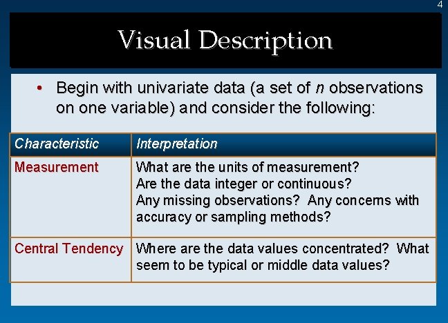
4 Visual Description • Begin with univariate data (a set of n observations on one variable) and consider the following: Characteristic Interpretation Measurement What are the units of measurement? Are the data integer or continuous? Any missing observations? Any concerns with accuracy or sampling methods? Central Tendency Where are the data values concentrated? What seem to be typical or middle data values?
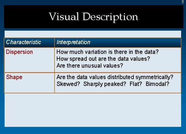
5 Visual Description Characteristic Interpretation Dispersion How much variation is there in the data? How spread out are the data values? Are there unusual values? Shape Are the data values distributed symmetrically? Skewed? Sharply peaked? Flat? Bimodal?
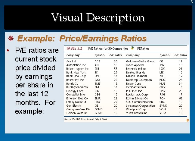
6 Visual Description ¯ Example: Price/Earnings Ratios • P/E ratios are current stock price divided by earnings per share in the last 12 months. For example:
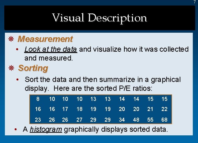
7 Visual Description ¯ Measurement • Look at the data and visualize how it was collected and measured. ¯ Sorting • Sort the data and then summarize in a graphical display. Here are the sorted P/E ratios: 8 10 10 10 13 13 14 14 15 15 16 16 17 18 19 19 20 20 21 22 23 26 26 27 29 29 34 48 55 68 • A histogram graphically displays sorted data.
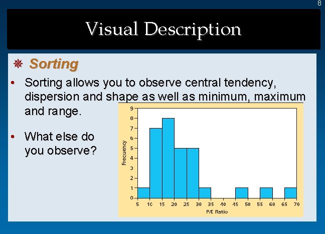
8 Visual Description ¯ Sorting • Sorting allows you to observe central tendency, dispersion and shape as well as minimum, maximum and range. • What else do you observe?
9 Dot Plots • A dot plot is the simplest graphical display of n individual values of numerical data. - Easy to understand - Not good for large samples (e. g. , > 5, 000). ¯ Steps in Making a Dot Plot 1. 2. 3. Make a scale that covers the data range Mark the axes and label them Plot each data value as a dot above the scale at its approximate location If more than one data value lies at about the same axis location, the dots are piled up vertically.
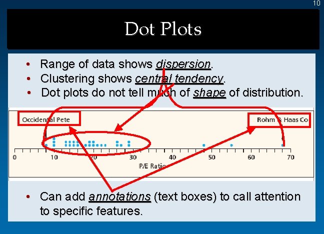
10 Dot Plots • • • Range of data shows dispersion. Clustering shows central tendency. Dot plots do not tell much of shape of distribution. • Can add annotations (text boxes) to call attention to specific features.
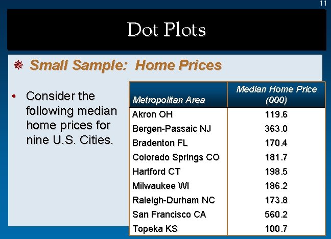
11 Dot Plots ¯ Small Sample: Home Prices • Consider the following median home prices for nine U. S. Cities. Metropolitan Area Median Home Price (000) Akron OH 119. 6 Bergen-Passaic NJ 363. 0 Bradenton FL 170. 4 Colorado Springs CO 181. 7 Hartford CT 198. 5 Milwaukee WI 186. 2 Raleigh-Durham NC 173. 8 San Francisco CA 560. 2 Topeka KS 100. 7
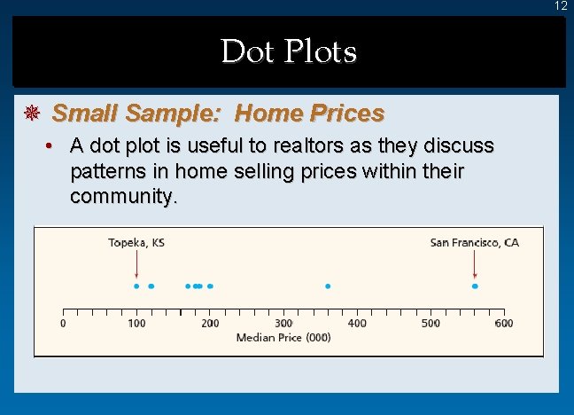
12 Dot Plots ¯ Small Sample: Home Prices • A dot plot is useful to realtors as they discuss patterns in home selling prices within their community.
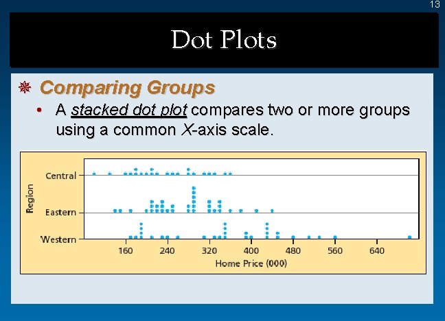
13 Dot Plots ¯ Comparing Groups • A stacked dot plot compares two or more groups using a common X-axis scale.
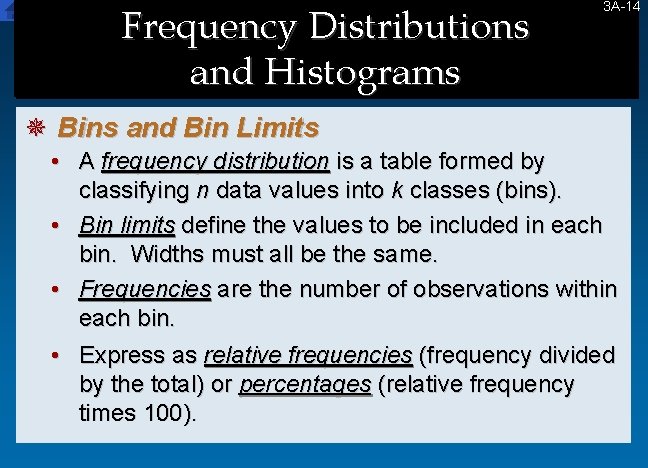
Frequency Distributions and Histograms 3 A-14 14 ¯ Bins and Bin Limits • A frequency distribution is a table formed by classifying n data values into k classes (bins). • Bin limits define the values to be included in each bin. Widths must all be the same. • Frequencies are the number of observations within each bin. • Express as relative frequencies (frequency divided by the total) or percentages (relative frequency times 100).
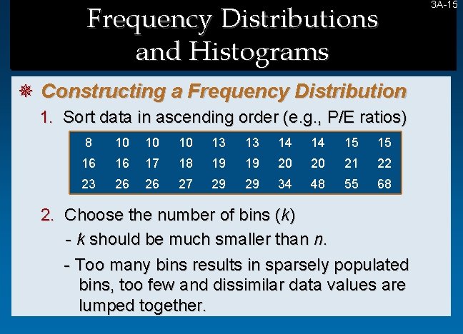
Frequency Distributions and Histograms ¯ Constructing a Frequency Distribution 1. Sort data in ascending order (e. g. , P/E ratios) 8 10 10 10 13 13 14 14 15 15 16 16 17 18 19 19 20 20 21 22 23 26 26 27 29 29 34 48 55 68 2. Choose the number of bins (k) - k should be much smaller than n. - Too many bins results in sparsely populated bins, too few and dissimilar data values are lumped together. 3 A-15 15
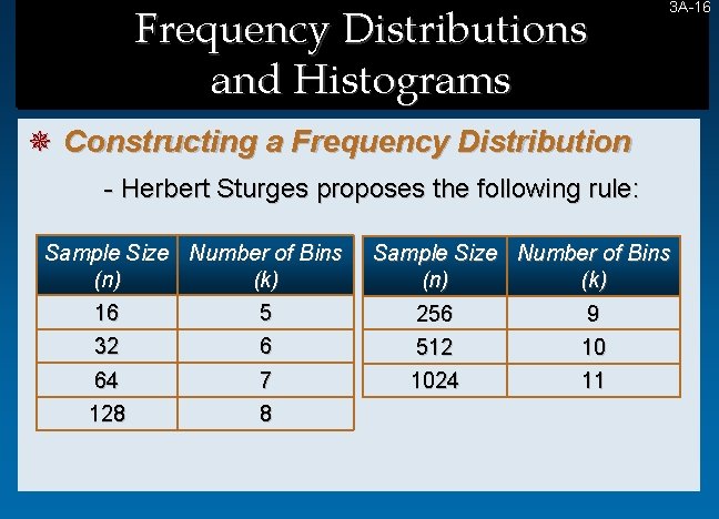
Frequency Distributions and Histograms 3 A-16 16 ¯ Constructing a Frequency Distribution - Herbert Sturges proposes the following rule: Sample Size Number of Bins (n) (k) 16 5 32 6 64 128 7 8 Sample Size Number of Bins (n) (k) 256 9 512 10 1024 11
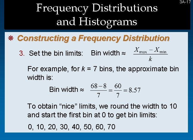
Frequency Distributions and Histograms ¯ Constructing a Frequency Distribution 3. Set the bin limits: Bin width For example, for k = 7 bins, the approximate bin width is: Bin width To obtain “nice” limits, we round the width to 10 and start the first bin at 0 to get bin limits: 0, 10, 20, 30, 40, 50, 60, 70 3 A-17 17
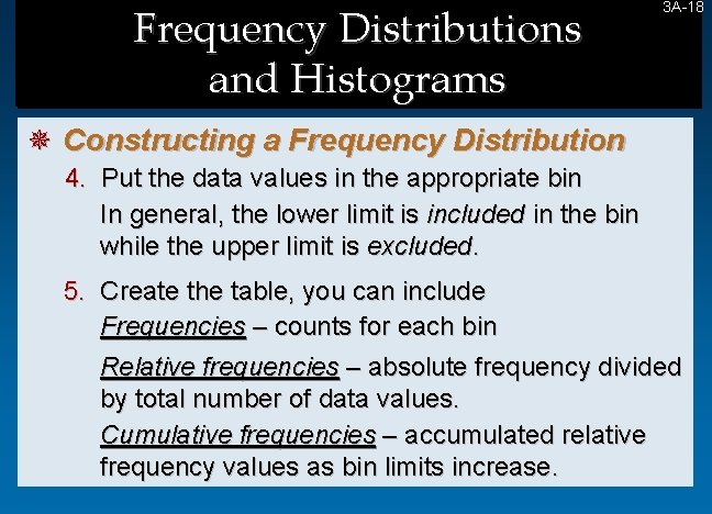
Frequency Distributions and Histograms 3 A-18 18 ¯ Constructing a Frequency Distribution 4. Put the data values in the appropriate bin In general, the lower limit is included in the bin while the upper limit is excluded. 5. Create the table, you can include Frequencies – counts for each bin Relative frequencies – absolute frequency divided by total number of data values. Cumulative frequencies – accumulated relative frequency values as bin limits increase.
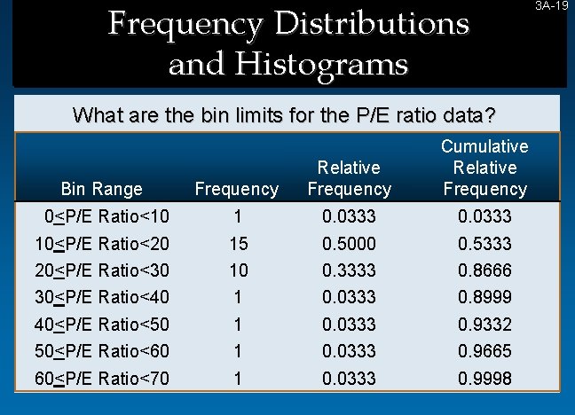
Frequency Distributions and Histograms What are the bin limits for the P/E ratio data? Cumulative Relative Frequency Bin Range Frequency Relative Frequency 0<P/E Ratio<10 1 0. 0333 10<P/E Ratio<20 15 0. 5000 0. 5333 20<P/E Ratio<30 10 0. 3333 0. 8666 30<P/E Ratio<40 1 0. 0333 0. 8999 40<P/E Ratio<50 1 0. 0333 0. 9332 50<P/E Ratio<60 1 0. 0333 0. 9665 60<P/E Ratio<70 1 0. 0333 0. 9998 3 A-19 19
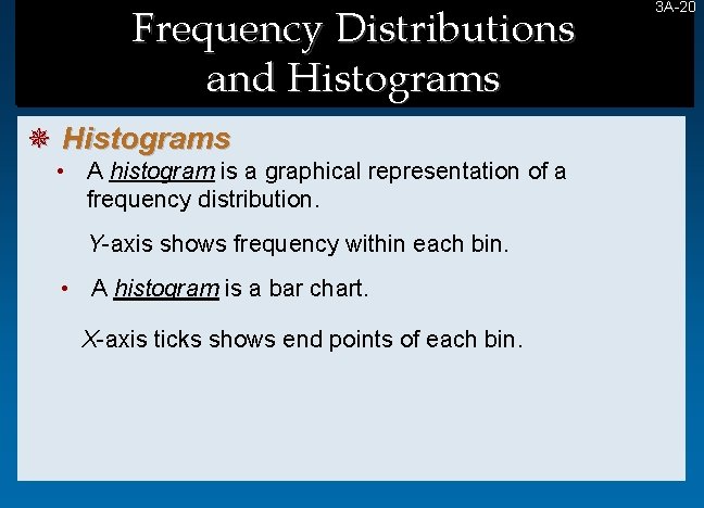
Frequency Distributions and Histograms ¯ Histograms • A histogram is a graphical representation of a frequency distribution. Y-axis shows frequency within each bin. • A histogram is a bar chart. X-axis ticks shows end points of each bin. 3 A-20 20
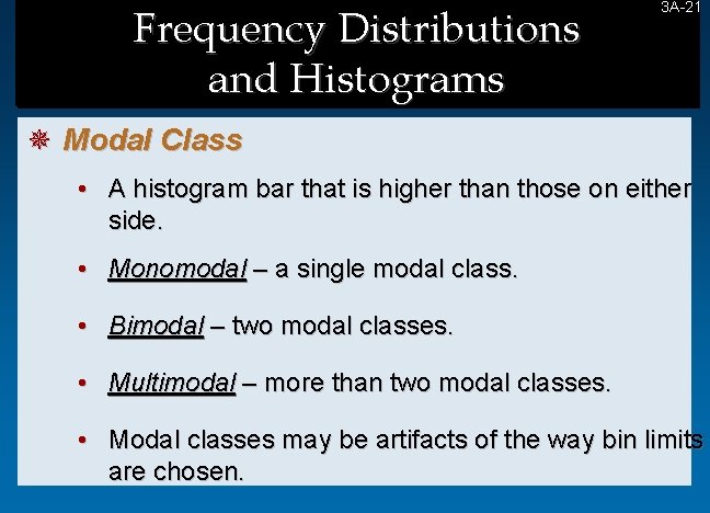
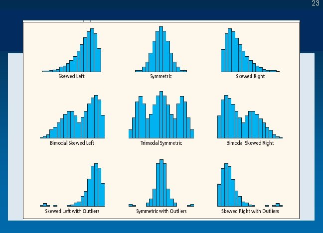
Frequency Distributions and Histograms 3 A-21 21 ¯ Modal Class • A histogram bar that is higher than those on either side. • Monomodal – a single modal class. • Bimodal – two modal classes. • Multimodal – more than two modal classes. • Modal classes may be artifacts of the way bin limits are chosen.
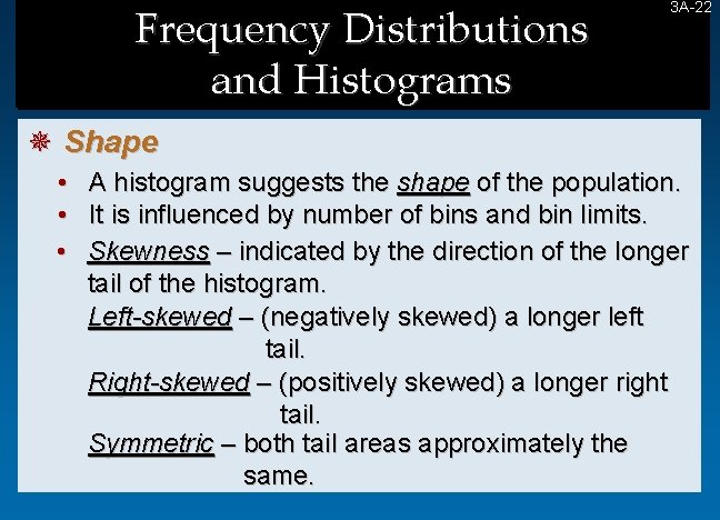
Frequency Distributions and Histograms 3 A-22 22 ¯ Shape • • • A histogram suggests the shape of the population. It is influenced by number of bins and bin limits. Skewness – indicated by the direction of the longer tail of the histogram. Left-skewed – (negatively skewed) a longer left tail. Right-skewed – (positively skewed) a longer right tail. Symmetric – both tail areas approximately the same.
23
- Slides: 23