1 2 Displaying Quantitative Data with Graphs Section


 and")


 Stemplots give us a quick picture of the distribution while including")
Separate each observation into a stem (all but the")
 These data represent the responses of 20 female AP Statistics students")


Divide the range of data into classes of equal")


Don’t confuse histograms and bar graphs. 2)Don’t use counts (in")


- Slides: 30
1. 2: Displaying Quantitative Data with Graphs
Section 1. 2 Displaying Quantitative Data with Graphs After this section, you should be able to… ü CONSTRUCT and INTERPRET dotplots, stemplots, and histograms ü DESCRIBE the shape of a distribution ü COMPARE distributions ü USE histograms wisely
Dotplots One of the simplest graphs to construct and interpret is a dotplot. Each data value is shown as a dot above its location on a number line. Number of Goals Scored Per Game by the 2004 US Women’s Soccer Team 3 0 2 7 8 2 4 3 5 1 1 4 5 3 1 1 3 3 3 2 1 2 2 2 4 3 5 6 1 5 5 1 1 5
How to Make a Dotplot 1. Draw a horizontal axis (a number line) and label it with the variable name. 2. Scale the axis from the minimum to the maximum value. 3. Mark a dot above the location on the horizontal axis corresponding to each data value.
Examining the Distribution of a Quantitative Variable • The purpose of a graph is to help us understand the data. After you make a graph, always ask, “What do I see? ” How to Examine the Distribution of a Quantitative Variable In any graph, look for the overall pattern and for striking departures from that pattern. Describe the overall pattern of a distribution by its: • Shape • Center • Spread Don’t forget your SOCS! Note individual values that fall outside the overall pattern. These departures are called outliers.
Smart Phone Apple i. Phone 4 Motorola Atrix HTC Thunderbolt Samsung Infuse 4 G T- Mobile G 2 X T – Mobile my. Touch Samsung Galaxy Samsung Nexus HTC EVO 4 G Xperia PLAY Battery Life (minutes) Talk time 420 530 378 480 420 624 390 360 312 460 Describe the shape, center, and spread of the distribution. Are there any outliers? Displaying Quantitative Data • Examine this data Here is the estimated battery life for each of 9 different smart phones (in minutes) according to http: //cellphones. toptenreviews. com/smartphones/.
Describing Shape When you describe a distribution’s shape, concentrate on the main features. Look for rough symmetry or clear skewness.
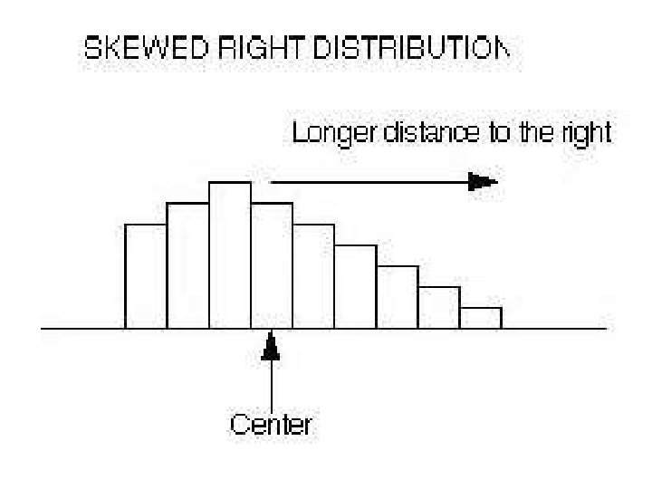
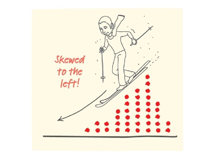
Shape Definitions: Symmetric: if the right and left sides of the graph are approximately mirror images of each other. Skewed to the right (right-skewed) if the right side of the graph is much longer than the left side. Skewed to the left (left-skewed) if the left side of the graph is much longer than the right side. Symmetric Skewed-left Skewed-right
Other Ways to Describe Shape: • Unimodal • Bimodal • Multimodal
The first dotplot shows the outcomes of 100 rolls of a 10 -sided die. This distribution is roughly symmetric with no obvious modes. Don’t worry about the small differences in the number of dots for each die roll—this is bound to happen just by chance even if the frequencies should be the same. A distribution with this shape can be called “approximately uniform. ” The second dotplot shows the number of calories in one serving of whole wheat or multigrain bread. This distribution is skewed to the left with a peak at 220 calories.
Outliers Definition: Values that differ from the overall pattern are outliers. We will learn specific ways to find outliers in a later chapter. For now, we can only identify “potential outliers. ”
Center We can describe the center by finding a value that divides the observations so that about half take larger values and about half take smaller values. Ways to describe center: • Calculate median (best when distribution is skewed) • Calculate mean (best when distribution is symmetric)
Spread The spread of a distribution tells us how much variability there is in the data. Ways to ‘describe’ spread: • Calculate the range • IQR (coming later) • Standard Deviation (coming later)
Below is a distribution of MPG achieved by various Honda vehicles. Describe the shape, center, and spread of the distribution. Are there any potential outliers? Remember to include CONTEXT!!!
Sample Answer: • Shape: The shape of the distribution is roughly unimodal and skewed left. • Center: The mean is 25. 9 mpg and the median is 28 mpg. (only need one measure) • Spread: The range is 19 mpg. • Outliers: There are two potential outliers/influential values vehicles: 14 mpg and 18 mpg.
Stemplots (Stem-and-Leaf Plots) Stemplots give us a quick picture of the distribution while including the actual numerical values.
How to Make a Stemplot 1)Separate each observation into a stem (all but the final digit) and a leaf (the final digit). 2)Write all possible stems from the smallest to the largest in a vertical column and draw a vertical line to the right of the column. 3)Write each leaf in the row to the right of its stem. 4)Arrange the leaves in increasing order out from the stem. 5)Provide a key that explains in context what the stems and leaves represent.
Stemplots (Stem-and-Leaf Plots) These data represent the responses of 20 female AP Statistics students to the question, “How many pairs of shoes do you have? ” 50 26 26 31 57 19 24 22 23 38 13 50 13 34 23 30 49 13 15 51
Two Special Types of Stem Plots – Spilt Stemplots: Best when data values are “bunched up” • Spilt 0 -4 and 5 -9 – Back-to-Back Stemplot: Compares two distributions of the same quantitative variable 0 0 1 1 2 2 3 3 4 4 5 5 Females “split stems” 333 95 4332 66 410 8 9 100 7 Males 0 0 1 1 2 2 3 3 4 4 5 5 4 555677778 0000124 Back-to-Back 2 58 Key: 4|9 represents a student who reported having 49 pairs of shoes.
Histograms – Quantitative variables often take many values. – A graph of the distribution may be clearer if nearby values are grouped together. – Most common graph of the distribution of one quantitative variable
How to Make a Histogram 1)Divide the range of data into classes of equal width. 2)Find the count (frequency) or percent (relative frequency) of individuals in each class. 3)Label and scale your axes and draw the histogram. The height of the bar equals its frequency. Adjacent bars should touch, unless a class contains no individuals.
Making a Histogram Class Count 0 to <5 20 5 to <10 13 10 to <15 9 15 to <20 5 20 to <25 2 25 to <30 1 Total 50 Number of States Frequency Table Percent of foreign-born residents
Team Hawks Celtics Bobcats Bulls Cavaliers Mavericks Nuggets Pistons Warriors Rockets PPG 101. 7 99. 2 95. 3 97. 5 Team Pacers Clippers Lakers Grizzlies 102. 1 Heat 102 Bucks Timberwolve 106. 5 s 94 Nets 108. 8 Hornets 102. 4 Knicks PPG 100. 8 95. 7 101. 7 102. 5 Team Thunder Magic 76 ers Suns Portland Trail 96. 5 Blazers 97. 7 Kings 98. 2 92. 4 100. 2 102. 1 Spurs Raptors Jazz Wizards PPG 101. 5 102. 8 97. 7 110. 2 98. 1 100 101. 4 104. 1 104. 2 96. 2 The table presents the average points scored per game (PTSG) for the 30 NBA teams in the 2009 -
Caution: Using Histograms Wisely 1)Don’t confuse histograms and bar graphs. 2)Don’t use counts (in a frequency table) or percents (in a relative frequency table) as data. 3)Use percents instead of counts on the vertical axis when comparing distributions with different numbers of observations. 4)Just because a graph looks nice, it’s not necessarily a meaningful display of data.
Check Your Understanding The dotplot displays the scores of 21 statistics students on a 20 -point quiz. a. What percentage of students scored higher than 16 points? b. Describe the shape of the distribution. c. Are there any potential outliers? Why?
Check Your Understanding The dotplot displays the scores of 21 statistics students on a 20 -point quiz. a. What percentage of students scored higher than 16 points? 17/21 or 80. 95% b. Describe the shape of the distribution. Skewed left. c. Are there any potential outliers? Why? Yes, the student scoring approximately 10 is an outlier. He/she preformed much worse than the rest of the class.
Check Your Understanding Here is a back-to-back stemplot of 19 middle school students’ resting pulse rates and their pulse rates after 5 minutes of running. Write a few sentences comparing the distributions of resting and after exercise pulse rates.
Check Your Understanding The resting and after exercise pulse rates are both skewed to the left. The median for resting pulse is lower at 76 beats compared to a median of 98 beats after exercise. The variabilities are fairly similar; resting range is 52 beats and after exercise is 60 beats. There is one potential outlier in both distributions: 120 beats (resting) and 146 beats (after exercise).