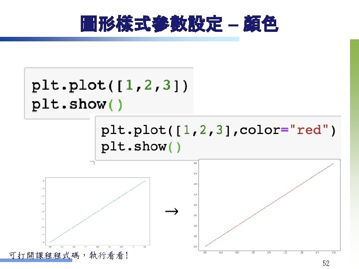
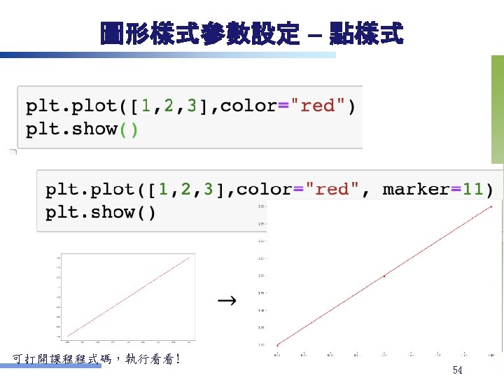
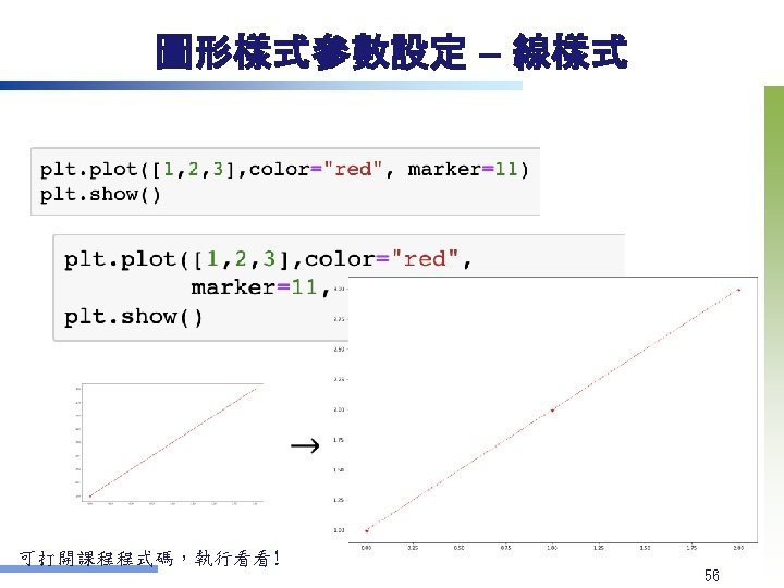
1 2 3 Python Datairis csv Anaconda Spyder


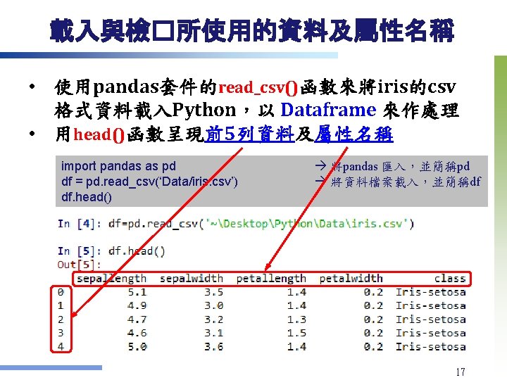
 用Anaconda�動 Spyder (請自行安裝Anaconda) 在Spyder內開� Desktop/Python. Visualize. py")


 n Sources (Perhaps the best known dataset in pattern recognition)")


![呈現資料分佈與關聯的圖形製作 – 二維資料 v 散佈圖 Scatter plot marker形狀是o,color是magenta plt. scatter(df['petalwidth'], df['petallength'], marker='o', c="m") plt.](https://slidetodoc.com/presentation_image_h2/e195dbf340c6ef299b678ac5556c77fb/image-26.jpg "呈現資料分佈與關聯的圖形製作 – 二維資料 v 散佈圖 Scatter plot marker形狀是o,color是magenta plt. scatter(df['petalwidth'], df['petallength'], marker='o', c=\"m\") plt.")

![呈現資料分佈與關聯的圖形製作 – 二維資料 v 散佈圖 Scatter plot 多色彩的版本 讓不同類的樣本色彩不同 df 1=df[df['class']=="Iris-setosa"]  df 2=df[df['class']=="Iris-versicolor"]](https://slidetodoc.com/presentation_image_h2/e195dbf340c6ef299b678ac5556c77fb/image-28.jpg "呈現資料分佈與關聯的圖形製作 – 二維資料 v 散佈圖 Scatter plot 多色彩的版本 讓不同類的樣本色彩不同 df 1=df[df['class']==\"Iris-setosa\"]  df 2=df[df['class']==\"Iris-versicolor\"]")


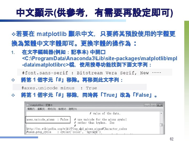
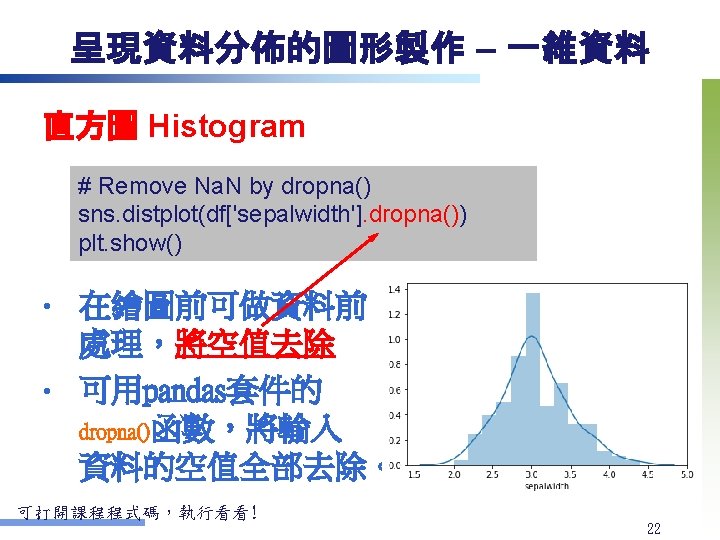
 2. 3. 再來到C: WindowsFonts,把字體 Microsoft Jheng. Hei (微軟正 黑體) UI字體複製到 Anaconda 3Libsitepackagesmatplotlibmpl-datafontsttf下,然後刪除目錄中原先 的<Deja.")
- Slides: 63
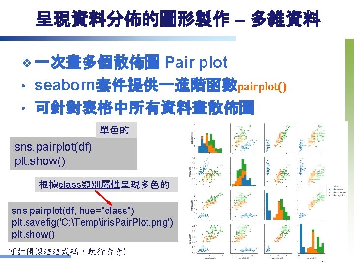
本課程範例程式碼與資料 1. 2. 3. 將Python資料夾複製到桌面 (內含Data/iris. csv) 用Anaconda�動 Spyder (請自行安裝Anaconda) 在Spyder內開� Desktop/Python. Visualize. py 8
Seaborn Gallery 程式範例與說明 10
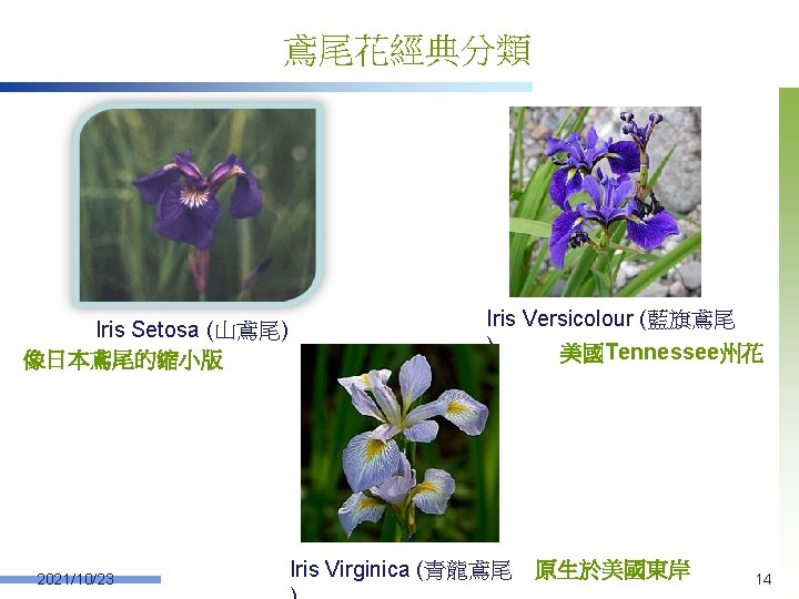
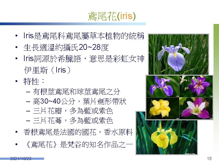
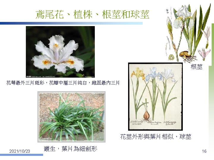
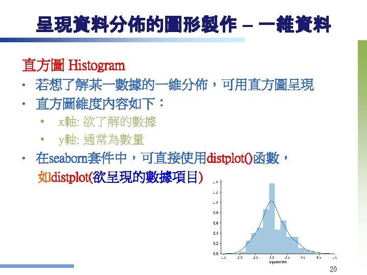
The iris Dataset (鳶尾花資料集) n Sources (Perhaps the best known dataset in pattern recognition) u u u n n Creator: R. A. Fisher Donor: Michael Marshall Date: July, 1988 Number of Instances: 150 (50 in each of 3 classes) Number of Input Attributes: 4, numeric Missing Attribute Values: None Attribute Information u u u 2021/10/23 sepal (花萼) length (in cm) sepal width (in cm) petal (花瓣) length (in cm) petal width (in cm) class: iris Setosa, iris Versicolour, iris Virginica (3 classes) 13
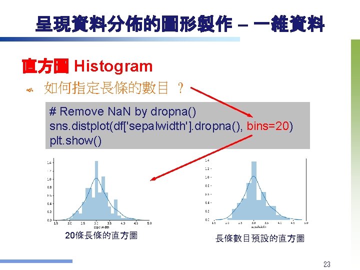
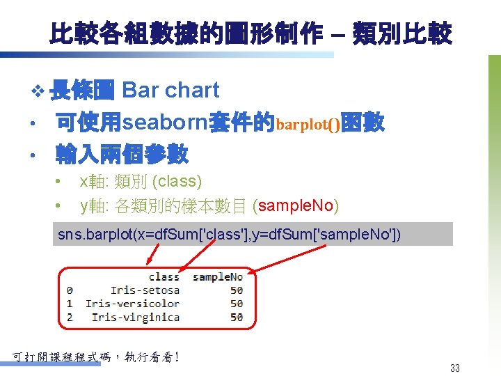
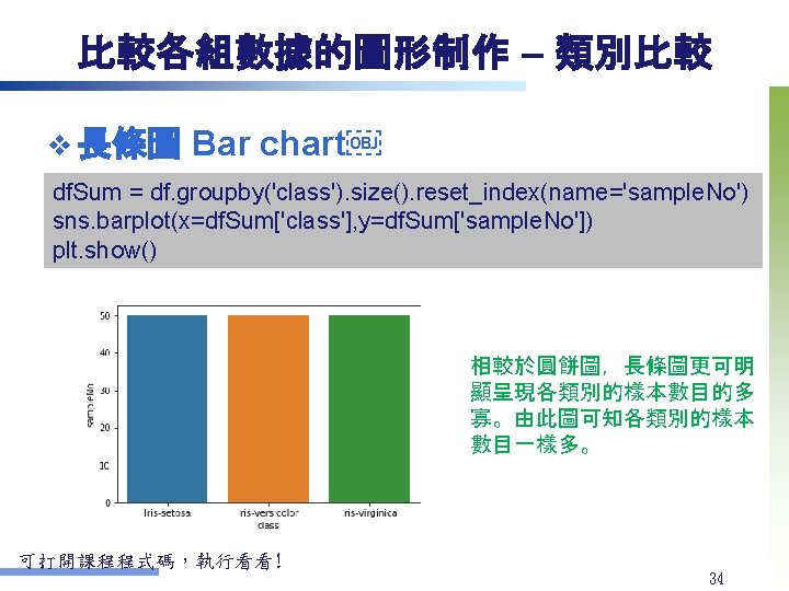
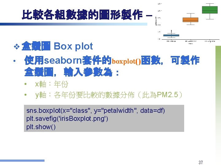
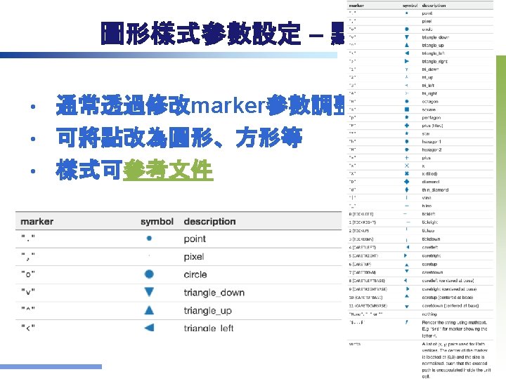
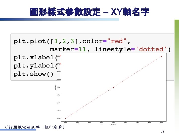
呈現資料分佈與關聯的圖形製作 – 二維資料 v 散佈圖 Scatter plot marker形狀是o,color是magenta plt. scatter(df['petalwidth'], df['petallength'], marker='o', c="m") plt. xlabel("petalwidth") plt. ylabel("petallength") plt. savefig('C: Tempiris. Scatterplot. png') plt. show() 由圖可知, petalwidth和 petallength的資料分佈有 一定關係 可打開課程程式碼,執行看看! 26
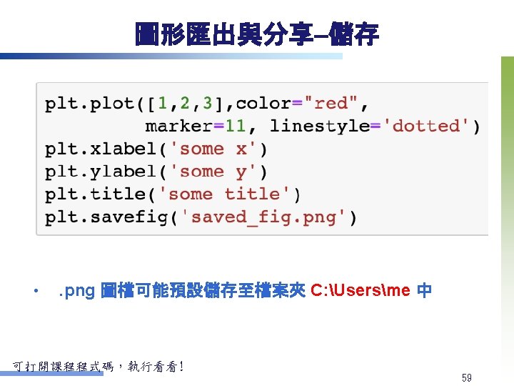
呈現資料分佈與關聯的圖形製作 – 二維資料 v 散佈圖 Scatter plot 加上趨勢線的版本  試著看看petalwidth和petallength有沒有相關? sns. regplot(x="petalwidth", y="petallength", data=df, marker=". ") plt. savefig('Regression. Plot. png') plt. show() v . png 圖檔可能儲存至預設的檔案夾 C: Usersme 中 27
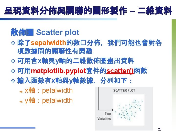
呈現資料分佈與關聯的圖形製作 – 二維資料 v 散佈圖 Scatter plot 多色彩的版本 讓不同類的樣本色彩不同 df 1=df[df['class']=="Iris-setosa"]  df 2=df[df['class']=="Iris-versicolor"] df 3=df[df['class']=="Iris-virginica"] plt. scatter(df 1['petalwidth'], df 1['petallength'], marker='^', c="m") plt. scatter(df 2['petalwidth'], df 2['petallength'], marker='o', c="b") plt. scatter(df 3['petalwidth'], df 3['petallength'], marker='+', c="g") plt. xlabel("petalwidth") plt. ylabel("petallength") plt. legend(loc='upper left') 可打開課程程式碼,執行看看! 28
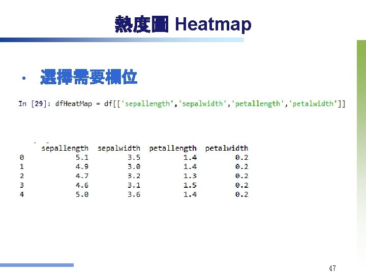
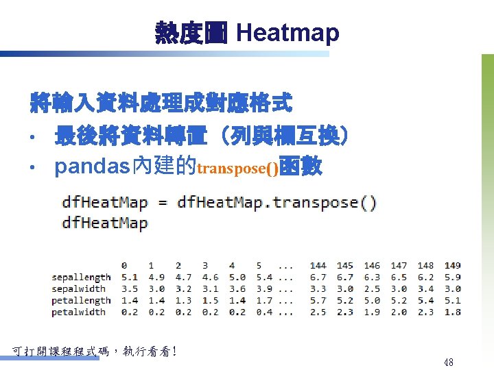
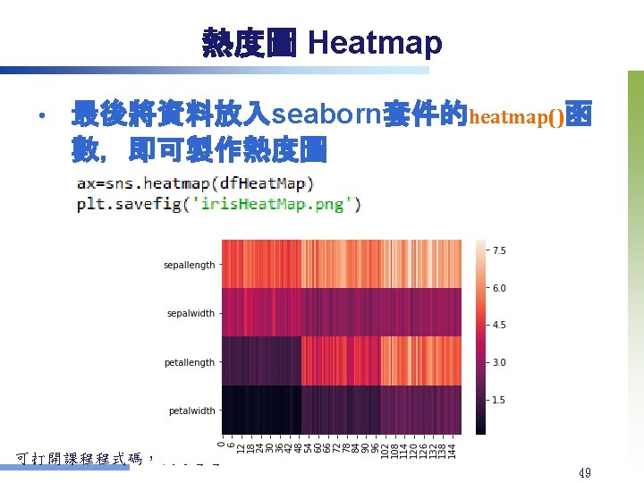
進階圖形製作 鳶尾花熱度圖 Heatmap v X軸為資料編號 v Y軸為鳶尾花的四個量測� v sepallength v sepalwidth v petallength v petalwidth 原始資料 46
Python資料視覺化參考資料 Python Graph Gallery • Matplotlib官方說明文件 • Seaborn官方說明文件 • 61
中文顯示(供參考,有需要再設定即可) 2. 3. 再來到C: WindowsFonts,把字體 Microsoft Jheng. Hei (微軟正 黑體) UI字體複製到 Anaconda 3Libsitepackagesmatplotlibmpl-datafontsttf下,然後刪除目錄中原先 的<Deja. Vu. Sans. tff>字型檔,再將剛剛複製的<msjh. ttc>檔案更名 為<Deja. Vu. Sans. tff>。 用記事本開� matplotlibrc,搜尋到 font. family,將後面改為 Microsoft Jheng. Hei,存檔後重新執行python軟體即可顯示中文。 設定rc. Params 參數與matplotlibrc 設定檔 63