1 1 Analyzing Categorical Data Pages 7 24

- Slides: 24

1. 1 Analyzing Categorical Data Pages 7 -24 Objectives SWBAT: 1) Display categorical data with a bar graph. Decide if it would be appropriate to make a pie chart. 2) Identify what makes some graphs of categorical data deceptive. 3) Calculate and display the marginal distribution of a categorical variable from a two-way table. 4) Calculate and display the conditional distribution of a categorical variable fro a particular value of the other categorical variable in a two-way table. 5) Describe the association between two categorical variables by comparing appropriate conditional distributions.

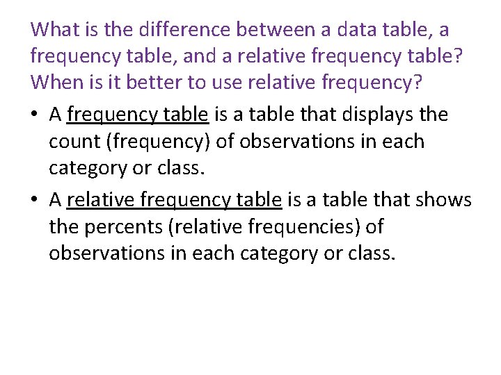
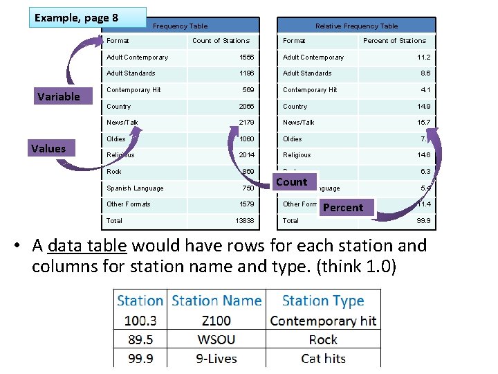
What is the difference between a data table, a frequency table, and a relative frequency table? When is it better to use relative frequency? • A frequency table is a table that displays the count (frequency) of observations in each category or class. • A relative frequency table is a table that shows the percents (relative frequencies) of observations in each category or class.

Example, page 8 Frequency Table Format Variable Values Relative Frequency Table Count of Stations Format Percent of Stations Adult Contemporary 1556 Adult Contemporary Adult Standards 1196 Adult Standards 8. 6 Contemporary Hit 4. 1 Contemporary Hit 569 11. 2 Country 2066 Country 14. 9 News/Talk 2179 News/Talk 15. 7 Oldies 1060 Oldies Religious 2014 Religious Rock 869 Spanish Language 750 Other Formats Total 1579 13838 7. 7 14. 6 Rock Count Spanish Language Percent 6. 3 5. 4 Other Formats 11. 4 Total 99. 9 • A data table would have rows for each station and columns for station name and type. (think 1. 0)

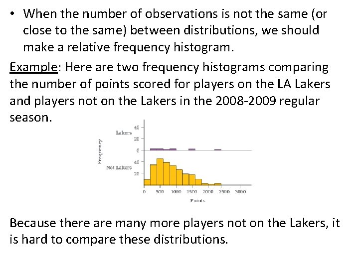
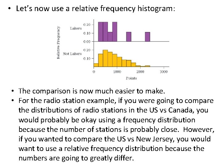
• When the number of observations is not the same (or close to the same) between distributions, we should make a relative frequency histogram. Example: Here are two frequency histograms comparing the number of points scored for players on the LA Lakers and players not on the Lakers in the 2008 -2009 regular season. Because there are many more players not on the Lakers, it is hard to compare these distributions.

• Let’s now use a relative frequency histogram: • The comparison is now much easier to make. • For the radio station example, if you were going to compare the distributions of radio stations in the US vs Canada, you would probably be okay using a frequency distribution because the number of stations is probably close. However, if you wanted to compare the US vs New Jersey, you would want to use a relative frequency distribution because the numbers are going to greatly differ.

What is the most important thing to remember when making pie charts and bar graphs? Why do statisticians prefer bar graphs? • The most important thing to remember is to make sure everything is properly labeled! • Statisticians prefer bar graphs because 1) they’re easier to make and read and 2) they allow for a comparison of quantities that are measured in the same units. When is it inappropriate to use a pie chart? • It is inappropriate when trying to compare distributions.

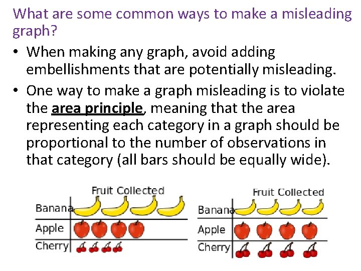
What are some common ways to make a misleading graph? • When making any graph, avoid adding embellishments that are potentially misleading. • One way to make a graph misleading is to violate the area principle, meaning that the area representing each category in a graph should be proportional to the number of observations in that category (all bars should be equally wide).

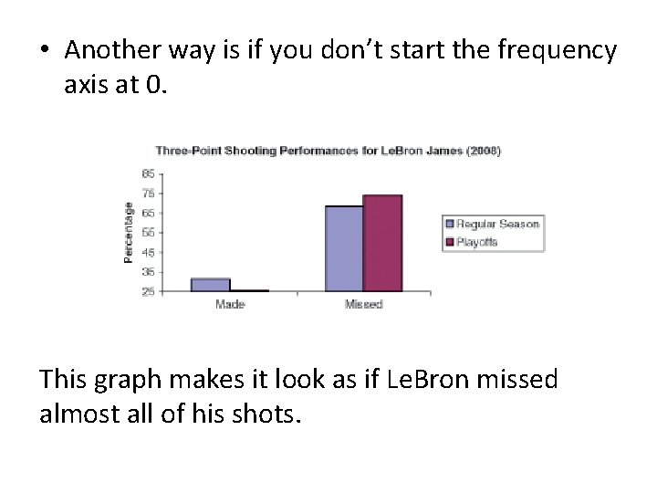
• Another way is if you don’t start the frequency axis at 0. This graph makes it look as if Le. Bron missed almost all of his shots.

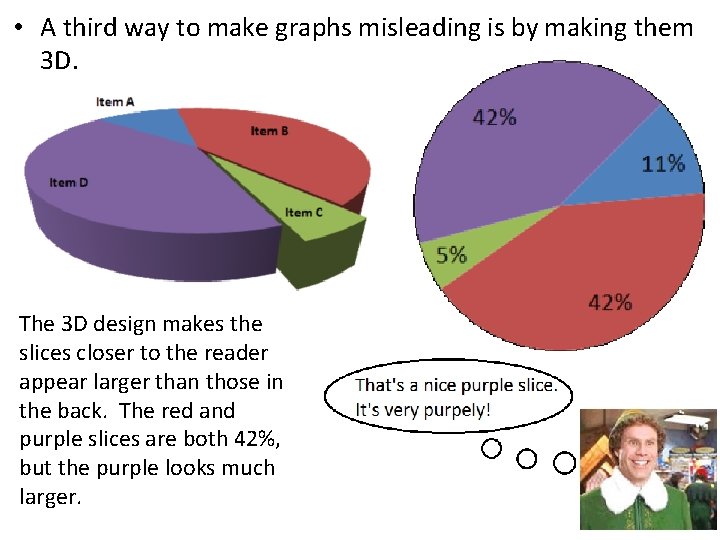
• A third way to make graphs misleading is by making them 3 D. The 3 D design makes the slices closer to the reader appear larger than those in the back. The red and purple slices are both 42%, but the purple looks much larger.

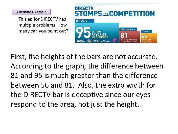
Alternate Example This ad for DIRECTV has multiple problems. How many can you point out? First, the heights of the bars are not accurate. According to the graph, the difference between 81 and 95 is much greater than the difference between 56 and 81. Also, the extra width for the DIRECTV bar is deceptive since our eyes respond to the area, not just the height.

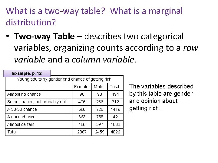
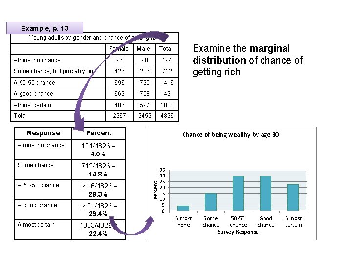
What is a two-way table? What is a marginal distribution? • Two-way Table – describes two categorical variables, organizing counts according to a row variable and a column variable. Example, p. 12 Young adults by gender and chance of getting rich Female Male Total Almost no chance 96 98 194 Some chance, but probably not 426 286 712 A 50 -50 chance 696 720 1416 A good chance 663 758 1421 Almost certain 486 597 1083 Total 2367 2459 4826 The variables described by this table are gender and opinion about getting rich.

• The Marginal Distribution of one of the categorical variables in a two-way table of counts is the distribution of values of that variable among all individuals described by the table. • Note: Percents are often more informative than counts, especially when comparing groups of different sizes. • To examine a marginal distribution, 1)Use the data in the table to calculate the marginal distribution (in percents) of the row or column totals. 2)Make a graph to display the marginal distribution.

Example, p. 13 Young adults by gender and chance of getting rich Female Male Total Almost no chance 96 98 194 Some chance, but probably not 426 286 712 A 50 -50 chance 696 720 1416 A good chance 663 758 1421 Almost certain 486 597 1083 Total 2367 2459 4826 Percent Almost no chance 194/4826 = 4. 0% Some chance 712/4826 = 14. 8% A 50 -50 chance 1416/4826 = 29. 3% A good chance 1421/4826 = 29. 4% Almost certain 1083/4826 = 22. 4% Chance of being wealthy by age 30 Percent Response Examine the marginal distribution of chance of getting rich. 35 30 25 20 15 10 5 0 Almost none Some 50 -50 Good chance Survey Response Almost certain

What is a conditional distribution? How do we know which variable to condition on? • Marginal distributions tell us nothing about the relationship between two variables. • A Conditional Distribution of a variable describes the values of that variable among individuals who have a specific value of another variable. • There are two sets of conditional distributions for a two-way table: one for the column variable and one for the row variable. – So how do we know what set we should use? – It all depends on whether changes in one variable might effect changes in the other. Let’s take a look at an example.

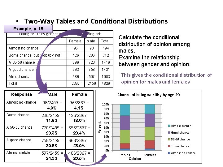
• Two-Way Tables and Conditional Distributions Example, p. 15 Young adults by gender and chance of getting rich Female Male Total Almost no chance 96 98 194 Some chance, but probably not 426 286 712 A 50 -50 chance 696 720 1416 A good chance 663 758 1421 Almost certain 486 597 1083 Total 2367 2459 4826 Male Female Almost no chance 98/2459 = 4. 0% 96/2367 = 4. 1% Some chance 286/2459 = 11. 6% 426/2367 = 18. 0% A 50 -50 chance 720/2459 = 29. 3% 696/2367 = 29. 4% 758/2459 = 30. 8% 663/2367 = 28. 0% 597/2459 = 24. 3% 486/2367 = 20. 5% A good chance Almost certain This gives the conditional distribution of opinion for males and females Chance of being wealthy by by age 30 30 100% 90% 80% 3570% 3060% 2550% 20 1540% 1030% 5 020% 10%Almost no no Some chance 0% chance Percent Response Calculate the conditional distribution of opinion among males. Examine the relationship between gender and opinion. Almost certain Good chance Males 50 -50 chance Good chance Males Females Opinion Females Some chance Almost certain Almost no chance

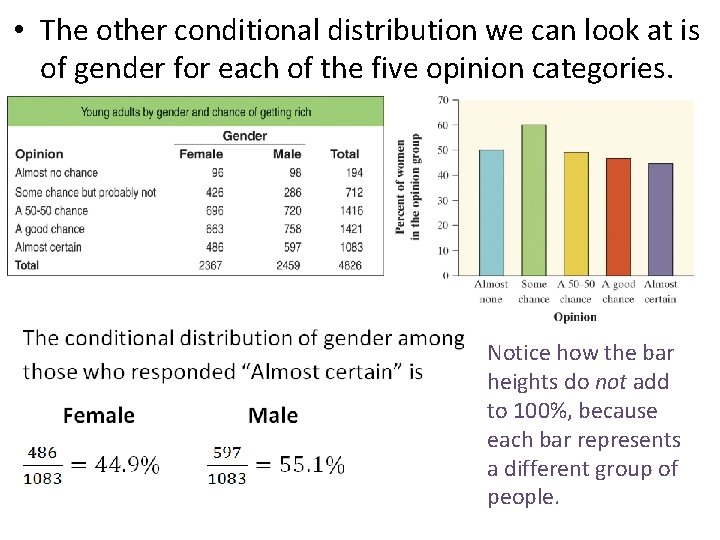
• The other conditional distribution we can look at is of gender for each of the five opinion categories. Notice how the bar heights do not add to 100%, because each bar represents a different group of people.

• We started by examining the conditional distributions of opinion for males and females. • Then we looked at the conditional distributions of gender for each of the five opinion categories. • Which of these two gives us the information we want? • Hint: think about whether changes in one variable might help explain changes in the other. • In this case, it seems reasonable to think that gender might influence young adults’ opinions about their chances of getting rich. • As a result, we should compare the conditional distributions of opinion for women and men (the first way).

What is a segmented bar graph? Why are they good to use? • A segmented bar graph displays the possible outcomes of a categorical variable as slices of a rectangle, with the area of each slice proportional to how often each corresponding outcome occurred (each bar must total 100%). • It is also known as a “stacked” bar chart. • Segmented bar graphs are good to use because they force us to use percents. • Note that they aren’t the best for comparison purposes. A better graph would be a side-by-side bar graph like the on page 17.

What does it mean for two variables to have an association? How can you tell by looking at a graph? • Two variables have an association if knowing the value of one variable helps predict the value of the other. – For example, if knowing that a person is male makes one of the responses more likely, there is an association between gender and response.

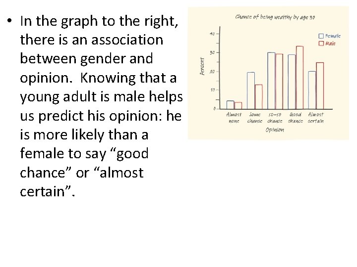
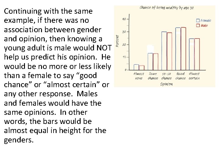
• In the graph to the right, there is an association between gender and opinion. Knowing that a young adult is male helps us predict his opinion: he is more likely than a female to say “good chance” or “almost certain”.

Continuing with the same example, if there was no association between gender and opinion, then knowing a young adult is male would NOT help us predict his opinion. He would be no more or less likely than a female to say “good chance” or “almost certain” or any other response. Males and females would have the same opinions. In other words, the bars would be almost equal in height for the genders.

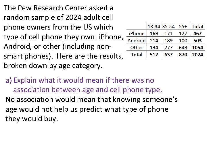
The Pew Research Center asked a random sample of 2024 adult cell phone owners from the US which type of cell phone they own: i. Phone, Android, or other (including nonsmart phones). Here are the results, broken down by age category. a) Explain what it would mean if there was no association between age and cell phone type. No association would mean that knowing someone’s age would not help us predict what type of phone they would buy.

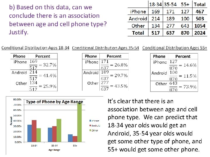
b) Based on this data, can we conclude there is an association between age and cell phone type? Justify. It’s clear that there is an association between age and cell phone type. We can predict that 18 -34 year olds would get an Android, 35 -54 year olds would get some other type of phone, and 55+ would get some other phone.
